
The Nautilus 5711 bracelet is not just a finishing detail; it defines how the watch wears, balances, and reads on the wrist. This article focuses on the part buyers most often misjudge, and the Nautilus 5712 PPF V3 review offers a closely related reference point for whether the bracelet starts cleanly from the case, stays low and tapered, and preserves the integrated shape without a swollen first link or a broken transition. Those points matter more here than a quick front-facing photo usually suggests.
What follows will help you separate acceptable variation from real red flags. You will see how to judge bracelet flow, articulation, brushing, bevels, and clasp behavior in QC photos, and why some flaws are worth rejecting while others are minor tolerance issues. The goal is to make the bracelet, clasp, and case junction easier to evaluate before you commit to a piece.
Replica watches should be clearly understood as replica-market products, not genuine watches from the original luxury brands. Brand names are used for reference and comparison only; they do not imply authorization, endorsement, or affiliation with the original luxury watch brands.
| Check | What You Want | Why It Matters |
|---|---|---|
| First link height | Low, smooth, no obvious hump | Protects the Nautilus silhouette |
| Case-to-bracelet flow | Natural drop and clean transition | Keeps the watch looking integrated |
| Bracelet articulation | Controlled curve, even movement | Improves comfort and wrist presence |
| Brushing and bevels | Aligned brushing, clear edge separation | Shows whether finishing is clean or coarse |
| Clasp engagement | Solid close, no looseness or scraping | Signals better assembly and daily use feel |
| QC photo angles | Front, side, wrist angle, underside | Helps reveal height, gaps, and crooked links |
Quick Questions Before You Read
Q: Is a slightly full first link always a problem?
No. Minor fullness can be acceptable, but a clear hump or abrupt step usually harms the watch’s integrated look.
Q: What matters more on a 5711 replica, the dial or bracelet?
The bracelet often matters more, because it defines the silhouette and wrist feel.
Q: Can front photos alone tell me if the bracelet is good?
Not reliably. Side views and wrist-angle photos are needed to judge height, flow, and taper.
Q: What is the biggest clasp-related warning sign?
Misalignment, rough closing action, or a clasp that looks inconsistent with the bracelet finish.
Editorial Perspective: For a Nautilus 5711 replica, the bracelet should be judged as a model-specific buying question, not as a simple factory-name decision. A factory label, seller description, or polished QC photo can help narrow the shortlist, but it does not prove that the first link height, case-to-bracelet flow, clasp alignment, and articulation are right on the actual watch being offered. At cleanvsfactory.com, this kind of evaluation is treated as a practical wrist-wear judgment: a piece that looks strong in flat photos may still be a weaker daily choice if the bracelet sits high, bends poorly, or feels rough in the clasp.
Why the Nautilus 5711 Bracelet Is Part of the Case Design
On the Nautilus 5711, the bracelet is not an accessory sitting under the case. It is part of the watch’s architecture, and that is exactly why bracelet quality matters so much on a replica watch. The thin case, broad horizontal profile, and flowing first links are supposed to read as one continuous shape on the wrist. If the bracelet rises too high, breaks too sharply away from the case, or looks visually separate, the whole watch loses the calm, integrated look that makes the 5711 recognizable.
The bracelet as a continuation of the case. The Nautilus 5711 bracelet should leave the case in a way that feels deliberate and controlled. It should not look bolted on, swollen at the junction, or disconnected by a hard visual step. That matters more here than on most watches because the case and bracelet do almost all of the design work together. In practice, the first link is not a small detail; it is the part that decides whether the watch feels like a unified object or a case with a bracelet attached to it.
Why flat photos can hide bracelet problems. Straight-on photos can make a Nautilus 5711 replica look much better than it really is. From the front, a weak bracelet transition may still seem acceptable because the bracelet and case sit in the same plane. The problems show up more clearly in side-profile and wrist-angle photos, where poor link flow, excessive height, or abrupt drop become obvious. A buyer who only checks a clean front shot can easily miss the integrated bracelet replica issue that matters most in daily wear.
The Clean VS Factory team usually treats the bracelet as part of the watch’s silhouette, not a separate component, because that is how the 5711 actually wears. On this model, the visual line from case to bracelet is what the eye catches first.
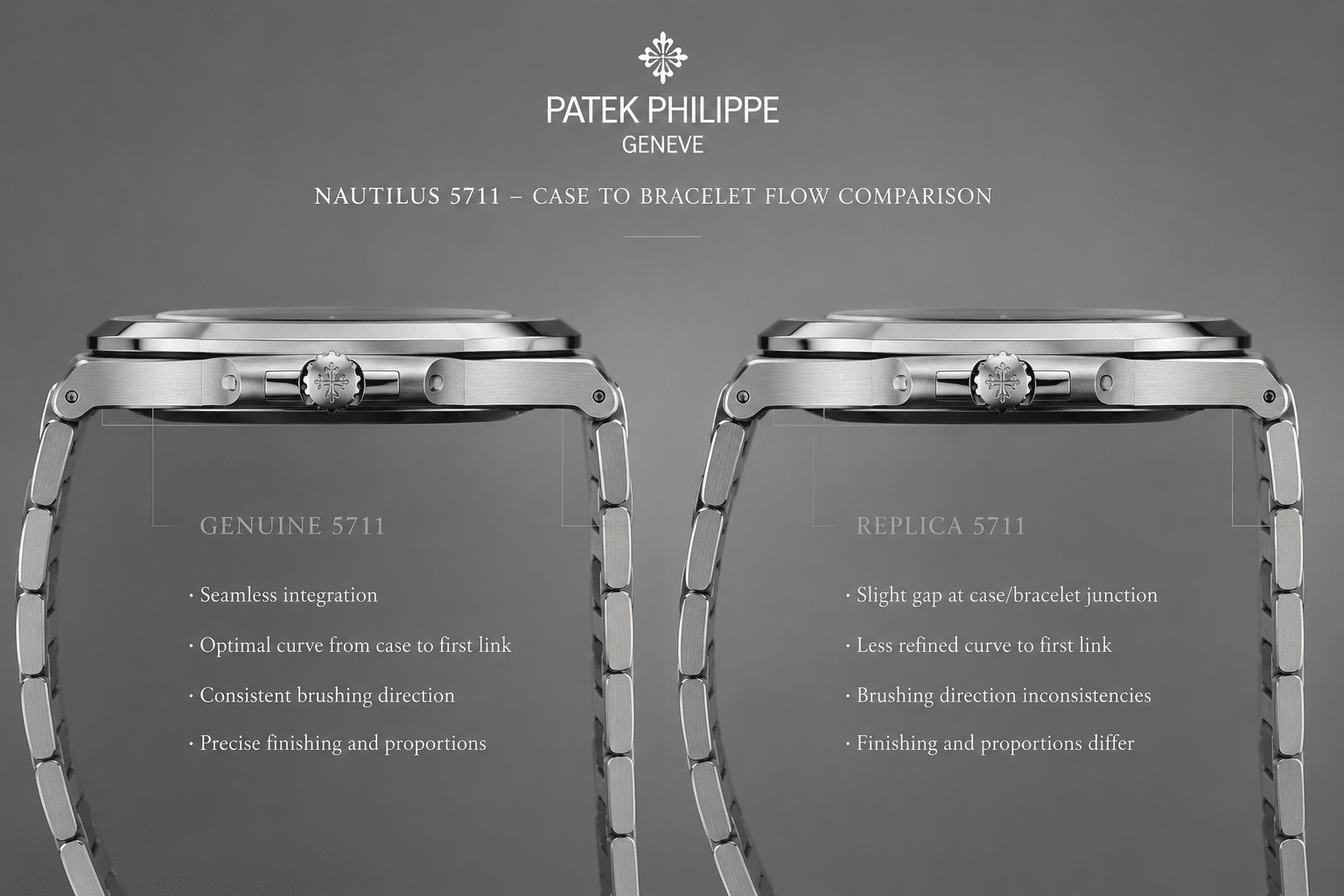
The Genuine 5711 Case-to-Bracelet Flow Buyers Should Understand
Before judging a replica, it helps to have the right mental picture of what the genuine Nautilus 5711 is trying to do. The genuine design depends on a low, controlled transition from case to bracelet, with the first link sitting as part of the profile rather than as a separate block. The bracelet should taper naturally, and the overall shape should feel smooth, continuous, and restrained instead of heavy or abrupt.
Front view: width, taper, and visual continuity. From the front, the 5711 bracelet should preserve the watch’s broad horizontal character without turning square or chunky. The first links should support that wide look without overpowering it. If the transition looks too tall or too rectangular, the watch starts to lose the elegant, low-slung feel that defines the model.
Side view: height and bracelet drop. From the side, the bracelet should not sit proud above the wrist or create a sudden step after the case. The drop should feel controlled, not abrupt. That is why the side profile matters so much in a Nautilus 5711 bracelet review: it shows whether the case-to-bracelet flow is disciplined or whether the bracelet seems to begin too aggressively.
What to check before you decide. A useful bracelet transition check usually starts with three photo angles: front, side-profile, and wrist-angle. Those are the minimum views that show whether the first link sits correctly, whether the taper looks balanced, and whether the bracelet visually continues the case in a believable way. Without those angles, it is easy to overrate a watch based on one flattering image.
The genuine reference design should be used as a visual comparison point, not as proof that any replica version is officially connected to the brand or built to the same standard. In replica-market discussion, the useful question is narrower: does the watch copy the visible case-to-bracelet logic well enough for normal wear, and where do the differences still show under close inspection?
Front View: Width, Taper, and Visual Continuity
The front view should show a bracelet that follows the Nautilus shape without looking blocky. The first links should carry the width of the watch smoothly into the bracelet, not break the line with a square or oversized shape. If the transition looks abrupt from the front, the watch will feel less refined even if the dial and case are otherwise decent.
Side View: Height and Bracelet Drop
The side view is where a weak bracelet often gives itself away. A good 5711 bracelet should sit low and settle into the wrist instead of standing up like a separate structure. If the first link creates a sudden step after the case, the watch can feel top-heavy and visually awkward even before you get into finer finishing details.
What to Check Before You Decide
Ask for front, side-profile, and wrist-angle photos before making a judgment. Those three views usually tell you whether the case-to-bracelet flow is genuinely convincing or only looks good in one carefully staged photo.
Why Factory Name Alone Does Not Decide a 5711 Bracelet
Factory reputation can be a useful starting point, but it is not enough to judge a Nautilus 5711 bracelet. The same factory may perform well on one model and less convincingly on another, especially when the watch depends on case thickness, first-link geometry, and integrated bracelet fit. A broad claim like “best factory” only becomes useful when it is narrowed to the specific 5711 version, bracelet construction, movement thickness, and the buyer’s intended use.
For this model, the more useful comparison is whether the watch keeps the correct low profile while still feeling wearable. A visually strong replica may look good in seller photos but feel stiff, sharp, or poorly balanced on the wrist. Another example may have slightly less dramatic finishing but better first-link flow and a more comfortable bracelet. The better daily-wear choice is not always the one with the brightest polished bevels or the most famous factory label.
Price should be read with the same caution. A higher price can reflect movement choice, bracelet finishing, availability, seller margin, or after-sale risk, but it does not automatically prove a better first link or cleaner clasp. On a Nautilus 5711, a buyer should compare the visible bracelet architecture before treating price as proof of quality. If the QC photos do not show the side profile, case junction, and clasp underside clearly, the price difference may be harder to justify.
Factory Name Clarification: Factory names in the replica watch market are commonly used buyer-facing labels. They should be treated as practical market references, not as official brand affiliations, audited manufacturer identities, or guarantees of identical quality across every model.
Compliance Boundaries for Factory and Brand Claims
A Nautilus 5711 bracelet comparison can mention Patek Philippe or Nautilus only to identify the genuine reference design being discussed. That does not mean a replica-market watch is produced, approved, serviced, certified, or endorsed by the original luxury brand. The correct buyer question is not whether the replica is “official” or “authentic”; it is whether the visible bracelet execution is acceptable for the buyer’s expectations while remaining clearly understood as a replica-market product.
Factory names are useful market references, but they do not guarantee identical quality across every model or version. A seller may use a factory label to describe a version, but the label should still be checked against visible QC evidence: first-link height, case-to-bracelet transition, bracelet curvature, clasp construction, brushing direction, and movement configuration. CleanVSFactory’s buyer-facing approach is to make those comparison points clearer, not to certify a watch or replace the buyer’s own verification.
The purpose of factory and movement information is to help readers understand quality and risk, not to represent a replica watch as genuine. Any claim that a watch is “same as authentic,” “inspection safe,” or “guaranteed to pass” should be treated as marketing language rather than useful evaluation. A strong super clone may look convincing in normal wear, but close inspection can still reveal differences in finishing, movement architecture, case proportions, bracelet feel, dial details, or service compatibility.
A Traceable Way to Compare 5711 Bracelet Versions
A more reliable comparison starts with the specific watch being offered, not the general reputation of the factory name. For a Nautilus 5711 bracelet, the traceable path is reference, version, movement thickness, case profile, first-link shape, bracelet articulation, clasp construction, and the actual QC photos. If one of those points is missing, the conclusion becomes weaker because the bracelet depends on all of them working together.
Version-specific judgment matters because the same visible flaw can have different causes. A high first link may come from bracelet geometry, case thickness, end-link fit, or the way the movement and caseback force the watch to sit. A stiff bracelet may come from link machining, pin tolerance, or finishing at the joints. Calling one factory stronger than another is only useful when the comparison explains which version, which bracelet construction, and which visible details support that conclusion.
For CleanVSFactory, the practical goal is to make replica watch comparison more traceable by connecting market names to visible execution. A bracelet review should show what can be verified in photos, what can only be felt in handling, and what remains uncertain until the watch is sized and worn. That approach is more useful than treating any factory label as a shortcut for quality.
The Fat First Link Problem on Nautilus 5711 Replicas
The fat first link problem is one of the most noticeable bracelet flaws on a Nautilus 5711 replica because it attacks the model’s most important visual rule: thin, continuous flow. In practical terms, the first bracelet link looks too tall, too bulky, or too visually heavy where it exits the case. Instead of easing into the bracelet, the watch appears to have a swollen junction that interrupts the silhouette.
What “fat first link” actually means. This is not just a thickness complaint. It can show up as excessive height, a bulky side profile, an awkward case junction, or a drop that feels unnatural compared with the genuine case-to-bracelet transition. The issue is really about proportion. On the 5711, even a slightly heavy first link can make the integrated bracelet look less elegant because the design is so dependent on lightness and balance.
Why this flaw changes the whole watch. The Nautilus silhouette is sensitive because the bracelet is visually connected to the case rather than hidden behind lugs. That means the eye reads the junction immediately. A swollen first link changes how the whole watch sits on the wrist, and it can make an otherwise solid replica feel off even if the dial and movement are acceptable. This is why many buyers overfocus on smaller details and miss the flaw that affects the wrist presence the most.
When the flaw is acceptable and when it is not. Minor fullness is one thing; an obvious step, hump, or broken flow is another. A little visual mass at the first link may be tolerable if the rest of the bracelet architecture is clean, but once the transition looks obviously forced, the watch stops carrying itself like a Nautilus. That is the point where the flaw becomes hard to ignore in daily wear, not just in macro photos.
For buyers comparing a Nautilus 5711 replica, this is one of the rare issues that can be more important than a small finishing complaint. A slightly imperfect brushing pattern may fade from memory on the wrist. A fat first link usually does not.
Bracelet Articulation, Link Flow, and Wrist Comfort
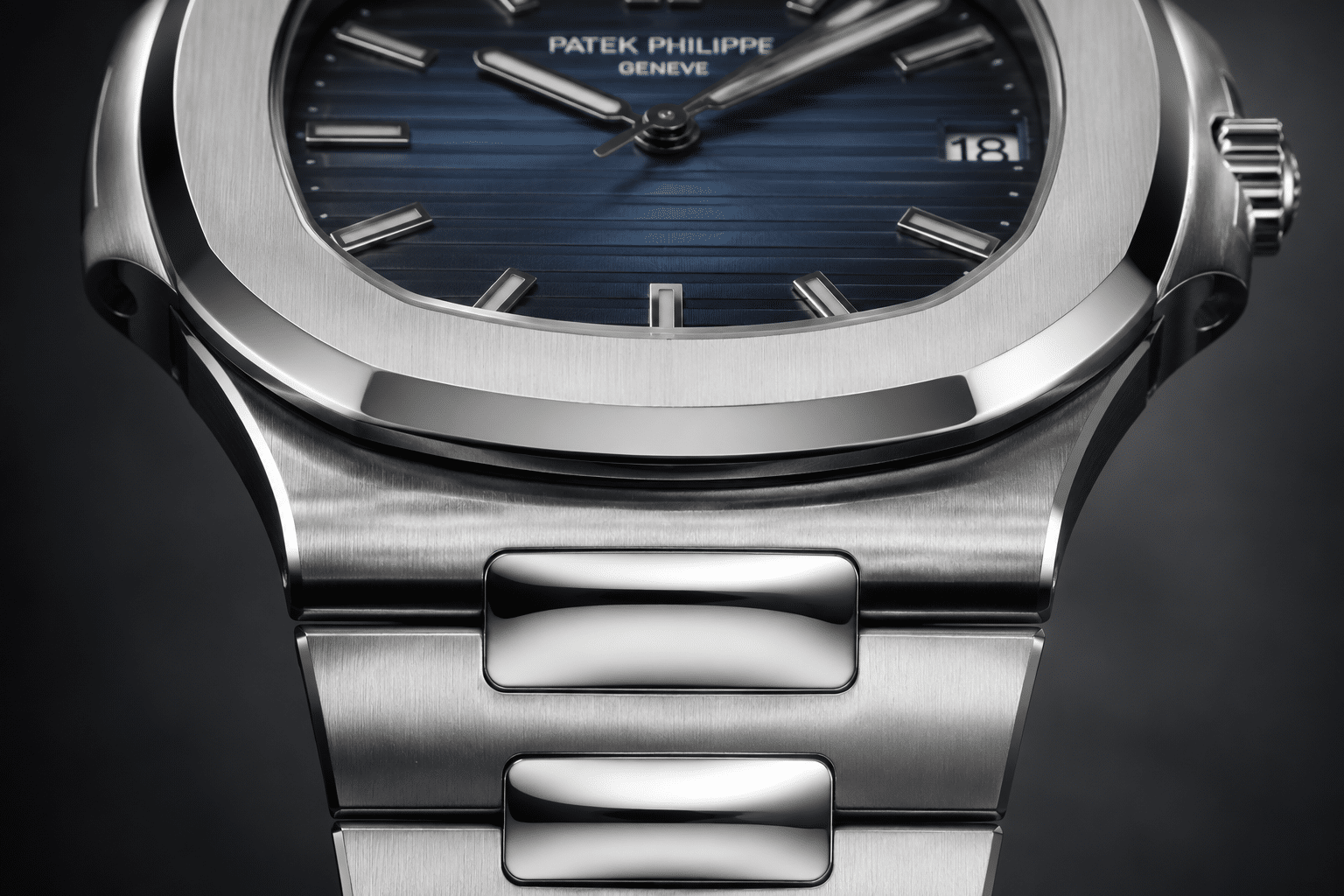
A Nautilus 5711 bracelet has to do more than look correct in a still photo. The real test is how the links move together on the wrist, because the bracelet is part of the watch’s shape, not an accessory hanging off the case. Good articulation gives the watch that low, fluid, integrated bracelet feel that makes the whole piece sit flatter and more naturally, especially when judged alongside Nautilus 5711 case thickness standards that influence how the head and bracelet balance together. A stiff replica can still look acceptable on a table, but once it bends around the wrist, the weakness becomes obvious.
The mistake many buyers make is treating comfort as a separate issue from appearance. On the 5711, they are tied together. If the bracelet does not articulate smoothly, it will not only feel less refined; it will also stop the case and first few links from flowing as one continuous unit. That is why a stiff Nautilus bracelet is more than a minor nuisance. It changes the way the watch presents itself in normal wear.
How the Bracelet Should Wrap the Wrist
The ideal 5711 bracelet should feel low, flexible, and continuous when it wraps the wrist. It should not behave like a straight metal strip that resists curvature and then suddenly bends in one place. Instead, the links should settle into a shallow arc, with the bracelet draping cleanly rather than fighting the shape of the wrist. That is what makes the Nautilus bracelet feel integrated rather than merely attached.
Wrist size matters here more than some buyers expect. On a smaller wrist, poor articulation can show up as a sharper break in the bracelet line, because the links have to bend more aggressively. On a larger wrist, the same bracelet may look a little better in photos because it is not forced into such a tight curve. That does not fix the problem, but it explains why one buyer may complain about rigidity while another only notices it after longer wear.
A well-executed bracelet also sits flat without feeling segmented. If the links are shaped and joined properly, the bracelet should flow across the top of the wrist in a controlled line instead of rising in small steps. Clean VS Factory usually looks at that kind of wearer-facing behavior first, because a watch that feels awkward on wrist rarely stays convincing for long.
Stiff Links and Uneven Gaps
Poor articulation usually shows up in two ways: the bracelet feels tight when curved, or the gaps between links open unevenly as it bends. Both problems matter. Tight articulation can create pressure points, especially near the first few links where the bracelet transitions from the case. Uneven spacing can make the bracelet look busy and mechanical instead of fluid.
This is where photos can be misleading. A bracelet may look fine when laid flat, but once it curves around a wrist, weak link flow becomes visible in the spacing between segments. If the links are too rigid, the bracelet may not settle evenly, and the result is a slightly broken silhouette. That does not just affect comfort; it also makes the watch feel less premium in daily use.
For buyers reviewing QC photos, the most useful clue is whether the bracelet bends in a natural arc or seems to hinge in isolated spots. If the links look forced into shape, or if one section flares while another stays flat, that is usually a sign of poor articulation rather than just normal wear behavior. The concern is not whether the bracelet moves at all. The concern is whether it moves with control.
What This Means for Daily Wear
In daily wear, bracelet flexibility affects comfort, sleeve fit, and how refined the watch feels during ordinary movement. A bracelet that wraps cleanly will sit lower, slide under a cuff more easily, and feel less distracting during the day. A rigid bracelet can make the watch feel heavier than it should, even if the actual weight is reasonable, because the bracelet is not distributing that weight smoothly across the wrist.
The wrist presence of a Nautilus depends on this balance. Good articulation lets the watch look composed from the side and comfortable from above. Poor articulation makes the bracelet call attention to itself, which is the opposite of what this design is supposed to do. The better the bracelet moves, the less you think about it while wearing it, and that is usually the sign of a more convincing replica watch experience.
Brushing Direction and Surface Finish on the 5711 Bracelet
The Nautilus bracelet has large visible surfaces, so brushing quality matters in a way that is easy to miss in casual discussion. The bracelet catches light constantly, which means the grain direction and texture are part of the watch’s appearance on the wrist, not just a finishing detail under magnification. A bracelet can be mechanically acceptable and still look wrong if the brushing is too harsh, too cloudy, or inconsistent from link to link.
Buyers sometimes focus on polished edges and ignore the brushed field in the center of the links. That is a mistake. The brushed surface is what controls the bracelet’s overall tone. If the grain is too coarse, the bracelet looks busy and cheap. If it is too soft or uneven, the integrated design loses definition and the watch starts to look unfinished.
Why Brushing Direction Matters
The brushing on a Nautilus bracelet should support the horizontal flow of the design. The grain needs to read as deliberate and aligned, not random or crosshatched. On the wrist, that horizontal direction reinforces the long, low shape of the case and bracelet together. When the grain direction is off, the bracelet can look visually confused even if the individual links are shaped reasonably well.
This is why brushing direction is more than a cosmetic detail. It changes how the bracelet behaves in light. Proper linear brushing gives the surface a controlled satin look, while rough brushing can make the links appear scratched or overworked. In a model like the 5711, where the architecture is already bold, the surface finish needs to calm the design down rather than make it noisier.
Uneven grain consistency is another common issue. If one link reflects light differently from the next, the bracelet loses the smooth rhythm that makes the Nautilus feel coherent. The flaw may not scream at you in one photo, but it becomes noticeable when the bracelet moves under indoor light or when the wrist turns. That is the kind of problem that separates a decent-looking replica from one that feels controlled.
How Lighting Can Hide Rough Finishing
Lighting can make weak brushing look better than it is. A bright, polished-looking photo often softens the appearance of rough grain and hides small inconsistencies between links. Overexposure can also flatten texture, making the bracelet seem cleaner than it will appear in normal room light or outdoors.
That is why a single glossy photo is not enough for judging 5711 bracelet finishing. You want to see the bracelet from multiple angles and under different light levels if possible. A surface that looks refined in a bright seller shot may reveal coarse texture, fuzzy brushing, or directional inconsistency once it is actually worn. The goal is not to chase macro perfection; it is to judge whether the finish looks stable and coherent in normal use.
Polished Bevels, Edge Definition, and Link Separation
The Nautilus bracelet depends on contrast. The brushed link surfaces give it structure, while the polished bevels define the edges and prevent the bracelet from looking flat. When that contrast is done well, the bracelet has depth and shape. When it is done poorly, the links blur together and the whole watch starts to look soft or unfinished.
This one of the easiest areas for replica buyers to underestimate. People often assume sharper edges are automatically better, but that is not true here. The best bracelet finishing has clean visual separation without feeling abrasive on the wrist. If the edges are too sharp, the watch may feel unpleasant. If they are too soft, the bracelet loses its architectural character.
Brushed Center Surfaces Versus Polished Edges
On a good 5711 bracelet, the brushed center surfaces should stay visually distinct from the polished bevels. That separation gives each link a defined shape and helps the bracelet read as a carefully built object rather than a generic metal band. The polished accents are small, but they do important work: they catch light, outline the link geometry, and stop the bracelet from looking visually heavy.
Weak replicas often get this relationship wrong. The bevels may be too wide, too bright, or too soft, so the brushed and polished areas blend together instead of remaining distinct. In practice, that flattens the whole bracelet. Even if the shape is close, the watch loses some of the crispness that makes the integrated design convincing.
Link separation also depends on edge definition. If the transitions are blurred, the bracelet can feel rounded in a way that reduces the model’s sharpness. If the transitions are too abrupt, the bracelet may look overprocessed. The better execution sits in the middle: clear lines, controlled shine, and a finished surface that still feels comfortable in hand.
Sharp-Looking Does Not Always Mean Better
Buyers sometimes mistake aggressiveness for quality. A bracelet with overly sharp edges may look defined in close-up, but it can feel less refined during wear. The real goal is balance. The bracelet should have enough edge definition to preserve the Nautilus shape, but not so much that the links feel harsh against the skin or under a cuff.
That balance matters because the 5711 is not supposed to feel bulky or overbuilt. If the polished bevels are executed with restraint, the bracelet looks crisp and elegant at the same time. If they are overdone, the bracelet can start to look rounder and less architectural. In bracelet finishing, more shine is not always an upgrade. The right amount of definition is usually what makes the watch feel expensive.
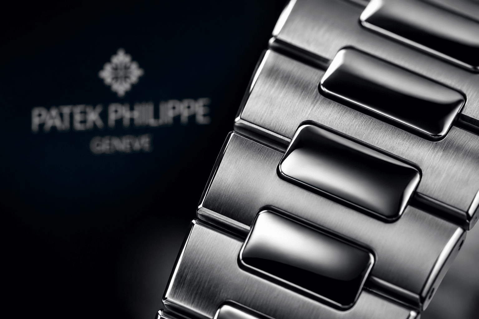
Clasp Construction, Engraving, and Closing Feel
The Nautilus 5711 clasp is easy to overlook in photos, but it is one of the first places a replica can feel cheaper in daily use. A clean-looking bracelet still loses credibility if the clasp engraving is soft, the surface finishing does not match the bracelet, or the closing action feels gritty and uncertain. That is why buyers should treat the clasp as a real quality checkpoint, not a minor accessory detail.
Replica clasp engraving is worth inspecting for depth, edge cleanliness, and consistency. Shallow or fuzzy engraving usually looks flat under normal light, while engraving that is too sharp can also look off because it suggests aggressive machining rather than crisp finishing. The best result is not simply “deep”; it is even, legible, and controlled. In practice, clasp engraving is a useful quality signal, but it should be read as part of the overall execution rather than as a standalone verdict.
Clasp brushing should visually follow the bracelet, not fight it. If the clasp finish is brighter, rougher, or directionally different from the rest of the bracelet, the back of the watch starts to feel disconnected even if the front looks strong. Misalignment between clasp halves or uneven edges around the fold also makes the whole assembly feel less refined. On a watch like the 5711, that mismatch is noticeable because the bracelet and clasp are part of one continuous visual system, not separate pieces bolted together.
The closing feel matters just as much as appearance. A good deployant clasp should snap shut with confidence, stay secure without feeling loose, and open without excessive stiffness or scraping. If the clasp feels cheap, the problem is usually not one single issue but a combination of weak tolerances, poor alignment, and inconsistent finishing. Photos may hint at these problems, but they rarely prove them, so video or a clear seller description can help when available. Buyers should not expect genuine-level action or long-term durability from a replica clasp; the practical question is whether it feels clean enough for normal wear.
Engraving Depth and Cleanliness
Look for engraving that is even, centered, and cleanly cut. Shallow engraving can disappear under light and make the clasp look plain, while fuzzy or uneven engraving suggests weaker clasp execution. Overly sharp engraving is not automatically better, because it can make the surface look harsh instead of refined.
Clasp Brushing and Component Alignment
The clasp should share the same visual language as the bracelet around it. If the brushed grain, edge treatment, or surface tone shifts too much at the clasp, the back of the watch feels less integrated. Poor alignment at the clasp halves can also make the clasp look and feel lower quality even when the watch is otherwise well assembled.
Closure Feel and Daily Handling
Buyers usually notice clasp quality in small moments: opening it, closing it, and adjusting the watch during the day. A good clasp feels controlled, with a solid snap and no loose wobble. A weak clasp feels either too stiff or too vague, which makes the watch less satisfying even if it looks acceptable in static photos.
Bracelet Gaps, End-Link Fit, and Case Junction Alignment
Bracelet fit at the case junction is one of the easiest places for a Nautilus replica to look slightly wrong. Even when the first link is not obviously too fat, poor end-link fit can create Nautilus bracelet gaps, uneven spacing, or a bracelet that sits crooked against the case. That matters because the 5711 depends on a clean integrated transition; once the junction looks broken, the whole silhouette loses its coherence.
The buyer should separate normal tiny spacing from obvious misfit. A very small, even gap can be acceptable in replica terms, but visible asymmetry is a different issue. If one side sits tighter than the other, or the bracelet does not nest evenly into the case, the watch will look less deliberate from the wrist and from QC photos. That kind of problem is not just cosmetic; it often signals weaker fitting tolerance at the junction.
Camera angle can distort this area, so a single photo is rarely enough. One side may look open simply because the watch is tilted, while the opposite side may be hidden by perspective. Matched left-right views are more useful than a dramatic close-up taken at a flattering angle. For buyers reviewing photos, the real question is whether the end-link fit is balanced enough that the bracelet appears to leave the case naturally instead of hanging on awkwardly.
Left-to-Right Symmetry at the First Links
Viewed straight on, both sides of the bracelet should appear balanced. If one side droops more, sits higher, or shows a different relationship to the case, the integrated design starts to look uneven. Symmetry here is not about perfection; it is about whether the watch still reads as one continuous form.
Visible Gaps Around the Case Junction
Large or uneven gaps between the case and bracelet are hard to ignore because they interrupt the Nautilus profile immediately. They can make the watch feel less substantial and suggest weak case-to-bracelet alignment. Minor spacing is one thing, but a visible break at the junction usually deserves closer scrutiny.
Case and Bracelet Checks
Ask for straight-on, side-profile, and angled photos that show both first links clearly. Those three views usually reveal whether the bracelet seats evenly, whether one side is crooked, and whether the case transition looks clean enough for daily wear.
QC Photos for Nautilus 5711 Bracelet and Clasp Review
A proper Nautilus 5711 QC photos review should make the bracelet and clasp easier to judge, not harder. The goal is simple: identify whether the first link flows correctly, whether the clasp looks clean, and whether the bracelet sits evenly on both sides of the case. No single photo will answer all of that, so buyers should expect to review a small set of angles before making a decision.
The most useful bracelet QC check starts with the front view, then moves to a side profile, a three-quarter case-to-bracelet angle, a clasp close-up, and a curved bracelet shot. In a Patek Philippe Nautilus guide, this same photo sequence is useful because each photo reveals a different issue. Front views help with symmetry and width impression, side profiles show height and drop, and close-ups show whether the clasp engraving and finishing look consistent. If the seller only provides flattering wrist shots, that is not enough to judge the bracelet properly.
Lighting matters more than many buyers expect. Harsh light can exaggerate brushing lines and make the bracelet look rougher than it is, while soft lighting can hide edge problems and make weak finishing appear better than it is. The point is not to demand studio-grade analysis; it is to make sure the photos are clear enough to expose obvious issues such as swollen first links, crooked alignment, or a clasp that looks unfinished.
QC photos reduce uncertainty, but they do not remove every risk. They are strongest for visible execution: first-link height, bracelet gaps, brushing direction, clasp engraving, case thickness, hand alignment, datewheel position, and dial printing. They are weaker for things a photo cannot fully show, such as clasp resistance, sharp edges against the skin, rotor noise, bracelet comfort after sizing, and long-term movement behavior.
QC photos can reduce uncertainty, but they do not guarantee perfection. Buyers should still review visible details and confirm seller policies before ordering, especially where the issue cannot be proven from photos alone. If a seller claim depends on words such as “upgraded,” “latest,” or “factory corrected,” the claim should be matched to visible evidence rather than accepted as a guarantee.
Front and Three-Quarter Views
These are the best angles for checking first-link balance, bracelet width impression, and the overall case-to-bracelet flow. If the watch looks clean from the front but awkward from a three-quarter angle, that usually means the transition is not as good as the seller suggests.
Side Profile and Wrist-Angle Photos
Side-profile photos show whether the bracelet sits naturally or rises too high off the case. Wrist-angle shots are useful because they expose stiffness, drop, and whether the bracelet wraps the wrist in a controlled way. If the watch looks flat only when held in the hand but changes shape badly on wrist, that is a warning sign.
Clasp and Underside Photos
Ask for a clear clasp photo and, if possible, an underside view that shows the closing parts and the finishing around them. This is where engraving, brushing, and alignment can be checked together. A clasp that looks tidy from far away may still show shallow text, uneven surfaces, or mismatched components once the photo is enlarged.
Red Flags Before Buying
Pause if you see obvious asymmetry, swollen first links, large gaps at the case junction, crooked clasp parts, rough brushing, or photos that stay too vague to judge. Those are the kinds of problems that usually do not improve on arrival. If the QC set does not clearly show the bracelet and clasp from multiple angles, it is reasonable to ask for better photos before approving the watch.
Verification Note: When possible, buyers should review real watch photos, bracelet fit, clasp finishing, case junction alignment, dial details, date alignment, and movement information before making a decision. Stock images and factory labels alone are not enough for a reliable judgment.
How to Read Seller Claims and QC Photos Together
Seller descriptions can be useful, but they should be treated as claims to verify rather than final proof. Phrases such as “latest version,” “best bracelet,” or “improved clasp” do not tell you whether the actual watch has a low first link, even end-link fit, or clean articulation. For the 5711, the buyer-verifiable evidence is the photo set: side profile, three-quarter case junction, curved bracelet view, clasp close-up, and underside alignment.
QC photos also have limits. They can show visible geometry, surface finish, and obvious misalignment, but they may not reveal clasp resistance, bracelet sharpness, rotor noise, or how the watch settles after sizing. A replica that photographs well can still be less satisfying for daily wear if the bracelet is stiff or the clasp feels vague. This is why visual accuracy and ownership comfort should be judged separately, even when the same bracelet is involved.
For first-time buyers, the safest approach is usually to avoid accepting a complicated explanation for a simple visible problem. If a first link looks clearly swollen from the side, or if one side of the bracelet sits differently from the other, the issue should not be dismissed only because the factory is well known or the seller says the angle is misleading. Camera distortion exists, but repeated evidence across multiple angles matters more than a reassuring label.
Claims such as “perfect,” “same as genuine,” or “guaranteed to pass inspection” should be treated with caution. A responsible comparison is not about misrepresenting a replica watch as genuine; it is about understanding quality, avoiding overpayment, and knowing which flaws will matter in normal use. The most useful seller claim is one that can be matched to specific photos and details, not one that relies on broad marketing language.
Movement, Price, and Policy Claims Around 5711 Replicas
Movement descriptions in the replica market should be checked carefully because they may refer to layout, decoration, clone architecture, or seller terminology rather than an official brand-manufactured caliber. For a bracelet-focused Nautilus 5711 review, the movement still matters because it can affect case thickness, caseback height, rotor behavior, serviceability, and long-term ownership expectations. It should not be described as a genuine brand movement unless there is clear, verified evidence, and decoration alone should not be treated as proof of performance.
Prices can change by factory label, version, movement, seller channel, and availability, so exact comparisons should be verified at the time of purchase. A higher price may reflect a better bracelet, but it may also reflect availability, seller margin, movement configuration, or after-sales uncertainty. The safer comparison is like-for-like: same reference style, same version claim, same movement configuration, same QC evidence, and similar seller terms.
Buyers should confirm return terms, repair options, water-resistance testing, shipping expectations, and after-sales support directly with the seller. Water resistance should not be assumed from the model name or appearance, and a replica Nautilus should be treated more cautiously around water than a genuine watch maintained through official service channels. No bracelet review can replace direct confirmation of the specific watch, seller policy, and practical ownership limits.
Do Bracelet Flaws Matter More Than Dial or Movement Flaws?
For the Nautilus 5711, the short answer is yes, bracelet flaws can matter just as much as dial or movement flaws, and sometimes more. That sounds exaggerated until you remember what this watch actually is: a thin case with an integrated bracelet that has to read as one continuous object. If the bracelet looks heavy, sits high, or breaks the flow at the first link, the whole watch loses credibility on the wrist even if the dial looks fine.
The practical judgment is not that every bracelet flaw is fatal. It is that Nautilus bracelet flaws vary a lot in impact. A small brushing inconsistency or slightly soft clasp engraving is usually a buyer tradeoff. A swollen first link, a crooked fit at the case junction, or stiff articulation is different. Those problems affect visual accuracy and wrist presence at the same time, which is why they are harder to ignore than many dial details that only stand out under closer inspection.
Dial and movement issues still matter, but they often fail in a narrower way. A dial may be a touch off in tone or print sharpness and still look acceptable from normal viewing distance. A movement may be less refined or less service-friendly and still wear without distracting you every time you look at the watch. Bracelet problems are more immediate because they change how the 5711 presents as a whole. If the bracelet feels wrong, the watch feels wrong.
High-Impact Bracelet Flaws
The flaws that should carry the most weight are the ones that disrupt the 5711’s silhouette. A fat first link is the obvious example, but it is not the only one. Poor case-to-bracelet flow, visible gaps, crooked alignment, and stiff articulation all affect the same thing: whether the watch looks like a single integrated design or a case with a bracelet attached afterward.
These are the issues that usually justify rejecting a watch. They are not just cosmetic. A bad first-link transition changes the side profile, and a stiff bracelet can make the watch sit awkwardly on the wrist even if the front view looks acceptable in photos. In practice, these problems are more damaging than a minor dial imperfection because they are harder to overlook once you start wearing the watch.
Medium-Impact Finishing Flaws
Brushing inconsistency, slightly soft bevels, and weak clasp engraving sit in the middle. They matter, but their impact depends on how the watch is used and how closely the buyer examines it. On a Nautilus 5711 replica, uneven brushing can make the bracelet look less refined under strong light, yet it may not ruin the overall impression if the architecture is correct. The same is true for a clasp that feels a little plain or engraving that is not as crisp as it should be.
These are the kinds of issues many buyers can live with if the bracelet shape is strong. A watch with solid flow, proper fit, and good articulation can still be a good daily-wear piece even if the surface finish is not perfect. That is the key buyer tradeoff: you can often tolerate modest finishing weakness, but you cannot easily compensate for a bracelet that distorts the watch’s proportions.
How to Decide What You Can Live With
The easiest way to judge which flaw matters more is to ask a simple question: does the issue draw your eye every time you wear the watch, or only when you inspect it closely? If the answer is the former, it is probably a real problem. If it is only visible in certain lighting or under close photos, it may be acceptable depending on your expectations.
For the Nautilus 5711, the bracelet should be judged by wrist presence first, then by photo inspection. If the bracelet feels balanced, low, and natural, minor finishing issues become easier to accept. If the bracelet looks bulky or awkward, no amount of dial accuracy will fully fix that. That is why buyers often ask is the bracelet good enough before anything else. In this model, that question is often the right one.
Daily Wear Versus Photo Accuracy on the 5711 Bracelet
A Nautilus 5711 replica can be strong for photos and still be a less practical daily-wear choice. Photo accuracy usually rewards the details that appear in a still image: dial tone, case shape, polished bevels, clasp engraving, and the first-link silhouette from one angle. Daily wear adds different questions: does the bracelet articulate smoothly, does the clasp close cleanly, do the edges feel comfortable, and does the watch sit low enough after sizing?
This distinction matters because the 5711 is a forgiving watch in some areas and unforgiving in others. The clean dial and simple time-and-date layout reduce the number of complications that can go wrong, but the integrated bracelet makes the case junction much harder to hide. A small dial-printing issue may only appear in macro comparison, while a poor first link or rigid bracelet will be visible every time the wrist turns.
Movement choice still affects ownership, even in a bracelet-focused decision. A thinner or better-fitted movement can help the case profile, while a noisier or less service-friendly movement may make the watch less pleasant over time. Movement decoration alone should not be confused with performance. For a daily-wear buyer, reliability, thickness, rotor behavior, and serviceability may matter more than whether the movement looks impressive in a caseback photo.
Movement descriptions in the replica market should be read as configuration references, not as official brand-caliber claims unless there is clear, verifiable evidence. Buyers should distinguish between movement layout, decoration, thickness, reliability, and actual serviceability. A movement may support a thinner case profile but still carry practical ownership limits, especially if parts access, regulation, or long-term maintenance is uncertain.
Water resistance and durability should also be handled with realistic expectations. A bracelet-focused Nautilus replica can be satisfying for ordinary wear, but it should not be assumed to match a genuine reference in sealing, shock resistance, movement stability, or service support. Buyers should confirm return, repair, shipping, and after-sales terms before ordering, because those policies can vary by seller and model.
Final Buyer Judgment on Nautilus 5711 Bracelet Execution
The most sensible way to read a Nautilus 5711 bracelet guide is to treat the bracelet as the watch’s structural test, not a finishing accessory. A strong 5711 replica bracelet review should not just ask whether the clasp closes or the links move. It should ask whether the entire bracelet system supports the case shape, sits naturally, and preserves the model’s low, integrated character.
The priority order is clear. First-link flow comes first, then fit and gaps, then articulation, then finishing, then clasp feel. If the first link is wrong, the watch already loses a major part of its identity. If the bracelet has obvious gaps or crooked seating, the problem becomes even more visible. If the bracelet is stiff, the watch may still look decent in photos but feel disappointing in daily wear. Those are the flaws that should carry the most weight in a bracelet flaw decision.
By contrast, minor brushing differences, slightly soft bevels, or imperfect clasp engraving are usually tolerance issues, not automatic deal-breakers. They matter more when the bracelet architecture is already strong, because then the eye has fewer structural problems to forgive. If the core shape is right and the wrist feel is good, many buyers can live with smaller finishing compromises. That is the real decision framework behind what matters most on wrist.
So the clean judgment is this: for a Nautilus 5711 replica, the bracelet is central enough that serious shape or fit errors should weigh heavily in any QC decision. Surface finishing matters, but only after the bracelet has proven that it understands the watch’s architecture. If the flow is right, small flaws may be acceptable. If the flow is broken, the watch is usually worth rejecting.
The final decision should stay grounded in what can be checked. Factory names, seller descriptions, and stock photos can guide the shortlist, but the actual judgment should come from visible bracelet geometry, case-to-bracelet alignment, clasp execution, movement configuration, and realistic ownership expectations. That is the difference between buying from reputation alone and making a traceable decision based on the watch in front of you.
The Bracelet Issues That Should Carry the Most Weight
Fat first link, poor flow, obvious gaps, crooked fit, and uncomfortable stiffness are the problems most likely to affect the entire watch. These are not isolated defects. They change the silhouette, the wrist feel, and the way the Nautilus reads from normal viewing distance.
The Details That Depend on Buyer Tolerance
Minor brushing differences, slightly soft bevels, and imperfect clasp engraving may be acceptable if the overall bracelet architecture is strong. Those issues are worth noting, but they do not automatically ruin the watch the way a bad transition or stiff, awkward bracelet can.
Disclosure: This article is for general educational and comparison purposes only. Replica watches are not genuine products from the original luxury brands, and brand names are used only to identify reference designs or comparison topics. Factory names, movement descriptions, prices, availability, QC details, seller policies, and version information can change, so readers should verify important details with the seller before making a purchase decision. Replica watches should not be represented, resold, or used as genuine watches.