
The main challenge with a Patek Philippe Nautilus 5711 blue dial replica is not simply finding a dial that looks blue in one photo. The real test is whether the dial keeps the right restrained grey-blue tone, gradual center-to-edge fade, and soft metallic movement when the light changes. A dial can look acceptable in a seller image but become too flat, too bright, too dark, or too teal once viewed indoors, outdoors, or from a side angle.
This article focuses on the visual judgment that matters most before choosing a 5711 replica: how the blue dial behaves under real lighting. It explains why factory reputation and single QC photos are not enough, what kind of gradient and sunburst effect should look natural, and which color shifts are acceptable versus which ones usually point to a weaker dial. For many buyers, this dial check matters more than small movement differences because it defines the watch’s first impression.
| What to Check | Stronger Sign | Warning Sign |
|---|---|---|
| Center-to-edge gradient | Brighter center fading gently to a darker rim | Flat blue surface or harsh edge darkening |
| Blue tone | Restrained grey-blue with controlled depth | Royal blue, overly teal, or too saturated |
| Sunburst effect | Soft movement under light without heavy flash | Flashy metallic glare or no visible movement |
| Indoor lighting | Dial calms down while keeping depth | Turns dull, blackish, or loses the gradient |
| Daylight view | Reveals depth without becoming loud | Looks too bright, artificial, or unstable |
| QC photo review | Several angles and lighting conditions match reasonably | Only one dramatic photo is provided |
Quick Questions Before You Read
Q: Is one good seller photo enough to judge the 5711 blue dial?
No. The dial should be checked across indoor light, daylight, and side angles because lighting can hide color and gradient problems.
Q: Should the dial look bright blue?
Not usually. A more convincing 5711 look is a restrained grey-blue with depth, not a pure royal-blue or heavily saturated finish.
Q: Is a faint green or grey undertone always a problem?
No. A mild undertone can be acceptable if the dial still keeps a natural gradient and does not shift too far toward teal.
Q: What matters most for a first-time buyer?
Check the dial behavior before focusing on minor specifications. On this model, the blue dial dominates the watch’s first impression.
Editorial Perspective: For a Nautilus 5711 blue dial replica, cleanvsfactory.com treats the factory name as only one signal. The more useful buying question is whether a specific batch keeps the right dial behavior across neutral indoor light, daylight, side tilt, and camera lighting. A factory may be strong on case shape, bracelet feel, or movement layout, but that does not automatically prove the blue dial is correct. Before choosing, the buyer should compare the dial’s gradient, grey-blue restraint, green undertone, sunburst strength, and consistency across several real photos instead of relying on one flattering seller image.
Evidence Boundaries for This Dial Guide
Official brand information can help define what Patek Philippe itself presents as Nautilus design language, but it cannot prove that any replica dial, case, bracelet, or movement is equivalent to an authorized watch. For example, Patek Philippe’s official Nautilus 5811/1G page identifies an authorized Nautilus model with a white-gold case and blue dial, which is useful as brand context only, not as evidence of replica quality.[1]
Factory names, seller labels, and version claims should therefore be read as buyer-market shorthand rather than verified manufacturer documentation. A phrase such as “best blue dial,” “latest batch,” or “5711 upgraded dial” may describe how a seller positions the watch, but it does not confirm the coating process, dial supplier, color formula, or actual batch consistency. The only practical evidence available to most buyers is the watch shown in QC photos and videos.
This article also avoids treating replica watches as authorized goods. Counterfeit-goods guidance from the USPTO explains the trademark issue around goods that use protected marks without authorization, which is why replica-watch content should keep disclosure language clear and avoid implying endorsement by the original brand.[2]
Why the 5711 Blue Dial Is Hard to Copy Correctly
A 5711 blue dial replica is not judged by whether the dial is simply blue. That is where many buyers start wrong. The Nautilus 5711 blue dial is difficult because the color has to work as a moving surface: lighter in the center, darker near the edge, slightly metallic under angle, and never too bright or too dead under normal indoor light. A dial can look attractive in one seller photo and still miss the character of the genuine 5711 dial once the watch is tilted on the wrist.
The problem is not one single color formula. It is the relationship between blue tone, gradient, sunburst effect, and undertone. If the base blue is close but the gradient is weak, the dial looks flat. If the gradient is strong but the tone is too black at the edge, the dial can look heavy and artificial. If the sunburst is too aggressive, the watch flashes like a generic blue luxury dial instead of carrying the softer, smokier look people expect from the Nautilus 5711 blue dial.
This is why factory reputation alone is not enough for this topic. A factory may be strong on case thickness, bracelet construction, or movement layout, but the dial still has to be judged separately. For this specific watch, dial color accuracy is one of the first things the eye reads. It is also one of the easiest details for photos to distort, which makes buyer confidence more fragile than it should be.
There is also a practical ownership reason to separate dial judgment from general factory ranking. The 5711 is a visually simple watch, so the blue dial carries more weight than it would on a busier chronograph or a highly textured bezel design. A buyer who plans to wear the watch daily may notice a wrong dial tone every time the watch passes under office lighting, while a slightly different movement layout may be less visible in normal use. That does not mean the movement should be ignored; it means the buyer should decide whether visual accuracy, reliability, or a balanced compromise matters most for this specific purchase.
What buyers usually notice first
Most buyers do not start by analyzing the dial like a watchmaker. They react to the overall shade. The common complaints are simple: the dial looks too grey, too flat, too dark, too saturated, or too bright. Those reactions matter because the Nautilus dial sits wide and clean under the crystal. There is no busy bezel, chronograph layout, or complicated dial architecture to distract from the color.
A slightly grey dial is not automatically wrong. In some lighting, a restrained grey-blue tone can look more believable than a bright royal blue. The mistake is assuming the “bluest” dial is the closest dial. On the 5711, a dial that looks vivid in a front-facing product photo can become too simple on the wrist, especially if the gradient does not deepen naturally toward the outer edge.
The more serious issue is flatness. A flat blue dial may photograph cleanly, but it often lacks the visual depth that makes the genuine style work. If the dial reads as one even sheet of blue from center to edge, it loses the smoky transition that buyers are actually chasing. That kind of flaw is more visible in daily wear than small printing differences that only show up under macro inspection.
Why small color shifts matter more here
Small color shifts matter on the 5711 because the dial is the emotional center of the watch. The case shape may frame it, but the blue dial creates the first impression. A minor change in undertone can push the watch from refined grey-blue to washed-out steel blue, or from deep Nautilus blue to something closer to a generic dark navy dial.
The genuine 5711 dial is not a flat color chip. It has a controlled transition and a surface that reacts to light without becoming loud. That is difficult for replica factories because each layer affects the next one. The base paint, horizontal dial texture, metallic finish, and final coating all change how the dial behaves under indoor light, daylight, side angle, and camera lighting.
The practical judgment is simple: for this model, a dial that is “almost right” in color but wrong in behavior can still be disappointing. Buyers should care less about one perfect-looking photo and more about whether the dial keeps its depth across different light conditions. A convincing 5711 replica dial should not only look close when facing the camera; it should stay believable when the wrist moves.
What the Genuine 5711 Blue Dial Is Supposed to Look Like
The genuine 5711 blue dial is best understood as a range of behavior, not one fixed shade. In some light it appears grey-blue and calm. In stronger daylight it can show more blue and more metallic activity. At certain angles, a subtle green undertone can appear, but it should not dominate the dial. This is why the original blue dial color is so easy to misunderstand from photos: the correct look changes depending on light and angle.
The target is restrained, smoky, and dimensional. It should not look like a flat royal blue panel. It should not look like a bright electric blue dial. It also should not collapse into black at the edge so aggressively that the center and perimeter look disconnected. The genuine 5711 blue dial has depth, but the depth is controlled.
For replica comparison, the most useful benchmark is not “which shade of blue is closest in one photo?” The better question is: does the dial move from a brighter center to a darker edge in a way that looks natural, and does the blue stay balanced between grey, blue, and a mild green cast under real light?
Because the provided official source set does not include a dedicated Patek Philippe 5711 technical page, this guide does not use official citation language to claim exact 5711 dial specifications, coating methods, or production details. The visual language here is a buyer-facing comparison framework: it helps evaluate replica dial behavior, but it should not be confused with authenticated factory documentation from Patek Philippe or from any replica manufacturer.
Center brightness versus edge darkness
The center of the dial should feel more open and brighter than the perimeter. This does not mean the center should be pale or washed out. It should still hold enough blue depth to look expensive and composed. The outer area should darken gradually, giving the dial its signature vignette-like effect without looking like a printed fade.
A good gradient has a soft transition. If the center appears too bright and the edge suddenly turns dark, the dial looks artificially blended. If the entire dial stays one tone, it loses the Nautilus character. The correct visual effect sits between those two errors: visible depth, but no harsh boundary.
This is one reason buyers should be cautious with front-facing studio photos. Even lighting can flatten the gradient and make a weaker dial look acceptable. A slight tilt or softer daylight often reveals whether the center-to-edge transition is actually present or just suggested by reflection.
The role of grey tone and green undertone
The best-looking 5711 replica dial is often not the one with the strongest blue. The genuine dial can lean grey-blue in ordinary indoor conditions, and that restraint is part of the appeal. A replica that chases bright blue may look impressive at first glance but less convincing over time because it misses the muted, metallic balance of the original.
A mild green undertone can also be part of the target, but it has to stay subtle. If the dial turns obviously teal or green in normal light, the effect becomes distracting. If there is no green or grey complexity at all, the dial can look too generic. The right balance is narrow: enough undertone to give the blue life, not so much that the watch changes personality.
At Clean VS Factory, we usually treat this kind of dial judgment as a light-behavior question rather than a single-color ranking. A still photo may show an attractive blue, but the better dial is the one that keeps the correct grey-blue balance as the viewing angle changes. For buyers, that distinction is more useful than arguing over one frozen shade.
Factory Dial Tendencies: Grey, Flat Blue, or Too Dark
A useful factory blue dial comparison should group dials by behavior, not by fan loyalty. On the 5711 replica dial color question, the most common outcomes are easy to recognize: some dials lean grey and restrained, some become clean but flat blue, and some go too dark or saturated. None of these categories automatically makes a dial good or bad. The decision depends on how the dial behaves under the light where the watch will actually be worn.
Batch variation matters. A factory known for a good Nautilus 5711 blue dial can still produce a batch that is slightly colder, flatter, darker, or greener than expected. Seller photos also make this harder because exposure and white balance can push the same dial toward navy, grey, or bright blue. The factory name is a starting point, not a final answer.
The strongest dial is usually the one with the least obvious mistake. It does not need to win every lighting condition. It needs to avoid looking plainly wrong in normal use. For most buyers, a slightly restrained dial with convincing gradient is safer than a dial that looks dramatic in photos but too flat or too dark on the wrist.
Price should be read with the same caution as factory reputation. A higher price may reflect a better movement, a newer dial batch, stronger finishing, lower availability, seller margin, or after-sale risk. It does not automatically prove that the blue dial is more accurate. For this model, a cheaper version with a more stable grey-blue gradient can be a better visual choice than a more expensive version with a movement claim but a dial that turns too bright or too black under normal light.
Grey-toned dials
Grey-toned dials are often misunderstood. A grey cast can actually help realism if the dial still has depth and a controlled blue base. The genuine look is not candy blue, and a cool grey-blue tone can appear more natural under office light, shade, or indirect daylight. This is why some buyers who expect a vivid blue may reject a dial that is actually closer to the restrained Nautilus character.
The risk is lifelessness. If the grey tone takes over and the sunburst effect is weak, the dial can look dull rather than refined. The center may stop glowing, the edge may lose richness, and the whole dial can feel like brushed slate instead of blue dégradé. A grey-toned dial only works when the gradient and metallic movement are still present.
The buyer’s rule should be practical: accept a slight grey cast if the dial keeps center brightness, darker edge depth, and a soft reflective movement, especially when judged against a Nautilus 5711 factory comparison across multiple photo angles. Avoid it if the dial looks dusty, chalky, or dead in more than one photo angle.
Flat blue dials
Flat blue dials are attractive in the easiest way. They look clean, bright, and consistent in product photos. For a buyer scrolling through QC images, that can feel reassuring. The problem is that the 5711 dial is not supposed to behave like a simple blue plate. If the blue is even across the surface, the watch loses the smoky gradient that gives the dial its depth.
This flaw often becomes more obvious after the first excitement fades. In daily wear, the dial may look too simple because it does not change enough as the wrist moves. The horizontal texture may still be present, but without a convincing gradient and subtle sunburst response, the color lacks the layered effect buyers expect from this model.
A flat blue dial is not always a dealbreaker for a buyer who mainly wants a clean-looking Nautilus-style replica. But for anyone specifically searching for 5711 blue dial accuracy, it is usually the wrong compromise. It may look good as a blue dial, while still not looking especially close to the genuine 5711 dial behavior.
Overly dark dials
Overly dark dials create a different problem. They can look premium in controlled photos because dark blue hides many surface imperfections. A deep navy dial may also make the watch seem more serious at first glance. But if the dial becomes too dark, it can bury the gradient and reduce the center-to-edge contrast that should define the 5711 look.
The edge should be darker than the center, but not so dark that the perimeter turns black in ordinary indoor light. When that happens, the dial stops looking smoky and starts looking heavy. The sunburst effect may also disappear because the darker surface absorbs light instead of reflecting it with subtle movement.
This is a red flag when the dial only looks “right” under strong direct light. A convincing Nautilus 5711 blue dial should not require perfect lighting to show its character. If the dial looks nearly black indoors and only reveals blue under a phone light or bright LED, the shade is probably too dark for a buyer who cares about realistic daily-wear appearance.
Gradient, Sunburst, and Undertone: The Three Details That Change the Dial
The 5711 blue dial is not judged by one shade of blue. It is judged by how three effects work together: the dial gradient, the sunburst effect, and the blue undertone. A replica can be close in one area and still look wrong because another layer behaves badly. This is why a dial that seems acceptable in a straight-on photo may feel flat, cold, or overly dark once the watch is moved.
The most useful way to evaluate the dial is to separate static color from moving reflection. Gradient is the base structure. Sunburst is the motion under light. Undertone is the character of the blue. If the gradient is weak, the dial loses depth. If the sunburst is too aggressive, it looks shiny rather than refined. If the undertone is wrong, the whole watch can feel like a generic blue-dial replica instead of a Nautilus 5711 replica.
How gradient depth should transition
The gradient should move from a brighter center into a darker outer edge without looking painted on. On a convincing 5711 blue dial replica, the center fade has enough brightness to keep the dial alive, while the edge shading gives the dial its smoky depth. The transition should feel gradual, not like a hard ring around the perimeter.
This is where many replica dials become easy to misjudge. A darker edge can look impressive in photos because it creates instant contrast, but if the center-to-edge transition is too abrupt, the dial looks artificial on the wrist. A weak gradient creates the opposite problem: the dial may look clean and even, but it loses the depth that makes the Nautilus blue dial recognizable.
The better practical test is not “is the dial dark enough?” but “does the darkness build naturally toward the edge?” A slightly grey dial with a good gradient often looks more believable than a brighter blue dial with no real center fade. For this model, depth usually matters more than saturation.
How the sunburst should move under light
The sunburst effect should move softly as the watch rotates. It should not flash like a polished blue plate, and it should not disappear completely under normal light. The genuine-style look is controlled: light reflection travels across the horizontal texture and gives the dial a metallic sheen, but the dial still keeps its blue-grey body underneath.
On weaker replica dials, the sunburst can fail in two ways. Some are too quiet, so the dial looks printed and lifeless. Others are too loud, with a sharp reflective burst that makes the blue look brighter and cheaper than it should be. The first problem hurts texture depth; the second problem hurts restraint. Neither is ideal, but the over-flashy version is usually more noticeable in daily wear because it catches light in a way the 5711 should not.
When comparing photos or videos, pay attention to how the reflection travels. A good sunburst should shift across the dial rather than explode from the center. If every angle produces a strong bright flare, the finish may be too metallic. If the dial barely changes at all, the finish may be too flat.
Why undertone is easy to miss
The blue undertone is the detail buyers often notice last, but it can change the entire impression of the watch. The correct direction is not a simple royal blue. The better 5711 dials usually carry a restrained grey-blue character, sometimes with a faint green undertone depending on light and angle. That slight impurity is part of why the dial looks complex rather than generic.
A dial that is too pure blue may look attractive in a seller photo, but it often feels wrong next to the Nautilus case design. The 5711 is a thin, brushed, understated watch; a loud blue dial fights that character. A dial that is too grey has the opposite issue. It may look mature, but if the blue disappears too quickly, the watch loses the signature 5711 identity.
The non-obvious point is that green undertone is not automatically a flaw. A subtle green cast can make the dial look closer under certain daylight conditions. The red flag is when the undertone dominates, making the dial look teal, murky, or uneven from angle to angle. Buyers should judge undertone as part of the whole dial behavior, not as a single color label.
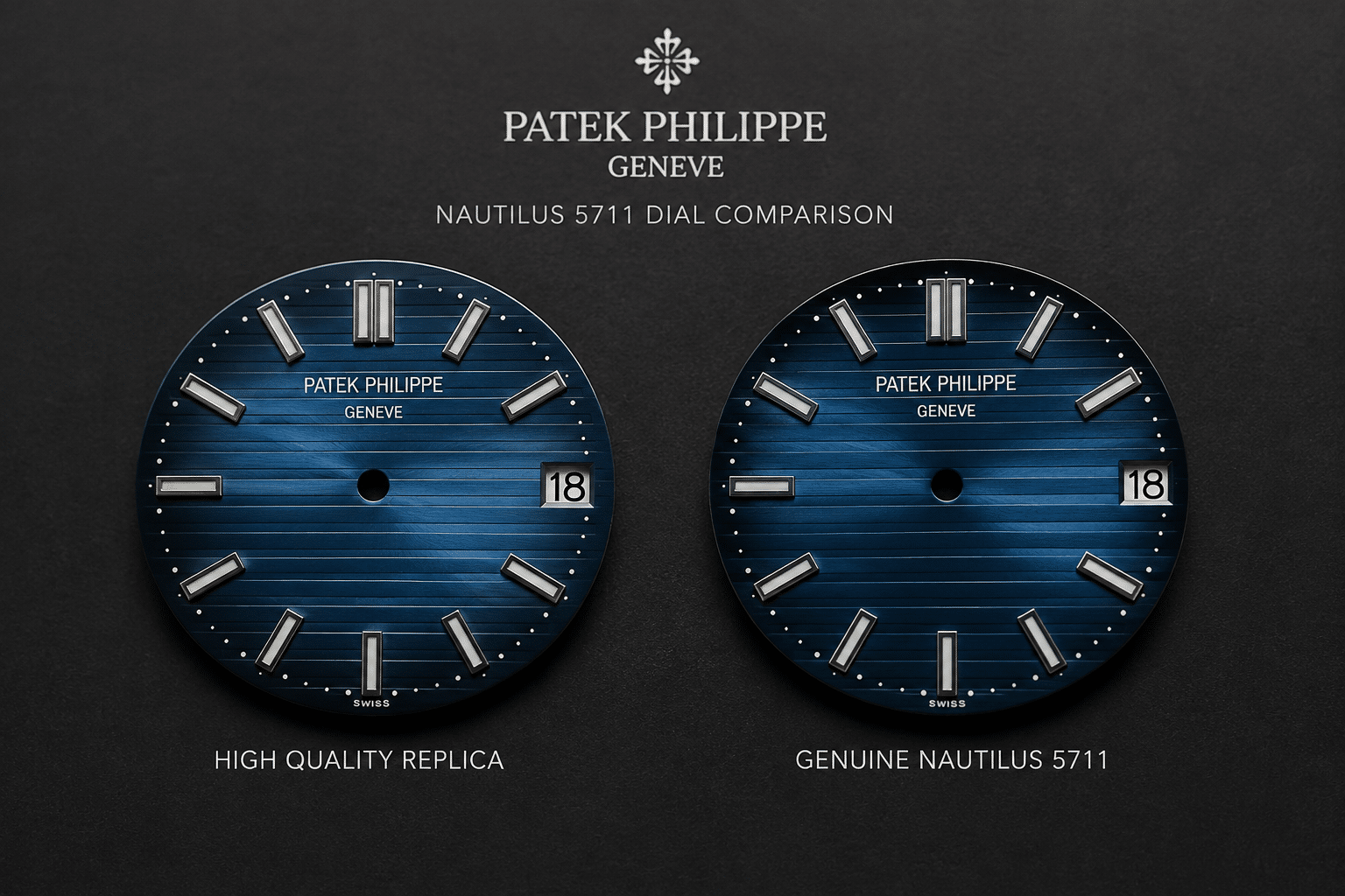
How Lighting Changes the 5711 Blue Dial
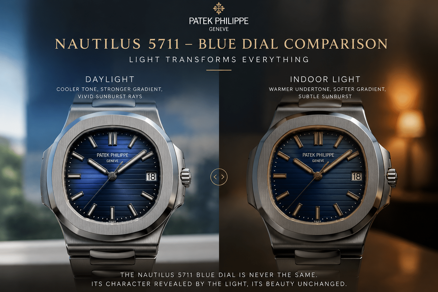
The 5711 dial does not have one fixed appearance. A strong replica dial should show an acceptable range of behavior across different light sources. It may look calmer indoors, deeper at an angle, brighter in daylight, and more reflective under camera lighting. That variation is normal. The problem starts when the dial only looks correct in one condition and collapses in the others.
This is why a real light test matters for the 5711. The question is not whether the blue dial under light always stays the same. It should not. The better question is whether the dial remains believable as lighting changes. A good dial can shift. A bad dial changes personality too dramatically.
Lighting also changes how buyer priorities should be weighed. A photo-focused buyer may prefer a dial that looks dramatic under camera lighting, but a daily-wear buyer should care more about the dial’s neutral behavior in rooms, cars, shade, and indirect daylight. A dial that looks impressive in a wrist shot can still be the wrong choice if it becomes too teal near a window or too black under office lighting. For this model, the best visual compromise is usually the dial that behaves quietly well in ordinary conditions, not the one that produces the most striking single image.
Indoor light
Indoor light usually makes the Nautilus blue dial look more restrained. Warm room lighting can pull the dial toward grey, while cooler LED light can make it look sharper and more metallic. This is normal to a point. Under indoor light, the dial should still show some center brightness and edge darkness, even if the sunburst effect becomes quieter.
The common mistake is judging an indoor photo as proof that the dial is too dull. Many good 5711 replica dials look less exciting indoors than they do outside. That is not automatically a defect. What matters is whether the dial still has texture depth. If indoor light turns the dial into a flat grey-blue surface with no visible gradient, the finish may be weak rather than merely subdued.
Daylight
Daylight is usually the most useful environment for judging 5711 dial lighting because it reveals both color and depth without the artificial push of a flash. Natural light tends to expose whether the dial is too saturated, too dark, too grey, or too green. It also makes the center fade easier to read.
A convincing dial should open up in daylight without becoming bright royal blue. The center may become more visible, and the sunburst may move more clearly, but the dial should still keep a smoky, controlled tone. If daylight makes the dial look electric blue, the color is probably too clean. If daylight cannot bring out any blue at all, the dial may be too grey or too dark.
Side angles
Side angles are where the dial becomes more revealing. Tilting the watch changes the gradient, sunburst, and edge shading at the same time. A good dial should become deeper or more reflective depending on the angle, but the transition should still feel connected to the dial surface. It should not look like a separate dark border sitting on top of a blue center.
This angle also exposes weak sunburst finishing. If the reflection moves naturally, the dial gains depth. If the reflection turns into a harsh stripe or glare patch, the metallic sheen may be too strong. If nothing happens when the watch tilts, the dial may lack the layered finish that makes the 5711 blue dial interesting.
Camera lighting
Camera lighting is the most dangerous condition to trust. Phone flash, bright LED panels, and showroom-style lighting can distort the dial more than buyers expect. Flash can exaggerate the sunburst, push the blue brighter, or wash out the edge shading. Strong overhead LEDs can make a good dial look too grey or make a weak dial look more dramatic than it really is.
This is why camera lighting should be treated as a stress test, not the final verdict. If the dial looks slightly different under a camera, that is expected. If it only looks good under direct artificial lighting and looks dead under normal room light, that is a warning sign. The best 5711 replica dial does not need perfect lighting to make sense.
Why QC Photos Mislead Buyers on Blue Dial Color
QC photos are useful, but they are not neutral evidence for blue dial color. The 5711 dial is especially easy to distort because exposure, white balance, angle, and reflection all change the apparent shade. A single photo can make the same dial look deep navy, washed grey, bright blue, or faintly green. That is why buyers often panic over a bad-looking QC image or approve a dial that only looks good because the photo helped it.
For this model, the right question is not “does one QC photo look close?” It is “does the dial behave consistently across several photos?” A real blue dial QC judgment needs more than a straight-on image. One front shot may show printing and marker alignment, but it rarely proves whether the gradient, undertone, and sunburst are working together.
What camera settings can distort
Brightness and exposure can flatten the dial gradient. If the camera overexposes the photo, the center can look too pale and the edge darkness can disappear. If the image is underexposed, the dial may look more accurate than it really is because the darkness hides weak texture and poor color balance.
White balance is another major source of confusion. A warm setting can make the dial look greener or more muted. A cool setting can make it look cleaner and bluer than it appears in person. Flash glare can create a false sunburst effect, making a flat dial look more dynamic. It can also do the opposite by blowing out the dial and hiding the darker perimeter.
The practical judgment is simple: do not reject or approve a 5711 replica watch QC set based on one dramatic dial photo. If the color looks strange in one image but normal in others, it may be a camera artifact. If the same wrong tone appears across every angle, the dial itself is more likely the issue.
Which QC angles are most useful
The most useful QC angles are the ones that show how the dial changes, not just how it sits. A straight-on photo under neutral light helps check the basic blue tone, center brightness, and edge darkness. A slight side-angle photo helps reveal whether the sunburst effect moves naturally. A softer daylight-style image, if available, is often better for judging undertone than a sharp flash photo.
The least useful image is a single high-glare front shot where the dial is dominated by reflection. It may look exciting, but it hides the actual blue undertone and can make the gradient appear stronger than it is. For the 5711, glare is not proof of quality. Controlled reflection is more valuable than maximum shine.
What to compare across multiple photos
Across multiple QC photos, compare three things: whether the center remains visibly lighter than the edge, whether the sunburst changes smoothly instead of flashing harshly, and whether the blue undertone stays within a believable grey-blue range. The exact shade can move. The character should not completely change.
A minor shift from blue-grey indoors to slightly livelier blue under brighter light is acceptable. A dial that turns from navy to teal to flat silver-blue across the same QC set deserves more caution. That kind of inconsistency may come from photography, but it can also reveal a dial finish that does not hold together under normal viewing.
At Clean VS Factory, we usually treat blue dial QC as a pattern-reading exercise rather than a single-photo decision. The best evidence is not the prettiest image; it is the set of images that shows the dial staying believable as angle and light change.
How to Read Seller Claims About the 5711 Blue Dial
Seller descriptions often reduce the blue dial to simple phrases such as “latest version,” “best blue,” or “closest color.” Those claims may be useful as a starting point, but in a Patek Nautilus super clone guide, they do not answer the buyer’s real question. A better seller claim should be checked against visible evidence: whether the dial has a soft center fade, whether the edge darkening is gradual, whether the color remains grey-blue instead of royal blue or teal, and whether the sunburst stays controlled in more than one light condition.
Factory labels should be treated the same way. A label can help narrow the shortlist, but it does not prove the exact dial batch, the camera conditions, or the final watch being shipped. For a dial-sensitive model like the 5711, buyers should ask for the evidence that matches the claim. If the listing says the dial has an improved gradient, the QC set should show a straight-on view and a mild side-angle view where the gradient is visible without relying on heavy glare. If the listing says the color is more accurate, the photos should not all be taken under one strong lamp that hides undertone problems.
The most practical warning sign is when the sales language is more specific than the proof. “Best factory” is too broad unless it is tied to this model, this version, and this buyer priority. A factory may have a stronger movement version while another batch may show a more natural blue dial. For a buyer focused on the 5711 blue dial, the final decision should come from the watch’s actual light behavior, not from the confidence of the description.
Claims That Need Extra Caution
Be careful when a seller connects dial color to claims about exact material, original-standard finishing, pressure-tested water resistance, or “same as genuine” execution. Official brand pages can describe authorized Nautilus models, but they do not verify replica dial coatings, replica case construction, or replica water resistance. Without individual testing or credible inspection evidence for the exact watch, those claims should stay outside the dial decision.
The same restraint applies to movement language. A movement claim may matter for case thickness, hand stack, date behavior, or service expectations, but it does not prove the blue dial is correct. For a 5711 dial-focused purchase, a detailed movement description is useful only after the dial has passed the basic light-behavior check.
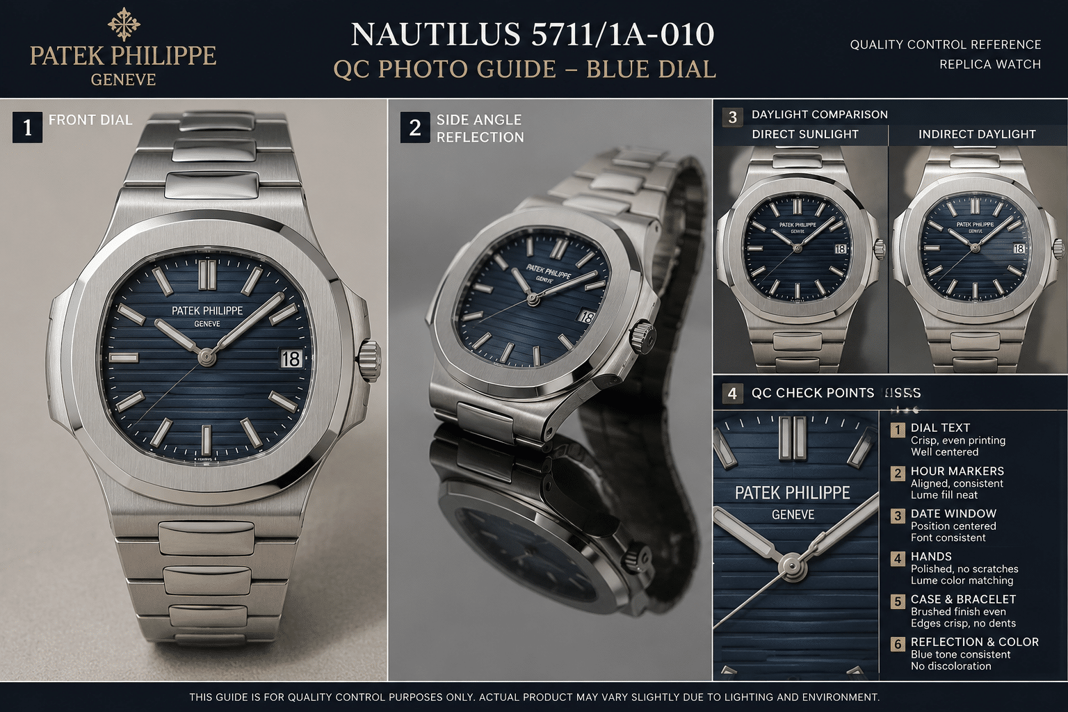
A Simple Light-Test Method for the 5711 Replica
A useful 5711 replica test does not need special equipment. The goal is not to prove a dial is perfect, because no photo or quick light test can do that. The goal is to catch the obvious mistakes: a blue that turns too bright, a grey cast that kills the dial, a gradient that disappears, or a sunburst that flashes in a way the Nautilus dial should not.
The simplest light test method is a four-step sequence: neutral indoor light, daylight, side tilt, then a comparison against a known reference photo taken in similar lighting. The mistake many buyers make is judging the dial from the most flattering image. For the 5711 blue dial, the least dramatic photo is often the most useful one, because it shows the base tone before reflections start doing too much work.
Neutral light check
Start with neutral indoor lighting, preferably near a white wall or on a white background. Avoid yellow room light, direct LED glare, and phone flash. In this setting, the dial should look controlled rather than loud. A convincing Nautilus 5711 blue dial replica will usually show a medium grey-blue center with darker edges, not a saturated royal blue plate.
This first check is where flat dials often reveal themselves. If the dial looks like one simple shade from center to edge, the gradient is weak. If it turns almost charcoal with no life in the center, it may be over-dark. A slight grey tone is not automatically a problem; in fact, some of the better-looking replica dials lean grey indoors. The issue is whether the grey still has depth, or whether it makes the dial look dusty and lifeless.
Daylight comparison
Daylight is the most honest part of the dial light test. It usually exposes whether the blue has the right depth and whether the undertone feels natural. Take the watch near a window or outside in open shade, not under direct harsh sun. Strong sun can make almost any metallic dial look more dramatic than it really is.
Under daylight, the center should open up slightly while the edge stays darker. The best result is a restrained blue-grey with a soft metallic lift. If the dial becomes electric blue, the color is probably too saturated. If it turns green in an obvious way rather than showing a faint green undertone at certain angles, that is also a warning sign. The genuine 5711 blue dial is not a green dial pretending to be blue, and it is not a bright blue sports-watch dial either.
When comparing two dials quickly, daylight should carry more weight than studio photos. A factory dial that looks excellent under dealer lighting but becomes flat or oddly colored near a window is not the safer choice for daily wear.
Side tilt check
The side tilt check is where gradient and sunburst behavior become easier to read. Hold the watch flat, then slowly rotate it left and right. A good dial should change gradually. The light should move across the horizontal texture and sunburst finish without turning into a sharp flash or a hard stripe.
This is also where overly dramatic replica dials can look wrong. Some dials appear impressive in still photos because the sunburst is strong, but on the wrist they flash too aggressively and make the surface look cheaper. For the 5711, subtle movement is more convincing than high contrast. The dial should feel like it has depth beneath the blue, not like the finish is shouting for attention.
For shared photos, ask for one straight-on image and one mild side-angle image in neutral light or daylight. That pair is more useful than five glossy dealer photos under the same lamp. If the dial keeps a believable center-to-edge transition across both views, it is usually a more sensible blue dial replica choice than one that only looks good from a single perfect angle.
Which Dial Error Is Acceptable and Which One Is a Red Flag
Not every dial error should make a buyer reject a 5711 replica. The better question is whether the flaw affects normal wrist presence or only appears under harsh comparison. On this watch, a slightly imperfect shade can be acceptable if the gradient, undertone, and light response still work together. A technically small color error can become a major problem if it makes the dial look flat from three feet away.
The clear judgment is this: depth matters more than maximum blue. Many buyers chase the “bluest” dial because it looks attractive in photos, but the Nautilus 5711 is usually more convincing when the blue is restrained, smoky, and slightly grey under real light.
Minor variation that can be lived with
A mild grey cast is usually acceptable if the dial still has a bright enough center and a darker perimeter. In daily wear, this can actually look closer to the original blue dial behavior than a cleaner, brighter blue. The 5711 dial was never meant to look like a flat paint sample, so some moodiness is part of the target.
A faint green undertone can also be acceptable, especially if it appears only at certain angles or in daylight. The problem starts when the green becomes the dominant impression. The undertone should add complexity, not change the identity of the dial.
Small differences in sunburst strength are usually livable as well. If the dial moves gently under light and the horizontal texture remains visible, a slightly stronger or softer reflection is not a dealbreaker for most buyers. This is the type of acceptable dial flaw that matters more in side-by-side macro comparison than on the wrist.
Flaws that should change the decision
A flat blue dial is the most common red flag dial color problem. It may look clean in a QC photo, but it removes the main visual character of the 5711. If the center, edge, and side angles all show nearly the same tone, the watch will look less convincing no matter how good the rest of the replica is.
An over-dark dial is another serious issue. Some factories or batches try to avoid bright-blue mistakes by making the dial too deep, but excessive darkness hides the gradient and makes the surface look heavy. The Nautilus dial should have shadow at the edge, not a blackened face with a small blue highlight.
Over-saturation is just as risky. A dial that turns vivid cobalt or royal blue under daylight may look attractive in isolation, but it does not behave like the original blue dial. This is one of the easiest mistakes to notice in real use because the watch immediately looks more generic.
The most serious replica dial issue is inconsistency across lighting. If the dial looks acceptable indoors but becomes obviously wrong in daylight, or if the side tilt exposes a harsh metallic flash, the color is not stable enough. For a dial-focused buyer, that should change the decision more than a tiny difference in shade visible only under a loupe.
Who Should Prioritize Dial Color Over Movement Accuracy
For this specific watch, dial color can matter more than many buyers expect. The Nautilus 5711 has a simple dial layout, a wide flat face, and a blue finish that dominates the first impression. If the shade is wrong, the watch looks off before anyone thinks about the movement route. That does not make movement accuracy irrelevant, but it changes the 5711 buyer priority for anyone buying mainly for visual presence.
At Clean VS Factory, we usually separate visual accuracy from mechanical satisfaction when discussing this model. A clone-style movement may support a thinner case and a more complete technical story, while another version may offer a dial tone that looks more natural in daily light. For a blue dial replica choice, the smarter decision depends on which flaw the buyer will notice every time the watch is worn.
Best for visual-first buyers
Visual-first buyers should prioritize dial color over movement accuracy. If the watch will mostly be judged on wrist impression, photos, casual wear, and the way the blue dial changes under light, then the dial is the feature that carries the purchase. A more accurate movement architecture will not rescue a dial that looks too flat, too bright, or too dark every time the buyer glances down.
This is especially true for buyers who already know they are sensitive to color. Some people can ignore a slightly different movement layout because they rarely remove the caseback or compare technical details. The same buyer may be bothered every day by a blue dial that feels too purple, too grey, or too saturated. For them, the best 5711 replica is not automatically the one with the most impressive movement claim; it is the one whose dial behaves most naturally in the light where they actually wear the watch.
Best for compromise buyers
Compromise buyers can accept a less perfect dial if the overall ownership experience matters more than the exact blue tone. If the dial has a believable gradient, a restrained color range, and no obvious red flag under daylight, it may be rational to accept a small shade difference in exchange for a version that better matches the buyer’s comfort level on reliability, serviceability, or price.
The line should be drawn at visible wrongness. A mild grey shift is a compromise. A flat, lifeless blue is a problem. A slightly stronger sunburst is a compromise. A dial that flashes like polished foil is a problem. For the 5711, the right priority rule is simple: if the dial error is visible in normal wear, do not hide behind movement specs to justify it. If the dial looks natural in neutral light, daylight, and side tilt, then a small technical tradeoff may be easier to live with than chasing a theoretically stronger version with the wrong face.
Legal, Customs, and Disclosure Caution
Replica watches can raise trademark, customs, import, resale, and disclosure issues depending on jurisdiction. U.S. Customs and Border Protection identifies intellectual property rights enforcement as a trade priority, so buyers should not treat cross-border shipment of imitation watches as risk-free or universally permitted.[3]
There is also a broader industry reason to keep wording careful. OECD reporting on counterfeiting and Swiss watches discusses counterfeit Swiss watches as part of a larger enforcement and economic-risk context, but that type of macro source does not tell a buyer what will happen to one package, one seller, or one individual order.[4] The practical takeaway is narrow: this article discusses visual evaluation of imitation watches, not authorized Patek Philippe products or legal advice.
Final Buyer Judgment: Choose the Dial That Behaves Well, Not the One That Photographs Best
The safest way to judge a Patek Philippe Nautilus 5711 blue dial replica is to avoid treating any single signal as final proof. A known factory name, a higher price, a seller’s “latest version” claim, or one attractive QC photo can all be useful, but none of them proves the dial will look right in daily wear. The buyer should look for a consistent pattern: restrained grey-blue tone, natural center-to-edge fade, controlled sunburst movement, and no obvious teal, royal-blue, or blackened shift across normal lighting.
For first-time buyers, this model is less forgiving than it may appear because the dial is broad, simple, and exposed. There are no complications or busy sub-dials to hide a weak color finish. A replica that looks excellent in a dealer photo may still disappoint if the dial turns flat in a room or too vivid outdoors. A more sensible choice is often the watch that looks slightly less dramatic in photos but stays believable under neutral indoor light, daylight, and side tilt.
The final decision should match the buyer’s use case. If the watch is mainly for wrist photos, camera behavior matters more, but camera lighting can flatter the dial. If the watch is for regular wear, daily-light stability should matter more than the most impressive single image. If the buyer values mechanical interest, movement choice still matters, but it should not be used to excuse a dial that looks visibly wrong. On the 5711 blue dial, the strongest replica choice is usually the one with the fewest obvious visual mistakes across real light, not the one with the loudest factory claim.
References
[1] Patek Philippe, “Nautilus 5811/1G official specifications,” official model information for an authorized Nautilus reference, available at Patek Philippe Nautilus 5811 Official Specifications.
[2] United States Patent and Trademark Office, “Counterfeit Goods Basics,” government guidance on counterfeit goods and trademark boundaries, available at USPTO Counterfeit Goods Basics.
[3] U.S. Customs and Border Protection, “Intellectual Property Rights,” official customs information on IPR enforcement and counterfeit-goods import risk, available at U.S. CBP Intellectual Property Rights.
[4] OECD, “Counterfeiting, Piracy and the Swiss Economy 2025: Swiss Watches,” institutional report section on counterfeit Swiss watches and enforcement context, available at OECD Counterfeiting and Swiss Watches.
Disclosure: This article is for general educational and comparison purposes only. Replica watches are not genuine products from the original luxury brands, and brand names are used only to identify reference designs or comparison topics. Factory names, movement descriptions, prices, availability, QC details, seller policies, and version information can change, so readers should verify important details with the seller before making a purchase decision. Replica watches should not be represented, resold, or used as genuine watches.