
Approving QC photos for a Patek Philippe super clone is less about finding microscopic perfection and more about deciding whether the specific watch in front of you has visible, wearable problems. Photos can confirm the ordered configuration, show dial balance, reveal case or bracelet assembly issues, and expose obvious damage, but they cannot prove authenticity, waterproofing, or long-term movement health. That makes the approval decision easy to misunderstand: a watch can look acceptable under heavy zoom flaws, yet still deserve rejection if the dial sits off-center, the caseback looks bulky, or the clasp does not close cleanly.
This checklist helps you separate normal QC-photo noise from real red flags. It focuses on practical checks such as front-view symmetry, logo and date-wheel placement, marker and hand alignment, case profile, bracelet integration, movement-layout confirmation, timegrapher stability, and short QC videos. The goal is to know when to approve, when to ask for clearer evidence, and when rejection is the safer choice.
Brand names are used in this guide to identify the genuine reference design being compared. A Patek Philippe super clone is a replica-market watch, not a genuine Patek Philippe watch, and QC approval should never be treated as proof of authenticity, official brand authorization, or suitability for resale as an authentic watch.
| QC Area | What To Check First | Decision Signal |
|---|---|---|
| Front-view dial | Centered dial, straight markers, balanced spacing | Reject if flaws remain obvious at normal viewing size |
| Logo and printing | Straight, centered, clean text in full-face photos | Minor zoom roughness may be acceptable; crooked or broken print is not |
| Date window | Single- and double-digit alignment, no clipping or debris | Ask for extra dates if the wheel looks borderline |
| Case profile | Bezel height, midcase shape, crown position, caseback fit | Bulky or tilted backs are serious concerns on dress models |
| Bracelet or strap | First-link fit, clasp closure, screw seating, strap trimming | Poor articulation or loose closure should be clarified before approval |
| Movement and timing | Correct layout, clean view, stable timegrapher trace | Use as support, not proof of long-term reliability |
Quick Questions Before You Read
Q: Should I reject a watch for tiny flaws under heavy zoom?
Not automatically. The stronger test is whether the issue is visible in normal front-view photos or daily use.
Q: What QC problem should I check before anything else?
Confirm the ordered version and judge the straight-on dial balance before studying close-up details.
Q: Can timegrapher numbers prove the movement is reliable?
No. They only show short-term timing behavior during QC and should be combined with video and visual checks.
Q: When should I ask for more photos instead of rejecting?
Ask when the concern may be caused by angle, lighting, reflection, compression, or an incomplete photo set.
Editorial Perspective: A Patek Philippe replica QC review should be treated as a unit-specific buying decision, not a simple trust exercise based on factory name, price, or seller wording. The factory label can help explain the expected version and movement route, but approval still depends on what the photos and videos show: case thickness, dial balance, date placement, bracelet or strap fit, movement layout, and timing stability. At cleanvsfactory.com, the safer approach is to separate visual accuracy from daily-wear reliability before giving GL, because a watch that photographs well may still be a poor choice if the clasp is weak, the caseback is bulky, or the movement evidence looks unstable.
What Patek Philippe QC Photos Can and Cannot Prove
Patek Philippe super clone QC is useful, but it is not a magic inspection report. The photos and QC video can help you catch visible defects, wrong configuration, poor alignment, damaged parts, and obvious assembly problems before approving the watch. They cannot prove that the watch is genuine, officially related to Patek Philippe, waterproof, fully serviced, or guaranteed reliable for years.
This distinction matters because Patek-style designs are unforgiving. A Nautilus, Aquanaut, or Calatrava replica does not have a busy bezel or oversized case to hide small errors. If the dial sits crooked, the date is visibly off, the case looks too thick, or the bracelet integration is poor, QC photos can often show it. But if you are trying to use replica watch QC photos to prove long-term movement health or genuine-level finishing, you are asking the wrong tool to do the wrong job.
Before approving, buyers should review the actual QC photos or videos for the specific unit, including dial printing, hand alignment, datewheel centering, side profile, bracelet fit, clasp action, caseback condition, and timegrapher behavior. Factory labels and stock photos can provide context, but they are not enough to judge the individual watch being supplied.
Evidence Boundaries Before Approval
Because no QC photo set is the same as a watchmaker inspection, buyers should divide evidence into visible proof, reasonable inference, and unsupported assumption. A straight-on dial photo can prove whether the logo appears level in that image. A movement-back photo can show the visible bridge layout and rotor decoration. A timegrapher screen can show a short timing snapshot. None of these, by themselves, prove factory origin, water resistance, authentic construction, long-term reliability, or official brand authorization.
This boundary is especially important when seller wording uses phrases such as “same as genuine,” “best factory,” “Swiss movement,” or “waterproof.” Treat those as claims that need buyer-verifiable support, not as facts created by the QC album. If the claim matters to your approval decision, ask for the specific evidence that can actually show it: clearer caseback photos, a true side profile, a function video, a second date example, or a more stable timegrapher clip. If the evidence cannot show the claim, do not let the claim lower your QC standard.
Brand Reference and Replica Status
When this guide mentions Patek Philippe, Nautilus, Aquanaut, Calatrava, or any genuine reference design, the purpose is identification and visual comparison only. Those names do not imply that the replica-market watch is made, approved, serviced, inspected, or endorsed by the original luxury brand. A genuine reference can help you understand proportions, dial layout, and design intent, but it should not be used to claim that a replica watch is authentic.
The safest way to use QC is to decide whether the replica watch being supplied matches the seller’s description closely enough for your expectations. It is not a process for preparing the watch to pass authentication, boutique inspection, professional appraisal, or resale screening. If a seller or listing suggests that QC approval makes the watch “authentic,” “official,” or safe to represent as genuine, treat that wording as a serious warning sign rather than a buying advantage.
Build a Traceable QC Trail Before GL
A practical QC decision becomes stronger when each concern is tied to a specific piece of evidence. Instead of saying “the watch looks wrong,” identify whether the issue is the case thickness, dial rotation, date position, logo placement, bracelet fit, clasp closure, movement layout, or timing stability. This makes seller communication clearer and prevents the review from becoming a vague argument about taste.
CleanVSFactory’s editorial approach is to make replica watch decisions more traceable by connecting factory claims to visible details, movement behavior, version differences, and practical QC checks. For a Patek Philippe super clone, that means a factory name should lead to specific questions: does this unit match the ordered version, does the movement view match the advertised route, does the case profile suit the model, and do the photos show a watch you would accept in normal use?
QC Is a Risk Filter, Not a Guarantee
The right way to treat QC is as a risk filter. It reduces the chance of receiving a visibly flawed watch, but it does not eliminate every ownership risk. A clean QC set can still arrive with rotor noise, weak water resistance, imperfect winding feel, or a movement that needs attention later. That is not unique to Patek replicas; it is part of the wider super clone watch market.
Before approving the watch, the buyer should separate three things: what QC can show, what QC can suggest, and what QC cannot prove. QC can show whether the ordered model, dial color, case style, strap or bracelet, and visible layout look correct. It can suggest whether the factory version is reasonably assembled. It cannot prove authenticity, pressure resistance, future accuracy on the wrist, or whether every internal part is finished like the genuine watch.
The strongest judgment here is simple: reject obvious visible faults, but do not expect QC to certify perfection. A watch with a clearly tilted dial or wrong configuration deserves a red light. A tiny reflection on the crystal, a dust-like speck in one photo, or a color shift caused by harsh lighting should usually lead to clarification, not an automatic rejection.
Treat Factory Labels and Versions as Signals, Not Final Proof
A factory name can be useful during QC, but it should not replace the inspection of the actual watch shown in the media. One factory may perform well on a simpler three-hand Nautilus-style model but be less convincing on a complicated calendar layout, a thin dress case, or a specific dial color. The label also does not guarantee that the unit is free from assembly variation, date-wheel offset, bracelet stiffness, or caseback thickness issues.
Version details matter because different production runs can use different movements, date discs, case parts, dials, or bracelet components. If a seller describes the watch with broad language such as “best version” or “top factory,” narrow the claim before approval: which movement route is inside, which dial variant is shown, whether the caseback matches the ordered model, and whether the bracelet or strap is the correct type. QC photos are strongest when they confirm those buyer-verifiable details rather than simply repeating the seller’s description.
This is especially important for Patek Philippe replicas because visual accuracy and ownership reliability do not always improve together. A more decorated movement may look better through an exhibition back, but it can also add thickness, service difficulty, or rotor noise. A simpler movement route may be less visually ambitious but more practical for daily wear. The right QC question is not only “is this from the famous factory?” but “does this exact version fit the way I plan to use the watch?”
Factory Name Clarification: Factory names in the replica watch market are commonly used buyer-facing labels. They should be treated as practical market references, not as official brand affiliations, audited manufacturer identities, or guarantees of identical quality across every Patek Philippe replica model or production run.
Photo Angles Can Hide or Exaggerate Problems
QC photos are not neutral evidence. Camera angle, lighting, compression, and cropping can make a good watch look worse or a flawed watch look better. A tilted front shot can make the dial look rotated. Strong overhead light can wash out a blue or green dial. A close side photo taken from too low an angle can make case thickness look more dramatic than it is. A cropped bracelet shot can hide poor first-link fit.
This is why one photo should rarely decide the approval review. Look for consistency across the full set. If the dial looks crooked in every straight-on image, that is a real concern. If it looks off in one rotated photo but balanced in another, the photo angle may be the issue. If the dial color looks pale under one light and richer in the QC video, ask whether the lighting is causing the difference before you decide to GL or RL.
Batch variation also matters. Two watches from the same factory version may not be identical in dial tone, datewheel centering, marker seating, or bracelet fit. The factory name tells you the production route, but QC tells you whether this specific unit is acceptable. For Patek Philippe replicas, that unit-level review is more important than buyers often admit.
The Approval Goal Is Practical Confidence
The goal is not to prove that the model is perfect in theory. The goal is to decide whether the watch shown in your QC photos is acceptable enough to approve, unclear enough to request more evidence, or flawed enough to reject. That is a practical decision, not an authentication process for a genuine Patek Philippe watch.
At Clean VS Factory, we usually encourage buyers to judge QC in layers: first confirm the basic configuration, then check visible balance, then ask for clarification only where the media is genuinely unclear. This keeps the review focused. Buyers get into trouble when they zoom into every pixel and treat compression, dust, or reflection as a defect while missing larger issues like poor case proportion or obvious dial imbalance.
A good QC mindset is calm but strict. Be strict about visible crookedness, wrong versions, damaged parts, severe alignment issues, and missing evidence. Be calmer about tiny macro-level roughness that would not affect normal viewing. Patek-style watches reward restraint, and the QC process should follow the same logic: do not approve a clear problem, but do not reject a solid watch because imperfect photos cannot answer impossible questions.
Match QC Strictness to the Intended Use
The same QC flaw does not matter equally to every buyer. A watch bought mainly for photos may place more weight on dial color, logo placement, hand finish, and front-view symmetry. A watch intended for frequent daily wear needs a stricter look at clasp security, bracelet articulation, crown operation, caseback fit, rotor behavior, and timing stability. A piece can be visually attractive in seller photos but still be frustrating if it wears tall, winds roughly, or has a clasp that feels uncertain.
Beginners are usually better served by being more cautious with complicated Patek-style replicas. Extra calendars, moonphase-style displays, chronographs, thin movement adaptations, and decorated exhibition backs create more areas where seller claims and real function can diverge. A simpler model with a stable movement route, clean dial, acceptable case profile, and strong bracelet or strap fit may be less dramatic on paper, but it can be the more forgiving first approval decision.
Start With the Front View: Symmetry, Dial Layout, and Overall Balance
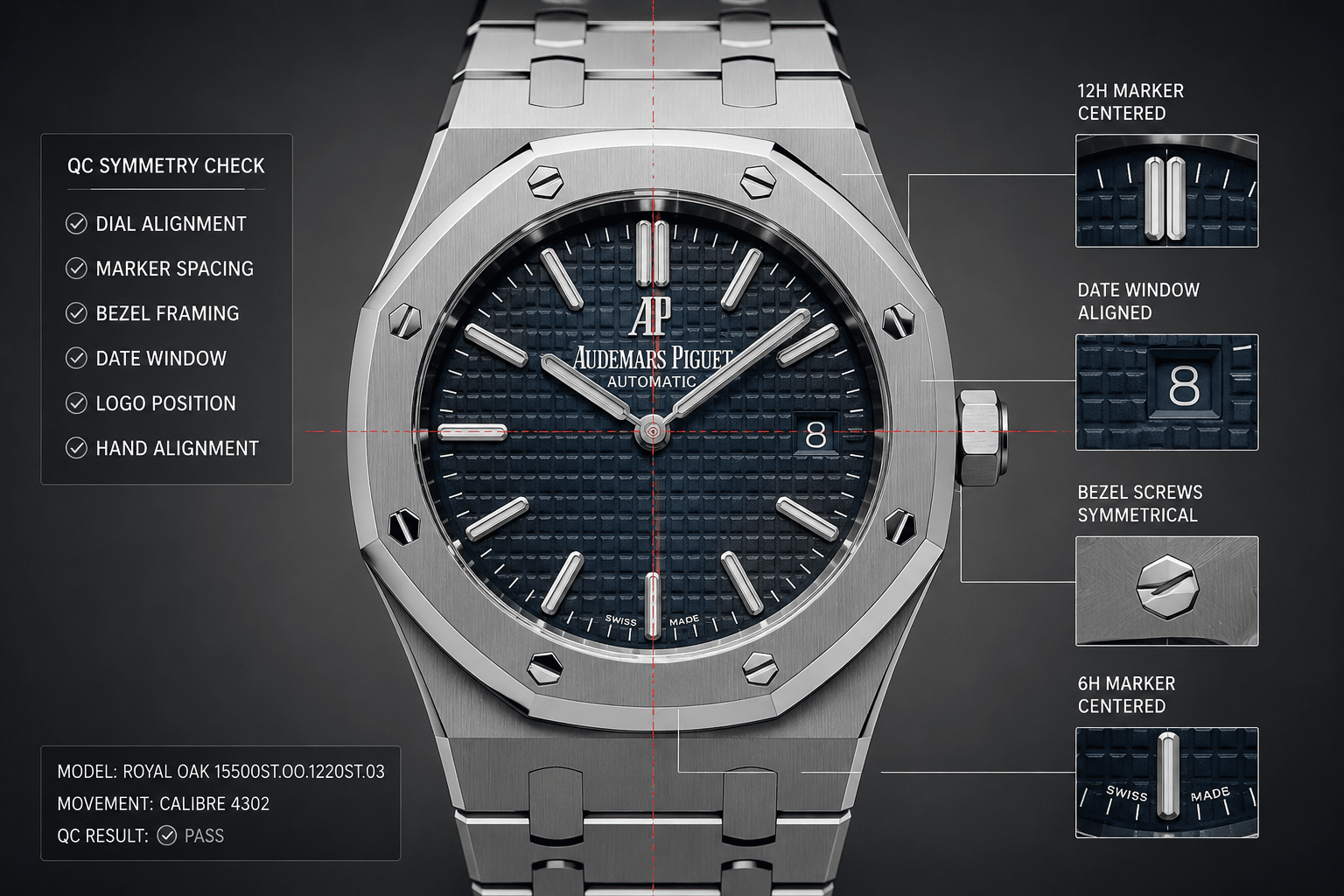
The first Patek QC front view should be judged at normal size before you zoom in. This is where many buyers make the wrong first move. They immediately enlarge the logo, date, or marker edges, but they skip the basic question: does the watch look balanced as a whole?
For a Patek Philippe replica dial alignment check, the full-front image matters because Patek designs rely on clean geometry. Nautilus and Aquanaut models use strong case shapes and open dial space, while Calatrava-style watches are even more minimal. If the first QC image already feels visually lopsided, no amount of macro inspection will save the impression on the wrist.
Check Whether the Dial Is Sitting Straight
Start by using the 12, 3, 6, and 9 o’clock positions as your reference points. The dial should not appear rotated inside the case, and the center pinion should feel visually centered within the dial opening. You are not looking for mathematical perfection from a phone photo; you are looking for obvious imbalance that remains visible after accounting for photo angle.
A slight tilt in the watch itself can create the illusion that the dial is crooked. Before calling it an RL issue, compare the dial against the case, bezel, and hour marker positions in more than one front photo. If every image shows the same rotation, or the 12 o’clock marker and 6 o’clock marker do not visually line up through the center, that becomes a stronger concern.
The non-obvious point is that dial rotation looks worse on Patek replicas than on many sportier Rolex-style watches. A Submariner bezel, large markers, and stronger visual noise can distract the eye. A Nautilus or Calatrava dial gives the eye fewer places to hide the error. If the dial looks crooked at normal viewing size, it is not a minor macro flaw.
Look at Marker Spacing Before Zooming In
After the dial looks generally straight, check the hour markers as a group. Do they sit evenly around the dial? Does one marker look higher, lower, or more tilted than the others? Are the 12, 3, 6, and 9 positions visually stable? Marker spacing matters because applied indices on a clean Patek-style dial act like architectural lines. One badly seated marker can make the entire watch feel cheaper.
Do not overreact to tiny bright edges or reflections on polished markers. QC lighting often creates white flashes that look like scratches or uneven finishing. The better standard is visibility at normal size. If a marker appears slightly imperfect only under extreme zoom, it is usually not a rejection reason. If it looks tilted or poorly seated before zooming in, it deserves closer review.
Marker balance is especially important on simpler Calatrava-style dials, where the dial furniture is sparse. On Nautilus and Aquanaut models, the texture can distract slightly, but it does not excuse obvious marker misalignment. If your first reaction is “that marker is crooked” without zooming, the issue is probably real enough to question.
Use the Bezel Shape as a Frame
For Nautilus and Aquanaut QC, the bezel is not just decoration. It frames the dial and controls the whole front-view impression. The rounded octagonal shape should look even around the dial opening, with no side appearing visually heavier unless the photo angle clearly explains it.
A Nautilus-style case can look wrong even if the dial itself is acceptable. If the bezel framing feels uneven, the watch may look twisted or poorly proportioned in normal wear. The same applies to Aquanaut-style cases, where the softened cushion shape should not make the dial look off-center. In QC, look at the relationship between the dial edge, case opening, and bezel outline, not only the dial details.
This is one of the most practical front-view checks because it catches problems that macro close-ups miss. A logo can look sharp and the markers can look clean, but if the bezel and dial do not sit together visually, the watch will not feel convincing as a complete object.
Front-View Red Flags
A front-view issue deserves rejection when it is obvious without heavy zoom. Examples include a visibly rotated dial, severely tilted markers, a dial that appears off-center inside the case opening, or a bezel-to-dial relationship that makes the watch look lopsided. These are not tiny factory-version debates; they affect the basic appearance of the watch.
A missing straight-on photo is also a problem. If the QC set only shows angled glamour shots, ask for a true front view before approving. You cannot properly judge Patek QC front view symmetry from a tilted photo, and you should not be pressured into a GL when the most important image is absent.
The practical standard is this: if the full front view looks balanced, proceed to detailed checks. If it looks wrong at arm’s length, stop and clarify before you approve. Patek Philippe super clone QC should begin with overall geometry because that is what your eye will notice first in daily wear.
Dial Color and Texture: Why Lighting Matters on Patek Replicas
Patek replica dial color is one of the easiest areas to misjudge from QC photos. A blue Nautilus dial can look gray, electric blue, navy, or washed out depending on light angle and camera exposure. Green, brown, gray, and gradient dials can shift even more. One overexposed image is not enough to decide that the dial color is wrong.
This does not mean every color concern should be ignored. Dial color and texture are central to many Patek-style replicas. A flat Nautilus horizontal dial, a muddy Aquanaut texture, or a blotchy sunburst finish can weaken the entire watch. The key is knowing when you are seeing a QC lighting issue and when you are seeing a real dial execution problem.
Reference Photos Are Comparison Tools, Not Proof
Official model photos and boutique-style images can help a buyer understand the broad visual language of a Nautilus, Aquanaut, Calatrava, or complication-style design, but they should not be treated as proof that a replica dial must look identical in QC lighting. Studio images are controlled, edited, and often shot to emphasize depth or color shift. Seller QC photos are usually taken quickly under direct light, so the more defensible comparison is configuration, layout, texture consistency, and obvious color mismatch rather than exact shade matching.
If you use reference images during QC, use several examples and focus on stable features: dial pattern direction, marker placement, date-window position, logo location, hand shape, and whether the ordered dial variant is represented correctly. Avoid rejecting only because the QC photo does not reproduce one specific online image. A color concern becomes stronger when the same abnormal tone, patchiness, or wrong variant appears across multiple QC photos and video.
Nautilus Dial Tone and Horizontal Texture
On a Nautilus-style replica, the horizontal dial pattern should look even across the surface. In QC photos, check whether the texture appears consistent from left to right and top to bottom. The lines should not disappear completely in one area while looking harsh or overcut in another, unless the lighting angle clearly explains the difference.
The blue dial is especially sensitive. Many buyers panic because the dial looks too bright in one image or too dark in another. That alone is not an automatic RL reason. A sunburst or gradient-style finish naturally changes under direct light, and phone cameras often exaggerate the effect. What matters more is whether the color behaves consistently across multiple photos and whether the ordered dial variant matches what you requested.
A real concern is uneven texture. If the horizontal pattern looks washed out, patchy, or irregular under similar lighting, ask for another neutral-light photo or short video. A convincing Nautilus dial should have some visual depth. It does not need to match genuine-level finishing under macro inspection, but it should not look like a flat printed plate.
Aquanaut Texture and Color Consistency
Aquanaut-style dials create a different QC problem. The grenade-style texture should look evenly molded or stamped across the dial, and the printed numerals or markers should sit cleanly over that texture. If the surface looks soft, uneven, or distorted around certain areas, the watch can lose the rugged-but-clean character that makes the Aquanaut design work.
Color consistency is more important than chasing an exact shade from one photo. Black, brown, green, and khaki-style Aquanaut dials can all shift under lighting. The question is whether the dial surface looks uniform under comparable angles. If one corner looks cloudy, if the center looks faded while the edges look saturated, or if the texture seems to disappear under normal light, that deserves clarification.
Also watch for printing that appears to sink into the texture unevenly. This section is not a full logo or text inspection, but on Aquanaut-style dials the relationship between texture and print is part of the visual quality. If the texture is too aggressive or too soft, even clean printing can look wrong.
When a Color Concern Needs Another Photo
Ask for another photo when the issue could reasonably be caused by lighting. A neutral-light image, a less reflective angle, or a short QC video can often answer whether the dial color is actually wrong. This is especially useful when one image looks alarming but the rest of the set looks normal.
Do not ask for endless photos just because the dial does not match a showroom image online. Genuine and replica Patek-style dials both change dramatically in different environments, and internet reference photos are often edited, filtered, or shot under studio light. The useful comparison is not “does this match one perfect online photo?” but “does this specific dial look even, correctly configured, and acceptable under ordinary lighting?”
A dial color concern becomes stronger when the same problem appears across similar photos: blotchy finish, inconsistent texture, obvious wrong dial variant, or a color that looks far outside the expected range in both photos and video. If the only problem is that one harsh QC shot makes the dial look lighter or darker, clarification is smarter than rejection.
Logo Printing, Text Placement, and Small Dial Details
Patek logo printing QC deserves more attention than it gets because Patek Philippe-style dials do not give errors many places to hide. On a busy chronograph dial, slightly heavy text can disappear into the layout. On a Nautilus, Aquanaut, or Calatrava-style replica, the brand text often sits in clean open space, so poor logo placement or fuzzy replica Patek dial text can disturb the whole face of the watch.
The goal is not to use QC photos as a genuine-authentication exercise. QC cannot prove genuine-level printing, and extreme zoom will make almost any printed dial look rougher than it appears in normal use. The practical question is simpler: does the printed text look straight, clean, centered, and consistent enough that it will not bother you every time you look at the watch?
Logo Position Relative to the Dial Center
Do not judge the logo in isolation. First compare it against the 12 o’clock marker, the center pinion, and the overall dial furniture. If the logo looks slightly high or low in a macro photo but still sits level and balanced in the full dial image, it is usually not a strong RL reason. If the logo looks crooked even at normal image size, that is a different matter.
A useful check is to imagine a vertical line running from 12 o’clock through the hand stack to 6 o’clock. The printed logo should feel centered on that visual axis. It should not lean left, float too close to the 12 marker, or look disconnected from the rest of the dial layout. This matters more on Calatrava-style pieces, where the dial is plain and the text carries much of the visual balance.
For Aquanaut and Nautilus-style models, texture can make logo placement harder to read. The raised or horizontal dial pattern may create shadows that make the text look uneven. In that case, use several photos before deciding. One tilted close-up can make a level logo look wrong, but a logo that appears tilted in every straight-on image is a real QC concern.
Font Weight and Print Sharpness
Font weight is where many buyers overreact and underreact at the same time. A slightly heavier print in a zoomed QC image is common on a Patek super clone and may not be visible on the wrist. But thick, fuzzy, bleeding, or broken print is not just a macro issue if it changes the way the dial reads at normal size.
Look for clean edges around the letters. The print should not look smeared, grainy, interrupted, or unevenly inked. If “PATEK PHILIPPE” appears darker on one side than the other, or if part of the text looks faded while the rest is bold, ask for a sharper close-up before approving. A single blurry QC photo should not decide the watch, but unclear printing should not be ignored either.
The most sensible standard is visibility. If you need to zoom heavily and compare letter shapes like a microscope inspection, the flaw is probably acceptable for QC. If the print is visibly crooked, too thick, or blurry in the regular front-view image, it becomes a daily-wear issue, not a forum-level detail.
Minute Track and Small Marking Alignment
The minute track and small dial markings should be checked after the main logo because they reveal whether the dial printing was applied cleanly as a whole. On models with an outer minute track, inspect whether the marks are evenly spaced and follow the dial edge consistently. If the track appears to drift closer to the case opening on one side, confirm that the photo is not tilted before treating it as a defect.
Small printed details near 6 o’clock can also expose poor text alignment. If the lower dial text looks slanted while the upper logo is straight, that can make the watch feel unbalanced. Minor softness in tiny markings is often acceptable, but broken letters, uneven spacing, or printing that visibly collides with markers should stop approval.
Be careful with reflections near the crystal edge. A curved crystal, harsh lighting, or compressed seller photo can make the outer text look wavy. If the minute track concern appears only on one angled photo, ask for a neutral straight-on close-up rather than rejecting immediately.
Acceptable vs. Rejection-Level Printing Issues
| QC Finding | Likely Decision | Why It Matters |
|---|---|---|
| Tiny roughness visible only under heavy zoom | Usually acceptable | Most replica watch QC photos exaggerate print texture beyond normal viewing distance. |
| Logo slightly darker or lighter due to lighting | Usually acceptable or clarify | Exposure and dial texture can change how the print appears in one photo. |
| Logo visibly tilted in straight-on photos | Clarify or reject | Patek-style dial text is central to visual balance and will remain noticeable. |
| Smeared, broken, or incomplete printed text | Reject | This is poor execution on the delivered dial, not a harmless macro flaw. |
| Minute track clearly off-center around the dial | Reject if confirmed | Outer printing affects the whole dial geometry and is hard to ignore in daily use. |
The cleanest rule is this: accept small print imperfections that disappear at normal viewing size, but do not approve a watch with visibly crooked, smeared, incomplete, or poorly centered dial text. On a Patek replica, restraint is the design language, so bad printing is not a small problem.
Date Wheel Alignment and Window Cleanliness
The Patek replica date wheel is one of the easiest QC areas to judge because the date sits inside a fixed frame. Unlike dial color, which changes with lighting, date alignment has a more practical standard: the number should sit comfortably inside the aperture without looking clipped, leaning, crowded, or obviously off-center.
This matters especially on clean Patek dials because there is usually no cyclops, heavy bezel, or busy subdial layout to distract the eye. If the date sits too high or the date is not centered, you will notice it often. Minor vertical offset can be acceptable, but a severe date window QC issue is one of the more rational reasons to ask for more evidence or reject the piece.
Vertical and Horizontal Date Centering
Start by checking vertical position. The date should not press against the top or bottom edge of the window. A number that sits slightly high may be acceptable if it is fully visible and consistent with other examples from the same date disc. A number that is clipped, touches the edge, or looks like it is sliding out of the aperture is a stronger RL concern.
Then check horizontal centering. Some Patek-style date windows are narrow enough that a date sitting too far left or right becomes obvious. The number should feel visually centered inside the frame, not trapped against one side. This is especially important with double-digit dates, where the extra width can reveal alignment problems that a single-digit date hides.
Do not judge from a sharply angled photo if the aperture is near the edge of the case. Perspective can make the date look lower or more compressed than it is. If the first image looks borderline, ask for a straight-on close-up before approving rather than relying on a tilted shot.
Single-Digit and Double-Digit Date Differences
A common buyer mistake is approving date alignment based on one number. Single-digit dates can look acceptable because they occupy less space. Double-digit dates may reveal that the date disc is too high, too far left, or printed with inconsistent spacing. If the QC set already shows a questionable date, ask for at least one single-digit and one double-digit example.
This does not mean you need photos of every date. QC is not a full calendar test. But if “8” looks centered and “23” sits high or clipped, the watch may annoy you in real use. The more minimal the dial, the less tolerance there is for a sloppy date display.
Be cautious with date font complaints. A date font that looks slightly different from reference photos is not automatically a QC failure, because the delivered watch may be using the normal date disc for that factory version. QC should focus first on centering, cleanliness, and consistency. Font style matters most when it looks obviously wrong, uneven, too thick, or mismatched across different numbers.
Version-Specific Datewheel Judgment
Datewheel expectations should be tied to the exact model and replica-market version being offered. A thin Calatrava-style case, a Nautilus-style integrated case, and a complication-style layout may use different movement routes or date-disc positions, so one general “Patek date” standard is not always useful. The fairer QC question is whether the date sits acceptably for this specific reference style, dial opening, and movement configuration.
If the seller claims an updated version, ask the QC evidence to support that update in visible ways rather than accepting the wording alone. A revised datewheel should show better centering, cleaner printing, or a layout that matches the advertised configuration. If the updated-version claim cannot be connected to the actual photo set, judge the watch by the unit shown instead of the version label.
Date Window Edges and Dust-Like Marks
The date window area often creates false alarms. What looks like a chip or black mark may be dust on the crystal, lint on the dial surface, or a reflection along the aperture edge. Before rejecting, compare multiple angles. If the mark moves or disappears, it is probably external dust or lighting. If it stays in the same position around the date window in every image, it may be a real dial or aperture issue.
Window edges should look clean and evenly cut. A slightly shadowed edge is normal, especially under harsh QC lighting. Rough paint, visible debris trapped near the aperture, or a damaged frame is more concerning because the date window is a high-visibility area. On a dressier Patek-style watch, a messy aperture can cheapen the entire dial.
If a QC video shows the date advancing, watch where the new date lands after the change. A date that briefly moves and then settles centered is less concerning than a date that lands consistently high, low, or partially hidden.
Date Checks Before Approval
- Check whether the visible date is centered vertically and horizontally inside the aperture.
- Ask for another date if the first number looks high, low, clipped, or crowded.
- Try to see both a single-digit and a double-digit date when the QC evidence is borderline.
- Compare close-up and full-dial images to decide whether the issue is visible in normal use.
- Do not treat one good date photo as proof of long-term calendar reliability.
A minor date offset is not always worth rejecting, especially if it disappears at normal viewing size. Severe clipping, leaning, inconsistent positioning, or a dirty-looking date window is different. Those flaws remain visible every time the date is in view, and they are harder to rationalize after approval.
Hands, Markers, and Lume: Small Parts That Change the Whole Watch
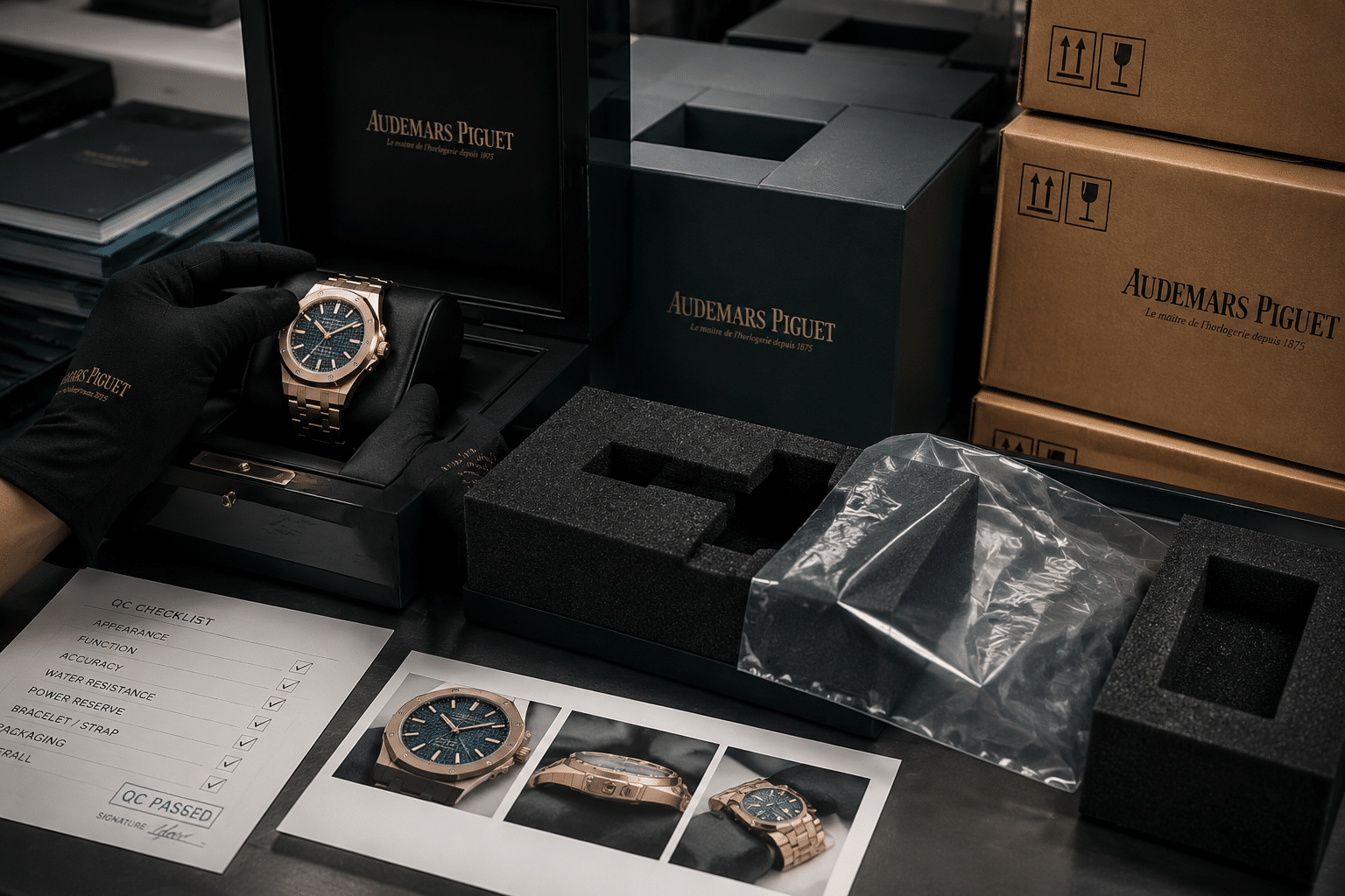
Patek replica hands QC is easy to overlook because the parts are small, but these components create much of the watch’s perceived quality. A clean dial with one crooked marker or scratched hand can look worse than a more complicated watch with the same defect. Patek designs rely on calm proportion, so small part errors have more visual weight than buyers expect.
The standard should still be practical. You are not looking for perfect hand polishing under extreme magnification. You are checking whether the hands, applied indices, and lume fill look clean, seated, and aligned enough that the watch will feel composed in daily wear.
Hand Condition and Alignment
Start with the hands at the center. The hour, minute, and seconds hands should appear properly stacked and centered on the pinion. If the center looks messy, offset, or damaged, ask for a sharper close-up. Poor hand stacking can make the whole dial feel cheap, even if the printing and markers are good.
Look for visible scratches, bends, stains, or rough hand edges. Polished hands reflect light aggressively, so not every bright line is a scratch. A mark that appears in only one photo may be reflection. A line or dark spot that stays in the same place across multiple angles is more likely to be damage.
Hand alignment also matters when the hands are set to a clean reference time. If the minute hand is at 12 and the hour hand is not reasonably aligned with the hour, ask for clarification. Do not over-police a casual QC time setting, but obvious slipping, strange hand position, or a visibly bent seconds hand should not be ignored.
Applied Marker Seating
Patek marker alignment should be checked at normal size first, then with zoom. Applied markers should sit straight and evenly, especially at 12, 3, 6, and 9 where the eye naturally anchors the dial. A marker that is slightly imperfect under macro may be acceptable. A marker that looks crooked in the full front photo is a real problem.
Pay attention to markers that appear lifted at one end, rotated, or set at a different height from neighboring indices. Poor marker seating can create uneven shadows, making the dial look untidy even if the marker itself is not dramatically misplaced. This is more visible on simple Calatrava-style layouts and on Nautilus-style dials where the horizontal pattern gives your eye a straight reference line.
If one marker looks wrong, compare it against the opposite side of the dial. Symmetry helps reveal whether the issue is actual placement or just camera angle. A tilted marker at 6 o’clock or 12 o’clock is usually more bothersome than a tiny edge imperfection on a less prominent index.
Lume Fill and Night-Shot Expectations
Lume should be judged according to the model, not as a generic sports-watch test. Many Patek-style replicas are not bought for strong night visibility, and some dressier designs have limited lume presence. A weak glow is not automatically an RL reason if the original design is not lume-driven and the daylight appearance is clean.
What matters more is uneven lume fill that is visible in normal lighting. If a hand has missing lume, a marker looks stained, or the lume color visibly clashes between hands and indices, that can affect the daytime look as well as the night shot. On Aquanaut and Nautilus-style models, inconsistent lume can stand out because the dial layout is simple and the markers are prominent.
A lume photo is useful when the model has obvious luminous hands and markers, but it should not become the main approval standard unless the defect is clear. The safer judgment is to prioritize visible hand condition, marker seating, and daylight cleanliness first. Lume strength fades in importance if the watch looks correct in normal use; uneven or missing lume remains a QC concern because it signals poor part execution.
For final approval, accept tiny macro-level finishing limits if the hands and markers look straight, clean, and balanced in the full dial image. Reject or clarify if a marker is visibly crooked, a hand appears bent or damaged, lume is missing in a way that shows in daylight, or the center hand stack looks poorly assembled. Those are not theoretical flaws; they change how the watch presents every time you check the time.
Side Profile and Case Thickness: The Patek QC Check Buyers Often Miss
A Patek replica can pass the front-view test and still look wrong once you see the side. This is especially true for Nautilus, Aquanaut, and Calatrava-style models, where the original design language depends on controlled thinness, soft case transitions, and a caseback that does not look like an added spacer. If the case looks too thick in QC, do not treat it as a minor cosmetic issue. On a Patek-style watch, bulk changes the whole character of the piece.
The important point is not whether you can measure exact millimeters from a photo. You usually cannot. The better QC question is whether the Patek super clone side profile looks proportionate: bezel, midcase, caseback, crown, and lugs should feel like one designed shape rather than stacked parts. A watch that looks slim from the dial side but tall, slab-sided, or bottom-heavy from the side should be treated with caution before approval.
Why Front Photos Are Not Enough
Front-facing QC images hide the most common thickness problems. A straight dial shot can make the bezel look clean, the logo look centered, and the date look acceptable, while completely concealing a tall caseback or awkward midcase. This is why a side profile check matters more on Patek replicas than many buyers expect.
On a Nautilus-style case, the side should show a layered but controlled profile. The bezel should not look like a thick cap sitting on top of the case, and the caseback should not look like it was added to make room for a thicker movement. On a Calatrava-style model, the tolerance is even lower. A dress watch with a simple dial and smooth bezel has nowhere to hide extra height; if it sits too tall, the watch loses the elegance that made the design attractive in the first place.
A common buyer mistake is approving a watch because the dial photo looks good, then noticing later that the watch wears like a hockey puck. QC photos cannot prove exact comfort, but they can reveal whether the case profile is already visually heavy. If the side photo is missing, asking for one is reasonable, especially before approving a more expensive Patek super clone.
Crown-Side and Non-Crown-Side Views
One side photo is helpful, but two are better. The crown side shows whether the crown sits naturally into the case and whether the midcase thickness looks balanced around it. A crown that appears too recessed, too proud, or oddly low can signal that the case architecture and movement position are not working cleanly together.
The non-crown side is just as useful because it removes the distraction of the crown. This angle makes it easier to judge the pure case line: bezel height, midcase wall, caseback thickness, and lug curve. If one side looks clean and the other looks uneven, ask for clarification before giving GL. It may be angle distortion, but it may also be a poorly seated caseback or an uneven case assembly.
Pay close attention to the caseback seam. A small seam is normal, but a caseback that appears proud, tilted, or visibly gapped is a stronger concern. It can affect both appearance and confidence in assembly. QC should not be used to assume waterproofing, but a poorly seated caseback is still a valid visual red flag.
Model-Specific Thickness Sensitivity
Not every Patek replica has the same tolerance for visible thickness. A Nautilus-style watch can accept slightly more visual substance because the case and bracelet are part of a sporty integrated design. Even there, the case should still look flat and wide rather than tall and chunky. If the case flank looks like a vertical wall, the watch will usually feel less convincing in daily wear.
An Aquanaut-style replica is slightly more forgiving because the rubber strap and sportier case language can absorb a little more thickness visually. The risk is different: if the caseback is bulky or the strap drops sharply from the lugs, the watch may sit high and lose the relaxed profile that makes the Aquanaut appealing.
Calatrava-style and dress-style Patek replicas are the least forgiving. These watches rely on thin bezels, simple cases, and clean wrist presence. A few visual flaws on the dial may be tolerable, but an overly thick dress case changes the entire personality of the watch. For these models, Patek replica case thickness should be one of the deciding QC points, not an afterthought.
Side-Profile Photos to Review
Useful QC should include a true side view, a crown-side angle, a non-crown-side or caseback angle, and ideally a flat wrist-free shot where the watch is not tilted toward the camera. A tilted photo can make a slim case look thick or hide a bulky caseback, so do not make the final decision from one dramatic angle.
Ask for an additional side view if the watch sits too tall in the available photos, if the caseback is cropped out, or if every image is taken from above. That is not being overly picky. For Patek-style designs, side geometry is part of the visual identity. A clean dial cannot fully rescue a case that looks poorly proportioned from the side.
Bracelet Links, Strap Fit, First Links, and Clasp Quality
Bracelet and strap QC is not just about neat photos. On a Patek replica, the wearing components often decide whether the watch feels acceptable after the first day. A dial flaw may only bother you under zoom, but a rough clasp, crooked first link, protruding screw, or twisted strap becomes noticeable every time you put the watch on.
This is especially important for Nautilus-style bracelets because the bracelet visually continues the case. The first links are not separate accessories; they are part of the watch’s silhouette. If the first link looks loose, raised, or disconnected from the case flow, the whole watch can look cheaper even if the dial and bezel are acceptable.
First-Link Integration on Nautilus-Style Bracelets
For a Nautilus-style Patek replica bracelet QC check, start where the bracelet leaves the case. The first link should follow the case line smoothly without looking twisted, pinched, or awkwardly elevated. A small amount of articulation is normal and necessary, but a visible step or gap at the first link can make the watch look poorly assembled.
Review the first links from both the front and side. A front photo may show even spacing, while a side photo reveals one link sitting higher than the other. This is one of the non-obvious QC checks that matters in real wear because the first link controls how the watch drapes around the wrist. A bracelet that begins badly usually does not improve further down the link line.
Minor stiffness is not automatically an RL reason. New integrated bracelets can feel tight before wear. The stronger concern is asymmetry: one first link drooping differently, a visible end link gap, or a link that appears bent compared with the opposite side.
Clasp Closure, Engraving, and Fit
A Patek clasp inspection should focus on alignment and function before engraving perfection. The clasp should sit closed, centered, and flush enough that it does not look half-latched in photos. If the QC video shows the clasp being opened and closed, watch whether it snaps into place cleanly or needs repeated pressure to stay shut.
Clasp engraving is worth checking, but do not overvalue macro-level engraving sharpness if the clasp itself works properly. Slightly shallow or soft engraving may be acceptable on many replica watches. Crooked engraving, damaged metal, rough edges, or a clasp that does not appear fully seated are more serious because they affect both appearance and daily handling.
If the seller provides only a closed bracelet photo and no clasp view at all, ask for one. The clasp is one of the highest-contact parts of the watch. A beautiful dial does not compensate for a clasp that feels unstable, cuts into the wrist, or looks visibly misaligned.
Bracelet Screws, Link Gaps, and Articulation
Look along the bracelet for uneven link gaps, protruding screws, and links that appear bent out of plane. A tiny variation between links is normal, especially under harsh lighting, but one link sitting visibly higher or wider than the surrounding links deserves attention. On an integrated bracelet, unevenness is easier to see because the link pattern is part of the design.
Bracelet screws should look seated, not proud of the link surface. A protruding screw can scratch, catch fabric, or suggest careless assembly. If a screw head looks damaged in QC, ask for a closer photo before approval. It may be reflection, but stripped-looking screws are not something you want to discover after delivery.
Video is useful here. A bracelet should articulate smoothly without looking floppy or frozen. Too much looseness can make the watch feel cheap; too much stiffness can make it uncomfortable. The best practical standard is simple: the bracelet should move evenly, close securely, and not show obvious gaps or assembly defects in normal QC views.
Aquanaut Strap and Deployant Checks
For Aquanaut-style replicas, the strap replaces the integrated bracelet as the main comfort risk. Check whether the rubber strap sits evenly against the case and whether both sides fall naturally. If one side twists, flares, or looks poorly cut at the case, the watch may wear awkwardly even if the dial looks good.
The rubber texture should appear consistent across both strap halves. Uneven pattern depth, rough trimming, or distorted edges are stronger concerns than a slightly different shine caused by lighting. Also check the deployant clasp: it should sit aligned, close fully, and not appear strained by the strap thickness.
A strap that is merely stiff may soften with wear. A strap that is visibly twisted, poorly trimmed, or badly seated usually will not correct itself. For approval, the strap and deployant should look like they belong to the case, not like parts fitted after the fact.
Movement View and Caseback: What You Can Actually Learn
A movement photo is useful, but it is often misunderstood. It can help confirm whether the watch roughly matches the expected movement route, rotor style, bridge layout, and caseback type. It cannot prove long-term reliability, service condition, genuine-equivalent construction, or whether the movement will remain stable after months of wear.
For Patek replica movement QC, treat the caseback photo as a consistency and cleanliness check. You are not authenticating a genuine Patek Philippe watch, and you should not expect QC photos to prove internal architecture beyond what is visible. The practical question is whether the movement view matches the version you ordered and whether there are obvious assembly problems that should stop approval.
Movement Claims Need Narrow Verification
Movement language is one of the easiest areas for buyers to misunderstand. A seller may describe a movement as “clone,” “decorated,” “Swiss,” “Asian,” “custom,” or “same layout,” but those terms do not all mean the same thing and should not be treated as proof of genuine-equivalent construction. During QC, the defensible question is narrower: does the visible movement layout match the route that was advertised for this replica version, and is there any obvious mismatch or damage in the photo or video?
If the exact movement matters to you, ask for evidence that can be checked from the specific unit, not a generic description copied from a listing. A clear caseback image, a rotor-side video, and a consistent bridge layout are more useful than broad claims. Even then, QC media can only support a visual consistency judgment; it should not be used to claim confirmed parts origin, official service compatibility, or long-term reliability.
Movement Transparency Note: Movement references in this article describe the replica-market movement type, visible layout, or advertised configuration, not an official Patek Philippe caliber or brand-manufactured movement unless independently verifiable evidence is provided. Buyers should judge the movement view by unit-specific photos, function video, and timegrapher behavior rather than by broad movement wording alone.
Movement Route Consistency
Start by comparing the movement view with the version you were told you were buying. If the model has an exhibition caseback, the bridge layout, rotor decoration, and visible finishing should be broadly consistent with the advertised movement route. If the watch was sold as one movement type but the visible layout clearly looks like another, that is a clarification issue before GL.
This matters more on Patek-style replicas because many models expose the movement through the back, and buyers often pay more for a specific movement route. Still, avoid turning the QC process into unsupported movement certification. A decorated movement can look impressive in photos while still having ordinary finishing, limited parts compatibility, or unknown long-term serviceability.
At Clean VS Factory, we usually treat movement photos as a version check, not a performance guarantee. If the movement looks consistent, clean, and appropriate for the ordered model, that supports approval. If the movement looks different from the claimed version, ask questions before accepting the watch.
Rotor, Bridges, Screws, and Cleanliness
Look for obvious visual red flags: loose screws, scratched bridge surfaces, debris, damaged rotor edges, or heavy marks around screw heads. A little reflection on polished or decorated surfaces is normal, but visible dust inside the caseback area or a rotor that appears scraped should not be ignored.
Rotor decoration should be judged realistically. Many Patek super clone caseback photos show decorative finishing that is convincing at a glance but not equal to genuine haute horlogerie finishing under magnification. That is expected. The QC concern is not whether every bevel is hand-finished; it is whether the decoration is unusually rough, misprinted, damaged, or inconsistent with the watch version being sold.
If audio or video is available, listen for extreme rotor noise, but do not overinterpret one short clip. Some automatic replica movements are naturally louder than genuine luxury movements, and a phone microphone can exaggerate sound. A grinding, scraping, or visibly wobbling rotor is different; that deserves clarification or rejection depending on severity.
Caseback Fit and Exhibition View
The caseback should look cleanly installed and evenly seated. On an exhibition caseback, check whether the crystal edge, gasket area, and metal back appear level. A caseback that looks tilted, uneven, or proud on one side is a stronger concern than small decorative differences on the movement.
For closed-back models, the QC value is different. You are checking engraving placement, surface condition, screw seating if applicable, and whether the back appears properly fitted. A closed caseback will not tell you much about movement condition, so do not let a clean engraving distract from missing side-profile or function evidence elsewhere in the QC set.
Caseback fit also connects back to thickness. Some Patek replicas use movement routes that require extra internal space, and that can show up as a thicker back. This does not automatically make the watch unacceptable, but if the caseback looks like a spacer added to support the movement, the watch may wear and look less refined than expected.
Movement Route to Verify
Before approval, verify three things against the ordered version: the expected movement route, the visible bridge and rotor layout, and whether the model should have an exhibition or closed caseback. If any of these do not match, ask for clarification before giving GL.
Accept normal replica limitations in finishing, but do not accept obvious mismatch, debris, damaged parts, loose-looking screws, or a poorly seated caseback. The movement view should give practical confidence that this is the correct configuration and visibly clean enough to proceed. It should not be treated as proof of genuine construction or guaranteed long-term movement health.
Timegrapher Results: Reading the Numbers Without Overreacting
A timegrapher screenshot is useful, but it is not a full movement diagnosis. For Patek super clone timing results, the buyer is mainly checking whether the movement appears reasonably stable before approval, not whether the watch has been serviced, regulated in every position, or proven reliable for years of ownership.
The biggest mistake is treating one clean number as a guarantee. A replica watch timegrapher QC image is usually taken in one position, often after an unknown amount of winding, with a lift angle setting the buyer cannot always verify. Good numbers are reassuring. Bad or unstable numbers deserve attention. Neither result tells the whole story.
For QC approval, the practical question is simple: do the rate, amplitude, beat error, and trace look normal enough for the claimed movement route, or is there a warning sign that should be clarified before GL? This is especially important on Patek-style replicas because many models use thin cases, decorated movement layouts, or movement adaptations where perfect-looking photos can hide a mediocre running condition.
Rate: Daily Gain or Loss in One Test Position
Rate is the number most buyers notice first. It shows how many seconds per day the watch is gaining or losing in the tested position. If the display reads +6s/d, the machine is estimating that the watch would gain about six seconds per day in that specific test condition.
That does not mean the watch will gain exactly six seconds on your wrist. Real-world wear changes the result because the watch spends time dial-up, crown-down, crown-up, moving, resting, and running at different levels of mainspring wind. A Patek replica showing a reasonable single-position rate in QC can still behave differently during daily use.
As a practical QC standard, a modest gain or loss is usually not a rejection reason by itself if the trace is stable and the other numbers are sensible. A rate that is wildly fast, wildly slow, or drifting during the reading is more concerning than a watch that is simply a few seconds off. The buyer should care less about chasing a perfect 0s/d screenshot and more about avoiding a movement that looks unstable before it even ships.
Amplitude: Useful but Context-Dependent
Amplitude is a rough indicator of how strongly the balance is swinging. In plain English, it gives a clue about movement energy. A healthy-looking amplitude can suggest the movement is wound enough and running with decent strength, while very low amplitude may point to low wind, poor adjustment, friction, dryness, or a movement that needs attention.
The difficult part is context. Amplitude depends on the movement type, winding state, test position, beat rate, and lift angle setting. A thin automatic movement used in a Patek Philippe super clone should not always be judged by the same expectation as a thick sports-watch movement or a chronograph movement. If the watch was barely wound before the test, the amplitude may look lower than it would after a fuller wind.
This is where buyers often overreact. A slightly lower amplitude is not automatically an RL, especially if the seller can show the watch after additional winding and the trace remains clean. But very low amplitude paired with a poor trace, erratic rate, or unclear winding condition is worth a clarification request. If the response is only “normal” with no better image or video, approval becomes more of a gamble.
Beat Error: When to Ask for Clarification
Beat error measures how evenly the balance swings from one side to the other. A small beat error is generally preferable because it suggests the escapement timing is more centered. A higher beat error does not always mean the watch is unusable, but it can indicate that the movement is not well adjusted.
For QC purposes, beat error matters most when it is obviously high or combined with other weak signs. A watch with a slightly imperfect beat error but stable rate and acceptable amplitude may still be a reasonable approval. A watch with high beat error, low amplitude, and a messy trace deserves more caution because the numbers are telling the same negative story from different angles.
The non-obvious point is that beat error is not a cosmetic flaw. Unlike a tiny dust reflection in a macro dial photo, it relates to how the movement is behaving. If the beat error looks unusually high in the timing result before GL, asking for a retest or clarification is more reasonable than accepting it just because the dial photos look good.
Timegrapher Numbers Need Movement Context
Timegrapher interpretation is more reliable when the buyer knows the movement configuration being tested. A Miyota-based route, ETA-style route, Seagull-based route, decorated automatic, or modified thin movement can show different behavior, and the same raw number may not carry the same meaning across all of them. The timing screen should therefore be read together with the advertised movement route and the visible movement photo, not as an isolated pass-or-fail certificate.
If the movement description is vague, the timing result should make you more cautious rather than more relaxed. A clean screenshot can support approval only when it fits the broader evidence: the unit appears to be the correct version, the movement view is consistent, the function video looks normal, and the trace is stable rather than captured at one flattering moment. Movement trust in the replica market depends on understanding what the claim describes: architecture, decoration, layout, reliability expectation, or simply a market name used by sellers.
Timing Results That Need More Context
Some timing results are not automatic rejections, but they should slow down the approval decision. The goal is not to demand watchmaker-level documentation. The goal is to avoid approving a watch when the only movement evidence is incomplete, unstable, or internally inconsistent.
- Unstable trace: A trace that wanders, breaks, or spreads heavily is more concerning than a single imperfect rate number.
- Very low amplitude: This needs context, especially whether the watch was fully wound and whether the lift angle setting is appropriate.
- High beat error: A high reading should be clarified when it appears alongside poor rate stability or low amplitude.
- Unclear lift angle: If the lift angle is wrong, the amplitude number may be misleading, so do not judge amplitude too aggressively from that alone.
- Only one quick screenshot: A clean still image is helpful, but a short timing video can show whether the reading is stable or only captured at a favorable moment.
A sensible QC decision treats timegrapher numbers as supporting evidence. They can reduce risk, and they can expose obvious movement concerns, but they cannot guarantee long-term reliability, waterproofing, service condition, or genuine-level performance.
QC Video Checks: Winding, Date Change, Hand Setting, and Clasp Action
A Patek replica QC video is valuable because it shows behavior that still photos cannot. Photos can make a watch look clean and aligned, but video can reveal whether the hands move smoothly, the date changes correctly, the clasp opens and closes, and the bracelet or strap behaves normally.
Watch the video at normal speed first. This matters because slowing everything down too early can make ordinary mechanical movement look suspicious. After the first pass, replay specific moments: crown operation, date change, clasp action, bracelet movement, and any sound if the audio is usable.
The video still has limits. You cannot truly feel crown resistance through a screen, and a short clip cannot prove long-term movement durability. But a watch function check video can catch obvious problems before approval, especially jerky hand setting, non-engaging date changes, slipping crowns, loose clasps, or awkward bracelet articulation.
Hand Setting and Crown Operation
During hand setting, the hands should move in a controlled way when the crown is turned. They should not jump unpredictably, slip backward, stall, or fail to respond. A small amount of gear backlash can be normal on many mechanical watches, but obvious skipping is a red flag.
Crown operation is harder to judge remotely. A video cannot tell you whether the crown feels refined, gritty, or slightly loose in the hand. What it can show is whether the crown pulls into its positions, whether the hands engage, and whether the operator appears to struggle. If the seller avoids showing crown operation on a watch where you already have timing or date concerns, asking for a clearer function clip is reasonable.
For Patek-style replicas, smooth hand setting also protects the visual impression. If the minute hand jumps or does not settle cleanly, the watch may look fine in static QC photos but become frustrating in daily use every time you set the time.
Date Change Demonstration
A date-change video is useful because it confirms more than the date wheel’s appearance. It can show whether the date advances, whether the change engages cleanly, and whether the new number lands properly inside the window afterward.
If the watch has a standard date display, the video should ideally show at least one date advancement. It does not need to become a long demonstration of every date on the wheel, but if earlier photos show the date sitting high, low, or off-center, a short video through one or two date changes can help separate a one-number alignment issue from a broader date wheel problem.
Do not confuse “date changes” with “date is acceptable.” A date can advance correctly and still land too high or too far left in the aperture. After watching the date function, pause the video or request a still image of the new date position if the landing looks questionable.
Clasp, Bracelet, and Strap Movement
For Nautilus-style bracelets and Aquanaut-style straps, video can be more useful than another polished front photo. The bracelet should articulate naturally, the first links should not look locked or twisted, and the clasp should close fully without obvious misalignment.
A slightly stiff new bracelet is not automatically a rejection reason. Many replica bracelets loosen with handling and sizing. The stronger concerns are visible binding, uneven link behavior, protruding screws, a clasp that does not seat flush, or a deployant that pops open too easily in the video.
On Aquanaut-style straps, look for twisting, poor strap seating, uneven deployant closure, and rubber that appears badly cut or forced into position. These are not tiny macro issues; they affect comfort and how the watch wears. A clean dial will not compensate for a strap or clasp that already looks wrong before shipping.
Extra Functions on Complication-Style Models
Complication-style Patek replicas need more caution. A chronograph, moonphase-style display, annual-calendar-style layout, power reserve display, or 24-hour subdial should match the claimed version and should not be assumed fully functional unless the QC video demonstrates it clearly.
This does not mean every decorative or simplified function is automatically unacceptable. Some buyers knowingly accept non-genuine-equivalent function routes because the model is visually appealing. The problem is approving a watch under one expectation and receiving another. If the seller’s claim is that a function operates, the QC video should show it operating.
For chronograph-style models, be especially careful. Starting, stopping, and resetting should be shown if those functions are part of the claimed build. A reset hand that does not return cleanly to zero, a pusher that fails to engage, or a subdial that behaves differently from the advertised version should trigger clarification before GL.
Simple GL, Clarify, or RL Standards for Patek Super Clone QC
The final QC decision should not be emotional. A Patek super clone GL RL decision is about whether the specific watch shown in the QC media is acceptable, unclear, or too risky to approve. It is not an authentication process, and it is not a search for a flawless watch under unlimited magnification.
The best replica watch QC approval standard is practical confidence. Approve when the visible details are balanced, the ordered configuration is correct, the movement evidence is reasonable, and the video does not show obvious functional problems. Ask for clarification when the issue may be caused by angle, lighting, missing media, or incomplete timing evidence. Reject when the flaw is visible, structural, functional, or inconsistent with the ordered watch.
For Patek Philippe replicas, this framework matters because the designs leave little room for distraction. A Rolex-style sports bezel can hide small imperfections better than a clean Calatrava dial, flat Aquanaut texture, or slim Nautilus case profile. On a Patek-style watch, proportion and restraint make the wrong flaw stand out quickly.
Legal, Brand, and Water-Resistance Boundaries
A QC approval should not be confused with legal reassurance, brand authorization, or waterproof certification. Replica watches are imitation products and are not authorized goods from the original trademark owner. Depending on jurisdiction and use, they may raise trademark, customs, import, resale, and disclosure concerns, so buyers should avoid treating seller assurances as universal legal advice.
Water resistance should also remain a separate issue from visual QC. A clean caseback, tight-looking crown, or sporty model style does not prove that an individual replica watch is safe for swimming, showering, or diving. Unless the specific watch is pressure-tested after purchase by a competent party, treat water resistance as unverified. This is not a reason to reject every watch, but it is a reason not to approve based on assumptions the QC media cannot support.
Price, Availability, and Seller Claims Should Not Lower the QC Standard
A higher price can reflect a better movement route, more difficult sourcing, stronger finishing, limited availability, seller margin, or after-sale risk. It does not automatically prove that the specific watch in the QC set is better assembled. Likewise, a hard-to-source model should not make a buyer accept visible dial rotation, a poor clasp, a wrong movement view, or a caseback that clearly changes the profile of the watch.
Seller descriptions are useful starting points, but the final approval should rely on buyer-verifiable evidence. If the listing claims a certain factory, version, movement, dial color, or function, the QC set should support that claim through photos and video. If the media does not show the relevant detail, the correct next step is a specific clarification request, not blind approval based on marketing language.
Seller Policies and After-Sales Terms Should Be Confirmed Separately
QC approval is only one part of the buying decision. Before approving, buyers should separately confirm the seller’s return terms, repair options, shipping expectations, water-resistance testing claims, and after-sales support in writing. These topics cannot be verified from dial photos, movement photos, or a timegrapher screen, and they should not be assumed from a factory label or listing phrase.
Be cautious with broad promises such as “factory-direct guarantee,” “customs-safe delivery,” “waterproof,” “full warranty,” or “inspection passed” unless the seller provides clear, specific, and current terms that apply to the exact order. A useful QC conversation should stay focused on evidence: photos, videos, timing behavior, and policy details that can actually be reviewed before the buyer approves the unit.
Use Factory and Movement Information Responsibly
Factory and movement information is most useful when it helps the buyer avoid confusion, not when it is used to overstate what a replica watch is. A factory label can help identify the expected market version, and a movement name can help identify the likely configuration, but neither should be treated as official brand authorization, authentic origin, or proof that the watch can match a genuine reference under every inspection condition.
The safest final comparison connects each claim to something visible or testable in the QC set. If the factory version is supposed to have a thinner case, the side photos should support that. If the movement route is supposed to have a particular bridge layout, the caseback photo should be consistent. If the model is sold with a working complication, the video should show the function. This traceable approach protects the buyer from approving a watch based only on reputation, stock photos, or exaggerated wording.
When GL Makes Sense
Green light makes sense when the watch looks balanced at normal viewing size and the main QC categories support the same conclusion. The dial should not appear rotated, the markers should look acceptably seated, the logo and text should be clean enough for daily viewing, and the date should sit reasonably inside the window.
The case and bracelet or strap should also look properly assembled. Minor reflections, tiny macro roughness, mild bracelet stiffness, or a rate that is not perfectly zero are usually acceptable flaws if the overall watch is clean and the timing evidence is stable enough.
A reasonable GL does not mean the watch is perfect. It means the visible alignment, configuration, function check, movement view, and timegrapher context do not show a defect strong enough to justify stopping the order.
When to Ask for Clarification
Clarification is the right middle path when the evidence is incomplete. This is often smarter than an immediate RL, especially when the concern could be caused by lighting, camera angle, compression, or a missing video angle.
Common clarification cases include a dial color that looks strange in one photo, a side profile that is cropped too tightly to judge thickness, a date window shown on only one questionable number, a clasp that is never opened or closed on video, or timegrapher numbers shown without a stable trace.
The key is to ask for specific evidence, not a vague reassurance. A neutral-light dial photo, a true side-profile shot, a second date example, a short crown/date video, or a clearer timegrapher clip can turn an uncertain QC decision into a confident GL or a justified RL.
When RL Is the Safer Decision
Red light is appropriate when the problem is obvious and unlikely to be explained away by angle or lighting. Severe dial rotation, visibly crooked markers, smeared or off-center dial text, damaged hands, a badly misaligned date, wrong dial color or configuration, or a case that looks clearly too bulky for the model are valid rejection reasons.
Bracelet and clasp problems can also justify RL when they affect wearability or the integrated design. A Nautilus-style first link that looks raised or twisted, a clasp that does not close properly, protruding screws, bent links, or a strap that sits poorly should not be dismissed as “only cosmetic.” These parts determine how the watch feels every day.
Movement and timing evidence can also push the decision toward RL. A damaged rotor, loose visible screw, obvious debris, unstable timing trace, very low amplitude without context, high beat error combined with other weak readings, or a function that fails in video should be taken seriously. A beautiful front photo is not enough if the operating evidence is poor.
Final Approval Mindset
The right standard is not perfection. It is practical confidence in the exact watch shown in the QC photos and videos. If the visible flaws are minor, the configuration is correct, the function video is clean, and the timing result does not raise a serious concern, approval is usually reasonable.
If one important area is unclear, ask for clarification before deciding. If the same flaw remains visible across multiple photos or appears during video operation, do not talk yourself into approving it just because the model is hard to source.
A Patek Philippe super clone should be judged as a replica watch with real QC limits, not as a genuine watch and not as a guaranteed long-term mechanical product. The safest final QC decision separates what the media can prove from what it cannot, then approves only when the evidence supports the watch you are actually about to receive.
Disclosure: This article is for general educational and comparison purposes only. Replica watches are not genuine products from the original luxury brands, and brand names are used only to identify reference designs or comparison topics. Factory names, movement descriptions, prices, availability, QC details, seller policies, and version information can change, so readers should verify important details with the seller before making a purchase decision. Replica watches should not be represented, resold, or used as genuine watches.