
The Tiffany Blue Nautilus 5711 replica is difficult to judge because the whole watch depends on one exposed detail: the dial color. Case shape, bracelet finishing, date alignment, and clasp feel still matter, but green dial color accuracy is the same kind of factory-level reference point when evaluating how closely a Nautilus 5711 replica matches its intended character. This version is recognized mainly by its turquoise tone. If that shade turns too minty, too blue, too flat, or too bright, the watch loses the character that makes the model appealing in the first place.
This article focuses on how to evaluate that risk before buying. It explains why QC photos can mislead, why factory reputation alone is not enough for this specific color, and why buyers should compare current dial photos under neutral indoor light and indirect daylight. The practical decision is not simply whether the Tiffany Blue 5711 replica looks attractive, but whether its high visibility, batch variation, and color sensitivity fit the way you plan to wear it.
Brand names are used here to identify the genuine reference design being discussed. A Tiffany Blue Nautilus 5711 replica is a replica-market watch, not a genuine Patek Philippe watch, not an authorized product, and not a watch that should be represented or resold as authentic. The purpose of this guide is buyer education: understanding visual accuracy, QC limits, factory-version claims, and realistic ownership risk.
Editorial Perspective: For the Tiffany Blue Nautilus 5711 replica, factory name is only a starting point. The more useful buyer question is whether the current batch shows the right turquoise balance in real lighting, because a commonly discussed factory can still miss this color if the dial supplier, finish, or exposure response changes. At CleanVSFactory, this kind of comparison is treated as a model-specific buying question rather than a simple factory ranking: movement choice, dial shade, case profile, and bracelet feel all matter, but none of them should be judged in isolation or trusted from a single seller photo.
| Decision Point | What to Check | Buyer Judgment |
|---|---|---|
| Dial shade | Balance of blue, green, and turquoise across angles | Reject if it looks minty, overly blue, washed out, or too saturated |
| QC photos | Neutral indoor light, indirect daylight, angle shots, date-window view | Do not judge from one bright or color-shifted photo |
| Factory claim | Current batch photos rather than reputation alone | A strong factory name does not guarantee the right Tiffany tone |
| Price difference | Color consistency, printing, finishing, and bracelet execution | Higher cost only makes sense if visible risk is reduced |
| Daily wear | Rarity, recognizability, and social attention | Choose standard blue for a quieter daily option |
| Alternative color | Blue, green, or Tiffany Blue version | Tiffany Blue has the most impact but also the highest QC risk |
Quick Questions Before You Read
Q: Is the Tiffany Blue dial harder to judge than the case?
Yes. On this model, the dial shade is usually the first detail people notice, and a poor color match is more obvious than many small case differences.
Q: Can factory reputation alone decide which version to buy?
No. Batch changes and dial supplier differences can affect the shade, so current photos under more than one lighting condition matter more.
Q: Are QC photos enough to confirm the color?
Only if they include varied lighting and angles. White balance, exposure, background, and camera settings can all shift the turquoise tone. QC photos can reduce uncertainty, but they do not guarantee perfection.
Q: Who should avoid the Tiffany Blue 5711 replica?
Buyers who want a low-profile daily watch or who will be bothered by small color differences may be better served by standard blue or green.
Why the Tiffany Blue Nautilus 5711 Became a High-Visibility Replica Target
The Tiffany Blue Nautilus 5711 replica is not popular for the same reason as a normal blue Patek 5711 replica. The standard blue 5711 is recognizable because of the Nautilus shape, thin case, integrated bracelet, and collector status. The 5711/1A-018 replica is recognizable because the dial announces itself before the case is even judged. That turquoise color is the watch’s identity, and that is exactly why it creates a different buying problem.
The genuine 5711/1A-018 became famous because it was rare, visually simple, and unusually photogenic. Many buyers first encountered it through auction coverage, social media posts, collector discussions, and heavily shared wrist shots rather than through real-life handling. That matters because online fame makes the color feel familiar even to people who have never seen the genuine watch in person. A rare dial color can become more recognizable than a common reference because the internet repeats the same image until it becomes a visual symbol.
For a replica buyer, this cuts both ways. The turquoise Nautilus has immediate impact, but it is also a high-visibility replica watch. It does not blend into the background like a conservative steel sports watch. If the buyer wants a quiet daily piece, the Tiffany Blue 5711 is usually the wrong starting point. It attracts attention first and gets evaluated second.
Because this reference is tied to a well-known luxury watch design, the buyer should keep the brand boundary clear. The replica-market version may use similar visual cues, but it is not a genuine brand-manufactured watch and it should not be treated as commercially or legally equivalent to an authentic Patek Philippe watch. Public guidance on counterfeit goods also emphasizes that unauthorized products using protected marks raise trademark and consumer-confusion concerns.[1]
The Color Made the Watch Famous Before Most Buyers Saw One in Person
The unusual part of the Tiffany Blue 5711 story is that the dial color became more famous than the wearing experience. Most collectors and casual watch fans have not handled the genuine limited Nautilus model, but many can still recognize the bright turquoise dial from photos. That creates a strange standard for replica evaluation: buyers are comparing the watch not only against the genuine reference, but against a mental image built from edited photos, auction lighting, and social media contrast.
This is why some Tiffany Blue replicas look impressive at first glance but still feel “off” after a buyer studies them longer. The watch is judged against a highly compressed visual memory: clean steel case, horizontal Nautilus dial grooves, black printed text, white-metal markers, and that specific rare dial color. If the shade moves too far in any direction, the whole watch starts to look like an interpretation rather than a convincing 5711/1A-018 replica.
Why Rarity Changes the Replica Buying Question
With many replica watches, the first question is simple: does the watch look close enough in normal wear? With the Tiffany Blue Nautilus replica, the better question is: does this watch make sense on the wrist in normal life? Rarity changes the calculation because the model is not merely attractive; it is publicly known as an ultra-uncommon reference. That means the watch may invite questions before anyone studies its dial printing, bracelet fit, or case profile.
This is the rare replica watch risk buyers often underestimate. A visually strong example can still be socially difficult to wear if the buyer prefers low attention. The issue is not whether someone can identify every detail. The issue is that the color itself is loud in a very specific way. It signals a famous, limited, highly discussed Nautilus rather than a normal steel sports watch.
How This Differs From a Standard Blue Dial 5711 Replica
A standard blue 5711 replica has more room to be judged as a complete watch. Case thickness, bracelet feel, bezel shape, dial gradient, and movement route all share the burden. On the Tiffany Blue version, the dial color dominates the judgment. A good bracelet cannot fully save a dial that looks too minty. A thin case cannot make a washed-out turquoise shade feel correct. A clean movement choice does not matter much if the color is visibly wrong at arm’s length.
That is the key difference: the Tiffany Blue 5711 is not just another blue Nautilus with a brighter dial. It is a color-led replica where the most noticeable feature is also the easiest feature to misread. Buyers who want the visual impact may accept that tradeoff. Buyers who want a believable, calmer daily Patek 5711 replica are usually better served by a more traditional dial color.
Buyer Expectation Note: No Tiffany Blue replica should be judged by factory reputation alone. A better decision usually depends on the specific batch, dial shade, case thickness, bracelet quality, and how the watch looks in neutral light rather than in one polished seller photo.
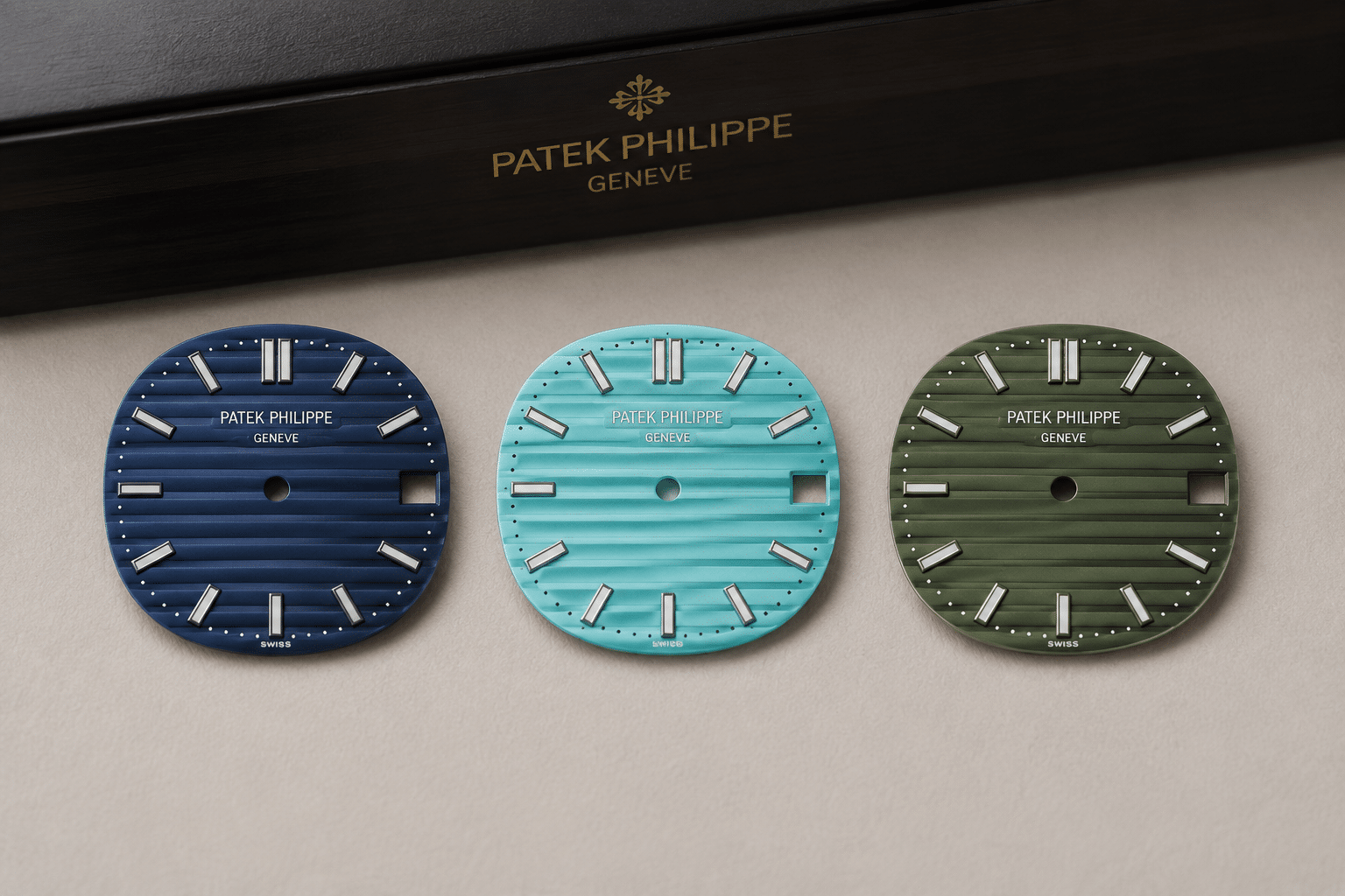
The Exact Tiffany Blue Shade Is Difficult Because It Sits Between Blue, Green, and Turquoise
Tiffany Blue dial accuracy is difficult because the color lives in a narrow zone. It is not simply light blue, not pure turquoise, and not mint green. A convincing turquoise Nautilus replica needs the right blue-green balance, controlled saturation, enough brightness to feel fresh, and enough depth to avoid looking like a flat painted dial. Small errors are obvious because the color is the whole reason the watch exists.
This is where many buyers make the wrong judgment. They see a bright dial and assume it is close because it looks exciting. But attractive is not the same as accurate. A replica can photograph beautifully and still miss the specific character of the 5711/1A-018. On this model, “close enough” is harder to define because the eye notices shade errors faster than it notices many small case or bracelet details.
The most sensible way to evaluate the dial is to separate hue, saturation, and brightness instead of asking whether the watch is simply “Tiffany Blue.” That phrase sounds precise, but in replica buying it often hides the real problem. One batch may lean green, another may look too pale, and another may be over-saturated to the point that it feels more like a fashion color than a refined Nautilus dial.
Hue: When the Dial Leans Too Green or Too Blue
Hue is the first trap. If the dial leans too green, the watch can start to look minty, almost like a different color concept rather than the intended Tiffany Blue effect. That green shift may seem minor in a single photo, but on the wrist it changes the personality of the watch. Instead of crisp turquoise, the dial can feel softer, warmer, and less connected to the famous reference.
If the dial leans too blue, the opposite problem appears. It may become a generic bright blue Nautilus rather than a specific 5711/1A-018 replica. That can still be attractive, but it weakens the point of choosing this version. Buyers paying attention to this model are not looking for any blue dial; they are looking for a rare dial color with a very particular blue-green tension.
Saturation: When the Color Looks Too Loud
Saturation is where many Tiffany Blue replicas become risky. A dial that is too vivid can look exciting in seller photos because strong color catches the eye quickly. The problem appears in normal wear, where the watch may look loud, glossy, or slightly toy-like. The Nautilus case is refined and relatively slim, so an over-saturated dial can fight against the design rather than support it.
This matters more on the Tiffany Blue version than on darker Nautilus dials. Dark blue and gray can absorb small finishing errors. A bright turquoise surface exposes them. If the color is pushed too hard, the horizontal grooves, printed markers, and date window can start to look less integrated, as if the dial color was chosen for impact rather than balance.
Brightness: When the Dial Turns Too Pale or Washed Out
Brightness creates the opposite risk. A dial that is too pale may look clean in a controlled photo but lose the crisp visual punch buyers expect from this model. The hands, applied markers, printed logo, and date window need enough contrast against the turquoise background. If the color is too washed out, the dial can feel weak rather than rare.
This is a common misunderstanding with pastel turquoise. Softer is not always more accurate. The Tiffany Blue effect needs freshness, but it also needs presence. A pale dial may avoid the neon problem, yet still fail because the watch no longer has the sharp, unmistakable look that made the reference famous in the first place.
Color Details to Compare Before You Decide
Before deciding on a Tiffany Blue 5711 replica, compare the dial under neutral light rather than relying on one attractive seller image. Look for side-by-side reference photos, but treat edited online images carefully because contrast and white balance can exaggerate the color. The most useful comparison is not the brightest photo; it is whether the dial stays reasonably consistent across several angles without turning obviously green, pale, or electric blue.
Also pay attention to the surface finish. The Nautilus dial should not look like a single flat block of color. The horizontal grooves need to create some visual structure, and the printing should sit cleanly against the dial rather than looking swallowed by the color. If the shade is close but the dial looks flat, the watch may still feel less convincing in real use.
Before making a decision, buyers should review real QC photos where available, including dial printing, hand alignment, bezel position, datewheel centering, bracelet fit, clasp engraving, case thickness, and overall finishing. Factory labels and stock photos alone are not enough for a reliable judgment.
Common Tiffany Blue 5711 Replica Dial Problems Buyers Should Recognize
The most common Tiffany Blue 5711 replica dial problems are not always printing mistakes or obvious manufacturing defects. Often, the dial is neatly made but the color is wrong. That distinction matters. A buyer can receive a watch with clean logo printing, aligned markers, and a tidy date window, yet still have a Nautilus replica dial color that fails because the turquoise tone does not match the character of the model.
For this reference, the dial should be judged as a complete visual field. Color interacts with the horizontal grooves, marker brightness, hand contrast, date window, and printed text. A shade that looks acceptable in isolation may look less convincing once those details sit on top of it. This is why the question “does the dial look fake?” is often really a question about color depth and balance, not just basic dial quality.
Too Green: The Mint Dial Problem
A too-green dial is one of the easiest mistakes to notice after the first excitement fades. It can make the watch feel like a mint fashion dial rather than the intended Tiffany Blue Nautilus. The problem is not that green is unattractive. The problem is that it changes the identity of the watch. The 5711/1A-018 replica depends on a sharper turquoise impression, not a soft green pastel tone.
This issue becomes more obvious against the steel case and bracelet. Stainless steel gives the watch a cool frame. If the dial turns too warm or minty, the case and dial stop feeling naturally matched. Buyers should be cautious when a dial looks pleasant but not specific. A nice color is not enough on a replica where the exact color is the main feature.
Too Pale: The Washed-Out Pastel Problem
A too-pale dial usually looks less offensive than a neon dial, but it can be just as disappointing. The watch may appear clean in photos, yet the hands, indices, logo printing, and date window lose definition. On a bright dial, contrast is not a minor detail. It controls whether the watch feels crisp or weak on the wrist.
The washed-out pastel problem often shows up as a lack of authority. The dial has the general idea of Tiffany Blue but not enough visual strength, and against a Nautilus 5980 chronograph replica reference, that weakness becomes easier to judge through color density and finishing expectations. For buyers who want the famous 5711/1A-018 look, this can feel unsatisfying because the watch loses the punch that made the model desirable in the first place.
Too Saturated: The Neon Turquoise Problem
A too-saturated dial is the opposite mistake. It grabs attention quickly, which can make it seem appealing in a product photo, but it often looks less refined in daily wear. Strong turquoise can push the watch toward a novelty look, especially if the dial lacquer appears glossy or the camera exposure makes the color glow unnaturally.
This is the version that may impress buyers for the first five seconds and bother them later. The Nautilus design is thin, broad, and controlled. If the color becomes too loud, it overwhelms the case shape and bracelet finishing. A Tiffany Blue replica should have impact, but it should not look like the color was turned up simply to make the photo sell faster.
Too Flat: When the Dial Has Color but No Depth
A flat dial can be harder to spot than a wrong hue, but it matters in practice. The Nautilus dial relies on horizontal grooves and subtle surface behavior to keep the face from looking like a painted plate. If the turquoise color sits evenly across the dial with no depth, the watch may look clean but lifeless. This is one reason a replica can have the “right” general shade and still feel unconvincing.
Depth also affects how the printed markers and logo appear. On a strong dial, the printing feels integrated with the texture and layout. On a flat dial, the text can look like it is sitting on top of a colored background rather than belonging to the dial. For buyers comparing QC photos, this is worth checking carefully: a dial that is merely bright is not automatically a good Tiffany Blue dial.
Lighting and QC Photos Can Make the Same Dial Look Like Different Watches
QC photos are useful for a Tiffany Blue 5711 replica, but they are a poor place to make a final color judgment. This dial sits in a narrow color range, so small changes in white balance, exposure, and camera angle can make the same watch look cleaner, greener, bluer, or flatter than it really is. If a seller shows only one flattering image, the buyer is not seeing enough to judge the replica dial color in lighting with confidence.
The safer approach is to compare the watch under neutral indoor light and indirect daylight, then check whether the shade stays consistent. Warm indoor light can pull the dial toward green. Cooler light can make it look more blue and sometimes less saturated. Strong contrast edits, filters, or overexposure can hide problems by making the dial look brighter and more attractive than it appears on the wrist.
Why White Balance Matters More on Turquoise Than on Dark Blue
White balance is a bigger issue here because turquoise sits in a sensitive middle zone. On a dark blue dial, the camera can shift the tone a little without changing the overall impression very much. On a Tiffany Blue 5711 QC photo, the same processing can move the dial far enough that the buyer starts asking the wrong question. A watch can look acceptable in one shot and noticeably off in another simply because the camera tried to “correct” the color.
That is why a single QC photo color looks different problem is so common on this model. A dial that seems balanced in one image may look green in another, not because the watch changed, but because the phone or camera interpreted the color differently. For this reference, white balance is not a technical footnote. It is part of the buying decision.
How Backgrounds and Skin Tone Affect Color Perception
The same dial also changes character depending on what sits around it. A white tray can make the color feel cleaner and more pastel. Dark gloves can make it appear brighter by contrast. A warm wooden desk can push the tone toward green. Even a wrist shot changes the impression, because skin tone and surrounding clothing influence how the eye reads the dial.
This matters because buyers often compare seller photos without noticing how much the setup is helping or hurting the watch. A Tiffany Blue 5711 replica shown on a neutral background is not the same thing as one shot against a warm desk lamp or under studio-style editing. If the lighting makes it look green, that may be a photo condition problem, or it may be revealing a real shade issue. The only honest way to tell is to compare multiple setups.
Why One Photo Is Not Enough for This Model
One front-facing photo can make a weak watch look surprisingly good. That is especially true with a bright dial, because the eye goes straight to the color and ignores small problems in texture or layout. The buyer should not decide from a single attractive angle, since dial color changes by angle are part of the normal behavior of this reference and can hide or exaggerate flaws.
Multiple images are more useful because they show consistency. If the watch looks balanced from the front, but turns oddly green from a slight tilt or becomes washed out in indirect light, that is information worth paying attention to. A replica can look convincing in one carefully chosen shot and much less convincing in the next. That is why the question is not whether the QC photo looks good, but whether the dial stays believable across several views.
QC Photos to Request
For this model, the most useful QC set is simple: a front dial shot under neutral indoor lighting, an indirect daylight photo, a slight angle shot that shows dial texture, a side profile, a bracelet or clasp view, and a date-window close-up. Those images do not prove accuracy or authenticity, but they do help the buyer judge whether the watch is stable in different conditions or only looks good in one curated frame.
Verification Note: When possible, buyers should review real watch photos, dial details, clasp finishing, caseback structure, date alignment, and movement information before making a decision. Stock images and factory labels alone are not enough for a reliable judgment.
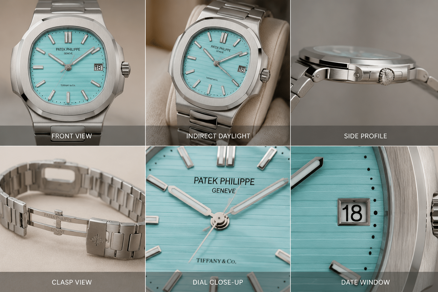
Case, Bracelet, and Dial Layout Still Matter, but Color Dominates the Decision
The Nautilus 5711 replica case and bracelet still matter, because the model depends on a thin, broad, integrated look that is easy to get wrong in a way you feel immediately on the wrist. A case that is too thick, a bezel that looks too wide, or a bracelet that does not flow correctly can weaken the watch even before the dial is judged. But on the Tiffany Blue version, none of that rescues a dial that misses the color badly. If the shade is wrong, the eye goes there first.
That is the key balance on this model: case and bracelet are confidence checks, not the final answer. A watch can have decent brushing, acceptable clasp behavior, and a respectable overall profile, yet still feel off if the color is not right. For a Tiffany Blue 5711 replica, the buyer should separate color versus build quality instead of assuming one can cover for the other.
The Nautilus Case Leaves Little Room to Hide Proportion Errors
The 5711 design is visually simple in a way that helps and hurts replica quality. There is not much dial clutter to distract from mistakes, and the slim sports-watch silhouette makes case shape easy to notice. If the bezel shape is off, the case profile looks too heavy, or the integrated lines do not sit naturally, the watch loses part of the Nautilus character right away.
That said, the case on this model is still a supporting detail compared with the dial color. A slightly imperfect case can sometimes look acceptable in ordinary use, but a poor Tiffany Blue tone cannot be ignored because it defines the watch. In practice, the case matters most as a credibility check after the dial has already passed the first test.
Bracelet Finish Affects Whether the Watch Feels Convincing
The 5711 bracelet is part of the identity of the watch, not just the way it stays on the wrist. Buyers should pay attention to integrated bracelet fit, brushing direction, polished edge quality, clasp feel, and how freely the bracelet drapes. If those elements feel stiff or overly sharp, the watch can seem less refined even if the dial itself is decent.
Replica versions can vary here more than buyers expect. Some feel better finished, some feel heavier or looser, and some reveal lower quality through the first few links and clasp action. Still, for this colorway, bracelet quality should be treated as the second question. The first question remains whether the turquoise tone is believable.
Dial Layout Problems Become More Noticeable on a Bright Dial
A bright dial gives the eyes fewer places to hide. Marker alignment, date window placement, and printed text all stand out more against turquoise than they do on darker colors. Even small spacing issues become easier to notice because the background is so open and clean. A dial that would look acceptable on a blue or gray variant may feel more exposed here.
This is why the buyer should not look only at the color and ignore the layout. On a Tiffany Blue Nautilus replica, the overall impression comes from the combination of shade, print, and placement. If the dial color is strong but the markers look uneven or the date window sits awkwardly, the watch stops feeling as convincing as it first appeared.
The Genuine Model’s Rarity Creates a Social Believability Problem
The Tiffany Blue Nautilus 5711 replica is not just a technical imitation problem. It is also a social believability problem, because the genuine reference is so rare and so widely discussed that the watch itself becomes a signal before anyone inspects the details. In practice, that means the wearer is choosing a high-profile replica watch whether they want that attention or not.
This is why the model is better understood as a bold visual choice than a quiet daily-wear option. Even a strong replica can draw questions simply because the color and reference are recognizable. The issue is not only “does it look good?” but “does this watch make sense on the wrist in normal life?”
This social point should not be confused with authentication. A convincing wrist presence is not proof that a watch is genuine, and a replica should not be used to create that impression. The safest use of factory, movement, and QC information is to understand quality and avoid overpaying or misunderstanding risk, not to misrepresent a replica watch as an authentic luxury watch.
Why Ultra-Rare References Attract More Questions
Rare colorways do not stay rare in people’s memory once they circulate heavily online. The Tiffany Blue 5711 became recognizable far beyond the usual collector circle because it was photographed, discussed, and reposted constantly. That means even casual watch fans may recognize the reference and react to it faster than they would to a standard Nautilus dial.
For the buyer, that changes the wearing experience. A rare Nautilus replica can create more questions than compliments, especially if the person looking has seen the genuine model in articles, auctions, or social media. The watch is not subtle by design, and the color makes sure of that.
Visual Impact Versus Quiet Daily Wear
This is the type of replica that makes sense when the buyer wants visual impact first. The turquoise dial is the main event, and that is exactly why it is appealing. But the same strength makes it less suitable for someone who wants a watch that fades into the background. A bright, rare reference does not wear like a standard steel sports watch, even if the case and bracelet are decent.
For daily wear, subtlety matters as much as accuracy. If the goal is low attention and easy plausibility, a more familiar Nautilus color is usually the safer path. If the goal is to enjoy the look of the reference itself, then the Tiffany Blue model can be satisfying, but only if the buyer accepts that it will never behave like an understated watch.
When the Watch Draws Attention Before the Details Are Judged
The biggest social issue is that the color itself can trigger attention before anyone studies the case, bracelet, or movement. That is different from a more common dial, where people may notice the watch as a whole without immediately fixating on it. With Tiffany Blue, the eye goes straight to the shade, and that makes every other detail feel secondary.
That is why the replica’s plausibility depends on more than technical closeness. A watch that looks strong in isolation may still feel less believable because it is such a recognizable version of a rare Patek Philippe reference. If the wearer wants a piece that quietly disappears into everyday use, this is not the most natural choice.
Movement Choice Affects Ownership More Than the Dial Photo Usually Shows
On a Tiffany Blue Nautilus 5711 replica, the dial attracts attention first, but the movement still shapes the ownership experience. Buyers often focus so heavily on the turquoise color that they overlook how the movement route may affect thickness, hand-winding feel, rotor noise, and long-term serviceability. A watch can look convincing in QC photos and still be a less satisfying daily wearer if the movement choice is awkward or difficult to live with.
This is where the replica buyer has to think beyond appearance. A movement that is visually closer to the genuine layout may not be the most practical choice if it introduces noise, inconsistent power reserve, or added maintenance risk. For a model already defined by color sensitivity, it is worth checking whether the movement is being chosen for real performance or only for factory marketing.
Movement descriptions in the replica market should be checked carefully because they may refer to layout, decoration, clone architecture, or seller terminology rather than an official brand-manufactured caliber. Unless a seller provides clear and verifiable evidence, a replica-market movement claim should not be read as a claim that the watch uses a genuine Patek Philippe movement or any official luxury-brand caliber.
Visual Similarity and Practical Reliability Are Not the Same Thing
Some movement choices are selected because they help the watch look more like the genuine reference through the caseback or by matching dimensions more closely. That can be useful, but it does not automatically mean the movement will be the easiest to own. A buyer should ask whether the movement supports stable daily use, not just whether it sounds like the more advanced option.
In practice, a simpler movement can sometimes be the smarter choice if it is easier to service and less likely to create issues over time. That tradeoff matters more on a watch like this than many first-time buyers expect. The dial may be the headline feature, but the movement is what decides whether the watch remains enjoyable after the first week.
Thickness and Rotor Behavior Can Matter on a Slim Nautilus Case
The Nautilus profile is slim enough that movement thickness and rotor behavior are not abstract technical details. If the movement makes the case sit too high, the watch starts to lose the elegant shape that the 5711 is known for. If the rotor is noisy or feels loose, the watch can seem less refined even when the exterior finish is respectable.
That does not mean every buyer needs the same movement. It means the movement should be judged against the intended use, especially when a Patek Philippe Nautilus super clone is being evaluated beyond surface finishing or dial accuracy. For a display piece or occasional wear, a more decorative or model-correct setup may be fine. For frequent wear, smoother operation and easier maintenance usually matter more than hidden technical bragging rights.
What Buyers Should Ask Before Paying for a Movement Upgrade
Before paying more for a movement upgrade, ask whether the upgrade improves what you will actually notice. Does it reduce thickness, improve winding feel, lower noise, or simply change how the movement looks through the back? If the answer is mostly cosmetic, the premium may not be worth it for this model.
This is especially important for the Tiffany Blue 5711 replica because the buyer is already paying for a difficult dial. Spending extra on a movement that adds little daily benefit can distract from the real quality issue, which is whether the watch wears comfortably and keeps working smoothly. On CleanVSFactory, that distinction is treated as practical buyer logic, not spec-sheet chasing.
Movement descriptions in the replica market should be read as configuration references, not as official brand-caliber claims unless there is clear, verifiable evidence. Buyers should distinguish between movement layout, decoration, reliability expectation, and actual serviceability.
Factory and Version Claims Should Be Treated Carefully on This Color
For a Tiffany Blue 5711 replica, the factory name is useful, but it is not the whole answer. This is one of the few Nautilus variants where the dial shade can matter more than the usual factory talking points, because the watch lives or dies by whether the color feels right in normal light.
A strong 5711 replica factory can still miss Tiffany Blue if the batch uses a slightly different dial supplier, a different print run, or a revised finish that shifts the tone. That is why version-specific evaluation matters more here than broad loyalty to one label. The real question is not just “which factory is better,” but “which version has better color in the photos I can actually verify?”
Factory names in the replica watch market are buyer-facing references, not official affiliations with Patek Philippe or any other luxury brand. They can help buyers organize discussions about versions, but they should not be treated as automatic proof of quality, authenticity, inspection passability, or equal performance across every model.
Why a Strong 5711 Factory May Still Miss Tiffany Blue
Good case shape, bracelet finishing, and overall assembly do not automatically produce the right dial color. A factory can get the bezel, profile, and bracelet flow reasonably close while still ending up with a Tiffany Blue tone that looks too green, too pale, or too saturated. On this watch, the dial is the feature people notice first, so a small color error becomes more important than a slightly better clasp or sharper edge finishing.
That is why buyers should not assume that a proven Nautilus factory will naturally handle this color well. Tiffany Blue is less forgiving than standard blue, because there is no easy “close enough” effect once the shade starts drifting. If the tone is off, the watch stops reading as the right watch, even if the rest of the build is solid.
Batch Variation Matters More Than Forum Reputation
Older reviews are easy to overtrust, but they often describe a specific batch, not the current one. A Tiffany Blue 5711 replica can change noticeably when the dial supplier changes or when a factory updates the finishing process. What looked convincing six months ago may not reflect the watch being sold now.
That is why factory reputation becomes less useful than current watch photos. A factory may have a good name for the model, but that does not guarantee the current batch still has the same color balance. For a turquoise Nautilus replica, batch variation is not a minor detail; it is often the main detail.
Version Labels Need Photo Evidence
Version labels are only useful if they are backed by clear QC photos. A seller can say the watch is a new version, an improved version, or a corrected batch, but those words mean little unless the dial shade, printing, and overall finish can be checked directly. On this color, the buyer should judge what is visible, not what is advertised.
That means version claims should be treated as a starting point, not a conclusion. If the photos do not show the dial under multiple conditions, the factory name and version label are not enough to make a confident decision. For this model, actual color evidence matters more than any marketing description.
Version Details to Confirm
Before accepting a Tiffany Blue 5711 replica version claim, check the dial shade under multiple lights, not just one flattering front shot. Confirm whether the case profile looks correct, whether the bracelet finish is consistent, whether the date aligns cleanly, and whether the movement-route description matches the version being offered. None of these details should be taken on faith, and none of them should be assumed from the factory label alone.
In practice, we usually treat the version as a photo comparison exercise, not a brand-name shortcut. That is the safest way to avoid buying a watch that sounds improved on paper but still misses the color where it matters most.
Policy, Water-Resistance, and After-Sales Claims Need Separate Verification
Buying decisions should not rely only on how the Tiffany Blue dial looks. Buyers should also confirm return terms, repair options, shipping expectations, water-resistance testing, and after-sales support directly with the seller before ordering. These are seller-policy questions, not conclusions that can be assumed from a factory label, model name, or product photo.
Water resistance is especially easy to misunderstand. A Nautilus-style case and bracelet do not prove that a replica watch has been pressure tested or can be treated like a genuine luxury sports watch serviced through official channels. Unless the specific watch has been tested and the seller’s policy is clearly confirmed, water exposure should be approached cautiously.
Pricing also needs context. Replica watch prices can vary by factory label, version, movement configuration, finishing quality, seller channel, availability, and after-sales support. A higher price is only meaningful if it is tied to visible details and clear terms, while a lower price may increase risk if the dial, movement description, or seller communication cannot be verified.
Price and Value Depend on Risk Tolerance, Not Just Rarity Appeal
The Tiffany Blue Nautilus replica price question is really a value question about risk. This colorway is desirable because it is rare and instantly recognizable, but that also means the buyer is paying into a higher-risk visual category where shade accuracy matters more and mistakes are easier to spot. A higher ask only makes sense if it buys better dial execution, stronger QC consistency, or cleaner overall finishing.
Rarity appeal alone does not create value. A more expensive 5711/1A-018 replica can still be a weak purchase if the dial looks wrong in the photos. On the other hand, a cheaper one is not automatically better value if it saves money but immediately looks too green, too pale, or too loud on the wrist.
When a Higher Price Might Be Justified
A higher price is easier to defend when the dial shade is closer to the target tone and stays more consistent across different lighting. Cleaner printing, better bracelet finishing, stronger case execution, and better QC consistency also matter because they reduce the chance of ending up with a watch that looks unstable from one angle to the next.
For this model, the price premium should be tied to visible quality, not hype. If the seller can show better dial color and cleaner execution in actual photos, the extra cost may be rational. If the photos do not prove that improvement, the premium is mostly paying for the name of the version.
When a Cheaper Tiffany Blue Version Becomes False Economy
A cheaper Tiffany Blue version can become false economy the moment the dial looks obviously off. If the color is too green, too pale, or too saturated, the watch loses the main thing that makes it attractive in the first place. At that point, saving money does not matter much because the replica no longer delivers the visual effect the buyer wanted.
This is especially true on a high-visibility watch like the 5711/1A-018 replica. A small discount is not worth much if the color flaw is obvious every time the watch hits daylight. Buyers sometimes focus on the lower price and forget that the whole point of this model is the dial.
Why Rarity Appeal Can Distort Buyer Judgment
Online hype can make buyers overrate a version just because it is associated with a rare, famous reference. That is a bad habit on this watch. A Tiffany Blue Nautilus replica can sound special even when the actual dial execution is only average, and the rarity story can distract from the quality of the watch in hand.
The cleaner way to judge value is simple: does this specific watch show a believable color, in believable light, with believable finishing? If the answer is no, the rarity story is doing too much work. The buyer is then paying for excitement rather than for a well-executed replica.
Should You Choose Tiffany Blue, Standard Blue, or Green Nautilus Instead?
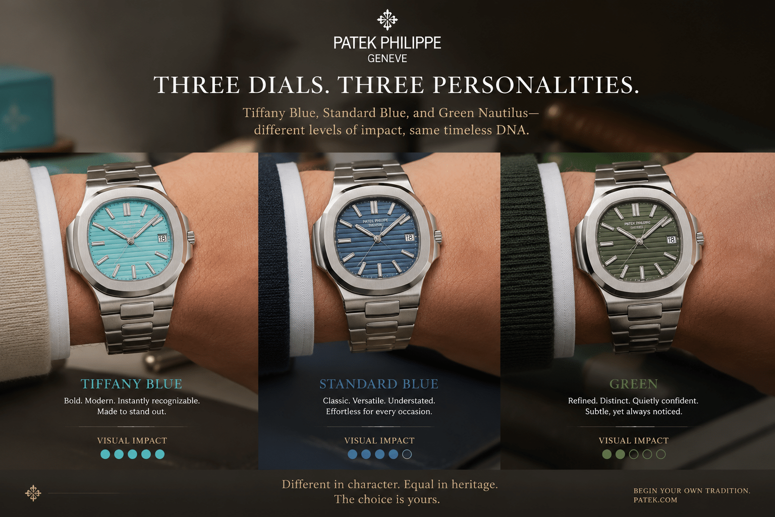
If the goal is a bold replica watch with maximum visual impact, Tiffany Blue is the obvious choice. If the goal is a more believable daily-wear Nautilus replica, standard blue or green is usually the safer path because those colors are easier to live with and less dependent on perfect shade matching. This is not about one color being universally better; it is about matching the watch to the buyer’s tolerance for attention and color risk.
For most buyers, the Tiffany Blue 5711 replica is the least forgiving option. It is the most exciting on paper, but also the easiest to second-guess once the watch is on the wrist. Standard blue is more familiar and usually easier to wear without attracting as much scrutiny, while green gives the buyer something distinctive without carrying quite the same rarity-driven pressure.
Choose Tiffany Blue If You Want Maximum Visual Impact
Choose Tiffany Blue if you understand that the watch is meant to be noticed. This color works best for buyers who are comfortable with attention and who accept that a turquoise dial has a narrower accuracy window than more traditional Nautilus colors. It is a deliberate high-visibility choice, not a quiet everyday one.
If the buyer is mainly chasing the feel of owning a striking replica rather than the most restrained look, Tiffany Blue makes sense. If the buyer wants low stress, low debate, and fewer questions about the dial, it is usually the wrong starting point.
Choose Standard Blue If You Want the Classic Nautilus Look
Standard blue is usually the most balanced option. It is more familiar to most people, more closely tied to the classic Nautilus image, and less socially unusual than Tiffany Blue. That makes it a more believable choice for everyday wear, especially for buyers who want the watch to blend in rather than announce itself.
It also reduces the risk that a small color mismatch will dominate the whole watch. With standard blue, the eye is less likely to obsess over minor shade shifts because the reference point is broader and more familiar. For many buyers, that alone makes it the smarter replica choice.
Choose Green If You Want Color Without the Same Tiffany Blue Rarity Problem
Green is still distinctive, but it does not carry quite the same social pressure as the Tiffany Blue 5711/1A-018 replica. It gives the watch color and personality without tying the whole experience to one ultra-famous shade that people may feel inclined to compare closely.
That makes green a practical middle ground. It still gives the buyer a more expressive Nautilus, but it is usually less exposed to the “is the shade right?” problem that follows Tiffany Blue around. For buyers who want color without the full rarity drama, green is often the more rational choice.
Final Buyer Decision Rule
Choose Tiffany Blue if you want impact and accept the QC risk. Choose standard blue or green if you want more believable daily wear and less dependence on perfect shade matching. If small color inaccuracies will bother you every time you look at the watch, skip Tiffany Blue and buy the safer dial instead.
That is the clean decision rule for this model: impact first, subtlety second, and tolerance for color error always. For a Tiffany Blue Nautilus 5711 replica, the dial is the whole story, so the color choice should be made with realistic expectations rather than hype.
A replica watch should be evaluated with realistic ownership expectations. Even a strong super clone can have limits in water resistance, long-term movement stability, servicing convenience, and close inspection compared with a genuine reference.
References
[1] United States Patent and Trademark Office, “Counterfeit Goods Basics,” public educational resource on counterfeit goods, trademarks, and consumer-confusion issues, available at USPTO Counterfeit Goods Basics.
Disclosure: This article is for general educational and comparison purposes only. Replica watches are not genuine products from the original luxury brands, and brand names are used only to identify reference designs or comparison topics. Factory names, movement descriptions, prices, availability, QC details, seller policies, and version information can change, so readers should verify important details with the seller before making a purchase decision. Replica watches should not be represented, resold, or used as genuine watches.