
The blue Royal Oak replica is attractive because it delivers the strongest, most recognizable version of the watch’s design, but it is also the easiest dial color to misjudge, especially when the dial impression is separated from Royal Oak bracelet integration and the way the case, bezel, and links control the overall visual balance. Small changes in saturation, lighting, camera exposure, or tapisserie depth can make the same watch look rich and controlled in one photo, then too flat, too dark, too purple, or too bright in another. That makes blue less forgiving than black, silver, or grey.
This article helps buyers judge the actual dial in front of them instead of relying only on a factory name or one polished seller image. The practical decision is whether the visual reward of blue is worth the extra QC effort, and how to check texture, reflection, color behavior, printing, markers, and date alignment before choosing a specific unit.
| Buyer Question | What To Check | Practical Judgment |
|---|---|---|
| Is blue worth choosing? | Shade control across natural, indoor, and direct light | Choose it for impact, not for the easiest QC process |
| Does the dial look believable? | Visible tapisserie depth, crisp channels, controlled reflection | Flat texture or neon gloss is a warning sign |
| Can factory name decide it? | Exact reference, batch, and QC photos | APSF, ZF, or others still need unit-by-unit checking |
| Are neutral dials safer? | Black, silver, or grey behavior under changing light | Better for buyers who want fewer shade surprises |
| Which QC photos matter most? | Straight, angled, close-up, natural-light, and wrist-style shots | One ideal photo cannot confirm the blue is acceptable |
| What flaws are objective? | Crooked markers, weak printing, dust, date alignment | Reject clear assembly flaws before debating color tone |
Quick Questions Before You Read
Q: Is a blue Royal Oak replica harder to buy than black or grey?
Yes. Blue changes more with lighting and camera settings, so it needs more careful QC review.
Q: Should I choose by factory name first?
No. Factory reputation helps, but the exact dial, batch, and photos matter more for blue.
Q: What is the first detail to inspect?
Check tapisserie depth and reflection control before judging whether the shade feels acceptable.
Q: Are seller photos enough to judge the blue color?
Not usually. Ask for multiple angles and natural-light photos to see how the dial behaves.
Editorial Perspective: A blue Royal Oak replica should be judged as a model-specific visual and ownership decision, not as a simple “best factory” question. At cleanvsfactory.com, the factory label is treated as one useful signal, but the more useful comparison is whether the exact reference, dial batch, tapisserie depth, movement route, case thickness, bracelet feel, and QC photo behavior match the buyer’s intended use. A watch that looks excellent in one seller photo may still be less suitable for daily wear if the dial is too reflective, the movement adds thickness, or the blue only works under controlled lighting.
Evidence Boundary: This guide discusses imitation watches and buyer evaluation, not authorized Audemars Piguet products. Official brand information can help a buyer understand the design language and reference family being imitated, but it should not be treated as proof that a replica has the same dial construction, movement, finishing, water resistance, serviceability, or legal status. For replica-specific claims, the more defensible evidence is the exact unit’s QC photos, current seller disclosure, movement photos where available, and the buyer’s own tolerance for visible compromise.
Brand Reference Boundary: Audemars Piguet and Royal Oak are used here to identify the genuine reference design being discussed. A replica Royal Oak is not a genuine Audemars Piguet watch, is not produced or approved by the original brand, and should not be represented as authentic. Any comparison to a genuine reference is useful only for understanding design cues such as dial layout, case shape, tapisserie texture, and visual expectations.
Why the Blue Dial Royal Oak Replica Creates More Buyer Confusion Than Other Colors
The AP Royal Oak blue dial replica is harder to judge because blue is not a fixed visual target. It depends on how the dial reacts to light, how much depth the pattern creates, and how the camera exposes the surface. A black dial can be slightly too warm or too cool and still look acceptable on the wrist. A silver or grey dial can drift a little without immediately looking wrong. Blue is less forgiving. If the tone is too bright, it starts to look toy-like. If it is too dark, the watch loses the energy buyers expect from a Royal Oak. If it is too flat, the whole replica AP Royal Oak feels less expensive even when the case and bracelet are strong.
This is why the blue dial Royal Oak replica creates more buyer confusion than the safer dial colors. The buyer is not only asking, “Do I like blue?” The better question is, “Can this specific blue tapisserie dial behave convincingly across normal lighting?” That is a much harder standard. A dial that looks rich in one seller photo may look over-saturated in daylight, nearly black indoors, or slightly purple under warm light. None of those changes automatically means the watch is poor, but they make blue a higher-risk choice for buyers who expect the same controlled look they have seen in polished AP photography.
Blue Is Popular Because It Defines the Royal Oak Look
Blue has become the emotional default for many Royal Oak buyers. It is the color most strongly tied to the steel Royal Oak image: sharp case, integrated bracelet, octagonal bezel, and that deep blue patterned dial sitting at the center. Even buyers who are new to Audemars Piguet often recognize the blue version first. For a replica watch buyer, that creates a clear attraction. The blue dial delivers the most recognizable Royal Oak impression at a glance.
That popularity is also the trap. Because the blue Royal Oak is so familiar, buyers carry a stronger mental image of what it “should” look like. They expect richness, depth, and a controlled shift from dark navy to brighter blue depending on angle. A neutral dial does not carry the same emotional burden. With blue, the buyer is usually chasing the most iconic version, which means the tolerance for visual compromise becomes much lower.
Popularity Raises the Standard for Visual Accuracy
The more famous the dial color, the more critical buyers become. Genuine AP blue dial photos are usually shot under ideal lighting, with carefully managed reflections and exposure. Those images make the dial look deep, clean, and dynamic. A replica is then judged against that idealized image, not against how real watches look under kitchen lights, office lighting, car windows, or overcast daylight.
This is where many buyers misjudge the blue dial risk. They look for one perfect shade in a photo, but the Royal Oak blue dial is really about behavior. Does it stay within a believable range? Does it shift without becoming loud? Does it hold depth without turning black? A blue dial that only looks good in one angle is not the same as a blue dial that works in daily wear.
At Clean VS Factory, we usually treat blue Royal Oak evaluation as a visual-risk decision, not just a factory-name decision. A strong factory version can still have a dial batch that looks too saturated or too muted for a particular buyer’s expectations. With blue, the exact watch matters.
A more traceable comparison starts by separating what can be seen from what is only claimed. The buyer can inspect dial color range, tapisserie definition, marker placement, bezel screw alignment, bracelet fit, clasp engraving, and date centering from real photos. The buyer cannot prove official production source, brand approval, or long-term performance from a factory label alone. Keeping those categories separate makes the blue dial decision more realistic and less dependent on hype.
Black, Silver, and Grey Hide More Small Differences
Black, silver, and grey Royal Oak dials are generally safer because they hide more small color differences. Black is forgiving because most buyers focus on texture, printing, and contrast rather than whether the shade is exactly right. Silver and grey shift with light too, but the shift feels more natural and less emotionally charged. A grey dial that looks slightly warmer in one photo rarely causes the same concern as a blue dial that suddenly looks electric or purple.
This does not mean neutral dials are automatically better. A black dial can hide weak texture. A silver dial can look washed out. A grey dial can lose contrast if the printing and markers are not crisp. But the margin for error is wider. The blue dial has a higher reward because it gives the strongest Royal Oak identity, yet it also creates the highest chance of buyer disappointment if the shade, depth, or light response does not match expectations.
The practical judgment is simple: blue is the most desirable Royal Oak dial color, but it is not the easiest one to buy confidently. If a buyer wants the iconic look and accepts that the dial will change dramatically in photos and real light, blue makes sense. If the buyer wants lower anxiety, easier evaluation, and fewer color surprises, black, silver, or grey is usually the more rational choice.
The Blue Color-Matching Problem: Shade, Temperature, and Saturation
The Royal Oak blue dial color is difficult because it is not one shade. A convincing AP replica dial color needs to sit inside a believable range: rich but not neon, dark but not dead, metallic but not glittery, dynamic but not cartoonish. The problem is that a small shift in color temperature or saturation can change the whole character of the watch. A little too much brightness and the dial looks cheaper. A little too much darkness and the Royal Oak loses the blue-dial impact that made the buyer choose it in the first place.
This is also why simple comments like “the blue is wrong” are not very helpful unless the buyer explains how it is wrong. Is it too royal blue? Too purple? Too grey? Too flat under soft light? Too bright under direct light? Each issue points to a different kind of visual compromise. Some are acceptable in daily wear. Others will bother the owner every time the watch catches sunlight.
When Blue Becomes Too Bright
An over-saturated dial is one of the most common reasons a blue Royal Oak replica disappoints in person. In seller photos, a vivid blue dial can look attractive because it jumps off the screen. The watch appears fresh, sharp, and easy to photograph. On the wrist, the same dial can become too loud. Instead of a controlled navy-to-blue shift, it reads as bright royal blue or even electric blue.
This matters because the Royal Oak case already has a lot of visual activity: brushed flats, polished bevels, bezel screws, bracelet facets, and a patterned dial. If the blue is too strong, the watch stops looking architectural and starts looking decorative. For a blue Royal Oak replica, that is a serious tradeoff. The watch may look impressive in a listing, but less convincing as a daily-wear object.
A bright dial is not always a reject. Some lighting will naturally make blue look more alive. The warning sign is consistency: if the dial looks aggressively bright in multiple angles and does not settle into a darker navy range, the buyer should assume that the watch will wear louder than expected.
When Blue Becomes Too Dark or Flat
The opposite problem is a blue dial that looks safe because it is dark, but then fails to show depth. A very dark blue can hide color mismatch in photos, which is why it may seem like the conservative choice during QC. The risk is that it can become visually dead indoors. Instead of a blue tapisserie dial with movement and shadow, the watch reads almost black, with only a hint of blue under strong light.
This is especially frustrating for buyers who chose blue for its presence. A flat blue dial may look clean in a straight-on photo, but it does not deliver the expected Royal Oak character on wrist. The issue is not simply that the dial is dark. Genuine blue dials can also appear very dark in some environments. The issue is whether the dial wakes up when the angle changes. If it stays dull across different lighting, the problem is not subtlety; it is lack of energy.
Why “Correct Blue” Is a Range, Not a Single Shade
There is no useful way to judge a Royal Oak blue dial from one frozen color sample. Genuine AP blue dials vary by reference, production period, photography, and lighting conditions. A replica dial should not be expected to match one internet photo perfectly in every environment. That standard will make almost every blue dial look wrong at some point.
The better standard is range control. A good blue should move between darker and brighter tones without becoming neon, purple, muddy, or lifeless. It should look believable in neutral light, acceptable under indoor light, and not exaggerated in direct light. If the dial only looks good under one specific condition, the buyer is taking more risk than the photo suggests.
This is the non-obvious part: the safest blue is not always the most beautiful blue in the first photo. The safest blue is the one that behaves consistently across several normal lighting situations. A slightly less dramatic dial that stays believable is usually a better ownership choice than a spectacular dial that becomes wrong the moment the light changes.
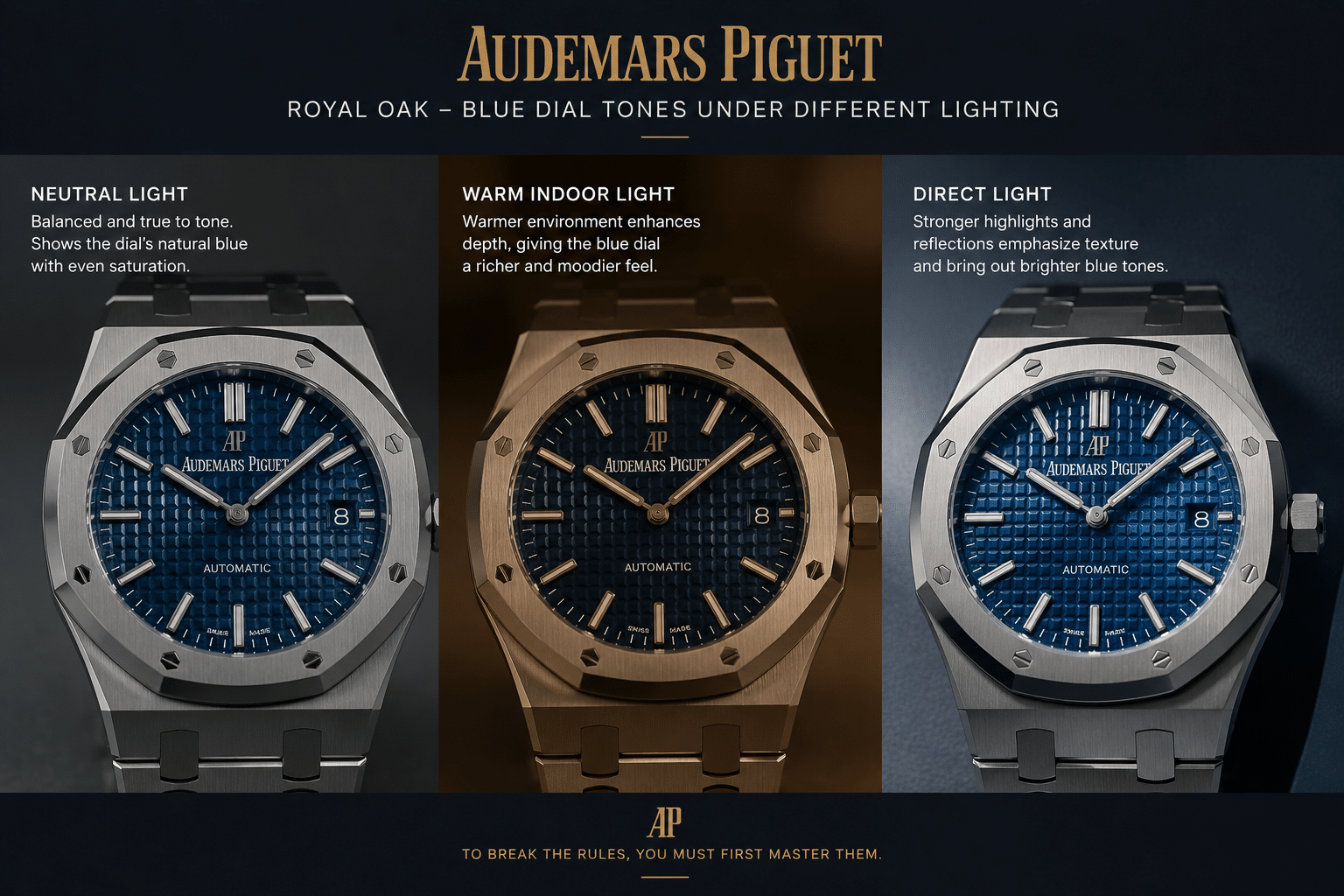
Lighting Is the Main Reason Blue Royal Oak QC Photos Are Misleading
Royal Oak QC photos can be useful, but blue dial QC photos are easy to overread. A camera does not simply record the dial; it interprets it. Exposure, white balance, lens angle, background, and the strength of the light source can all change the perceived color. This is why the same blue dial may look deep navy in one photo, washed out in another, and much brighter in a third.
The mistake is judging blue from a single front-facing seller photo. That image may be technically honest and still not represent how the watch will look in daily wear. Controlled seller lighting can make a dial appear richer than it is. Harsh direct light can make the same dial appear too bright. Warm indoor light can push the color darker or slightly purple. None of this proves the seller is trying to mislead the buyer. It proves that blue is unusually sensitive to photography.
Natural Light Shows the Most Honest Color Range
Natural light is usually the most useful condition for judging a blue dial because it exposes both the attractive and risky sides of the color. Under daylight, a good Royal Oak blue should show depth without turning electric. It may brighten at an angle, but it should not become a loud, flat blue slab. It should still have some controlled darkness around the pattern and markers.
If a dial only looks convincing under dim indoor lighting but becomes harsh in daylight, the buyer should be cautious. Daily wear includes outdoor moments, car windows, storefront light, and bright rooms. A blue dial that cannot survive daylight without looking over-saturated will probably bother a buyer who is already sensitive to color accuracy.
Indoor Light Can Make Good Blue Look Too Dark
Indoor lighting creates the opposite problem. Warm bulbs, low light, and mixed lighting can make a good blue Royal Oak dial look darker than expected. Buyers sometimes reject a dial too quickly because it appears nearly black in one indoor QC photo. That reaction is understandable, but it can be wrong.
A blue dial that turns dark indoors is not automatically flawed. Many dark blue luxury watch dials behave this way. The better question is whether other angles show life. If the dial looks dark indoors but opens up in neutral or natural light, that may be normal behavior. If every photo shows a flat, heavy surface with no tonal movement, then the concern is more valid.
Direct Light Can Expose Over-Saturation
Direct light is useful because it reveals what controlled photos can hide. A dial that looks refined in soft lighting may become too bright when hit with strong light. On a blue Royal Oak replica, this is where over-saturation becomes obvious. The color may jump toward electric blue, the surface may look too glossy, or the dial may lose the darker shadows that make the Royal Oak pattern feel dimensional.
This is why direct-light photos should not be used only to admire the watch. They are stress tests. If the blue remains within a controlled range under strong light, that is a positive sign. If it turns loud, plastic-like, or unusually purple, the buyer should assume the issue will appear in real use, not just in the photo.
QC Photos to Request
For a blue Royal Oak replica, the most useful QC set is not the largest number of photos, but the right mix of angles and lighting. A straight dial shot is necessary, but it is only the starting point. Ask for a slight tilt to show how the color changes across the dial. If possible, request one photo in natural light or near a window, because that gives a better sense of the real wrist color than a fully controlled lightbox shot.
A side angle through the crystal is also helpful because reflections can make the blue appear darker or brighter than the dial itself. One wrist-style photo, even if imperfect, can show whether the blue feels balanced against the steel case and bracelet. The goal is not to use QC photos as an authentication exercise. The goal is to decide whether the dial’s color behavior is acceptable for your own tolerance.
- Request a straight dial photo: useful for general tone, logo visibility, and overall dial balance.
- Request a slight angled photo: better for judging color shift and whether the blue has movement.
- Request natural light if available: the best practical check for over-bright or too-flat blue.
- Request a side or crystal-reflection angle: helps separate dial color from reflection and exposure effects.
- Request one wrist-style photo if possible: shows whether the blue feels wearable, not just photogenic.
Before making a decision, buyers should review real QC photos where available, including dial printing, hand alignment, bezel position, datewheel centering, bracelet fit, clasp engraving, case thickness, and overall finishing. Factory labels and stock photos alone are not enough for a reliable judgment.
QC photos can reduce uncertainty, but they do not guarantee perfection. They are a buyer-evaluation tool, not a certification process, authentication report, or proof that the watch matches a genuine Audemars Piguet reference under close inspection. The most useful QC review is practical: identify obvious assembly issues, compare the visible execution against the seller’s description, and decide whether the remaining uncertainty is acceptable.
The clear judgment: do not accept or reject a blue dial Royal Oak from one flattering photo. Blue needs a small set of imperfect but varied images. If the dial looks believable across those conditions, the risk is much lower. If it only works in one controlled shot, the buyer should treat that as a warning rather than a strength.
Tapisserie Texture: Why the Royal Oak Pattern Makes Blue Harder
The Royal Oak tapisserie dial is not just a decorated background. On a blue dial Royal Oak replica, it is the structure that decides whether the color looks expensive, dimensional, and alive, or simply painted onto a patterned surface. This is where many buyers misjudge the watch. They look first at whether the blue shade is attractive, but the better question is whether the dial texture gives that blue any depth.
A convincing blue tapisserie replica has to do two things at once. The raised squares need enough height and edge definition to create tiny shadows, while the recessed channels need to catch light without looking muddy or overcut. If the Grande Tapisserie pattern is weak, even a beautiful blue tone can fall flat. If the pattern is too aggressive, the dial can look stamped, brittle, or almost plastic under close light. Blue exposes both mistakes more clearly than black, silver, or grey because the color changes as the texture catches light.
This is why dial texture matters more on blue than buyers often expect. A black dial can hide shallow grid depth because the shadows blend into the base color. A silver or grey dial can disguise minor pattern errors because the whole surface already reflects light softly. Blue sits in the middle: it needs shadow, reflection, and color shift to work. When any one of those elements is off, the dial starts to look less like an architectural Royal Oak dial and more like a printed imitation of one.
Depth Matters More Than the First Color Impression
The first photo of a blue Royal Oak replica usually makes buyers react to color: too dark, too bright, too purple, too grey. That reaction is understandable, but it is not enough. The stronger check is whether the pattern creates a believable shadow gradient across the dial. On a good example, the raised squares should not disappear into the surface. They should give the dial a layered, machined look, especially when the watch is slightly tilted.
Buyers should pay attention to the spaces between the squares. If the channels look shallow, soft, or visually filled in, the dial may look acceptable in a compressed seller image but disappointing in close-up QC photos. The blue may still look “nice,” but the Royal Oak character will be weaker. For this model, nice color without texture depth is not a full win.
The non-obvious point is that stronger blue can sometimes hide weaker construction in the first few photos. A saturated dial grabs attention and distracts from the grid. Once the watch is viewed in normal light, the problem becomes clearer: the blue has presence, but the tapisserie does not create the miniature shadow work that makes the Royal Oak dial feel dimensional. If choosing between a slightly less exciting blue with better grid depth and a more dramatic blue with flat texture, the better daily-wear choice is usually the dial with stronger structure.
Flat Texture Makes Blue Look Cheaper
A flat tapisserie pattern is one of the fastest ways for a blue Royal Oak replica to lose its appeal. The problem is not that the dial becomes immediately obvious from across the room. It is more subtle than that. The watch may still look attractive, but it loses the tension that makes the Royal Oak dial special: hard geometry, controlled reflection, and small pockets of shadow.
When the dial pattern is too shallow, the blue surface tends to behave like one continuous color field. The raised squares do not separate cleanly from the recessed grid, so the dial lacks blue dial depth. This is especially noticeable around the applied markers and logo area, where the pattern should still feel crisp and consistent rather than fading into a smooth background.
Dial printing also becomes more important when the texture is weak. If the AP logo, minute track, or text appears to float on a soft patterned surface, the whole dial can feel less precise. A strong tapisserie pattern gives the printing a stable visual foundation. A weak pattern makes even decent printing look less integrated.
This is also where low-resolution photos can mislead buyers. A flat dial may look clean because fewer shadows mean fewer visible irregularities. In sharper photos, the same dial can look underdeveloped. For a blue Royal Oak, “clean” is not always the same as convincing.
Too Much Gloss Can Be as Risky as Too Little Depth
The opposite mistake is a dial that tries too hard. Some blue Royal Oak replicas show a very glossy or overly sharp tapisserie texture that looks impressive in bright seller lighting but less natural on the wrist, especially when Royal Oak 15450 sizing is judged alongside dial balance and wrist presence. The raised squares may catch light too aggressively, or the recessed areas may produce a metallic glare that overwhelms the pattern. This can make the dial look more like a shiny molded surface than a finely textured watch dial.
A Royal Oak blue dial should have reflective energy, but it should not flash from every angle. The pattern needs restraint. If every square lights up at once, the dial loses the controlled, architectural feel that buyers expect. Too much gloss also exaggerates minor flaws in the grid because harsh reflections draw the eye to uneven edges, inconsistent channels, and printing that does not sit cleanly over the texture.
The best practical judgment is balance. The tapisserie should be visible without shouting. The blue should move with the pattern, not sit above it like lacquer. If the dial looks spectacular only under strong direct lighting but turns harsh or toy-like from a slight angle, the texture may be over-reflective rather than genuinely well-executed.
At Clean VS Factory, we usually separate the first color reaction from the texture judgment on Royal Oak-style watches. A blue dial can be attractive and still be the wrong choice if the tapisserie looks flat, overly glossy, or poorly integrated with the printing. For this model, the pattern is not a small detail. It is the dial.
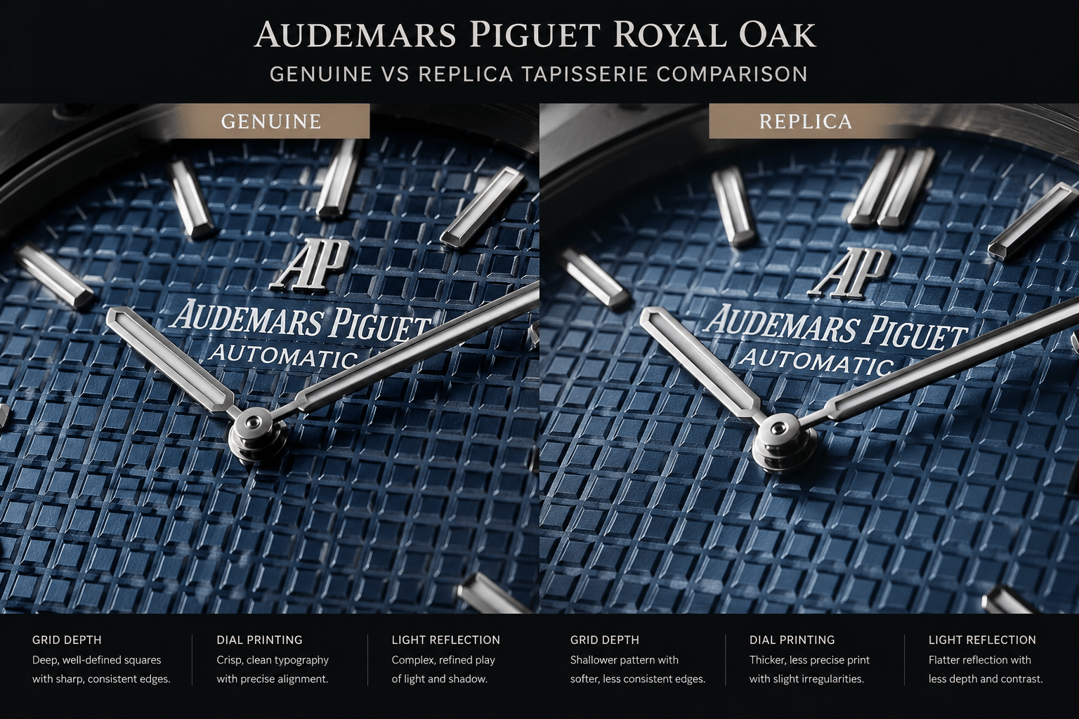
The Sunburst Effect: What Buyers Expect Versus What Replicas Often Show
The Royal Oak sunburst dial is best understood as a behavior, not a fixed finish. Buyers often expect the blue dial to shift from dark navy to brighter metallic blue as the wrist moves. That expectation is reasonable, but it is also where many AP blue sunburst replica dials become difficult to judge. A single photo can show color, but it cannot prove how light travels across the dial.
On a convincing blue Royal Oak, the light should move across the surface in a controlled way. It should create a radial feeling around the center while still working with the tapisserie grid. The dial should not look like a plain blue plate, and it should not explode into glare every time it faces a light source. The problem with replicas is that they often miss the middle ground: some look too dead, while others look too shiny.
This matters because the blue Royal Oak is not admired only for being blue. It is admired for the way the blue changes with angle. A dial that looks correct in one straight-on image can feel wrong in real wear if the light play does not develop as the watch moves.
A Good Blue Dial Should Shift, Not Flash
The right sunburst behavior is gradual. As the dial tilts, one area should brighten while another area deepens. The effect should feel like a shadow gradient, not a camera flash. If the entire dial suddenly turns electric blue under light, the finish may be too reflective or the blue layer may be too saturated. That can look exciting in photos, but on the wrist it often feels less refined.
A good blue dial should also retain some texture while shifting. If the sunburst reflection wipes out the tapisserie pattern, the dial becomes too glossy. If the tapisserie remains visible but the color never changes, the dial becomes too static. The better examples preserve both: pattern and motion.
This is why angled photos are more useful than one perfect front shot. A straight dial image can make almost any blue look orderly. A slight tilt reveals whether the radial brushing and dial reflection actually create depth, or whether the blue is simply brightened by camera exposure.
Dead Blue Dials Often Look Better in Still Photos Than on Wrist
A dead blue dial is not always obvious at first. In QC photos, it may look clean, even, and safe. The color may appear close enough, the markers may be aligned, and the printing may look acceptable. The problem appears when the dial does not respond to movement. It stays the same flat blue whether viewed straight on, from the side, under indoor light, or near a window.
This kind of dial can be less satisfying in daily wear than buyers expect. The Royal Oak case and bracelet are full of hard angles and reflective surfaces, so a flat dial can feel visually disconnected from the rest of the watch. The exterior catches light; the dial does not. On a black or grey version, this may be easier to forgive. On blue, it feels like the main attraction is missing.
There is a buying lesson here: a blue dial with no sunburst can photograph better than it wears. Still photos reward evenness. Wrist presence rewards movement. If a seller or QC set only shows the dial from one front-facing angle, the buyer has not really seen the sunburst behavior yet.
Overactive Reflection Can Look Artificial
The opposite failure is an overactive dial. Some blue Royal Oak replicas show a strong metallic blue reflection that looks dramatic in the first image but becomes tiring in normal use. The dial flashes too quickly, becomes too bright at mild angles, or produces a hard glare that makes the tapisserie pattern look artificial.
This is not automatically a sign of a poor watch, but it is a warning for buyers who want a more restrained Royal Oak look. The genuine design language depends on sharpness and light control, not maximum shine. A dial that behaves like a bright metallic fashion dial can make the whole replica feel less convincing even if the color itself is attractive.
The practical check is to look for controlled angle shift. The dial should move from darker to brighter blue without turning neon, silver-blue, or mirror-like. If the light play is so aggressive that it hides the dial texture, the watch may look better in a sales photo than it does during ordinary wear.
APSF, ZF, and Batch Differences: Why Factory Name Alone Does Not Solve the Blue Dial Problem
Factory choice matters, but it does not remove the blue dial risk. Buyers often ask which factory has the better blue dial, APSF or ZF, as if there is a permanent answer. That question is too simple for this model. An APSF Royal Oak blue dial and a ZF Royal Oak blue dial can vary by reference, version, dial batch, and even the specific watch shown in QC photos.
This is especially true with blue. A small shift in saturation that would barely matter on a black or silver dial can change the whole personality of a blue Royal Oak. One batch may look rich and controlled; another may lean too bright, too flat, or too grey. Factory reputation can narrow the search, but it cannot replace looking closely at the actual dial in front of you.
The better approach is to treat factory name as the starting filter, not the final decision. A factory may be respected for case finishing, bracelet feel, or movement architecture, while its blue dial execution still needs current review. On a Royal Oak, those categories overlap visually, but they are not the same thing.
Why APSF Versus ZF Depends on the Specific Royal Oak Reference
The APSF vs ZF Royal Oak comparison changes depending on the reference. A 15400, 15500, 15510-style watch, or Jumbo-inspired model does not create the same dial problem. The tapisserie scale, dial layout, marker spacing, date position, and movement route can all affect how the blue dial appears.
For example, a larger 41mm Royal Oak-style dial gives the blue surface more room to show texture and sunburst behavior. That also means flaws have more space to be seen. A slightly different reference may have a different dial layout, different marker proportions, or a different factory dial supplier. Buyers who assume “this factory is best for AP” can end up applying the right reputation to the wrong reference.
Current market discussions often point to APSF for stronger integrated movement routes on some modern Royal Oak models and to ZF for strong external finishing on certain versions. Those observations can be useful, but they do not automatically answer the blue dial question. The dial still has to be judged by its color behavior, tapisserie depth, printing, and light response in current photos.
A factory comparison is most useful when it is tied to the specific reference, version, movement, and visible execution details rather than treated as a universal ranking. For blue Royal Oak replicas, the same factory name can mean different buyer outcomes if the dial batch, case profile, bracelet finishing, or movement route changes between versions.
Batch Variation Matters More on Blue Than on Neutral Colors
Batch variation is not unique to blue dials, but blue makes it more visible. If a black dial batch comes out slightly warmer or cooler, most buyers will not notice unless the printing or texture is also poor. If a silver or grey dial shifts a little, the change may still sit within a believable neutral range. Blue is less forgiving because buyers already have a strong mental image of what the Royal Oak blue should be.
This is why “latest batch blue dial” claims should be handled carefully. Newer does not always mean better for a specific buyer. A version update may improve texture while changing the shade. Another update may improve color but make the dial more reflective. Without current comparison photos, the word “updated” does not tell the buyer enough.
A small dial batch change can also alter how the sunburst effect behaves. The base blue might look similar straight on, but under tilt one batch may become rich navy while another jumps to a brighter metallic blue. That difference is exactly why blue dial QC matters more than factory name alone.
Factory Strength in One Area Does Not Guarantee Dial Accuracy
One of the common mistakes in AP Royal Oak replica factory comparison is blending every category into one score. A watch can have a strong case profile and a good bracelet but still carry a blue dial that is too saturated. Another can have a more convincing dial tone but weaker finishing elsewhere. These are separate tradeoffs, and blue dial buyers need to keep them separate.
Movement choice is another area that can distort judgment. A buyer may prefer an integrated clone movement for thickness, architecture, or caseback appearance, but that does not guarantee the dial is the best available. Likewise, a factory with strong bracelet finishing does not automatically have the most believable blue tapisserie replica dial. The dial supplier, printing process, texture execution, and batch color all matter.
The clear judgment is this: do not buy a blue Royal Oak replica on factory name alone. Factory reputation can help avoid poor options, but the specific dial decides whether the watch will satisfy the buyer. For blue, the final answer is always factory plus reference plus batch plus QC photos.
Factory Claim Caution: Factory names in the replica market are buyer-community labels and seller-facing shorthand, not official brand categories. A comparison between APSF, ZF, or another factory should therefore be read as practical buyer evaluation rather than verified manufacturing evidence. Unless the seller provides current photos and clear version details for the exact unit, claims such as “best blue,” “newest batch,” or “brand-equivalent” should be treated as marketing language and narrowed to what the buyer can actually inspect.
Factory Name Clarification: Factory names in the replica watch market are commonly used buyer-facing labels. They should be treated as practical market references, not as official brand affiliations, audited manufacturer identities, or guarantees of identical quality across every Royal Oak reference, dial batch, or blue tapisserie version.
Version Details to Confirm
Before deciding on an APSF Royal Oak blue dial, ZF Royal Oak blue dial, or another AP Royal Oak replica factory option, confirm the exact reference style first. A seller description that only says “Royal Oak blue” is too vague. The buyer should know whether the watch is being presented as a 15400, 15500, 15510-style version, or another layout, because dial proportions and pattern behavior can differ.
If a version or batch is mentioned, ask for current photos of that exact watch rather than relying only on older comparison images. Older photos may show a different dial batch, different lighting setup, or a previous factory release. This is not about chasing a perfect answer. It is about making sure the watch being approved matches the dial behavior the buyer expects.
The minimum useful review set should include a straight dial photo, at least one angled dial photo, a close view of the tapisserie and printing, and a shot where the blue is not being exaggerated by harsh lighting. If comparison photos are provided, check whether they are current and whether they show the same reference and factory version. A good factory name is helpful, but a blue dial still needs to prove itself in the actual watch being considered.
Movement, Thickness, and Daily Wear: The Part Blue Dial Buyers Sometimes Ignore
Because this article focuses on the blue dial, it is easy to treat the movement as a separate issue. In practice, movement choice can change the ownership experience more than the dial color does. On a Royal Oak replica, the movement route may affect case thickness, rotor sound, winding feel, date behavior, power reserve, and how convincing the watch feels during daily handling. A visually strong blue dial does not automatically make the watch the best choice if the movement is noisier, less stable, or installed in a case that feels too thick for the reference being copied.
This matters especially for buyers comparing APSF, ZF, or other factory versions. One option may offer a more appealing dial shade, while another may use a movement construction that produces a slimmer profile or a more suitable caseback presentation. The better decision depends on the buyer’s priority. If the watch is mainly for photos, the dial, bezel, and bracelet may carry more weight. If the watch is intended for regular wear, winding feel, date operation, rotor noise, and serviceability become harder to ignore.
First-time Royal Oak replica buyers should be cautious with complicated versions or choices that add extra mechanical risk without much daily benefit. A simple time-and-date Royal Oak-style model is generally easier to evaluate and live with than a more complicated AP replica with additional functions, thicker construction, or harder-to-service movement parts. The blue dial already creates enough visual uncertainty; adding movement complexity can make the buying decision less forgiving.
The practical rule is to separate visual accuracy from ownership reliability. A good blue dial may win the photo comparison, but a slightly calmer dial paired with better case thickness, smoother bracelet feel, and a more dependable movement can be the better daily-wear choice. For this model, the best decision is not always the most dramatic dial in the QC photos.
Movement Claims Need Unit-Level Proof
Movement descriptions in replica listings should be read carefully. A seller may describe a watch as using an integrated movement, a decorated movement, or a movement inspired by a genuine architecture, but those phrases do not prove long-term reliability, service compatibility, or mechanical equivalence. The buyer should not assume that decoration visible through a caseback means the movement behaves like the authentic calibre, and should not treat a movement label as confirmed unless the seller provides clear supporting photos and consistent version information for the specific watch.
This matters because the blue dial can distract from mechanical compromises. A watch may look excellent in wrist photos while still carrying a movement route that is thicker, noisier, harder to service, or less suitable for regular wear than the buyer expected. If the seller cannot explain the movement route clearly, the safer approach is to judge the watch as a visual replica first and avoid paying a premium purely for vague mechanical language.
Movement Transparency Note: Movement references in this article describe replica-market movement types, movement routes, or visible configurations, not official Audemars Piguet calibres unless supported by verifiable evidence. Buyers should judge movement claims by the specific version, case thickness, service risk, rotor behavior, date operation, and available movement photos rather than by decorative language alone.
Movement trust in the replica market depends on understanding what the movement claim actually describes: architecture, decoration, layout, reliability expectation, or simply a market name used by sellers. A decorated movement may improve the view through a caseback without changing serviceability, while an integrated-style route may help thickness but still require careful attention to winding feel, rotor sound, and date operation on the exact unit.
Why Black, Silver, and Grey Royal Oak Dials Are Safer Choices
The simplest way to frame the dial decision is this: blue gives the AP Royal Oak replica its highest visual payoff, but black, silver, and grey usually create fewer ways to be disappointed. A black dial Royal Oak replica does not need to hit a precise emotional shade of blue. A silver dial Royal Oak replica is less likely to look dramatically wrong because of one camera exposure. A grey dial Royal Oak can shift under light without triggering the same “too purple,” “too electric,” or “too dark” reaction that blue often creates.
This does not make neutral dial colors automatically better. It makes them safer. For a buyer who wants a lower-variation dial color, easier daily wear, and fewer arguments with QC photos, black, silver, and grey are usually more rational than blue. The tradeoff is obvious: they do not carry the same iconic Royal Oak blue-dial impact, but they also ask less from the factory and less patience from the buyer.
Black Hides Tone Variation but Can Lose Texture
Black is the most forgiving color for shade accuracy because small tonal differences are harder to notice. If a black dial is slightly warmer, cooler, or deeper than expected, most buyers will not obsess over it the way they might with blue. This is why a black dial Royal Oak replica can be a beginner-friendly AP replica choice for buyers who care more about a clean overall look than chasing the most famous dial color.
The risk with black is different: it can hide the tapisserie pattern too much. A weak black dial may look neat in a front-facing photo but lose the architectural character that makes the Royal Oak dial interesting. The buyer should not only ask whether the black looks “black enough.” The better question is whether the squares still show depth, whether the printing stays crisp, and whether the applied markers stand cleanly against the dial.
Black is safer than blue for color matching, but it is not a free pass. If the tapisserie looks flat, the dial can become visually dead. In daily wear, that may matter more than a small shade difference because the Royal Oak depends on texture as much as color.
Silver and Grey Are More Neutral Under Changing Light
Silver and grey are often easier to live with because their lighting behavior feels less dramatic. A silver dial may brighten under direct light and soften indoors, but that shift usually reads as normal metal-dial behavior. A grey dial Royal Oak may move between charcoal, slate, and lighter grey tones without looking obviously wrong. Blue does not get the same forgiveness because buyers already have a strong mental image of what Royal Oak blue should be.
This is where neutral dial colors reduce buyer anxiety. They still need proper marker alignment, clean logo placement, good printing, and visible tapisserie consistency, but their color range is less emotionally charged. If a grey dial looks slightly warmer in one photo and cooler in another, most buyers accept it. If a blue dial makes the same move, buyers often start questioning the factory, the batch, and the lighting setup.
For daily wear, silver and grey also handle mixed environments well. Office light, car interiors, cloudy daylight, and restaurant lighting can all change the dial’s appearance, but the change is usually subtle rather than suspicious. That makes silver and grey sensible options for buyers who want a Royal Oak replica that looks consistent without needing constant mental comparison to reference photos.
Blue Is Best for Buyers Who Accept Visual Sensitivity
Blue remains the most rewarding choice if the buyer wants the instantly recognizable Royal Oak look. It has more presence, more collector appeal, and more visual energy than the safer neutral colors. But it is also the dial color most likely to punish unrealistic expectations. A blue dial can look excellent in one lighting condition and questionable in another, even when the watch itself is not defective.
The practical rule is straightforward: choose blue if the iconic look matters more than perfect consistency. Choose black, silver, or grey if you want the easiest Royal Oak dial to choose, lower QC stress, and fewer surprises after delivery. At Clean VS Factory, we tend to treat this as a buyer-tolerance question more than a style question. Some buyers enjoy the shifting character of blue; others find that same behavior frustrating.
If small differences in saturation, brightness, or camera angle will bother you every time you look at the watch, blue is probably not the smartest choice. A less risky dial color may give up some drama, but it can deliver a calmer ownership experience.
Price Differences: What They May Reflect and What They Do Not Prove
A higher price on a blue Royal Oak replica does not automatically prove a better blue dial. Price can reflect the factory route, movement type, case finishing, bracelet finishing, availability, seller margin, current demand for a specific batch, or the after-sale risk the seller is willing to absorb. Blue dials can also attract hype because many buyers want the most recognizable Royal Oak configuration, and that demand can push pricing without guaranteeing that the exact unit has the best color behavior.
The more useful price question is what the extra cost is buying. If the difference comes from a thinner case, a more suitable movement, better bracelet articulation, cleaner brushing, or more consistent QC support, the premium may make sense for a daily-wear buyer. If the difference is only explained as “best blue” without current photos, reference details, or movement confirmation, the buyer should treat that claim as marketing language rather than evidence.
For this model, price should be checked against the same practical details as QC: exact reference style, current batch, dial texture, blue behavior under multiple angles, date alignment, and case thickness, while an Audemars Piguet Royal Oak guide can also help frame bracelet feel, movement route, and model-specific buying expectations. Paying more for a blue Royal Oak may be reasonable, but only when the added cost connects to buyer-verifiable improvements. A more expensive listing with one flattering photo can still be a weaker decision than a cheaper but better-documented watch.
Suspiciously simple pricing explanations should be treated carefully. If one listing asks a premium but cannot connect that premium to a reference, batch, movement route, case thickness, bracelet finishing, or current QC evidence, the buyer has very little traceable information. The safest purpose of factory and price information is to avoid overpaying or misunderstanding quality, not to support broad claims about official origin or brand-level equivalence.
Exact price comparisons should be verified at the time of purchase because replica watch prices can change by factory label, version, movement configuration, seller channel, availability, finishing quality, and after-sales support. A price that looks attractive is not automatically a better value if the dial batch is unclear, the movement claim is vague, or the seller cannot explain the terms that matter after delivery.
QC Limitations: What Blue Dial Photos Can and Cannot Prove
An AP Royal Oak QC check can catch many real dial problems, but it cannot fully predict how a blue dial will behave on the wrist. That distinction matters. QC photos are useful for judging construction and obvious execution errors. They are less reliable for deciding whether the blue is the “perfect” shade, because camera angle, exposure, white balance, and lighting temperature can change the dial dramatically.
The mistake is treating every blue dial QC photo as a final verdict. One photo may make the dial look too bright. Another may make it look almost black. A third may finally show the tapisserie and blue tone in a believable range. The buyer’s job is not to demand that every photo look identical. The job is to separate objective flaws from photo-sensitive uncertainty.
Objective Dial Flaws Are Easier to Judge
Some things are relatively fair to judge from QC photos. Dial printing should be even and clean. The AP logo should sit straight and in the correct visual position for the reference. Hour markers should not lean or float at inconsistent angles. The date window should not look visibly crooked, and the datewheel should sit reasonably centered inside the opening. Hands should align cleanly without obvious damage, staining, or poor finishing visible in normal QC resolution.
These are not “maybe lighting” issues. A crooked marker is still crooked under different light. A badly centered date does not become centered because the camera moves. Uneven printing, visible dust under the crystal, damaged markers, or inconsistent tapisserie cutting are stronger reasons to pause than a dial that appears slightly darker in one shot.
For a blue dial QC, tapisserie consistency also matters. The pattern does not need to look like a macro photo of a genuine AP dial, but it should appear even across the surface. If one area looks flat, smeared, or noticeably different from the rest of the dial, that is more concerning than a color shift caused by exposure.
Color Accuracy Requires More Than One Angle
Exact blue shade is harder to judge because it depends heavily on how the photo was taken. A straight-on photo under bright seller lighting may exaggerate saturation. A low-light shot may make the same dial look dull. A tilted angle may reveal more sunburst or make the crystal reflection dominate the image. None of these alone proves the dial is right or wrong.
For blue dial QC, one front-facing image is not enough. A useful set should include a straight dial shot, at least one slight tilt, a closer view of the date and logo area, and a photo where the dial is not blasted by direct light. If a natural-light image is available, it can be especially helpful because it often shows whether the blue lives in a believable range rather than only looking good under controlled indoor lighting.
The strongest blue dials usually show controlled variation. They may darken at angle, brighten under stronger light, and reveal texture as the watch moves. That is different from a dial that jumps into a harsh electric blue in every bright photo or collapses into a flat ink-blue surface in every softer image.
Some Uncertainty Remains Even After Good QC Photos
Even good QC photos cannot remove all uncertainty. A blue Royal Oak replica may look slightly different in person because your home, office, car, and outdoor lighting are not the seller’s photo setup. This is not unique to replicas; blue dials in general are difficult to capture accurately. The difference is that replica buyers often expect QC photos to answer a question that photography cannot answer perfectly.
The realistic standard is not whether the dial matches one ideal image. The standard is whether the photos show a coherent, believable dial: clean layout, acceptable marker placement, controlled blue tone, visible tapisserie, and no obvious manufacturing flaw. If several angles support that impression, rejecting the watch because one image looks slightly too dark can be overreacting.
On the other hand, buyers should not excuse everything as lighting. If the blue is severely over-saturated in every photo, if the tapisserie looks shallow from every angle, or if the dial printing and markers are visibly poor, the issue is probably not just camera behavior.
Red Flags Before You Decide
Before accepting or rejecting a blue dial QC, focus on the problems that are least likely to disappear in real life. Severe over-saturation across multiple photos is a warning sign, especially if the dial looks more like bright royal blue than a controlled Royal Oak blue. A flat tapisserie pattern is another serious concern because color cannot compensate for a dial that lacks depth.
Uneven dial printing, a crooked AP logo, badly misaligned hour markers, a visibly off-center date, or dust and marks under the crystal should carry more weight than a minor color difference between two lighting setups. Also watch for inconsistent color behavior that cannot be explained by angle or exposure, such as one area of the dial looking patchy or uneven while the rest appears normal.
The best QC decision is usually not based on the most flattering photo or the worst photo. It comes from the pattern across the whole set. If the dial looks believable in most angles and the objective details are clean, the remaining blue-tone uncertainty may be acceptable. If every photo reveals a different problem, the safer decision is to slow down rather than talk yourself into it.
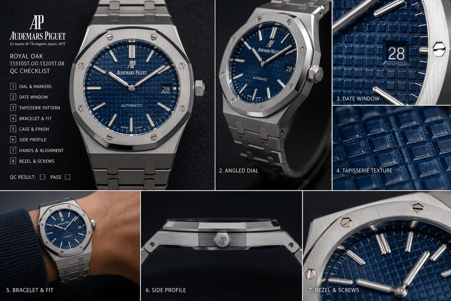
How Buyer Expectations From Genuine AP Photos Create Extra Risk
The blue Royal Oak replica problem is not only technical. It is also psychological. Many buyers judge a replica against idealized genuine AP blue dial comparison photos: perfect lighting, controlled angles, clean reflections, and carefully selected images that make the dial look deep, expensive, and alive. Then they compare those images to a seller’s QC photos taken under ordinary lighting and assume the replica has failed.
That comparison is often unfair. It is also risky because it creates a standard no normal wrist experience can hold all day. Genuine blue Royal Oak dials also change with lighting, angle, camera settings, and reflections. The problem is that buyers often remember the most dramatic genuine marketing photo, not the way a blue dial actually looks across a full day of wear.
Marketing Images Are Not Neutral Reference Points
Official-style marketing photos are designed to flatter the watch. Lighting is placed to bring out dial depth, reduce unwanted glare, sharpen the case lines, and make the blue appear rich without becoming too dark. The image may show the Royal Oak at its best possible moment, not its average appearance under normal indoor or outdoor conditions.
That matters because Royal Oak replica expectations are often built around those polished images. A buyer sees a deep, dimensional, perfectly balanced blue in a reference photo and expects the replica dial to deliver that same look in every QC angle. But QC photos are usually functional, not artistic. They may reveal harsh reflections, uneven exposure, or a duller dial tone simply because the setup is not built to glamorize the watch.
A good replica AP Royal Oak blue dial should not be judged only by whether it recreates one hero image. It should be judged by whether its real-world appearance stays within a believable range while the dial layout and finishing remain clean.
Wrist Presence Matters More Than One Perfect Shade
The better question is not “does this blue match one genuine photo?” It is “does this dial make sense on the wrist?” Wrist presence includes the relationship between the blue tone, tapisserie texture, markers, hands, bezel, and bracelet. A dial that is slightly darker than a favorite reference photo may still look more convincing in daily wear than a dial that photographs bright and impressive but looks artificial under normal light.
This is where buyers often misjudge the decision. They chase the most exciting blue in photos, then discover that the same saturation feels too loud in person. Or they reject a calmer blue because it does not match a dramatic marketing image, even though that calmer tone may be easier to wear and less likely to look wrong across different lighting.
For a blue Royal Oak replica, wrist behavior is more important than a perfect still image. The dial should have enough depth to avoid looking flat, enough control to avoid looking neon, and enough consistency that it does not feel like a different watch every time the lighting changes.
The Best Buyer Standard Is Believable, Not Perfect
The most useful standard is believability. A blue dial does not need to be treated as a flawless copy of a genuine AP dial to be acceptable for a buyer who understands the compromise. It needs clean execution, a reasonable blue range, visible tapisserie structure, and a dial tone that does not become distracting in normal use.
This standard also protects buyers from both extremes. It prevents overpaying emotionally for a blue dial just because it looks spectacular in one photo. It also prevents rejecting a solid example because it does not match a highly edited or perfectly lit reference image. The right threshold is practical: would the watch still look coherent at the desk, in a car, near a window, and outside in daylight?
If the answer is yes, the blue dial may be worth the added visual sensitivity. If the buyer needs the dial to look like the best genuine AP photo at all times, blue is likely to disappoint. For that buyer, a neutral dial may be the smarter Royal Oak replica choice, not because it is more iconic, but because it creates fewer expectation traps.
How to Read Seller Claims Without Overreacting to Them
Seller descriptions, factory labels, and QC photos are useful, but they should not be treated as final proof. A phrase like “latest batch,” “best blue,” or “updated dial” may point to a real change, but it does not explain whether the update improved the exact thing that matters to you. A newer dial could have better tapisserie definition but a brighter tone. A more expensive version could have better movement architecture but a blue shade that is less restrained under daylight.
The buyer-verifiable details are more useful than broad claims. Ask what reference style the watch is based on, what movement route it uses, whether the case thickness matches that route, and whether the QC photos show the exact unit rather than old promotional images. For the blue dial itself, check whether the photos include both straight and angled views, and whether the dial remains believable when the light is less flattering.
It is also worth remembering that a replica watch is not genuine, official, authorized, or brand-approved. The goal of review is not to prove that the watch is indistinguishable; it is to decide whether the compromises are acceptable for the buyer’s use. That distinction keeps the decision more realistic. A blue Royal Oak replica can be visually satisfying, but it still needs to be judged as a replica with factory variation, movement tradeoffs, and QC limits.
Claims That Need More Than a Sales Description
Some seller statements should trigger a request for more information rather than an immediate rejection or acceptance. If a listing claims a special blue dial update, ask for current photos in more than one lighting condition. If it claims a specific movement route, ask for clear version details and, where possible, movement-side photos. If it claims water resistance, treat that as unverified unless the individual watch has been pressure-tested after purchase. If it claims a special steel grade, crystal treatment, lume material, or factory-exclusive part, remember that those claims are difficult to verify from ordinary QC photos and should not replace visible execution.
The safest reading method is to divide claims into three groups: visible details, partially verifiable details, and unverifiable claims. Visible details include marker alignment, date position, printing, bezel brushing, bracelet finishing, and dial behavior across photos. Partially verifiable details include movement layout, case thickness, and some caseback presentation. Unverifiable claims include broad factory superiority, perfect equivalence to genuine, universal waterproofing, and “same supplier” language. The first group should carry the most weight in a blue dial decision.
Claims such as “perfect,” “brand-equivalent,” or “guaranteed to pass inspection” should be treated with caution. A more reliable comparison looks at the actual model version, movement configuration, finishing details, and available QC evidence, not language that encourages misrepresenting a replica watch as genuine.
A Traceable Blue Royal Oak Decision Checklist
A practical blue Royal Oak replica decision should move from broad market labels to specific evidence. Start with the factory name only as a search filter, then confirm the reference style, version or batch, movement route, case thickness, bracelet structure, and the exact QC photos of the unit being offered. This sequence reduces the chance of choosing a watch because the listing sounds strong while the visible execution does not support the claim.
For the dial itself, the most important traceability points are shade range, tapisserie depth, sunburst behavior, printing clarity, marker alignment, datewheel centering, and how the blue behaves in more than one lighting condition. A strong decision does not require every photo to look identical. It requires enough consistency that the watch appears coherent across straight, angled, close-up, and less flattering photos.
| Traceability Step | Buyer-Facing Question | Why It Matters |
|---|---|---|
| Factory label | Which replica-market factory name is being used? | Useful as a starting reference, not official proof |
| Reference style | Is it 15400, 15500, 15510-style, Jumbo-inspired, or another layout? | Dial size, date position, and marker spacing affect blue behavior |
| Version or batch | Are current photos tied to the exact unit? | Blue shade and tapisserie execution can change between batches |
| Movement route | Is the movement claim supported by clear version details? | Thickness, rotor feel, date behavior, and service risk can differ |
| QC evidence | Do photos show straight, angled, close-up, and natural-light behavior? | Stock photos and one polished image cannot prove dial performance |
For CleanVSFactory, the goal is to make replica watch comparison easier to understand by connecting factory names, movement claims, visible QC details, and realistic ownership limits. That approach is especially important for blue Royal Oak replicas because the most attractive photo is not always the most reliable ownership signal.
Seller Policies, Water Resistance, and After-Sales Questions
Dial quality is only one part of the buying decision. Before ordering, buyers should confirm return terms, repair options, shipping expectations, payment process, and after-sales support directly with the seller, because those terms should not be assumed from a factory label, price level, or polished QC photo. A visually strong blue dial can still become a poor ownership choice if the seller cannot explain what happens when the watch arrives with a defect, movement issue, or materially different appearance from the approved photos.
Water resistance deserves separate caution. The Royal Oak design may look sporty, but a replica watch should not be treated as waterproof or safe for swimming unless the specific unit has been tested and the seller’s policy is clearly confirmed. Even then, replica watches should be treated more cautiously around water than genuine watches serviced and tested through official channels. A model name, screw-down crown appearance, or caseback design is not enough to prove sealing performance.
These questions are not meant to make the buyer fearful. They keep the decision traceable. A responsible blue Royal Oak replica purchase weighs the visible dial behavior, the movement route, the case and bracelet execution, and the seller’s stated terms together. If any major part of that chain is unclear, the safer move is to ask for clarification before approving the watch rather than relying on broad claims such as “factory direct,” “latest version,” or “same as genuine.”
The Practical Buyer Rule: Choose Blue for Reward, Neutral Colors for Lower Risk
The simplest rule is this: choose the AP Royal Oak blue dial choice if the iconic look matters more than predictability. Choose black, silver, or grey if you want the safer Royal Oak replica experience with less color anxiety, easier QC confidence, and fewer surprises in daily wear.
Blue is the highest-reward dial because it gives the Royal Oak its most recognizable personality. It is also the highest-risk dial because small changes in saturation, tapisserie depth, camera exposure, and lighting angle can change the entire impression of the watch. A blue dial Royal Oak replica can look rich and convincing in one set of photos, then too bright, too flat, or too dark in another. That does not automatically make it a bad choice. It does mean the buyer has to be comfortable with visual sensitivity.
The best Royal Oak replica dial color is not the same for every buyer. If you enjoy studying QC photos, comparing angles, and accepting that the dial will shift under different light, blue can be the most satisfying option. If you want a watch that feels more predictable from photo to wrist, a neutral dial is usually the smarter decision. The mistake is treating blue as the default because it is the most famous color. Fame does not make it easier to replicate.
Choose Blue If You Can Accept Lighting Variation
Blue makes sense if you want the Royal Oak look most people picture first: steel case, integrated bracelet, octagonal bezel, and a blue tapisserie dial with real wrist presence. For many buyers, that combination is the emotional reason to buy an Audemars Piguet Royal Oak replica in the first place. If the dial has believable depth, controlled saturation, and enough movement under changing light, blue can justify the extra evaluation risk.
The buyer who does well with blue is not looking for one frozen shade. They understand that a strong blue dial should change. It may look darker indoors, brighter near a window, and more reflective under direct light. The key is whether those shifts stay within a believable range. If every lighting change makes you worry that the dial is wrong, blue may become frustrating even if the watch is objectively decent.
A useful test is personal tolerance. If you are the type of buyer who will compare every wrist shot against polished genuine AP photography, blue is risky. If you can judge the watch by overall wrist impression, tapisserie depth, and consistency across several normal lighting conditions, blue becomes more reasonable. The reward is real, but only for buyers who accept that this dial color will never be the lowest-maintenance decision.
Choose Black, Silver, or Grey If You Want Lower Drama
Black, silver, and grey are better choices if your priority is avoiding buyer regret. They still need good printing, clean markers, and convincing tapisserie texture, but they do not expose color mismatch as aggressively as blue. A slightly different grey or silver tone usually feels like normal lighting behavior. A slightly wrong blue can dominate the entire watch.
Black is often the most forgiving for buyers who dislike uncertainty. It hides small tone differences better, though it can also hide some of the tapisserie depth that makes the Royal Oak dial interesting. Silver and grey sit in the middle: more visual texture than black, less saturation risk than blue, and generally more stable across indoor and outdoor light. For many first-time AP replica buyers, those neutral dials create a calmer ownership experience.
The tradeoff is that neutral colors may not deliver the same immediate impact. A blue or black Royal Oak replica is often the emotional comparison buyers start with, but emotion should not be the only standard. If you want a watch that is easier to approve from QC photos and less likely to look dramatically different on your wrist, neutral colors are the more rational option. They are not necessarily more exciting, but they are usually less punishing.
The Factory Name Helps, but the Specific Dial Still Decides
Factory reputation is useful, but it should not decide the dial for you. APSF, ZF, or any other AP Royal Oak replica factory can have strengths in case shape, bracelet feel, movement layout, or finishing while still producing blue dials that vary by reference, version, or batch. Blue makes that variation more visible. A strong factory name lowers some risk, but it does not remove the need to judge the actual dial in front of you.
For this specific watch, the final decision should come from the exact unit: the dial behavior in QC photos, the tapisserie depth, the saturation level, the date and marker alignment, and whether the color remains believable across multiple angles. If the blue looks attractive only in one carefully lit image and questionable everywhere else, the factory label should not rescue it. If the dial looks balanced across normal conditions, the same factory label becomes more meaningful.
At Clean VS Factory, we usually treat the blue Royal Oak as a visual-risk decision before it is a factory decision. The question is not only “which factory is better?” The better question is whether this specific dial matches your tolerance for variation. Choose blue for impact if you can live with the sensitivity. Choose black, silver, or grey if you want lower drama and a more predictable daily-wear result.
Legal, Disclosure, and Ownership Boundaries
Replica watches can raise trademark, import, resale, disclosure, and customs issues depending on jurisdiction. This article is not legal advice, and it should not be read as saying that a replica watch is authorized, risk-free, or safe to import everywhere. Buyers should understand that a Royal Oak replica is an imitation product, not an Audemars Piguet watch, and it should not be represented as genuine in resale, gifting, repair, or public disclosure contexts.
This boundary also matters for buyer expectations. A replica may be visually satisfying, but it does not carry the original brand’s authorization, warranty, service network, material assurance, or official testing standard. The practical value of QC is therefore limited to deciding whether the individual watch looks acceptable for the buyer’s personal use. It should not be stretched into claims of authenticity, brand equivalence, or guaranteed performance.
A replica watch should be evaluated with realistic ownership expectations. Even a strong super clone can have limits in water resistance, long-term movement stability, servicing convenience, and close inspection compared with a genuine reference. Buyers should confirm return, repair, shipping, and after-sales terms before ordering, because those terms can vary by seller and should not be assumed from a factory name or dial photo.
Disclosure: This article is for general educational and comparison purposes only. Replica watches are not genuine products from the original luxury brands, and brand names are used only to identify reference designs or comparison topics. Factory names, movement descriptions, prices, availability, QC details, seller policies, and version information can change, so readers should verify important details with the seller before making a purchase decision. Replica watches should not be represented, resold, or used as genuine watches.