
The Royal Oak tapisserie dial is one of the easiest details to underestimate when comparing AP-style replica watches. A dial can look acceptable in a straight front photo yet feel wrong on the wrist, where Royal Oak case thickness and dial depth can make proportion errors more obvious if the square pattern is too flat, too glossy, wrongly scaled, or mismatched to the reference. Petite, Grande, and Méga Tapisserie are not interchangeable decoration; each pattern belongs to a different Royal Oak family and changes the watch’s visual balance.
This guide focuses on how to judge the dial before being distracted by factory names, logos, or clean product photos. It explains how scale, depth, color behavior, date placement, subdial integration, and QC angles affect the final impression. The goal is to help buyers spot the difference between a dial that only photographs well and one that has convincing texture under normal wrist viewing.
Brand names are used here to identify the genuine reference design being discussed. Replica watches are not genuine products from Audemars Piguet or any original luxury brand, and they should not be represented, sold, or used as authentic watches.
| Dial Check | What to Look For | Buyer Risk |
|---|---|---|
| Pattern type | Petite for Jumbo-style, Grande for 15400/15500-style, Méga for Offshore | Wrong scale makes the whole watch look off |
| Texture depth | Raised blocks and recessed channels should create natural shadow | Flat or printed texture is obvious in angled light |
| Color behavior | Blue, grey, black, silver, white, or green should shift naturally with texture | Overly glossy or muddy color weakens wrist presence |
| Date and markers | Grid should stay clean around logo, markers, and date window | Distortion near applied parts suggests poor dial execution |
| Complicated layouts | Subdials and displays must interrupt the pattern cleanly | Perpetual calendar dials expose alignment flaws quickly |
| QC photo angles | Request front, angled, macro, and date or subdial close-ups | One bright straight-on photo can hide shallow texture |
Quick Questions Before You Read
Q: Is the tapisserie pattern more important than the factory name?
For this detail, yes. A strong factory label does not fix the wrong pattern scale or a flat dial.
Q: Can a good dial be judged from one front-facing photo?
Not reliably. Angled light and close-ups reveal depth, color shift, and grid consistency better.
Q: Is a bolder tapisserie texture always better?
No. Jumbo-style models need restrained Petite Tapisserie, while Offshore models can support the stronger Méga pattern.
Q: Which flaws should make a buyer pause first?
Wrong pattern scale, printed-looking texture, glossy color, uneven grid spacing, or distortion around the date and markers.
Editorial Perspective: For AP Royal Oak replicas, the most useful buying judgment is not “which factory is best” in general. It is whether the exact reference, dial pattern, movement choice, case thickness, bracelet feel, and QC photos match the buyer’s intended use. A watch that looks impressive in one seller photo may still disappoint as a daily wearer if the dial is flat, the movement adds too much thickness, or the version has known weaknesses around the date window or subdial layout.
Why the Tapisserie Dial Defines the Royal Oak Look
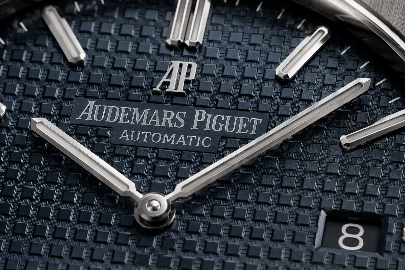
The Royal Oak tapisserie dial is not a background decoration. It is one of the main reasons the watch looks like a Royal Oak at all, and it is one of the first areas that can expose a weak AP Royal Oak replica. Buyers often start with the octagonal bezel, bracelet finishing, or case thickness, which makes sense. But if the AP Royal Oak dial looks flat, overly sharp, wrongly scaled, or disconnected from the rest of the watch, the whole piece loses credibility even when the case and bracelet are otherwise strong.
The important point is simple: the tapisserie pattern controls depth, shadow, and light reflection. A dial with square texture is not automatically convincing. The genuine-style effect depends on how the raised blocks, recessed channels, color coating, and surface finish work together. Many replica dials can copy the visible grid, but fewer create the layered optical effect that makes the dial change under natural light. This is why a replica watch can look acceptable in a seller’s front-facing photo but feel dull or stamped on the wrist.
For AP replicas, the dial is also a model-correctness check. A Royal Oak is not only “blue dial plus bracelet plus octagonal bezel.” The pattern scale and texture character need to match the reference family. A well-finished but incorrect waffle dial can still make the watch feel wrong because the Royal Oak identity is built from proportion, not just isolated parts.
The Dial Texture Is Part of the Case Design Language
The Royal Oak case is angular, flat, and architectural. The bezel has hard geometry, the bracelet is integrated into the case, and the markers sit sharply across the dial. The tapisserie texture works because it echoes that structure in miniature. The square grid gives the dial the same disciplined, engineered feel as the case and bracelet.
This is why a weak dial texture damages more than the dial itself. If the pattern is too shallow, the watch can look like it has a printed checkerboard instead of a dimensional surface. If the squares are too aggressive or glossy, the dial can fight against the brushed case and start looking toy-like. A Royal Oak should feel technical and metallic, not merely decorative.
Applied markers make the issue even clearer. On a strong dial, the indices appear to sit cleanly over a textured base, with enough depth around them to create separation. On a weaker AP replica dial, the markers may look as if they are floating over a flat printed surface, or the grid may appear compressed around the applied parts. That small visual disconnect matters more than many buyers expect, because the Royal Oak dial has very little open space to hide mistakes.
Why Front-Facing Photos Can Hide Dial Weakness
Straight-on photos are useful for checking logo position, marker alignment, date window placement, and general color. They are less reliable for judging tapisserie depth. A front-facing product image often flattens the dial, reduces shadows, and makes stamped or shallow engraving look cleaner than it really is. This is one reason many AP replica watches look stronger in catalog-style photos than they do in angled wrist shots.
The more useful test is angled light. A convincing tapisserie dial should show controlled shadow between the squares and a natural shift in tone as the watch moves. It should not depend entirely on dark printed lines to create contrast. If the dial only looks good from one direct angle, the texture may be doing less work than the photo suggests.
Macro photos also need to be read carefully. They can reveal uneven square rhythm, rough channel edges, or a surface that looks too stamped. But harsh macro lighting can exaggerate small flaws that are not very visible in daily wear. The practical judgment is not whether every square looks perfect under magnification. The better question is whether the dial still has believable depth and color behavior under normal viewing conditions.
At CleanVSFactory, we usually treat the tapisserie dial as a primary AP checkpoint, not a final minor detail. Case shape and bracelet finishing may make the first impression, but the dial decides whether that impression holds up once the watch is actually on the wrist.
Buyer Priorities: Photo Accuracy, Daily Wear, and Ownership Risk
Before comparing Petite, Grande, or Méga Tapisserie, buyers should decide what kind of replica watch decision they are making. A watch chosen mainly for wrist photos can prioritize dial color, visible texture, and clean frontal symmetry. A watch intended for frequent daily wear needs a broader check: movement behavior, rotor noise, hand setting feel, date change, bracelet comfort, clasp security, and whether the case thickness still matches the Royal Oak profile well enough on the wrist.
This distinction matters because AP Royal Oak replicas are not all difficult in the same way. A time-and-date Royal Oak with a clean dial layout may be more forgiving than a perpetual calendar-style or Offshore chronograph replica, where subdials, calendar displays, or chronograph modules add more places for visual and mechanical compromises. More complication can look more impressive in a listing, but it also gives the factory more alignment, printing, thickness, and movement problems to manage.
Price should be read as a clue, not proof. A higher price may reflect a better movement, improved dial finishing, lower availability, seller margin, or simply after-sale risk being priced into the transaction. It does not automatically mean the tapisserie depth is better or the bracelet feels more convincing. For this model family, the more useful comparison is whether the exact version’s dial execution, case profile, movement thickness, and QC evidence fit the buyer’s goal.
Replica watch prices can vary by factory label, version, movement configuration, finishing quality, seller channel, availability, and after-sales support. Buyers should compare like-for-like details before treating one option as better value.
Factory labels, seller descriptions, and QC photos are all useful signals, but none of them should be treated as final proof. A seller may accurately name a factory while still showing photos from a different batch, using flattering lighting, or describing a dial upgrade without showing the angles that would confirm it. A cautious buyer should treat the factory name as the start of the shortlist and the model-specific QC as the decision point.
Evidence Boundaries for AP Replica Dial Claims
Because this guide discusses imitation watches rather than authorized Audemars Piguet products, official brand information can only be used to clarify the authentic model family or design language when such information is available. It should not be treated as proof that any replica dial has the same manufacturing process, material quality, movement behavior, water resistance, or finishing standard as an authentic watch. For buyer evaluation, that distinction matters: a reference-correct look is not the same as verified authentic construction.
Factory claims also need a narrower reading. Names used in replica-watch listings are often buyer-facing labels, and the public information behind them is usually informal, seller-driven, or difficult to verify independently. A factory may be commonly discussed for a certain Royal Oak style, but that does not prove every batch has the same dial, movement, crystal, bracelet, or case finish. The practical way to reduce risk is to compare the exact QC photos against the claimed reference, not to rely only on a factory reputation summary.
Factory names in the replica watch market are useful buyer-facing references, but they should not be treated as official luxury-brand affiliations or automatic guarantees of quality across every model. A factory comparison is most useful when it is tied to the specific reference, version, movement configuration, case shape, dial execution, bracelet construction, and available QC evidence.
Movement and durability language deserves the same restraint. A decorated movement, a clone-style movement description, or a seller’s water-resistance phrase should not be accepted as a guarantee without clear evidence for the individual watch. Buyers should treat water resistance as unverified unless the specific watch has been pressure-tested after purchase, and they should treat movement claims as expectations to be checked through seller transparency, movement photos where available, and realistic service-risk tolerance.
Movement names in the replica market often describe layout, decoration, clone architecture, or seller terminology rather than an official brand-manufactured caliber. Even when a movement description sounds close to the genuine reference, it should be read as replica-market terminology unless there is clear, verifiable evidence explaining the exact movement configuration being supplied.
Petite, Grande, and Méga Tapisserie: The Core Difference
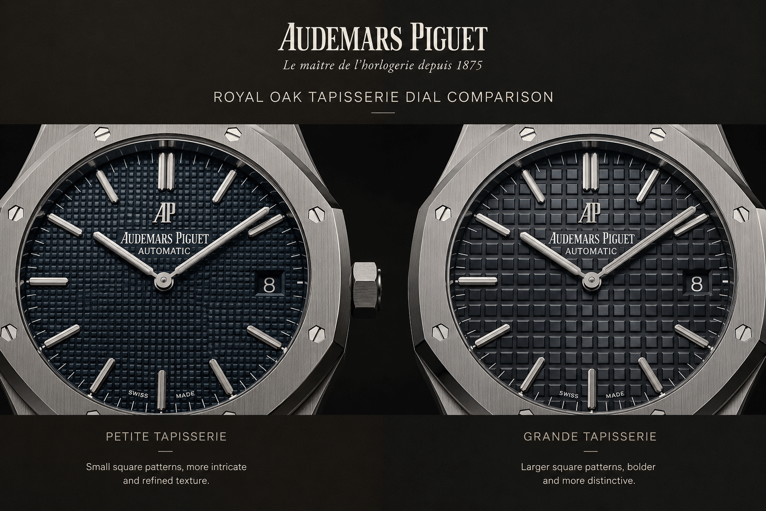
The difference between Petite Tapisserie, Grande Tapisserie, and Méga Tapisserie is mainly pattern scale, but the buying consequence is bigger than that sounds. These are not three decorative options that can be chosen by taste. Each pattern belongs to a different Royal Oak design language, and the correct pattern depends on the model family the watch is trying to represent.
Petite Tapisserie is finer and more restrained. Grande Tapisserie is larger and more visible on many standard Royal Oak models. Méga Tapisserie is much bolder and better suited to Offshore-style designs. If a buyer is asking which pattern is correct, the answer should start with the reference, not the color or factory name.
This is where many AP replica dial evaluations go wrong. Buyers may see a sharp square texture and assume the dial is good. But a good-looking square texture can still be wrong if the pattern size does not match the intended model. Pattern scale changes the entire personality of the watch. It affects how busy the dial looks, how strongly it catches light, and how naturally it fits the case size.
| Pattern Type | Visual Character | Buyer Takeaway |
|---|---|---|
| Petite Tapisserie | Small, tight, subtle squares with a refined texture effect | Best judged by delicacy and light control, not dramatic depth |
| Grande Tapisserie | Larger, clearer square grid with stronger wrist presence | Needs visible dimensional relief without looking stamped or blocky |
| Méga Tapisserie | Very large, bold, aggressive texture associated with Offshore-style dials | Should look muscular and integrated, not plastic-like or exaggerated |
These pattern names are useful as visual categories, but buyers should avoid turning them into proof of factory accuracy. A listing can use the right term while still showing the wrong scale, weak relief, or poor date-window integration. The safer approach is to treat the term as a hypothesis: if the watch is described as Jumbo-style, the dial should behave like a fine Petite Tapisserie dial; if it is described as a standard 15400 or 15500-style watch, the Grande pattern should carry more presence; if it is Offshore-style, the Méga texture should look bold without becoming artificial.
Petite Tapisserie: Fine, Compact, and Subtle
Petite Tapisserie uses smaller and tighter squares, giving the dial a finer texture. It is the most restrained of the three patterns and is strongly associated with Jumbo-style Royal Oak references. The visual effect should be elegant rather than loud. If the texture jumps out too aggressively, the watch can lose the thin, refined character that buyers usually want from this family.
For replica evaluation, Petite Tapisserie is difficult because the smaller pattern leaves less margin for error. Shallow grooves can make the dial look printed, while overly crisp cuts can make the surface look artificially etched. A strong Petite Tapisserie replica dial should not need heavy contrast to look interesting. It should reveal its texture as the light moves.
Grande Tapisserie: Larger and More Readable
Grande Tapisserie has a larger and more readable grid. It is the pattern many buyers mentally picture when they think of a modern standard Royal Oak. The squares are easier to see from normal wrist distance, so the dial carries more visual weight than a finer Jumbo-style dial.
The trap is assuming larger means easier. In some ways, Grande Tapisserie gives factories more room to create visible relief, but it also makes poor surface finishing easier to notice. If the channels are too shallow, the dial looks stamped. If the raised blocks are too hard-edged, the texture can look mechanical in the wrong way. Grande Tapisserie should have presence, but it should not look like a simple grid pressed into metal.
Méga Tapisserie: Bold Offshore-Style Texture
Méga Tapisserie is the boldest pattern. The squares are much larger, the texture reads immediately, and the dial has a more aggressive sport-watch feel. This makes sense on Offshore-style models, where the thicker case, stronger bezel, rubber strap options, and chronograph-style layouts can visually support a heavier dial texture.
On a replica, Méga Tapisserie can look impressive in photos because the large pattern is easy to capture. The real test is whether it still feels integrated. If the blocks look too glossy, too sharp, or too plastic-like, the dial can become cartoonish. A bold pattern is correct for the right Offshore-style watch, but exaggerated texture is not the same as accurate texture.
Pattern Scale Is Not Interchangeable
The most important buyer rule is this: pattern scale is not interchangeable. A dial can have the right color, decent markers, and clean printing but still look wrong if the tapisserie family does not match the reference. This is a more serious issue than a small color shift because it changes the model identity.
For AP replica dial comparison, start by asking whether the pattern type belongs on that watch. Only after that should you judge depth, color, logo, date position, and marker alignment. A factory name can help narrow the search, but it does not replace reference-correct evaluation. A strong factory can still release a version where the dial texture looks good in isolation and wrong for the model.
Petite Tapisserie on Jumbo-Style Royal Oak References
Petite Tapisserie matters most on Jumbo-style Royal Oak references because the entire watch depends on restraint. The thin case profile, minimal dial furniture, lack of visual clutter, and compact texture all work together. On an AP 15202 replica dial, the fine pattern is not there to create a dramatic “waffle” effect. It is there to add quiet depth without overpowering the flat, elegant case architecture.
This is why a Petite Tapisserie replica is often more difficult to judge than a bolder dial. Large texture can impress quickly. Fine texture has to be right in a quieter way. If the grooves are too shallow, the dial looks flat. If the square edges are too harsh, the surface looks artificially cut. If the color coating lacks interaction with the texture, the dial may look like a smooth blue or grey plate with a pattern drawn on top.
For Jumbo Royal Oak buyers, the mistake is expecting the dial to behave like a standard modern Royal Oak dial. A Petite Tapisserie dial should not shout from across the room. It should show tight square consistency, fine shadow transitions, and controlled shimmer when the wrist turns. If it needs exaggerated lighting to look textured, the dial may be weaker than the photos suggest.
Why Smaller Squares Make Errors More Visible
Small repetitive patterns are unforgiving. With Petite Tapisserie, every square sits close to the next, so uneven spacing or inconsistent edges can create a visible rhythm problem. The eye may not identify one defective square, but it will notice when the grid feels nervous, wavy, or mechanically repetitive in the wrong way.
Shallow grooves are a common weakness because they reduce the dial to surface contrast. Instead of seeing raised squares and recessed channels, the viewer sees light and dark lines. That is not enough for a convincing fine dial pattern. On the other side, overly sharp engraving can also look wrong, especially in macro photos. The genuine-style impression is not about razor-like harshness; it is about dimensional texture that transitions smoothly enough to catch light naturally.
This is where the Petite Tapisserie replica problem becomes more subtle than “good” or “bad.” A dial can look clean and still lack depth. Another dial can show strong texture but feel too aggressive for a Jumbo-style watch. The better option is the one that preserves the quiet character of the model, not the one that looks most dramatic in a close-up image.
How Petite Tapisserie Should Behave Under Light
Petite Tapisserie should create a restrained shimmer. The dial should not go dead flat under soft light, and it should not explode into harsh reflections under direct light. The best effect is a controlled shift: the raised squares catch light, the channels create fine shadow, and the color changes slightly as the watch turns.
Darker blue and grey dials can hide weakness in casual photos because low light compresses the pattern. A blue AP 15202 replica dial may look rich and convincing in one straight-on image, then appear flat when photographed at an angle. This is why angled light matters. It shows whether the texture has real visual relief or whether the dial is relying mostly on color and contrast.
Buyers should also watch for excessive gloss. A Jumbo-style dial with too much shine can make the fine pattern look like a lacquered print rather than a textured metal surface. Some shine is expected because the dial is not matte in a simple way, but the light should move through the pattern, not simply bounce off the top.
Common Replica Weaknesses on Jumbo-Style Dials
The most common weakness on Jumbo-style dials is flatness. The watch may photograph well because the grid is present, the color is attractive, and the markers are aligned, but within an AP Royal Oak bracelet guide context, the dial still lacks the small shadow transitions that give Petite Tapisserie its depth. On wrist, this can make the watch look less expensive and less architectural than the Royal Oak design demands.
Another issue is a too-clean printed appearance. If the square pattern looks perfectly uniform but lifeless, the dial may feel more like a graphic surface than a cut or formed texture. Petite Tapisserie should be precise, but it should not look digitally sterile. The texture needs enough dimensional behavior to avoid becoming a flat checkerboard.
Grid rhythm is also worth checking. The fine dial pattern should remain consistent around the markers, logo area, and date window if present on the version being evaluated. If the pattern seems to bend, blur, or lose definition near applied parts, the dial can look poorly integrated. Marker placement matters here because markers sitting awkwardly over the pattern can make the dial feel assembled rather than designed.
The strongest judgment for buyers is this: on a Jumbo-style Royal Oak replica, do not reward the most obvious tapisserie. Reward the most disciplined one. Petite Tapisserie is supposed to support the thin, restrained character of the watch. If the dial looks loud, flat, or artificially sharp, it is missing the point even before you compare movement architecture or case thickness.
Grande Tapisserie on 15400, 15500, and Standard Royal Oak Models
Grande Tapisserie is the pattern most buyers picture when they think of a modern standard Royal Oak replica. It is larger and more assertive than Petite Tapisserie, but not as oversized as the Offshore Méga pattern. On a 15400 or 15500-style watch, the dial texture is not a quiet background. It gives the watch much of its visual weight, especially on blue, grey, black, and silver dials where the raised squares and recessed channels control how the color changes under light.
This is why a Grande Tapisserie replica can look strong in a straight dealer photo but weaker in real use. The larger square pattern gives factories more visible geometry to work with, which helps the dial look textured from a distance. The tradeoff is that poor depth, uneven block shape, or a flat stamped surface becomes easier to notice. A good AP 15400 replica dial or AP 15500 dial should not look like a printed grid with dark lines between squares. It should have dimensional relief, controlled shadow, and a surface that changes as the watch turns on the wrist.
How Grande Tapisserie Changes Wrist Presence
On standard Royal Oak models, Grande Tapisserie makes the watch feel broader and more architectural than a Jumbo-style dial. The larger square pattern visually supports the 41mm case, the wider bezel, and the stronger applied indices. If the texture is too weak, the dial can make the whole watch feel cheaper than the case and bracelet suggest. If the texture is too aggressive, the dial can look harsh and over-machined.
The better standard Royal Oak replicas usually understand this balance: the dial should have enough depth to catch light, but not so much that every square looks like a carved plastic block. Grande Tapisserie accuracy is about proportion as much as detail. The squares should feel integrated into the dial, not laid on top of it as a separate graphic effect.
For buyers, the practical judgment is simple: on a standard Royal Oak replica, the dial carries more of the watch’s identity than the logo does. A slightly imperfect logo print may only bother you in macro photos. A flat or wrongly scaled Grande Tapisserie pattern affects the entire wrist presence every time you look down.
15400 and 15500 Dial Differences Buyers Should Not Blur Together
The 15400 and 15500 are often discussed together because both are modern 41mm Royal Oak references with Grande Tapisserie dials, but they are not the same dial problem. Buyers make mistakes when they treat “15400 vs 15500 dial” as only a movement or case discussion. The dial layout, text, marker proportions, and date-window relationship all need to match the claimed reference.
On a 15400-style dial, the presence of “AUTOMATIC” text and the 3 o’clock marker layout create a different visual balance. The dial has more information in the lower half, and the applied indices interact differently with the tapisserie grid. On a 15500-style dial, the cleaner layout and changed marker proportions make spacing more exposed. If the logo is too high, the markers are too thick, or the date window sits awkwardly against the square pattern, the dial can look wrong even if the texture itself is acceptable.
This is where factory reputation alone becomes a weak shortcut. A factory may produce a convincing 15500 batch but still have a less convincing 15400 dial execution, or the reverse. At CleanVSFactory, we tend to separate the reference from the factory name first. The better question is not “which factory makes the best AP,” but whether this exact batch has the correct dial layout, Grande Tapisserie scale, date placement, and marker relationship for the model it claims to copy.
In QC photos, look beyond whether the dial is blue or grey and whether the AP logo appears centered. Check whether the applied indices sit naturally over the square pattern. Check whether the date window cuts cleanly through the grid rather than looking squeezed into it. Check whether the printed minute track and dial text have enough sharpness without becoming too heavy. These smaller items interact with the Grande Tapisserie surface, so judging them separately can be misleading.
Where Grande Tapisserie Replicas Often Look Too Stamped
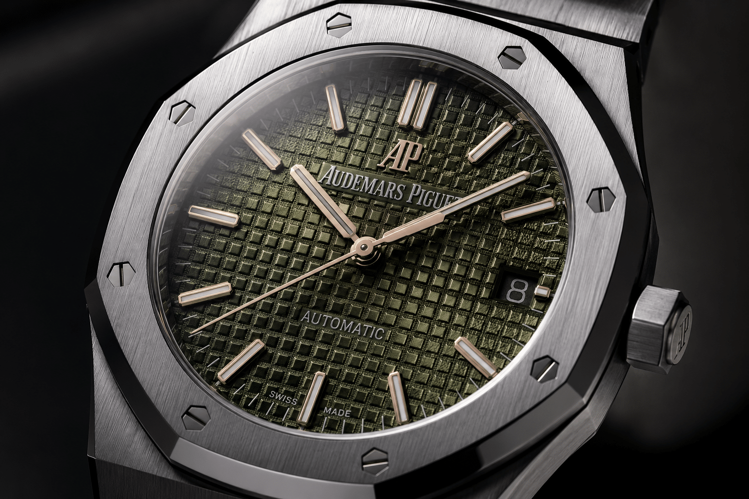
The most common weakness on a Grande Tapisserie replica is not that the grid is missing. It is that the grid looks too uniform, too shallow, or too mechanically stamped. Genuine-style tapisserie has a layered visual effect: raised squares, recessed channels, and surface finishing work together so the dial changes character as light moves across it. Many replica dials imitate the pattern outline but struggle to reproduce that depth.
A too-stamped dial usually shows one of three problems. First, the channels between squares look like dark printed lines rather than cut recesses. Second, the square tops look flat and repetitive, with no convincing surface behavior. Third, the edges are so hard and sharp that the dial looks dry under macro lighting. None of these flaws may be obvious in a low-resolution front photo, but they become visible in angled shots.
Color can either hide or expose the issue. Dark blue and black dials may look impressive in bright seller photos because the contrast disguises shallow relief. Silver or grey dials can reveal flatness sooner because the light spreads across the surface more evenly. Green-style dials can be especially unforgiving if the coating looks glossy without enough texture underneath. This is why Royal Oak dial QC should include at least one angled photo, not only a straight-on beauty shot.
The buyer’s tolerance should depend on use. If the watch is meant as a casual daily-wear AP replica, a slightly imperfect Grande Tapisserie pattern may be acceptable if the case, bracelet, date alignment, and overall dial balance are strong. If the buyer is specifically chasing close macro-level dial accuracy, Grande Tapisserie is one of the areas where even higher-tier replicas still show limitations. Paying more may reduce obvious flaws, but it does not make the dial equivalent to genuine AP dial work.
The mistake to avoid is choosing the watch only because the square pattern looks bold. Bold is not the same as accurate. A convincing standard Royal Oak dial should have the right pattern scale, believable depth, clean interaction with the date window, and color that still looks credible when the watch is tilted.
Méga Tapisserie on Royal Oak Offshore Replicas
Méga Tapisserie belongs to a different visual world from the standard Royal Oak. On a Royal Oak Offshore dial, the larger square texture is not a mistake or an exaggeration; it is part of the model’s sportier design language. The Offshore case is thicker, the bezel feels more muscular, the pushers and crown guards are more aggressive, and the dial needs a stronger texture to avoid looking empty inside that architecture.
For a Méga Tapisserie replica, the buyer’s question should not be “is the pattern big enough?” Most Offshore replicas can make the grid look bold. The harder question is whether the large dial squares have believable depth and whether the texture works cleanly around chronograph subdials, applied markers, printed tracks, and date elements. A Royal Oak Offshore dial can look exciting in photos but still feel toy-like if the square blocks are too glossy, too sharp, or poorly integrated with the rest of the layout.
Why Offshore Dials Need a Larger Pattern
The Offshore is not a thin, restrained Royal Oak. It is intentionally louder. Méga Tapisserie gives the dial enough mass to compete with the larger case, thicker bezel, rubber strap options, and chronograph-style layout. If an Offshore-style replica used a pattern that felt too fine, the dial would look visually underpowered. The bolder texture helps the watch feel coherent.
That does not mean bigger is always better. On a good Offshore replica dial, the large squares should still look controlled. The raised areas need shape, the channels need shadow, and the finish should avoid the cheap shine that makes the surface look molded rather than machined. The best Méga Tapisserie effect is bold but not cartoonish.
This is an important distinction for buyers coming from 15400 or 15500 comparisons. Standard Royal Oak dial accuracy rewards balance and refinement. Offshore dial accuracy rewards integration and texture control. If you judge an Offshore dial by the same subtle standard as a Jumbo-style Royal Oak, you may misunderstand the design. If you accept any oversized grid as correct, you may miss the flaws that actually matter.
Subdials, Printed Tracks, and Grid Interruptions
Chronograph layouts make Méga Tapisserie harder to evaluate because the grid is interrupted in several places. Subdials cut into the texture. Printed minute tracks cross over the pattern. Applied markers may sit partly on raised squares and partly near recessed channels. If these elements are not placed cleanly, the dial looks busy in the wrong way.
On an Offshore chronograph replica, check whether the subdials appear centered within the larger dial design, not just whether they are round and functional-looking. Poor subdial spacing can make the Méga Tapisserie grid look awkward because the squares stop and restart around the subdial edges. The interruption should feel intentional. If the texture seems abruptly chopped off, blurred, or uneven around the subdial borders, the dial loses credibility quickly.
The printed tracks matter too. White or colored printing over a large square pattern can expose weak manufacturing because ink may appear too thick, broken, or poorly seated across raised and recessed areas. In casual photos, the bold texture may distract the eye. In close inspection, messy printing over Méga Tapisserie is often easier to notice than buyers expect.
Dial accuracy and chronograph movement risk should also be kept separate. A replica can have a visually strong Royal Oak Offshore dial and still use a movement architecture that carries its own ownership compromises. This section is about the dial, but buyers should not assume a strong tapisserie pattern automatically means the whole Offshore replica is low-risk.
When Bold Texture Starts Looking Artificial
Méga Tapisserie fails when it becomes exaggerated rather than dimensional. The most obvious red flag is a plastic-like shine across the square tops. Offshore dials can be sporty, but they should not look like a glossy molded panel. Another common issue is overly sharp square walls, where every edge catches light in a harsh, identical way. That type of texture can look impressive in a macro photo but unnatural on the wrist.
Too much contrast is also a problem. Some Méga Tapisserie replica dials appear to rely on dark channels and bright square tops to create drama. The result can look graphic rather than physical. A better dial should show depth through shadow and surface finish, not only through heavy contrast.
For buyers, the practical test is whether the dial still looks convincing when the watch is tilted. If the pattern only looks good straight-on, but turns glassy, flat, or overly sharp under angled light, the texture is probably doing too much visually and not enough dimensionally. With Offshore models, boldness is expected. Artificial boldness is the warning sign.
Movement and Case Thickness Still Affect Dial Judgment
Although this guide focuses on tapisserie, movement choice can change how the dial is experienced in real ownership. Some AP Royal Oak replicas use movements or movement constructions that influence case thickness, hand stack height, date position, rotor sound, and setting feel. A dial that looks accurate in isolation may sit inside a case that feels too thick for a Jumbo-style reference, or a date aperture may look slightly wrong because the movement architecture does not support the same layout.
This is especially important for first-time buyers comparing a visually attractive watch with a more stable daily-wear option. A decorated movement may look better through a caseback, but that does not automatically mean it is quieter, easier to service, or better for long-term use. Visual similarity and ownership reliability are related but separate buying priorities. If the buyer plans to wear the watch often, movement stability and serviceability may matter more than a slightly more impressive dial macro photo.
Complicated AP replicas deserve extra caution. Perpetual calendar-style layouts and Offshore chronographs can look more technical, but the movement side may introduce thicker cases, non-identical functions, fragile modules, or date and subdial behavior that does not match the visual promise. A good-looking tapisserie dial should not distract from these ownership questions. For many beginners, a simpler Royal Oak reference with fewer displays may be a more forgiving first purchase than a complicated model with more visible and mechanical risk.
When a seller describes a movement as “clone,” “decorated,” “upgraded,” or “same layout,” read that wording carefully. Those phrases may describe appearance, hand position, caseback decoration, or general architecture, but they do not automatically prove serviceability, durability, or equivalence to an authentic movement. For dial evaluation, the key movement-related question is narrower: does the movement choice force a case thickness, date position, hand height, or subdial arrangement that makes the tapisserie dial look less reference-correct?
Perpetual Calendar Models and Pattern Interruptions
A Royal Oak perpetual calendar replica creates a different tapisserie problem from a simple time-and-date Royal Oak. The base pattern still matters, but the dial is no longer judged only by square size and depth. Multiple subdials, calendar displays, and moonphase-style elements interrupt the grid, so the question becomes whether the entire AP perpetual calendar dial remains visually balanced.
This is where buyers often overfocus on the complication label. A Royal Oak perpetual calendar replica may look impressive because the dial is crowded and technical, but crowded does not automatically mean accurate. The tapisserie pattern must still sit correctly beneath the layout. A dial can have acceptable texture in the open areas and still look wrong if the subdials are poorly centered, the calendar tracks are misprinted, or the grid appears to break awkwardly around the displays.
Why Complication Layouts Expose Grid Problems
On a simple Royal Oak dial, the tapisserie grid has room to breathe. On a perpetual calendar-style dial, the pattern is repeatedly interrupted. Each subdial becomes a test of alignment. The calendar tracks need to sit cleanly inside their circular zones. The moonphase-style display, if present, needs to feel integrated rather than pasted over the texture. These interruptions make poor grid planning easier to see.
The challenge is symmetry. A small shift in a subdial position may not sound serious, but on a tapisserie background it can become visually obvious because the eye reads the grid as a measuring system. If one subdial cuts through the square pattern differently from another, the whole dial can feel slightly unsettled. This is especially true in macro photos, but on crowded dials it can also affect normal wrist viewing.
Buyers should not judge AP calendar replica accuracy by the base dial texture alone. The more useful question is whether the tapisserie, subdials, printed scales, and applied elements work together. If the dial looks technically busy but not visually organized, the issue is usually layout integration rather than the complication itself.
Texture Depth Around Subdials
The area around subdial edges is one of the first places to inspect on a Royal Oak perpetual calendar replica. The texture should not look melted, blurred, or suddenly flattened near the circular cutouts. It also should not look as if a generic tapisserie pattern was stamped first and then the subdials were punched into it without regard for transition quality.
A believable dial should show clean boundaries. The tapisserie texture can stop at the subdial edge, but it should stop with control. If the square pattern becomes fuzzy around the border, the dial may look lower grade even if the color is attractive. If the transition is too abrupt and sharp, the subdial can look disconnected from the rest of the surface.
This is a more serious flaw than a minor color difference. Color can vary under lighting and photography. Bad texture transition around subdials is structural. Once seen, it tends to remain noticeable because the wearer keeps returning to those crowded areas of the dial.
Subdial and Pattern Checks
For perpetual calendar dial QC, start with subdial centering. Each subdial should appear intentionally placed within the Royal Oak dial architecture, not merely close enough. Then check the printed scales inside the subdials. Numerals and calendar markings should be clear, evenly weighted, and not squeezed against the edge.
Next, look at grid continuity. The tapisserie pattern does not need to continue through the subdials, but the surrounding areas should feel consistent. Uneven square rhythm, distorted texture around display openings, or mismatched depth between different dial zones are warning signs. The dial should not look as if separate layers were assembled without a shared geometry.
Finally, judge visual balance. Perpetual calendar-style Royal Oak dials are naturally dense, but they should not feel chaotic. If the subdials sit awkwardly, the moonphase-style display dominates too much, or the printing fights against the tapisserie texture, the watch may disappoint even if the base pattern looks decent. For this model family, the safest buying mindset is not “more complication is more impressive,” but “more interruption gives the factory more chances to get the dial wrong.”
Depth, Light Play, and Color: Why Flat Tapisserie Looks Wrong
The easiest mistake is judging a Royal Oak dial by whether it has squares. That is not enough. The convincing part is tapisserie dial depth: raised squares, recessed channels, and the way both surfaces catch light differently. If the texture does not create controlled shadow lines, the dial starts to look like a printed grid instead of a dimensional surface.
This is where many AP replica dials separate themselves. A front-facing photo can show a clean pattern and acceptable color, but angled light often tells the truth. A strong dial should shift gently as the wrist moves. A weak dial may stay visually dead, turn muddy, flash too glossy, or show harsh edges that make the pattern look machine-stamped rather than naturally layered.
Raised Squares Versus Printed Shadows
On a convincing tapisserie dial, the raised squares should feel like physical blocks sitting above lower channels. The shadow is not just dark pigment between squares; it is created by height difference. This matters because dimensional relief changes the dial every time the viewing angle changes. The pattern should not look exactly the same in every photo.
Flat replica dials often rely too much on contrast. The channels look dark, the squares look lighter, but the surface does not have enough real relief. In QC photos, this can appear neat and tidy. On the wrist, it can feel strangely lifeless because the dial is showing a drawing of texture rather than behaving like texture.
The opposite problem is also possible. Some replica examples look overly sharp, with square walls that appear too crisp or dry under macro lighting. That can impress buyers at first because the pattern looks “detailed,” but it is not always more convincing. Royal Oak dial texture should have definition, not a razor-cut, artificial harshness that dominates the hands and markers.
Why Dial Color Changes With Texture
AP dial light play cannot be separated from color accuracy. A blue dial is not just “correct blue” or “wrong blue.” The texture changes how that blue reads. Deeper channels can make the dial look darker and more saturated. A shallow surface can make the same color look flat, pale, or slightly plastic. This is why one photo rarely proves AP replica color accuracy.
Blue dials expose this problem the most because buyers expect a rich, shifting tone. If the tapisserie is too shallow, the blue can look like a single flat coating, and in a Royal Oak replica models comparison, that weakness becomes a useful dial manufacturing reference point. If the finish is too glossy, it may turn electric or toy-like under strong light. Grey and black dials are more forgiving in casual photos, but they can still reveal weak depth when the shadow lines disappear at an angle.
White and silver-style dials create a different issue. They can hide poor depth because the surface looks clean and bright, but they may also wash out the grid completely if the recessed areas do not hold enough shadow. Green-style dials are especially sensitive to surface finish; too much gloss can make the color look loud, while too little depth can make it look dull. The practical judgment is simple: do not approve a dial color until you have seen how the texture behaves with it.
Macro Photos Can Help and Mislead
Macro photos are useful because they reveal square consistency, channel definition, marker seating, and whether the pattern has believable relief. They can show problems that a straight product shot hides, especially uneven grid rhythm or shallow recessed areas near applied markers. For tapisserie evaluation, a macro image is worth asking for when the seller’s standard photos are too bright or too flat.
But macro photos are not neutral truth. Harsh lighting can exaggerate tiny surface marks, make edges look more aggressive than they feel on wrist, or create shadows that make a shallow dial appear deeper than it is. A buyer who judges only from one macro image may reject a reasonable dial or approve a weak one for the wrong reason.
The better approach is to compare three views: straight-on, angled under neutral light, and closer dial detail. If the dial only looks good in one perfectly lit photo, be cautious. A convincing Royal Oak tapisserie dial should not require a single flattering angle to work.
Replica Production Limits: Stamped, Laser-Engraved, and Guilloché-Style Effects
Most factories can now reproduce the basic Royal Oak grid well enough for a clean front photo. The harder part is the finish. A replica tapisserie dial has to imitate not only square spacing, but also relief, surface grain, coating behavior, and the soft transition between raised and recessed areas. That combination is why two AP replica dials with similar layouts can look very different in real use.
It is safer to talk about visible production effects rather than pretend every factory’s exact method is known. In many replica examples, the dial may show a stamped-dial look, a laser-engraved look, or a more refined guilloché-style texture. None of those labels alone tells the buyer whether the dial is good. The real question is what the surface does under light.
Why Stamped Texture Can Look Too Uniform
A stamped texture often appears consistent at first glance, which is why it photographs well. The squares line up, the channels repeat, and the dial looks orderly. The weakness is that the pattern can become too even. Realistic texture needs depth and subtle variation in how light breaks across the surface. If every square looks mechanically identical and the grooves are shallow, the dial can feel like pressed metal with painted contrast.
The stamped dial problem is most obvious when the watch is tilted. Instead of separate raised areas and recessed channels producing layered shadows, the surface may reflect light as one flat sheet. Buyers sometimes mistake this clean uniformity for quality, but on a Royal Oak dial, excessive sameness can be a warning sign. A perfect-looking grid is not automatically a convincing grid.
Why Laser-Engraved Effects Can Look Too Sharp
Laser-engraved effects can solve one problem while creating another. They may give the dial clearer lines and stronger definition than shallow stamping, but the edges can look too abrupt. Under macro photos, the channels may appear dry, cut, or harsh rather than smoothly integrated into the dial surface.
This is where “more detail” becomes overrated. A buyer comparing QC images may prefer the dial with the sharper grid because it looks more dramatic. On wrist, that same sharpness can make the watch feel less refined. Royal Oak tapisserie should have structure, but it should not look like a computer-etched pattern sitting on top of the dial color.
The Hardest Part Is Not the Grid, but the Finish
The grid is only the skeleton. The finish is what makes it believable. Surface finishing, recessed-channel treatment, color coating, and the way the dial accepts reflection all work together. If one part is wrong, the entire dial changes character. A dial with correct square spacing can still look weak if the blue turns flat, the grey looks chalky, or the black loses all shadow separation.
This is why AP replica dial production remains difficult even in higher-tier super clone watch versions. Factories may improve pattern geometry from batch to batch, but the final credibility depends on the coating and finishing process as much as the machining. Buyers should treat factory claims about “upgraded dial texture” as a reason to look closer, not as proof that the problem is solved.
At CleanVSFactory, we usually evaluate AP dial claims by photo behavior rather than description. If the texture does not show depth across multiple angles, the advertised production method matters less than the visible result.
Model-Correct Pattern Matching Before You Judge Factory Quality
Before deciding whether a factory did a good job, confirm the dial is being judged against the right reference. AP replica reference accuracy starts with model-correct pattern matching. A Royal Oak dial pattern can be well executed and still be wrong if the scale belongs visually to another part of the Royal Oak family.
This is a bigger issue than a small color shift. Lighting can make a blue dial look slightly different from photo to photo. A wrong tapisserie scale changes the character of the watch. If the pattern is too large, a restrained model can look heavy. If the pattern is too fine, a sportier model can lose the visual force it is supposed to have.
Jumbo, Standard Royal Oak, Perpetual Calendar, and Offshore Are Not the Same Dial Problem
A Jumbo-style Royal Oak, a standard 41mm Royal Oak, a perpetual calendar layout, and an Offshore chronograph do not create the same dial challenge. The case size, dial opening, marker proportions, date placement, subdials, and overall design language all change how the Royal Oak dial pattern should read.
For a 15202-style dial, the texture is expected to feel finer and more restrained. For 15400 and 15500-style models, the larger pattern has stronger wrist presence and must interact cleanly with the date window and applied indices. For perpetual calendar-style dials, the problem is not only the base pattern but how subdials and calendar tracks interrupt it. For Offshore models, the bolder dial architecture can support a more aggressive texture, but it also makes flat or glossy execution easier to notice.
The non-obvious point is that “good texture” is not universal. The right texture must suit the reference. If the dial looks attractive by itself but fights the model’s proportions, the watch will feel off even if the case and bracelet are acceptable.
Factory Reputation Does Not Replace Reference Checking
A known AP replica factory may be strong on one model and less convincing on another. That does not make the factory useless; it means the buyer should avoid turning factory reputation into a shortcut. The better question is not simply which factory is good, but whether this factory version has the correct Royal Oak dial pattern for the specific reference being sold.
This matters because version differences can be real. A factory may update dial color, change texture depth, adjust marker placement, or use a different dial supplier without the model name changing much in seller listings. Two watches described as the same AP 15500 replica may not have identical dial behavior if they come from different batches or different versions.
Buyers should also be cautious with mixed reference language. A listing that loosely says “Royal Oak blue dial” without clearly matching the case size, dial layout, date position, and tapisserie type is not enough. For this kind of watch, vague naming increases the risk of receiving a dial that looks generally AP-like but not reference-correct.
Version Details to Confirm
Before judging factory quality, confirm the claimed reference, dial color, tapisserie type, date or subdial layout, and whether the QC photos match the version being discussed. A seller photo from one batch and QC photos from another can create false confidence, especially with AP dials where small changes in texture and coating matter.
The most serious red flag is not a minor difference caused by lighting. It is a mismatch between the model and the dial architecture: the wrong pattern scale, the wrong date layout, subdials that do not belong to the claimed reference, or a texture style that makes the watch read like a different Royal Oak family. Once the pattern is wrong, better finishing cannot fully rescue the watch.
A practical buyer should check reference correctness first, then judge depth, color, and factory execution. That order prevents the common mistake of praising a clean-looking dial that was never correct for the model in the first place.
How to Read Seller Claims Without Overreacting
Seller language around AP Royal Oak replicas often compresses several different issues into one phrase. “Best dial,” “latest version,” or “upgraded tapisserie” may refer to improved color, sharper pattern edges, better marker placement, a new movement, or simply a newer batch. None of those claims is useless, but each needs a buyer-verifiable check. For a tapisserie dial, the claim should be supported by angled photos, close-ups around the date or subdials, and a clear reference match.
A factory label should also be read narrowly. If a factory is known for a strong 15500-style Royal Oak, that does not automatically prove its 15202-style Petite Tapisserie dial, perpetual calendar layout, or Offshore Méga Tapisserie execution is equally strong. Model difficulty changes the evaluation. Simpler dials expose texture and case proportion; complicated dials expose alignment and printing; Offshore models expose bold texture control and movement thickness.
The safest interpretation is to treat every listing as a set of signals rather than a conclusion. The factory name helps identify the likely source, the price gives context, the description tells you what the seller wants to emphasize, and the QC photos show the actual watch being considered. When these signals disagree, the physical evidence in the QC photos should carry more weight than the marketing phrase.
Be especially careful with listings that combine several high-risk claims at once, such as “latest best factory,” “perfect 1:1,” “genuine movement,” “waterproof,” or “passes inspection.” In a replica-market context, those phrases should not be treated as proof. The safer reading is to ask what can actually be verified from the specific watch: dial scale, texture behavior, date placement, movement photos if available, seller terms, and whether the description stays consistent with the QC evidence.
QC Photo Checklist for AP Royal Oak Tapisserie Dials
AP Royal Oak QC photos are useful only if they show the dial doing more than sitting flat under bright light. A straight-on photo can confirm basic dial alignment, but it rarely tells you whether the tapisserie has real-looking depth, whether the color changes naturally, or whether the applied markers sit cleanly over the grid. For this specific watch family, the dial check should not be treated as a quick glance at color and logo placement. The tapisserie is the surface that ties the whole Royal Oak face together.
The most useful tapisserie dial checklist starts with photo angles. Ask for, or at least prioritize, a clear front dial shot, an angled dial shot under neutral light, one macro photo of the texture, and a close-up of the date window or subdial area depending on the reference. If the seller only provides one overexposed front photo, you are judging the safest-looking version of the dial, not the actual dial behavior. That is where many replica AP dial inspection mistakes begin.
QC photos cannot prove that a replica dial has genuine-level manufacturing or long-term durability. They can, however, help you reject the obvious bad examples: the wrong tapisserie scale, flat stamped texture, muddy color, crooked applied details, or a grid that falls apart around the date window and subdials. At CleanVSFactory, we usually treat this as risk reduction, not perfection hunting. The goal is to avoid a dial that will bother you every time light hits it, not to chase an impossible guarantee from photos.
QC photos can reduce uncertainty, but they do not guarantee perfection. Buyers should still review visible details, confirm seller policies before ordering, and avoid treating any photo set as evidence that a replica watch is authentic or equivalent to the genuine brand-manufactured watch.
Texture Depth and Square Consistency
Start by checking whether the tapisserie squares look raised and recessed, not merely drawn onto the dial. In a good QC photo, the grid should show some dimensional relief: the square tops should catch light, while the channels between them should create controlled shadow. If the entire dial surface looks like one printed pattern with dark lines between blocks, the replica may look acceptable in a small product photo but flat on the wrist.
Square consistency matters because the Royal Oak dial is unforgivingly repetitive. One uneven area can disturb the rhythm of the whole face. Look for rows that remain straight across the dial, channels that do not widen or narrow randomly, and square tops that do not appear melted, rounded, or crushed. A tiny variation is normal in real-world QC photography, especially with reflection and crystal distortion. A visible wave, slant, or patch of weaker texture is more concerning.
The non-obvious check is the area close to applied markers, the logo, and the date aperture. Factories often make the central grid look respectable, but the texture near applied parts can reveal weak dial finishing. If the grid seems to fade, blur, or flatten around the markers, the dial may have been finished in a way that looks cleaner from the front than it does under angled light. This is more serious than a small dust speck because it changes the whole visual depth of the dial.
- Acceptable: slight lighting variation across the dial, minor shadow differences caused by crystal reflection, or small texture softness that is not obvious at normal viewing distance.
- Concerning: squares that look printed, channels with no real shadow, uneven grid rhythm, or areas where the pattern becomes noticeably weaker around applied details.
- Serious red flag: the wrong pattern scale for the claimed reference, because no amount of QC tolerance fixes a dial that belongs visually to another Royal Oak family.
Dial Color Interaction Under Different Angles
Do not approve or reject an AP Royal Oak dial color from one straight-on photo. Blue, grey, black, white, and green-style dials all behave differently depending on the tapisserie depth, crystal glare, and light angle. A blue dial can look rich in a bright front shot but dull or purple-leaning in angled light. A grey dial can look clean in neutral light but washed out when the texture fails to create enough shadow. A black dial may hide shallow texture better, which sounds helpful until the watch looks dead and featureless on the wrist.
The better test is comparison, not a single image. Put the front dial photo next to the angled dial photo and check whether the color changes naturally. A convincing Royal Oak-style tapisserie dial should show some shift across the raised squares and recessed channels. It should not look like one flat block of color with a grid printed over it. If the dial only looks good in one lighting angle and collapses into a muddy or overly glossy surface in another, that is a practical ownership issue, not just a macro-photo complaint.
White and silver dials deserve a slightly different tolerance. They can make shallow texture look less obvious in photos because the surface reflects more light. The risk is that the dial becomes too bright and loses the shadow structure that makes tapisserie recognizable. Darker dials have the opposite problem: they may hide imperfect squares, but they can also make the grid look like black printed lines rather than dimensional channels. Neither is automatically bad, but both require angled-light confirmation.
| Dial Color | What QC Photos Can Hide | What to Check |
|---|---|---|
| Blue | Color shift, flatness, overly saturated factory lighting | Compare straight-on and angled photos for natural shadow and tone change |
| Grey | Washed-out texture or weak contrast | Check whether the grid still has depth without looking too dark |
| Black | Shallow tapisserie hidden by darkness | Look for visible relief, not just dark channels |
| White or Silver | Overexposure and loss of shadow detail | Ask whether the square pattern remains readable under neutral light |
| Green-style | Glossy surface effect or uneven tone | Check for color consistency across the dial and around markers |
Markers, Logo, Date Window, and Subdial Placement
After the texture and color check, move to the applied details. The hour markers should sit naturally over the tapisserie grid. They should not look crooked, floating, squeezed between pattern blocks, or placed at an angle that fights the dial geometry. On a Royal Oak-style dial, marker placement is especially obvious because the tapisserie grid gives your eye a built-in ruler. A marker that might pass on a plain dial can look more wrong here.
The logo should be centered and clean, but the more useful check is how it interacts with the texture beneath it. If the logo looks pasted on top of a flattened patch, or if the surrounding squares look distorted, the dial may appear less convincing in person. Printing should be sharp without becoming too thick or heavy. Overly bold text is often more noticeable on a textured AP dial because the tapisserie already creates visual density.
For date models, date window alignment deserves close attention. The window should look cleanly cut into the dial, the date should sit centered enough to avoid looking high, low, or squeezed, and the surrounding tapisserie should not appear abruptly damaged or blurred. A slightly imperfect date wheel can be tolerable if it is not obvious on wrist. A poorly framed date aperture is harder to ignore because it sits directly inside the dial architecture.
For perpetual calendar-style and Offshore-style layouts, subdial placement adds another layer of risk. The subdials should feel integrated into the grid rather than randomly dropped onto it. Check whether printed scales are centered, whether subdial rings cut through the tapisserie cleanly, and whether the dial still feels balanced. If the subdials interrupt the pattern unevenly, the watch can look crowded even when the base texture itself is acceptable.
- Markers: check straightness, spacing, and whether each marker sits cleanly on the pattern.
- Logo and text: look for centered placement, clean printing, and no obvious flattened patch around the logo.
- Date window: check date centering, aperture cleanliness, and texture behavior around the cutout.
- Subdials: check centering, printed scale clarity, and whether the tapisserie interruption looks intentional rather than messy.
Red Flags Before You Decide
The biggest red flag is the wrong tapisserie pattern for the claimed model. A dial can have attractive color and clean markers, but if the pattern scale does not match the reference family, the watch will always feel visually off. This matters more than a small difference in shade because it affects model correctness, not just finishing preference.
Flat stamped texture is the next serious warning sign. If the dial has square shapes but no believable relief, the Royal Oak identity becomes weaker immediately. The same applies to a grid that looks too sharp and dry, with harsh edges that appear cut into the surface rather than formed with layered depth. Both problems can look acceptable in seller lighting and disappointing in daily wear.
Inconsistent grid rhythm should also make you pause. A Royal Oak tapisserie dial depends on repetition. If rows bend, channels vary, or the square geometry changes noticeably across the dial, your eye will keep returning to the flaw. This is especially true near the date window, subdials, and applied markers, where weak finishing is easier to expose.
Finally, be cautious with any dial color that only looks convincing in one angle. A good QC set should show the dial surviving normal light changes. If blue looks rich only in a direct front shot, grey only looks clean under heavy exposure, or black hides all texture unless the photo is edited or brightly lit, you are not seeing reliable dial behavior. For an AP Royal Oak replica, that is a real buying risk because the tapisserie is not background decoration. It is the face of the watch.
- Reject-level issue: pattern scale does not match the reference family.
- High-risk issue: the dial looks flat, printed, muddy, or overly glossy in angled light.
- High-risk issue: grid spacing is visibly uneven or distorted around applied details.
- Moderate issue: slight color shift that remains natural across different angles.
- Usually tolerable: minor macro-level texture imperfections that are not visible in normal wrist viewing.
Final Buying Judgment: What the Dial Can and Cannot Prove
A strong tapisserie dial can make an AP-style replica much more convincing, but it cannot prove the watch is authentic, authorized, factory-perfect, waterproof, or mechanically equivalent to a genuine Royal Oak. It is one important visual checkpoint among several: case profile, bracelet finishing, bezel geometry, crystal clarity, marker placement, movement behavior, and seller transparency still matter. The dial may be the face of the watch, but it should not be the only evidence used to approve a purchase.
The most defensible decision process is layered. First, confirm the claimed model family and the correct tapisserie scale. Second, check whether the texture has believable depth under angled light. Third, inspect how the grid behaves around markers, date windows, and subdials. Fourth, separate visual quality from ownership risk, especially on complicated or Offshore-style replicas. This keeps the buyer focused on what photos can actually show instead of relying on broad claims such as “best version” or “same as genuine.”
The purpose of factory and movement information is to help readers understand quality and risk, not to represent a replica watch as genuine. A strong super clone may look convincing in normal wear, but close inspection can still reveal differences in finishing, movement architecture, case proportions, bracelet feel, dial details, or service compatibility.
For CleanVSFactory readers, the takeaway is deliberately cautious: choose the replica that best matches the reference’s dial architecture and survives realistic QC-photo inspection, not the one with the loudest factory claim or most dramatic product photo. A good Royal Oak-style tapisserie dial should look correct in scale, dimensional in light, and integrated with the rest of the watch. Anything beyond that should be treated as expectation, not guaranteed fact.
Disclosure: This article is for general educational and comparison purposes only. Replica watches are not genuine products from the original luxury brands, and brand names are used only to identify reference designs or comparison topics. Factory names, movement descriptions, prices, availability, QC details, seller policies, and version information can change, so readers should verify important details with the seller before making a purchase decision. Replica watches should not be represented, resold, or used as genuine watches.