
On most watches, color and case material operate as surface decisions. On vacheron constantin replica watches, they function as tolerance multipliers. The brand’s layouts leave large areas of exposed dial, rely on thin typography, and keep the center axis visually naked. That combination converts microscopic production variance into macroscopic perception. A half-degree of hand tilt, a fractional shift in print registration, or a softened case edge that might pass unnoticed on busier designs becomes immediately legible here. This is why VC replicas stratify so sharply: not because the watches are harder in isolation, but because their geometry refuses to hide process noise.

Dial negative space amplifies every upstream shortcut. Thin markers offer no visual ballast. The exposed pinion turns the hand stack into a reference instrument. Add the hard transitions between brushed and polished surfaces, and you get a system where color density and material reflectivity directly control how visible assembly discipline becomes. In practice, this means that choosing a deep blue dial or a plated case is not an aesthetic preference—it is a decision to increase the signal-to-noise ratio of defects. Readers who approach VC replicas as color-first objects usually learn this the expensive way.
The effect is more aggressive here than on brands built around texture and mass. Designs from Rolex rely on dense interfaces and prominent applied elements that absorb small errors. Audemars Piguet leans on architectural cases and layered dials that distribute visual load. VC does the opposite. It uses restraint as structure. That restraint converts finishing quality into the primary user experience, which is why surface choices accelerate failure on VC replicas long before they do on most competitors.
VC Uses Visual Silence, Which Leaves No Place for Manufacturing Errors
VC’s visual silence is not minimalism for its own sake; it is a design strategy that elevates alignment into a core feature. Large dial whitespace increases perceptual sensitivity. Thin markers remove forgiveness. When printing drifts by a fraction or applied indices sit a hair proud of the lacquer, the eye catches it immediately because there is nothing else to look at. On replicas, this manifests as minute-track waviness, logo baselines that feel subtly off, and hand tips that appear to wander even when the movement is technically keeping time.
This is why VC replicas cannot hide behind texture or clutter. A textured dial can mask dust inclusion. A busy layout can camouflage micro-rotation. VC offers neither. The dial becomes a measurement plane, and every element is read against it. Over repeated ownership cycles, the same pattern emerges: watches that looked “fine in photos” reveal themselves on the wrist as uneasy objects, not because any single flaw is dramatic, but because the design amplifies cumulative smallness into persistent visual discomfort.
Once you understand this, configuration decisions change. You stop asking which color looks best and start asking which color reduces contrast around the center axis, which finish diffuses reflection, and which layout minimizes the chance that human assembly variance will surface. That shift—from appearance to behavior—is the only reliable way to approach VC replicas.
Material Transitions Expose Guangzhou Polishing Discipline
Case material on VC replicas is not about taste; it is about how upstream polishing discipline is made visible — steel is mechanically honest, brushed planes scatter light and polished bevels retain crispness when the underlying machining is sound, whereas plated metals behave differently because electroplating introduces thickness variance, softens corners, and pools at edges, a material-dependent failure progression that maps directly to the long-term surface integrity and maintenance outcomes analyzed in the long-term behavior and maintenance implications for Vacheron Constantin super-clone watches.
This is where guangzhou replica watch production becomes legible to the naked eye. Edge sharpness tells you how well fixtures were set. Bevel continuity tells you whether operators respected geometry through successive polishing stages. Plating thickness reveals whether surface preparation was uniform or rushed. On rose-gold VC replicas, minor inconsistencies in these steps turn into visible asymmetry because reflective surfaces amplify specular highlights. Lugs lose definition. Crown guards blur. Left and right bevels stop matching. The watch begins to feel “soft” even when nothing is obviously broken.
Steel, by contrast, offers a more forgiving optical environment. Without a plated layer to accumulate at transitions, the original machining lines remain closer to their intended profiles. This does not make steel replicas perfect, but it reduces amplification. Over time, owners notice that steel VC replicas age more gracefully, while plated versions tend to reveal their compromises quickly. The lesson is structural: material choice reflects system discipline. When the production chain is tight, any material can work. When it is not, rose gold exposes it first.
Color and material on VC replicas therefore operate as engineering filters. They determine how loudly the watch reports its own manufacturing history. Treat them as decoration, and you inherit that history blindly. Treat them as tolerance controls, and you regain agency over how much upstream variance you are willing to carry.
Dial Color Risk Map: Which VC Replica Colors Fail First
Dial color on vacheron constantin super clone pieces is not a cosmetic variable. It governs how aggressively manufacturing variance becomes visible once the watch is on the wrist. Ink density controls how sharply text edges reveal themselves. Contrast determines whether micro misalignment reads as character or as defect. Surface reflectivity decides whether dust, waviness, and uneven lacquer stay hidden or turn into persistent visual noise. After enough exposure to different batches and finishes, a clear hierarchy emerges: some colors absorb process imperfections, while others broadcast them.
This hierarchy matters because VC geometry already runs hot. The exposed center axis, long minute tracks, and thin typography convert small deviations into perceptual events. Dial color either dampens that signal or amplifies it. Treating color as a style choice ignores the way these watches actually behave over time. Treating it as a risk variable makes configuration predictable.
Silver / White Dials: Highest Structural Success Rate
Light dials offer the widest margin for upstream inconsistency. Low contrast between print and base layer softens micro drift in text placement and minute tracks. Diffuse reflection from silver or white lacquer reduces the visibility of tiny height differences between applied markers and dial surface. The result is not perfection, but forgiveness. Small errors still exist, yet they arrive quietly.
This is why silver and white dials consistently deliver the highest structural success rate. They do not eliminate geometry problems, but they prevent color from joining the failure stack. Owners tend to experience these watches as coherent objects even when tolerances are merely average. That coherence matters, because VC layouts provide no secondary textures to distract the eye. When color stays neutral, geometry becomes the only remaining variable, which simplifies judgment and lowers surprise.
Light dials therefore form the baseline configuration. They are not exciting, but they are stable. For anyone learning how VC replicas reveal themselves in daily wear, this stability creates a controlled starting point.
Practical judgment tips: evaluating light dials
Begin by checking minute track concentricity under angled light rather than straight on. Subtle drift often disappears head-on but shows itself when reflections slide across the outer ring. Then inspect the logo baseline relative to the center axis. On light dials, even a slight tilt becomes readable once you stop relying on contrast and start reading geometry.
Finally, verify that applied markers sit evenly above the lacquer layer. Uneven seating presents as tiny shadow gaps or inconsistent highlights at the marker bases. On silver and white dials, failures rarely originate from color itself. They surface through alignment and height relationships, which makes geometry the decisive filter.
Deep Blue Dials: Most Common Failure Zone
Deep blue is where VC replicas most often collapse from attractive to unusable. High saturation increases contrast between ink and base, which magnifies edge fuzz, haloing, and microscopic bleed around printed elements. Any dust trapped under the lacquer becomes immediately legible. Sunburst brushing, when present, adds another amplifier by converting minor radial inconsistencies into visible asymmetry as the watch moves.
This is why blue VC replicas vary wildly between batches. When process control is tight, blue looks exceptional. When it is not, blue exposes everything at once. Text edges lose definition. Subtle print misregistration turns into readable misalignment. The dial stops behaving as a surface and starts behaving as a diagnostic panel.
Over repeated encounters, the pattern stays consistent. Blue dials do not fail because they are inherently flawed. They fail because they demand discipline across printing, cleaning, and finishing steps that replicas often execute unevenly. Blue simply refuses to forgive shortcuts.
Practical judgment tips: reading blue dial defects
Start by looking for haloing around printed text — any soft glow at letter edges signals ink spread or surface contamination, and similarly when you check sunburst symmetry from multiple angles by rotating the watch slowly to see whether light radiates evenly from the center or breaks into irregular bands, you’re essentially applying the surface-tolerance and finish criteria outlined in the price stratification in Vacheron Constantin super-clone production quality and surface inspection methodology, where subtle finish variances correlate directly with production tier and inspection outcomes.
Finish by inspecting the date window border sharpness. On blue dials, soft aperture edges usually correlate with broader finishing compromises. These checks do not require tools. They rely on how saturated color interacts with light. When blue fails, it does so immediately and decisively.
Black and Grey Dials: Medium Risk, Behavior-Dependent
Black and grey sit between silver and blue, both optically and behaviorally. Lower chroma reduces the visibility of printing defects compared to blue, but darker tones highlight dust, surface waviness, and uneven lacquer thickness. Instead of exposing ink problems first, they expose cleanliness and flatness.
This makes black and grey behavior-dependent. A clean, well-leveled dial can feel composed and restrained. A rushed one reads as cloudy, soft, or subtly uneven. Many assume black is safe because it hides print drift, but it replaces that risk with another. Dust inclusion that would disappear on white becomes obvious on charcoal. Minor surface ripples that blue might mask with sunburst start to register as dull patches.
Understanding this middle ground prevents false confidence. Black is not automatically stable, and grey is not automatically forgiving. Both demand attention to surface quality rather than typography. They complete the color risk spectrum by reminding the wearer that every tone chooses a different failure mode, and that VC geometry will always translate that mode into lived experience.
Case Material Behavior: Why Rose Gold Multiplies Edge Errors
Case material on VC replicas is not a finishing choice layered on top of geometry. It is part of the geometry. The moment electroplating enters the process, the original machining profile stops being the final form and becomes only a substrate. Every micron of deposited material changes corner radii, softens transitions, and redistributes visual weight along edges. On watches built around exposed lines and restrained surfaces, those changes do not remain subtle.
What looks like a minor plating variance on paper becomes a visible distortion once light starts moving across the case. Bevels lose their snap. Lug edges gain thickness unevenly. Symmetry that existed at the steel stage drifts after coating. This is why rose gold VC replicas often feel “off” even when nothing appears obviously wrong. The material is not just covering the case. It is actively rewriting it.
Assembly discipline becomes legible through these effects. When polishing stages are tightly controlled, plating can sit evenly and preserve edge intent. When they are not, the plating amplifies every upstream shortcut. Case material, in this sense, is not aesthetic. It is diagnostic.
Stainless Steel: Most Forgiving Surface for VC Replicas
Stainless steel provides the cleanest reference baseline because it preserves the original machining geometry without introducing an additional accumulation layer. Brushed planes scatter light, which reduces the visibility of micro waviness. Polished facets retain sharper boundaries because there is no electroplated skin rounding them over. What you see in steel is much closer to what the cutters and polishing wheels actually produced.
This makes steel the most forgiving surface for VC replicas. Small inconsistencies still exist, but they arrive muted. A slightly uneven bevel reads as texture rather than distortion. A marginally soft corner does not immediately announce itself through specular highlights. The watch remains coherent because reflection is diffused rather than concentrated.
For this reason, steel cases tend to age more gracefully in replica form. They expose fewer compounded errors and allow the underlying geometry to speak without interference. That does not mean steel guarantees quality. It simply removes one amplification layer from the system. In practical terms, steel becomes the control sample against which all other materials should be judged.
Rose Gold: Electroplating Turns Minor Defects into Major Ones
Rose gold does the opposite. Electroplating introduces thickness variance by nature, and that variance rarely distributes itself perfectly across complex shapes. Material accumulates at edges. It softens sharp transitions. It exaggerates left–right differences that were barely perceptible in raw steel. On VC cases, where bevel continuity and lug symmetry are central to the visual experience, this is destructive.
Polish diffusion compounds the problem. Before plating, cases already pass through multiple polishing stages. Any inconsistency introduced there becomes magnified once a reflective rose layer is applied. Highlights grow brighter. Shadows deepen. Asymmetry stops hiding. What was once a quiet imperfection becomes a persistent visual signal.
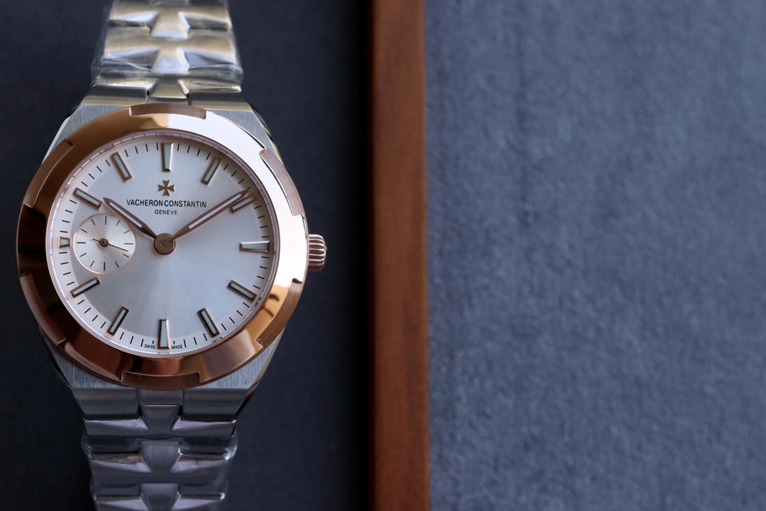
This is why rose gold VC replicas so often disappoint in hand. Even when the watch photographs well, real-world movement exposes uneven edge thickness and softened crown guards. The case begins to feel inflated rather than precise. Owners often describe these watches as lacking tension or structure, not because the design is flawed, but because plating has diluted the original geometry.
The failure is systemic. Rose gold does not create problems on its own. It reveals whether the production chain was disciplined enough to support it.
Practical judgment tips: reading plated cases
Start with the lug edges. Sharpness matters more than shine. Run your eye along the transition between brushed and polished surfaces and look for consistent line weight from tip to base. Any rounding or swelling near the corners usually indicates plating buildup.
Next, compare left and right bevel thickness. On well-executed cases, both sides mirror each other closely. On compromised ones, one bevel often appears wider or softer under the same light. This asymmetry is rarely accidental.
Finally, examine the crown guards. Plating tends to pool in these recesses, which makes them an early indicator of process shortcuts. If the guards look blunted or overly padded, the rest of the case usually tells a similar story.
These checks take seconds and require no tools. They work because plating does not hide polishing mistakes. It preserves them in metal. Once you learn to read those signals, rose gold stops being seductive and starts behaving like what it is on VC replicas: a magnifying glass for assembly discipline.
How Color and Material Interact with VC Geometry
Color and case material never operate in isolation on VC replicas. They sit on top of a layout that exposes its own structure: a long, uninterrupted minute track, a visually dominant center axis, and a bezel that frames everything with near-perfect symmetry. This geometry acts like a measurement rig. Whatever happens on the dial and case is immediately referenced against that underlying structure, which is why configuration choices feel amplified compared to most other watches.
The center axis is the critical point. VC designs leave it visually naked, with minimal surrounding clutter to dilute attention. Hands radiate from a clearly defined origin, and any deviation in alignment or height becomes part of the visual narrative. Dial color controls how sharply that origin stands out. Case material controls how aggressively reflections pull the eye back toward it. When both variables push in the same direction, small tolerances stop being abstract manufacturing details and start becoming lived experience.
This is where many owners misinterpret what they are seeing. They attribute discomfort to randomness or individual defects, when in reality they are observing a predictable interaction between contrast, reflectivity, and exposed geometry. Once you recognize this interaction, VC replicas become easier to read. The watch is not being temperamental. It is reporting how color and material are coupling with its structural layout.
Light Dials Reduce Axis Anxiety; Dark Dials Magnify It
Light dials soften the visual authority of the center axis — low contrast around the pinion reduces how strongly the eye locks onto the exact origin point of the hands, so micro tilt in the hand stack still exists but does not announce itself, and because the surrounding field does not compete with it this calmer axis effect masks alignment errors that remain present yet recede into the overall surface, a perceptual and dimensional behavior precisely characterized in the Vacheron Constantin replica structural and alignment performance review where surface contrast and axis fidelity interplay in real-world observation.
Dark dials reverse that relationship. High contrast creates a visual target around the pinion, which turns even minimal hand tilt into a perceptual event. The darker the field, the more aggressively the eye measures symmetry. This is why the same mechanical tolerance can feel acceptable on a silver dial and unsettling on a deep blue or black one. The geometry has not changed. The perceptual gain has.
Understanding this stops the cycle of blaming luck. When a dark-dial VC replica feels unstable, it is rarely because that specific watch is uniquely flawed. It is because contrast has elevated the visibility of normal assembly variance. Light dials dampen that signal. Dark dials amplify it. Once you internalize this, axis behavior becomes something you anticipate rather than something that surprises you.
Plated Cases Emphasize Hand Height Errors
Case material adds a second amplification layer, this time in the vertical dimension. Plated surfaces, especially rose tones, produce strong specular highlights along bezel edges and case transitions. Those highlights draw attention to the spatial relationship between dial plane, hands, and crystal. Any irregularity in hand stack height that might go unnoticed on brushed steel becomes readable once reflective surfaces start framing the dial.
This effect is subtle but persistent. Plating increases reflectivity, which sharpens perceived depth. When the minute hand sits a fraction higher than expected, or when the seconds hand appears closer to the crystal on one side of its sweep, the eye registers it more readily against a glossy case. The watch begins to feel spatially inconsistent even though nothing is obviously broken.
That is why some VC replicas feel “off” without presenting a clear defect. The combination of reflective case material and exposed geometry exaggerates vertical offsets that would otherwise stay quiet. Steel diffuses this behavior. Plated cases concentrate it. The difference is not mechanical. It is optical.
Taken together, these interactions explain a large portion of perceived quality variation. Light dials reduce center axis anxiety. Dark dials intensify it. Steel cases mute hand height sensitivity. Plated cases magnify it. Color and material do not merely decorate VC replicas. They actively participate in how geometry is experienced. Once you start reading those interactions, configuration stops being guesswork and becomes a form of structural literacy.
Configuration Judgment: Safe vs High-Risk VC Replica Setups
Once color, material, and geometry are understood as interacting systems, configuration stops being subjective. Patterns emerge quickly. Certain combinations dampen manufacturing variance, while others stack risk until even small tolerances become dominant. China super clone vacheron builds follow this logic with remarkable consistency. What changes from batch to batch is execution quality. What does not change is how different configurations react to that execution.
Think of each setup as a gain structure. Dial contrast sets the first level of amplification. Case reflectivity sets the second. VC’s exposed layout provides the reference frame that converts both into perception. When all three lean in the same direction, failure accelerates. When they counterbalance each other, the watch retains coherence even under average assembly conditions. This is the mental map that separates stable configurations from fragile ones.
Lower-Risk Configurations
Silver or white dials paired with stainless steel establish the structural baseline. Contrast stays low, reflections remain diffused, and the center axis does not dominate the visual field. In this environment, alignment behavior becomes readable without becoming aggressive. Minor printing drift blends into the surface. Small height differences between hands do not immediately announce themselves. Bezel symmetry still matters, but it does not shout.
Simple three-hand layouts reinforce this stability. With fewer visual events competing for attention, the eye settles into the dial rather than scanning for problems. Geometry remains the primary variable, but it operates in a softened optical context. For newcomers, this configuration provides a clear starting point because it minimizes surface amplification while preserving the core VC experience. It does not guarantee perfection. It simply removes unnecessary multipliers.
Over time, owners notice that these setups feel calmer. They tolerate small inconsistencies without turning them into constant visual noise. This is not about playing safe. It is about choosing a configuration where structural signals arrive at human scale.
High-Risk Configurations
Deep blue dials combined with rose gold cases sit at the opposite end of the spectrum. Here, contrast and reflectivity align with VC geometry to amplify every deviation. Saturated color sharpens ink edges and exposes dust. Plating concentrates highlights along case transitions and around the bezel. Sunburst finishes add directional sensitivity on top of both. The result is a compounding effect: contrast magnifies dial variance, plating magnifies edge variance, and the exposed layout ties them together through the center axis.
These builds fail disproportionately because they demand discipline across too many stages at once. Printing must be perfect. Surface preparation must be uniform. Plating thickness must be tightly controlled. Polishing symmetry must survive multiple handoffs. When any one of these slips, the configuration ensures that the error becomes visible. What might pass quietly on steel with a light dial becomes persistent on blue-and-gold.
This is where system assembly discipline reveals itself. High-risk configurations do not create defects. They surface them. Owners often describe these watches as visually restless or structurally soft, even when individual components seem acceptable in isolation. The interaction between color, material, and geometry is what pushes them over the edge.
Closing Judgment: VC Color Choices Are Manufacturing Tests, Not Style Choices
On vacheron constantin replica watches, color and material operate as engineering filters that determine how tolerance stacking across dial, case, and assembly becomes visible, which is why these watches succeed or fail structurally long before they succeed visually, and understanding that interaction gives you the clarity to choose how much upstream variance you are willing to live with.