
Understanding Vacheron Constantin: Why VC Design Philosophy Makes Replicas Unforgiving

Vacheron Constantin is best understood as a geometry-first watchmaker rather than a heritage-first one. Its designs do not rely on visual density, decorative clutter, or layered distractions to carry presence. Instead, they depend on proportion, axial balance, and uninterrupted lines to establish legitimacy on the wrist. That choice creates an immediate consequence in replication: VC is not difficult because of complications, it is difficult because nothing is hidden.
Across repeated comparisons, VC exposes alignment errors earlier than almost any other major brand. A one-degree hand rotation error, a half-millimeter dial offset, or a slightly drifting bezel does not remain subtle. It becomes visually loud because the layout gives your eye nowhere else to go. Where other brands allow mistakes to dissolve into texture, VC forces every deviation into the foreground.
This is why VC replicas feel brutally polarized in real use. The good ones feel unusually coherent. The average ones feel unstable, even when individual parts appear well finished. That split does not come from marketing tiers or movement labels. It comes from geometry.
Vacheron Constantin Is Not Modular by Design
Rolex builds tolerance buffers; VC removes them
Most buyers coming from Rolex carry an assumption they don’t realize they have: that modern luxury watches are built to absorb manufacturing variation. Rolex designs with buffers everywhere. Thick bezels compress visual space. Dense dial printing adds texture. Cyclops lenses, rehaut engravings, and stacked text blocks act as anchors that redirect attention away from minor misalignment.
VC does the opposite. Bezels are thin. Dials are open. Central axes run long and uninterrupted. Text is sparse and lightweight. There are no visual shock absorbers built into the layout.
The practical outcome is simple. Rolex absorbs errors. VC amplifies them.
On a Rolex, a slightly rotated dial can disappear inside bezel mass and print density. On a VC, the same deviation breaks symmetry immediately. The watch stops feeling calm, even if you cannot articulate why. This is the structural reason why Vacheron Constantin replicas fail so unevenly across factories, and why vc vs rolex design tolerance is not a theoretical distinction but a daily ownership reality.
VC designs around axial balance, not feature density
VC layouts prioritize centerline symmetry, visual calm, and proportional spacing over feature count. Hands are long. Indices are evenly distributed. Negative space is intentional, not leftover. The design assumes that every component will land exactly where it belongs.
When that assumption is violated, harmony collapses fast — a minor dial shift is not “acceptable” but becomes visually dominant, and a slightly short hand does not read as a small defect but destabilizes the entire composition, a structural consequence of module-induced stack changes and interface exposure documented in the market drift and structural risk patterns in Vacheron Constantin super-clones.
This is the replica consequence most buyers underestimate. VC does not give you partial credit. Either the geometry holds, or the watch feels wrong.
The Three Core Design Routes of Vacheron Constantin
These routes define how VC expresses geometry across its catalog. They also explain why different VC replicas fail in different ways.
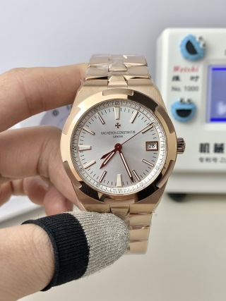
Route 1: Integrated Sport Geometry (Overseas)
The Overseas line is built around integrated sport geometry. The bezel references the Maltese cross. The bracelet flows directly into the case. Polished and brushed surfaces alternate in tight, deliberate transitions.
Replica difficulty here is not cosmetic. Bezel symmetry must align simultaneously with the dial, the case midline, and bracelet articulation. If any one of those axes drifts, the entire watch twists visually on the wrist.
Tolerance stack errors usually surface as bezel imbalance, bracelet torque, or subtle case asymmetry during wear. Even when individual parts look impressive in isolation, misalignment between these systems produces overseas replica alignment issues that become obvious after minutes of real use.
This is why Overseas replicas demand factory-level discipline across case machining, bezel indexing, and bracelet geometry. You cannot fix one after the fact without disturbing the others.
Route 2: Radical Minimalism (Patrimony)
Patrimony represents radical minimalism. Maximum dial white space. Thin hands. Sparse text. Long, evenly spaced indices. There are no complications to distract the eye and no surface treatments to mask errors.
This is where many replicas quietly fail. With no visual noise, font weight, hand length, and index placement become fully exposed. A slightly heavy logo. Hands that end a fraction short. Indices that drift off radial alignment. Each of these defects becomes immediately legible.
The critical insight is that Patrimony is harder to replicate than complicated watches. Complexity gives manufacturers places to hide. Minimalism removes them. This is why vacheron patrimony design punishes shortcuts, and why patrimony replica flaws often feel more severe than those on models with calendars or chronographs.
Route 3: Classical Ornament Discipline (Traditionnelle)
Traditionnelle follows classical ornament discipline — Dauphine hands define sharp central geometry, railway minute tracks impose strict perimeter symmetry, and dial layers create measured depth rather than decorative relief — design intentions whose behavioral rather than aesthetic success modes are precisely what the VC replica failure modes through mechanical behavior and assembly sequencing analysis seeks to expose, because when these engineered relationships break down the result is behavior that betrays the underlying discipline.
Here, replica errors tend to surface in more technical ways. Minute track spacing becomes uneven. Hand stack height drifts, causing visual crowding or excessive air. Dial depth collapses when factories compress layers to simplify assembly.
These issues rarely appear dramatic in photos. They emerge through wear, when reflections change and shadows reveal structural shortcuts. Traditionnelle replica accuracy depends less on surface finishing and more on whether the factory respects classical spacing rules that were never designed to tolerate approximation.
In every route, the same pattern repeats: Vacheron Constantin does not reward shortcuts, because its designs are built to expose them.
Why VC Is One of the Lowest-Tolerance Brands in Watchmaking
Dial whitespace increases error visibility
Vacheron Constantin treats empty space as an active design element, not a passive background. Large uninterrupted dial fields raise perceptual sensitivity, because your eye has nothing to anchor against except symmetry itself. When a brand removes texture and clutter, even small positional errors become proportionally larger in visual impact.
For replicas, this creates a harsh reality. QC failures cannot hide behind guilloché, heavy printing, or layered complications. A slightly drifting index or a marginally off-center dial does not blend in. It announces itself immediately, because VC’s silence amplifies everything placed inside it.
Thin typography punishes printing inaccuracies
VC typography is narrow, light, and tightly spaced by design. Letterforms sit close to their baselines, and spacing between characters is calibrated to preserve calm rather than create emphasis. This restraint leaves no margin for sloppy pad printing or casual alignment.
On replicas, printing drift becomes obvious almost instantly. The most common tell is baseline instability in “VACHERON CONSTANTIN,” where even a fractional tilt breaks the horizontal logic of the dial. On denser brands this kind of defect often disappears into surrounding graphics. On VC it becomes the focal point.
Exposed center axis leaves no escape
VC relies on long central hands and clear vertical symmetry to establish balance. There are no sub-dials to interrupt the axis and no visual clusters to absorb rotation errors. Everything references the same straight line from twelve to six.

The result is unforgiving. A one-degree deviation in hand seating or dial rotation looks wrong immediately, even to non-enthusiasts. This is where vc dial alignment and replica watch axis deviation stop being abstract concepts and turn into lived experience, because the watch never lets your eye rest elsewhere.
How This Design Philosophy Creates Extreme Replica Quality Stratification
Why VC replicas have bigger gaps than Rolex or AP
Compared with Rolex and Audemars Piguet, Vacheron Constantin imposes far steeper visual penalties for small manufacturing errors. On Rolex, thick bezels and dense layouts soften mistakes. On AP, aggressive case architecture and layered dials redistribute attention. VC offers neither refuge.
Small deviations therefore cascade into large perceptual failures. Entry-level replicas collapse almost immediately under this pressure, even when their materials look respectable. Only disciplined builds survive, because VC converts minor process drift into obvious on-wrist instability.
This is why the spread between average and top-tier VC replicas feels wider than in most other brands. It is not marketing segmentation. It is geometric consequence.
Why factory choice matters more for VC than most brands
With VC, movement selection alone does not determine outcome. You can place a competent automatic caliber inside a poorly controlled case and still end up with a watch that feels unusable. Assembly discipline and geometry control dominate, because every subsystem must converge on the same axial targets.
Factories that lack consistent dial seating, hand height regulation, or bezel indexing discipline cannot compensate later through finishing. The watch may photograph well, but it will not wear coherently. This is why VC replicas force buyers to think in terms of manufacturing systems rather than parts lists.
That reality sets the foundation for everything that follows: factory comparisons, QC acceptance frameworks, and movement behavior analysis only make sense once you understand that Vacheron Constantin replicas are governed first by geometry, and only second by components.
What Readers Should Understand Before Evaluating Any VC Replica
Do not start with price
Price is the least reliable entry point for Vacheron Constantin replicas, because cheap builds fail structurally long before they fail cosmetically. A low-cost piece may carry a decent movement and acceptable surface finishing, yet still collapse on the wrist due to dial rotation, hand misalignment, or bezel indexing drift. Those failures are not visible in listing photos, and they rarely announce themselves during a quick visual check.
For VC, “looks okay in photos” is meaningless. Geometry only reveals itself through wear, reflections, and repeated handling. If your evaluation begins with budget rather than structure, you will almost always approve something that feels unstable once it leaves the desk.
Evaluate alignment before finishing
Alignment must come before polish, brushing, or movement decoration. VC layouts are too sparse to tolerate positional error, so you need to establish structural correctness first, then worry about surface quality.
Start with dial centering relative to the case. Confirm hand axis accuracy by checking whether minute and hour hands track cleanly through twelve without lateral drift. Verify bezel symmetry against the dial midline, and examine text baseline consistency across “VACHERON CONSTANTIN” and lower dial markings. If any of these fail, stop there, because no amount of case finishing compensates for broken geometry.
Understand that VC punishes impatience
Fast approval almost always becomes regret with VC replicas — small issues that feel negotiable in the moment tend to compound during ownership, especially once lighting changes and daily wear exposes asymmetry, because Vacheron Constantin designs surface errors over time rather than just at first glance, a progressive exposure dynamic documented in the Vacheron Constantin replica structural and alignment performance review, which is why these replicas demand stricter QC acceptance standards than most brands.
This is not about being picky. It is about recognizing that VC converts minor manufacturing shortcuts into persistent visual tension. Patience at the QC stage is not optional; it is part of the ownership cost.
Closing Perspective: VC Replicas Are a Geometry Test, Not a Brand Test
Vacheron Constantin does not reward shortcuts, it exposes manufacturing truth, which is why the best VC replicas feel exceptional while the average ones feel unusable, and that same reality sets the stage for deeper discussions around factory discipline, movement behavior, and series-specific QC logic in the chapters that follow.