
Opening: Why Portofino Moonphase Is a Harder Replica Than People Think
Dress watches don’t forgive “almost”
On a Portofino Moonphase, there is nowhere to hide.

No rotating bezel. No skeleton bridges. No aggressive case geometry to distract the eye. What you get is a clean dial, polished steel, two hands, a date window, and a moon disc. That simplicity is exactly what makes this model brutal to replicate.
On sport replicas, you can survive with decent proportions and acceptable lume. On a dress watch like this, everything is exposed. Printing weight becomes obvious. Polishing quality becomes audible in how light rolls across the bezel. Moonphase alignment becomes the first thing your eye lands on, whether you want it to or not.
I evaluate this watch the same way I evaluate any Portofino: at 30 centimeters, under warm indoor light first, then again under daylight near a window. Indoors tells you whether the dial feels calm or busy. Daylight tells you whether the polishing holds discipline or collapses into distortion. If it looks convincing in both conditions, you’re already ahead of most replicas.
This is why spec sheets don’t matter here. Case diameter and movement names won’t save a watch that fails under light.
Where this model fits in the top IWC replica landscape
IWC replicas are factory-specialized. That matters more than brand reputation.
ZF dominates Portuguese and Pilot icons because they invest in long-reserve movements and large sport cases. MKS has historically been strongest in clean dress execution—simple dials, restrained polishing, and consistent case geometry. YLF tends to compete on value and availability, often offering similar models with slightly softer finishing.
None of that is universal. It changes model by model.
The Portofino Moonphase is not a brand-wide ranking exercise. It’s a very specific comparison between two factories on one very unforgiving dress reference. What works on a Big Pilot tells you almost nothing about what works on a Portofino.
Model Identity: Which Portofino Moonphase Are We Talking About?
The key gen references and dimensions
Before comparing anything, we need to separate the families. People constantly mix these up.
There are two main Portofino Moonphase lines that matter here.
The first is the Portofino Automatic Moon Phase at 40mm, commonly referenced as IW459401 in steel. IWC lists it at 40mm in diameter, with published thickness around the low-11mm range.
The second is the Portofino Hand-Wound Moon Phase at 45mm, often cited as IW516401, with a much larger case and thickness typically reported around 13.2mm.
They wear completely differently. They look completely different. They should never be compared directly.
This review focuses on the 40mm automatic moonphase family, IW459401-style. That is the version most buyers search for when they say “Portofino Moonphase,” and it’s the one that lives or dies on subtle finishing rather than size presence.
Why the 40mm auto moonphase is the “replica-relevant” one
Forty millimeters sits in the wearable center for most wrists. It slips under cuffs. It doesn’t dominate the arm. That means any mistake becomes proportionally louder.
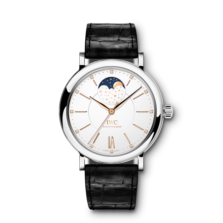
The dial on this model is modern and open, with enough negative space that misaligned printing or uneven spacing shows immediately, and as the legibility and finishing benchmarks in the IWC Top Gun Pilots’ Chronograph replica real-world dial and aperture fidelity evaluation demonstrate, the moonphase sits centered enough that disc quality and aperture finishing are impossible to ignore.
On paper, the genuine watch lives around the 11.1mm thickness range. In practice, how thick it feels matters more than the number. Mid-case height, bezel lip definition, and caseback curvature decide whether it wears like a dress watch or like a small sport watch pretending to be elegant.
This is the version where replicas get exposed.
Comparison Setup: What We’re Measuring (So It’s Not Vibes)
Evaluation pillars (dress-watch specific)
I don’t score this watch on marketing features. I score it on discipline.
Moonphase disc realism comes first. If the disc looks cheap, the entire watch collapses.
Dial print weight and spacing come next. This dial has too much empty space for sloppy typography.
Case polish geometry matters more than raw thickness: bezel lip, lug chamfers, and how reflections travel across the mid-case.
Thickness only matters in how it’s distributed. A thin watch with a tall mid-case still wears thick.
Crown feel and setting behavior tell you whether the movement architecture was treated with respect.
Strap and buckle correctness finish the experience. On a Portofino, the sound of the strap flexing and the feel of the buckle closing are part of the illusion.
These are the pillars that decide whether this feels like a dress watch or like a dressed-up replica.
The “one rule” for readers
If the moonphase looks cheap, the watch reads cheap, even if everything else is good.
If the case profile is wrong, the watch doesn’t wear like a Portofino.
Everything else is secondary.
Dial & Moonphase: The Real Battle (MKS vs YLF)
Moonphase disc artwork: print resolution and color temperature
This is where most Portofino Moonphase replicas either earn their place or expose themselves.
The moon disc is not decoration. It is the emotional center of the watch. On a clean Portofino dial, your eye goes there first, whether consciously or not.
Start with the moon itself. The edge of the moon face should be clearly defined, not feathered or fuzzy. On stronger examples, you can see a sharp transition between the illuminated portion and the blue background. When that edge blurs, the disc immediately reads as printed, not composed.
Then look at the star field. Too sparse and the disc feels empty. Too dense or sparkly and it starts to resemble glitter paper. The correct effect is restrained: enough stars to create depth, but not so many that it becomes decorative noise.
Color temperature matters more than most people expect. If the blue is too bright, the watch looks playful, almost toy-like. If it’s too gray, the dial feels tired and lifeless.
Across multiple batches, MKS tends to land closer to what I’d call Swiss restraint. The blue is calmer. The moon print is cleaner. The overall disc feels quieter under indoor light.
YLF’s risk pattern shows up in inconsistency. Some batches look acceptable. Others drift toward over-saturation or softer print resolution. When that happens, the disc takes on what I call a “digital moon” look—flat color, low depth, and edges that feel computer-generated rather than printed.
If the moon disc feels synthetic, the entire watch feels synthetic.
Moonphase aperture: bevel, border, and alignment
Treat the aperture like a piece of jewelry, not a hole in the dial.
The edge of the opening should be crisp and even all the way around, and as the aperture finish and dimensional control criteria in the IWC replica watches series comparison for Portuguese, Pilot, Ingenieur, and Portofino dial geometry and edge fidelity assessment make clear, any roughness or unevenness becomes obvious because the surrounding dial is so clean, and the thin border ring around the aperture must keep a consistent thickness because if it widens on one side your eye will catch it immediately.
Alignment is non-negotiable.
At the full moon position, the moon should sit visually centered in the window. Not drifting upward. Not biased to one side. It doesn’t need to be mathematically perfect, but it must feel balanced.
Also check for scraping marks or uneven reveal along the disc edge. Poor assemblies sometimes leave faint witness marks where the disc rubs during rotation. Once you notice that, you won’t unsee it.
This is another area where MKS generally shows tighter control. YLF can get it right, but the variance between units is wider.
Dial printing: text weight, minute track, and negative space
Portofino dials punish excess.
The “IWC / Schaffhausen” text must carry just enough weight to anchor the dial without crowding it. Too heavy, and it feels stamped on. Too light, and it floats awkwardly in space.
Minute track dots should stay small and precise. Fat dots ruin the calm geometry of the dial. Because there’s so much negative space, even slight mis-centering becomes visible.
A fast way to evaluate printing quality is to take a photo from a 45-degree angle under strong light. Poor printing will start to bleed or blur at the edges. Good printing stays crisp, even when light grazes the surface.
MKS typically keeps tighter discipline here. Letter edges stay cleaner. Spacing feels intentional. YLF occasionally drifts toward thicker print or slightly soft edges, especially on lighter dial colors.
On a sport watch, you might ignore this. On a Portofino, you can’t.
Hands and indices: polish quality and light cut
Hands should feel cut from metal, not coated with shine.
Look for a clean central ridge where applicable and uniform polishing along both sides. Any hazy plating kills contrast when light moves across the dial. Indices should have crisp edges and defined corners, not rounded profiles that look pressed rather than machined.
This is a subtle but repeatable difference between the two factories.
YLF sometimes uses softer finishing here. Under changing light, the hands can look flat, as if they absorb light instead of reflecting it.
MKS tends to hold sharper edges. When you tilt the watch, the hands catch light cleanly, and the indices flash briefly before going quiet again. That behavior is what gives a dress watch its sense of refinement.
It’s not dramatic. But once you see it, you start to prefer it.
Case & Thickness: Where Portofino Wearability Lives or Dies
Bezel lip and mid-case profile (the side view tells)
The Portofino relies on a thin bezel and a calm mid-case curve. That side profile defines whether the watch feels elegant or merely compact.
From the side, the bezel should appear as a fine, controlled lip, not a rounded dome. The mid-case should flow gently into the lugs without abrupt steps.
MKS usually executes this “thin dress-case illusion” better. The bezel edge feels more defined, which visually reduces thickness even when measurements are similar.
YLF can appear slightly heavier through the mid-case. On paper the numbers may match, but on wrist the profile sometimes feels more upright, which changes how the watch sits under cuffs.
This is one of those differences you feel before you measure.
Thickness control: “measured” vs “felt”
Two watches can share the same thickness and still wear completely differently.
A watch feels thick when the caseback bulges or when the mid-case walls stand tall before tapering. It feels thin when the bezel is crisp and the caseback curves gently into the wrist.
There’s a simple test.
Place the watch on a flat table and look at how much the caseback lifts the lugs. If the lugs float noticeably, the watch will sit higher on your wrist. If they stay closer to the surface, the watch will hug the arm better.
In repeated comparisons, MKS tends to manage this balance more gracefully. YLF sometimes compensates thickness with a fuller caseback, which makes the watch feel taller even if calipers say otherwise.
Polishing quality: distortion and edge discipline
Dress watch polish should behave like a clean mirror. Straight lines should reflect straight. Curves should stay smooth. Any waviness tells you the surface wasn’t finished with enough discipline.
Inspect the transition between lug tops and lug sides. That edge should be defined, not melted together. Look at reflections across the bezel. If they ripple, the polishing stage was rushed.
And one more thing: there should be no crown guards. If you see any hint of protective shoulders, something has gone wrong. The Portofino’s purity depends on uninterrupted case lines.
Here again, MKS generally shows tighter control of edge definition and surface flatness. YLF can look good at first glance, but under direct light you’ll sometimes catch subtle distortion that breaks the illusion.
On a watch this simple, those small failures matter.
Movement Reality: What’s Inside and Why That Matters for Moonphase
Likely movement architecture in the replica market
There’s no mystery here, and there shouldn’t be.
Most Portofino Moonphase replicas in this segment use a stable automatic base movement with a moonphase module layered on top. That’s normal. It’s also the correct engineering compromise at this price level.
You’ll typically see architectures derived from 9015 or 2892 families, with a modular moonphase driving the disc and date. That approach prioritizes reliability and serviceability over visual theatrics. You are not getting a true in-house IWC-style integrated moonphase caliber here, and pretending otherwise only leads to disappointment.
My decision rule is simple: prefer stable, serviceable architecture over fantasy engravings.
A clean, boring movement that keeps time and advances the moon correctly is worth far more than decorative bridges that hide fragile mechanics underneath. In long-term ownership, availability of parts and familiarity for watchmakers matters more than rotor text.
Moonphase function checks (what to test before accepting)
Moonphase failures don’t usually arrive dramatically. They arrive quietly, through poor adjustment or sloppy assembly.
Start with the quickset behavior. The moon disc should advance cleanly in defined steps. No hesitation. No half-clicks. No scraping sounds. If it stutters during adjustment, walk away.
Then respect the midnight danger zone.
Around the date change window, usually roughly between 9 p.m. and 3 a.m., the movement is already engaged in calendar operations. Forcing moonphase or date adjustments during this period stresses the module teeth and jumper springs. That’s how discs end up misaligned after a few weeks.
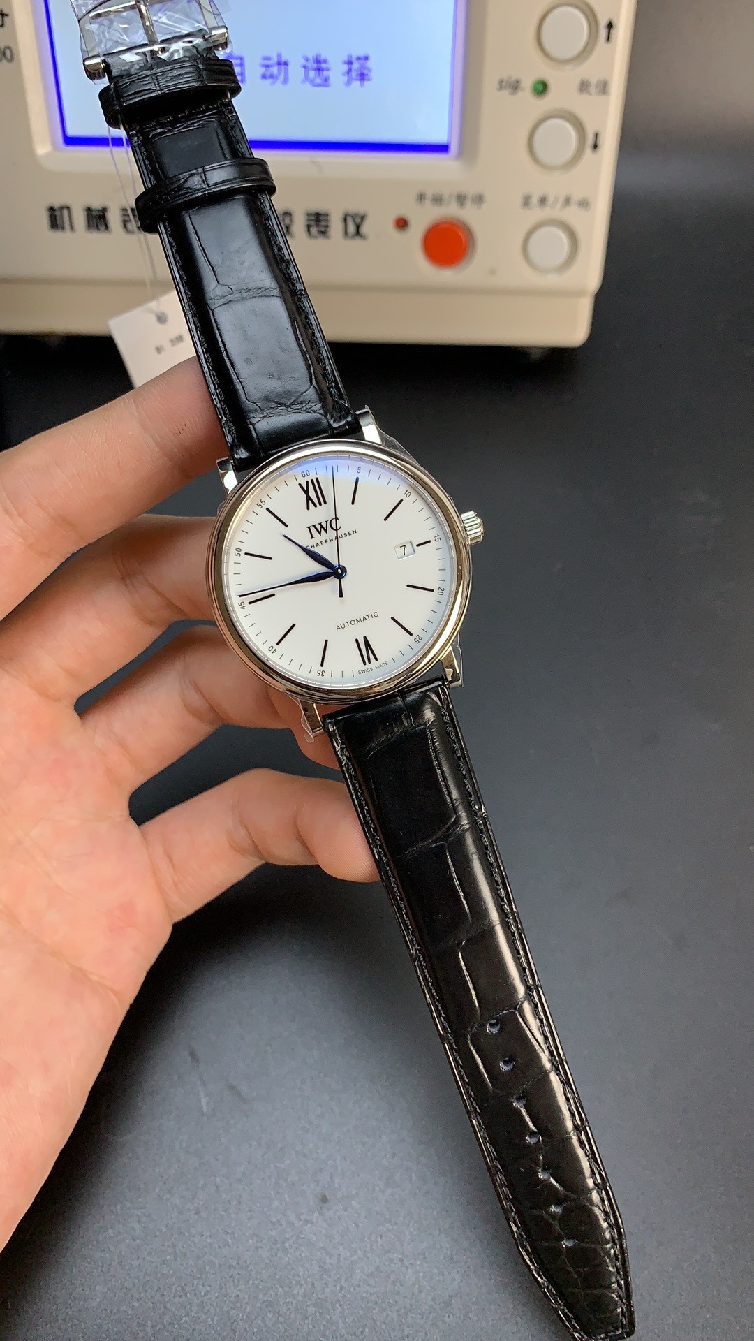
A basic consistency check saves headaches later.
Advance the hands through a full 24-hour cycle twice. Watch how the date changes and how the moon disc behaves. They should stay synchronized. If the date advances but the moon disc hesitates or drifts, the module wasn’t seated properly.
This takes five minutes and tells you more than any spec sheet.
Winding and crown feel (dress-watch standard)
A Portofino crown should feel smooth and controlled, with clear detents between positions.
You’re not looking for sporty resistance. You’re looking for calm precision.
Red flags show up fast:
Gritty winding usually means poor lubrication or debris inside the keyless works.
Crown wobble points to loose tolerances in the stem or tube.
Rough setting steps feel like sand under the fingers and signal cheap components in the keyless system.
Across samples, MKS tends to deliver a more refined crown feel. Engagement is cleaner. Position changes feel deliberate.
YLF can vary more. Some units feel fine. Others reveal roughness early. It’s not catastrophic, but on a dress watch, this tactile feedback becomes part of the daily experience.
Strap & Buckle: The Quiet Part That Exposes the Replica
Strap leather behavior (stiffness, creasing, edge paint)
The strap tells on the watch long before the case does.
A proper Portofino strap should crease softly along the wrist. It should form gentle curves, not sharp folds. When leather cracks instead of bending, the illusion breaks.
Check the edge paint closely. It should sit flat and continuous, without bubbles or rough overhang. Cheap edge paint flakes within months.
Here the pattern repeats.
MKS straps usually arrive with cleaner edges and more controlled finishing. They’re not luxury leather, but they behave predictably.
YLF straps often feel stiff out of the box and need break-in. That’s not fatal, but it does mean the watch won’t feel “settled” for the first few weeks unless you replace the strap.
Many owners do exactly that.
Buckle engraving and polish
The buckle is small, but it carries weight.
Engraving depth should be clean and evenly cut. Letters should have consistent spacing. If the engraving looks shallow or fuzzy, it cheapens the whole experience.
Polish tone matters too: the buckle should reflect light the same way the case does, and as the case-to-component surface finish comparison in the Mark XVIII vs Big Pilot replica polish and finishing coherence analysis highlights, if the buckle looks brighter or duller it signals mismatched finishing processes, with MKS generally keeping buckle polish aligned with case polish while YLF sometimes misses this, producing buckles that feel like they came from a different watch.
It’s a small detail, but dress watches are made of small details.
MKS vs YLF: Category-by-Category Verdict (No Fanboying)
Dial & moonphase category winner
I weight this category deliberately.
Disc realism carries the most influence. Aperture execution follows. Printing weight and spacing complete the picture.
In practice, MKS wins here.
Their moon discs show calmer color temperature and cleaner print edges more consistently. Apertures tend to sit better centered. Dial text feels more proportional to the negative space.
YLF can look good in strong batches, but variability shows up more often. When the disc drifts toward saturation or printing softens, the entire watch loses authority.
On a moonphase dress watch, that matters.
Case & wear category winner
This comes down to side profile elegance, polish distortion, and comfort at the cuff line.
MKS again takes the edge.
Their bezel lips tend to be sharper. Mid-case profiles feel calmer. On wrist, the watch sits lower and slides under cuffs with less resistance.
YLF pieces sometimes feel a touch taller due to fuller mid-cases or casebacks, even when thickness numbers look similar. Under a shirt sleeve, that difference becomes noticeable.
It’s not dramatic, but it’s persistent.
Movement & ownership category winner
Here I focus on crown feel, setting reliability, and moonphase stability over a week of wear.
MKS shows better consistency.
Crown engagement feels more controlled. Setting steps feel cleaner. Moonphase modules tend to stay aligned after normal use.
YLF isn’t unreliable, but the variance between units is wider. Some perform perfectly. Others develop minor setting roughness or disc drift sooner.
If you plan to wear this regularly, predictability matters.
Who should choose which? (behavior profiles)
Choose MKS if you care about dial calmness and an “expensive” look under indoor light, and if you often wear this watch with shirts or jackets where case profile and polish discipline become obvious.
Choose YLF if budget matters more and you accept slightly softer finishing, especially if you’re comfortable upgrading the strap to elevate the overall feel.
Both can tell time. Only one consistently behaves like a Portofino.
QC Checklist Before You Accept (Moonphase + Dress Watch Specific)
Dial checks (strict)
Start with the moon disc.
Look at print crispness first. The edge of the moon should be clearly defined, not foggy. If you see softness where the moon meets the blue background, that softness will only become more obvious with wear.
Move to the aperture border. The ring around the moon window must be symmetrical. Uneven thickness is not a cosmetic quirk on this model—it’s a structural tell.
Check text alignment next. “IWC” and “Schaffhausen” should sit level and centered within the dial’s negative space. Because the dial is so open, even minor drift becomes visible at arm’s length.
Finish with the minute track. Spacing between dots should feel consistent as your eye moves around the dial. Any compression or stretching in one quadrant usually means the dial pad print wasn’t seated evenly.
If one of these fails, don’t rationalize it. On a Portofino, dial discipline is the watch.
Case checks (strict)
Run a straight reflection test across the bezel and lugs using a window frame or light strip. The reflected line should stay clean and continuous. If it bends or ripples, the polishing stage wasn’t controlled.
Feel the bezel edge with a fingernail. It should be defined, not rounded into the mid-case. A soft bezel kills the dress-watch profile.
Check lug symmetry visually and physically. Both sides should mirror each other, and the underside of the lugs should feel smooth against the wrist. Sharp transitions underneath become annoying after a full day of wear.
This is where many replicas look fine in photos and fall apart in person.
Function checks (strict)
Cycle the crown through all positions. There should be no wobble, no vague engagement, and no gritty resistance.
Check date centering across at least three or four different dates. Some watches look fine on one number and drift on others.
Finally, advance the moonphase. It should move in clean steps, not partial clicks. Any hesitation here usually means the module wasn’t seated correctly.
These are five-minute tests that save months of regret.
Ownership Reality: What to Expect Long-Term
Water resistance (conservative)
Treat this as splash-resistant unless you personally pressure-test it.
Hand washing is fine. Rain is fine. Swimming is not the design intent.
On dress watches, sweat and humidity do more long-term damage than occasional water contact. Wipe the caseback after warm days. Let the strap dry naturally. Small habits extend service life more than marketing claims ever will.
Serviceability and risk points
The moonphase module adds complexity. That doesn’t make it fragile, but it does mean you should handle setting operations gently and avoid adjustments during the midnight change window.
Over time, the first aging signal won’t be the movement. It will be the strap.
Daily wear compresses leather edges, softens stitching, and changes how the watch sits on your wrist. Plan for strap upgrades if this becomes a regular rotation piece. A fresh strap often restores the entire character of the watch.
Mechanically, these movements are serviceable. Practically, what determines longevity is how calmly you interact with them.
Engineering Summary: The Decision Rule (Judgment-Forward Close)
If the moon disc looks printed cheap, the whole watch looks cheap.
For Portofino, finishing is the complication.
MKS consistently delivers calmer dials, sharper case profiles, and more predictable ownership behavior, while YLF remains a workable option for buyers who accept softer finishing in exchange for lower entry cost—and how that balance fits into your life is a decision only you can make.
Related IWC Articles: If you found this helpful, you might also enjoy IWC Aquatimer Replica Guide: Is This Cold Series Actually Worth Buying?, and ZF IWC Portofino Chronograph Review: Where the Elegance Holds—and Where the 7750 Shows. Another related article is How Good Are IWC TOP GUN Pilot’s Chronograph Replicas?.