
Why the Portofino Chronograph Is a “Hard Easy Watch”
The Portofino identity: slim, quiet, dress-first
The Portofino Chronograph looks simple on paper. Round case. Two subdials. Leaf hands. A calm dial with plenty of empty space. But that apparent simplicity is exactly what makes it difficult to replicate well.
A Portofino is supposed to disappear under a cuff. It should feel neutral on the wrist, visually restrained, and emotionally quiet. This is not a watch designed to project capability or sport. It exists to coexist with tailored clothing, not compete with it.
Chronographs fight that identity by default.
The moment you add pushers, extra wheels, and stacked gearing, you introduce thickness, weight, and mechanical resistance. Even when the dimensions only grow by half a millimeter, the wearing experience changes. The case gains visual mass. The midcase becomes more slab-like. Pushers demand attention. The watch starts behaving like a tool instead of a dress piece.
That tension—between dress restraint and chronograph mechanics—is the entire story of the Portofino Chronograph.
For this review, everything is judged against four measurable behaviors:
How the watch sits in diameter and thickness on a real wrist.
How the pushers feel in repeated use.
How clearly the dial reads under low, indoor light.
And whether the overall presence stays quiet once sleeves come down.
Those four points decide whether the Portofino character survives.
What the genuine watch sets as the benchmark (numbers, not vibes)
The genuine Portofino Chronograph in the IW3910 family measures 42mm in diameter and is commonly listed at approximately 13.5mm thick.
That thickness matters. It defines how the case edge presents itself under a cuff and how much vertical mass your eye registers when the watch is at rest.
Inside, IWC uses the Calibre 79320, which is explicitly Valjoux 7750–based.
That deserves to be stated plainly.
A 7750-based movement is not a compromise or a shortcut. It is a mature, durable architecture with decades of service history behind it. IWC has relied on this platform for years in dress chronographs precisely because it is predictable and robust.
But it is not thin.
The 7750 carries height by design. Any watch built around it will pay a thickness tax. The genuine Portofino already lives at the upper edge of what most people consider acceptable for a dress chronograph.
That makes every additional fraction of a millimeter immediately visible.
The ZF Version You’re Reviewing (Define the Target Clearly)
Reference mapping: what ZF is trying to copy
ZF focuses on the IW3910 family and its close relatives.
In practice, that means three main dial groups appear repeatedly in their lineup: classic silver or white dials, black dials with higher contrast, and blue special editions inspired by Laureus-style releases in the genuine catalog.
The case geometry remains consistent across these variants. Differences live almost entirely in dial color, printing tone, and hand contrast.
This review treats ZF as a factory approach rather than a single colorway.
The inspection logic applies across all IW3910-style ZF Portofino Chronographs, regardless of dial choice.
Spec snapshot: dimensions and movement choice
ZF typically lists the Portofino Chronograph at approximately 42mm in diameter and around 14mm in thickness, powered by an Asian 7750 automatic chronograph movement.
That specification already tells you most of what you need to know.
If the genuine watch sits around 13.5 mm, ZF’s roughly 14 mm claim falls squarely into what I consider a realistic 7750 tax range per the dimensional wear-and-clearance measurements in the 2023 IWC Ingenieur 40 mm replica construction and vertical stack review, where increased module height impacts case geometry and ultimately wrist feel.
Half a millimeter does not sound dramatic on paper. On the wrist, it shows up as a slightly taller midcase and a touch more cuff resistance.
The key question is not whether ZF is thicker.
It is whether that extra height disrupts the Portofino’s quiet behavior.
Everything that follows in this review exists to answer that single question.
Dial & Printing: The Portofino Lives or Dies Here
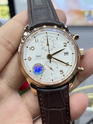
Text and scale: when “almost” becomes obvious
The Portofino dial leaves nowhere to hide.
There is too much negative space for sloppy printing to blend in. On sport watches, busy textures forgive small errors. On a Portofino, every character sits alone. When something is off, your eye finds it immediately.
Start with the “IWC” logotype. On a good ZF sample, the edges are clean and the ink sits sharply against the dial surface. If you see feathered borders or soft corners, that is not lighting—it is weak pad printing.
Then move to “Schaffhausen.” The baseline should run perfectly straight. Any upward tilt at one end, or uneven vertical spacing between letters, breaks the calm geometry of the dial. This is one of the fastest tells on weaker batches.
Subdial numerals matter more than most people expect. Their thickness should be consistent from digit to digit. If the “3” looks heavier than the “9,” or if curves appear filled in, the watch starts to feel cheap even before you consciously register why.
The simplest real-world check uses no tools.
Hold the watch under angled light, zoom in with your phone, and compare left-to-right symmetry. The Portofino layout is balanced by design. If the printing does not mirror itself visually across the vertical axis, something is wrong.
Subdials: the “chronograph credibility zone”
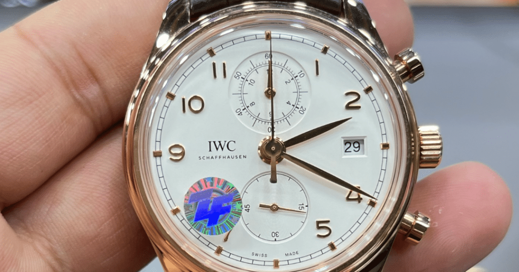
This is where most replicas quietly fail.
The IW3910 layout places subdials at 12 and 6. That vertical symmetry is intentional. It creates visual calm and keeps the dial from feeling crowded.
The first thing to inspect is subdial ring concentricity. Each ring should sit perfectly centered around its pinion. Even slight wobble reads as amateur finishing. On a clean ZF piece, those rings look machine-drawn.
Next, look at the subdial hand pinions. The center of each subdial should appear tidy and controlled. If you see rough edges, glue residue, or uneven metal around the hand stack, that is low-grade assembly showing through.
More important than absolute perfection is rhythm.
The two subdials should feel evenly weighted. Neither should dominate the dial. If the upper subdial feels heavier or darker than the lower one, the watch loses its composure. A Portofino chronograph should feel relaxed, not mechanically busy.
When that balance is right, the watch reads as elegant even before you register the complications.
Hands & polish: leaf-hand elegance is a finishing test
Leaf hands look simple. They are not.
Their curved profiles require precise polishing to produce a clean highlight line down the center. On good ZF examples, that line runs smoothly from base to tip. On weaker finishing, the reflection breaks into waves.
That waviness tells you the hand was polished too quickly.
Check the minute hand carefully. It must reach the minute track. If it stops short, even by a small margin, the entire dress aesthetic collapses. Short minute hands are one of the fastest ways to make a refined watch feel toy-like.
This is not a minor detail. It directly affects how the watch reads at a glance.
Case, Crystal, and Thickness: Does It Still Wear Like a Portofino?
Thickness reality: what 0.5mm does in dress-wear
The genuine Portofino Chronograph sits around 13.5mm.
ZF typically lists their version closer to 14mm.
That half-millimeter sounds trivial. On the wrist, it changes two things.
First, cuff clearance. Shirts that comfortably slide over the genuine watch may hesitate on the ZF. Jackets become less forgiving. The watch announces itself slightly more when you move your arm.
Second, side profile. Extra thickness tends to accumulate in the midcase, not evenly across the crystal and caseback. If the midcase becomes slab-like, the watch looks taller even when the raw measurement difference is small.
This is why distribution matters more than the number.
If the height is absorbed into a domed crystal or subtly curved caseback—as shown in the case geometry and wear analysis of the IWC Big Pilot replica vertical clearance and stack behavior review—the watch still wears softly, but if it stacks in the midcase the Portofino starts behaving like a sport chronograph in formal clothing.
ZF does a reasonable job here. The thickness exists, but it does not explode outward. Still, you feel it compared to the genuine, especially under tight cuffs.
Crystal behavior: reflections, distortion, and “dress clarity”
The genuine watch uses a cambered sapphire crystal with anti-reflective coating. That combination creates gentle edge distortion and controlled glare.
You can test this in seconds.
Rotate the watch slowly under a ceiling light. On a good crystal, highlights move cleanly across the surface and the dial remains readable at oblique angles. On cheaper sapphire, you see milky haze and smeared reflections.
ZF’s crystal generally performs well. Distortion at the edges looks natural rather than exaggerated, and glare stays manageable indoors. This matters more than people realize. A dress chronograph lives under artificial lighting. If the crystal blooms with haze, the watch loses its refinement immediately.
Case finishing: Portofino polishing should look liquid, not chrome
Portofino cases should reflect light like calm water, not like plated jewelry.
Use a straight-line reflection test. Hold the watch near a window or overhead light and observe how a straight reflected line travels across the case flank. On proper polishing, that line bends smoothly along the curve. If it breaks or ripples, micro-dents or rushed finishing are present.
ZF’s polishing usually passes this test, especially on the bezel and upper lugs.
Pay attention to lug tips. Over-softened edges make the watch look generic. Sharp, well-defined lug transitions preserve the tailored feel of the case. When those tips blur, the entire watch starts to resemble a mass-produced accessory instead of a refined dress chronograph.
This is one of those details you do not consciously analyze—but you feel it when it is missing.
Pushers & Crown Feel: The Part Nobody Photographs
Pusher feel grading: start/stop/reset should feel controlled, not springy
If there is one place where a Portofino Chronograph reveals its true quality, it is the pushers.
This is a refinement watch. You do not interact with the bezel. You do not feel a rotating crown guard. You press two buttons, occasionally. That makes pusher feel the primary tactile interface, and it carries far more weight here than it would on a sports chronograph.
Start with the initial press. A good ZF sample delivers a confident, defined click with a short, deliberate travel. What you do not want is a soft or mushy engagement, which usually points to weak return springs or uneven lever contact inside the chronograph module. That kind of start feel makes the whole watch feel vague, even if the dial looks perfect.
Stopping the chronograph should require similar force to starting it, without a second micro-step or hesitation. Inconsistent resistance between start and stop often means the cams are not seating cleanly, which may not fail immediately but tends to worsen with use. Reset is the final test. The chronograph seconds hand must snap back to 12 decisively, not drift into position. Run the full start–stop–reset cycle three times in a row. If alignment degrades across repetitions, that is not acceptable on a dress chronograph.
This matters because the Portofino offers almost no other physical feedback. There is no rotating bezel or tactile complication to distract you. If the pushers feel cheap, the entire watch feels cheap.
Crown action: winding feel tells you about assembly quality
The crown tells a quieter story, but it is just as important.
Hand-winding should feel smooth and even, with no grinding sensation and no sudden changes in resistance. Rough winding usually indicates poor lubrication or misaligned keyless works, both of which tend to show up later as reliability issues rather than immediate failures. On ZF examples that are assembled well, winding feels linear and predictable, even if slightly heavier than a simple three-hand movement.
Quickset operation for day and date should engage cleanly. Binding or stiffness during quickset is a warning sign, especially on 7750-family chronographs where calendar components already sit under more mechanical stress. A healthy watch allows you to advance both functions without hesitation or audible scraping.
You may also notice rotor presence when the watch moves on the wrist. That subtle oscillating mass sensation is characteristic of the 7750 architecture. It is not automatically a defect. It becomes a problem only when it is accompanied by rattling, excessive noise, or inconsistent winding efficiency.
Movement Reality: Modified 7750 vs “Portofino Elegance”
What “7750-based” means in the genuine watch (and why it matters here)
The genuine Portofino Chronograph uses IWC Calibre 79320, which is openly Valjoux 7750–based.
That context matters.
ZF is not cutting corners by choosing a 7750-family movement — the platform aligns historically with the genuine watch and, as detailed in the discussion of base calibers and modular integration in the 7750-2892 7-day power reserve movement architecture and serviceability analysis, its architecture delivers proven durability, straightforward servicing, and predictable chronograph behavior, so criticizing a Portofino replica simply for using a modified 7750 misunderstands the original design philosophy of the model.
Where differences emerge is not in the base layout, but in execution.
IWC refines the 7750 extensively. They regulate tightly, finish consistently, and assemble under controlled conditions. Replicas inherit the same core geometry but diverge in finishing depth, quality control, and post-assembly regulation.
Where replicas usually diverge
The first visible divergence appears in finishing.
Rotor engraving on replicas tends to be shallower, with less crisp edge definition. Perlage often looks uniform but lacks the subtle variation seen on factory-finished movements. Screw heads may appear polished but usually miss the clean chamfering of genuine examples. None of this affects basic operation, but it does affect long-term wear and visual credibility when viewed through the caseback.
Regulation is the second difference. After shipping, replica chronographs often show wider amplitude variation across positions. That does not mean they cannot be regulated, but it does mean consistency out of the box is less predictable. A well-regulated ZF can perform admirably, but it rarely arrives at that state by default.
Then there is service reality.
A modified chronograph movement carries more levers, springs, and friction points than a simple three-hander. That makes it more sensitive to shock, dry lubrication, and careless handling. Owners who treat it like a grab-and-go daily watch often encounter issues sooner than expected. This is not unique to replicas. It is inherent to the complication.
Power reserve and daily wear expectations
The genuine 7750-based calibre is commonly rated around 44 hours of power reserve.
ZF’s version operates in the same range under normal conditions. That means overnight downtime is enough to stop the watch if it was not worn actively during the day. This is standard chronograph behavior, not a flaw.
What matters is how you plan to use it.
If your expectation is set-and-forget convenience, a Portofino Chronograph is the wrong variant to choose. This watch rewards regular wear and mindful handling. In exchange, it delivers mechanical engagement and visual refinement. But it does not offer the carefree ownership experience of a three-hand Portofino.
That trade is fundamental. No amount of finishing can change it.
The Wear Test: Does It Still Read as a Dress Chronograph?
Under-cuff behavior (the only test that matters for this model)
This watch earns or loses its identity under sleeves.
Start with a slim dress shirt cuff. Slide the cuff down naturally and observe whether the case edge catches fabric or whether it disappears without resistance. On a good ZF example, the watch clears most tailored cuffs with only mild friction, but you will feel the extra height compared to a three-hand Portofino. The midcase presents slightly taller, which means you become aware of the watch when typing or reaching forward, even if it does not outright snag.
Next, move to a jacket cuff. Here the Portofino Chronograph usually behaves better. The additional room masks the thickness, and the polished bezel helps the watch glide rather than grab. This is the environment where ZF’s version feels most at home. It reads as elegant and composed, with none of the visual bulk associated with sports chronographs.
A sweater cuff tells a different story. Knit fabric tends to cling to the case flank, and this is where the 7750 height becomes most apparent. You may also notice slight wrist rotation if the strap is not broken in, especially on slimmer wrists. This is not instability, but it does remind you that you are wearing a chronograph, not a minimalist dress watch.
In short, ZF’s Portofino Chronograph wears like a dress chronograph, not like a pure dress watch. That distinction matters.
Strap and buckle: where ZF can lift or ruin the illusion
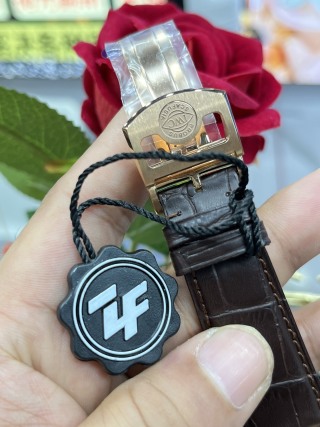
Strap quality has disproportionate influence on how expensive the watch feels.
Look first at the strap edges. Clean edge paint with no bubbling or cracking is a quiet luxury tell. Crooked stitching or uneven thread tension cheapens the entire presentation, even if the case is finished beautifully. ZF’s supplied straps are serviceable, but they vary by batch. Some arrive with straight stitching and neat edges, others benefit from immediate replacement.
The buckle deserves equal attention. Engraving depth should match the visual weight of the case finishing, and the brushing on the buckle should not look dull next to the polished lugs. When the tones mismatch, the watch starts to feel assembled rather than designed.
A higher-quality strap upgrade often does more for perceived refinement than any other single change.
QC Checklist Before You Accept (Portofino Chronograph Specific)
Dial acceptance checks (strict)
Before approving any unit, inspect the dial under magnification.
There should be no fuzzy edges in the printing when viewed through phone zoom, and as the tolerance and finishing benchmarks in the IWC replica watches series comparison for Portuguese, Pilot, Ingenieur, and Portofino dial-and-calendar fidelity make clear, subdial rings must sit perfectly concentric without visible offset or wobble, hands need to be centered on their pinions and must clear each other and the markers without contact, and day and date must sit centered within their window, because drifting toward one edge indicates careless calendar alignment.
If any of these fail, do not rationalize them away. On a Portofino, small dial flaws dominate the entire watch.
Chronograph acceptance checks (strict)
Run the chronograph through at least five full cycles.
Start and stop resistance should feel consistent every time. Reset must return the chronograph seconds to zero precisely on each attempt, not “close enough.” While the chronograph is running, the seconds hand should sweep smoothly without hesitation or micro-stutter. Pushers must feel even and controlled, never gritty or uneven.
Chronograph inconsistency is not cosmetic. It predicts future reliability issues.
Case acceptance checks (strict)
Inspect the polished surfaces under strong light.
You are looking for uninterrupted reflections without ripples, especially along the bezel and upper lugs. Lug symmetry matters more than people expect; uneven lug lengths change how the watch sits on the wrist. Crystal clarity should remain high even under harsh lighting, with no cloudy haze or distortion that obscures the dial.
These checks determine whether the watch feels refined or merely shiny.
Who This Replica Is For (and Who Should Walk Away)
Buy ZF Portofino Chronograph if…
This watch suits owners who want a clean, understated dress chronograph and who accept a small thickness trade as part of the complication. It works best for those who prioritize dial calmness over sporty aggression, and who spend most of their time in office or evening settings where jackets and structured sleeves soften the case profile. If you appreciate mechanical interaction and do not mind engaging with the chronograph occasionally, ZF’s version delivers a credible Portofino experience.
It rewards measured expectations and regular wear.
Skip and choose a different IWC replica if…
If you are sensitive to cuff clearance and want a watch that truly disappears under any sleeve, the three-hand Portofino is the better choice. If you rarely use chronograph functions, carrying the added height and mechanical complexity makes little sense. And if you value silent movement behavior above all else, simpler automatic movements will suit you better than any 7750-based chronograph.
This model is not trying to be effortless.
Engineering Summary
If the dial is disciplined and the pushers feel controlled, ZF’s Portofino Chronograph keeps the Portofino spirit—thickness becomes a trade, not a failure.
Related IWC Articles: If you found this helpful, you might also enjoy ZF Factory IWC Portuguese Chronograph IW3714 Replica Review (Deep-Dive), and ZF Factory IWC Replica Watches Review: How Good Are Portugieser 7-Day, Portugieser Chronograph, and Big Pilot Builds?. Another related article is 7750 vs 2892 Movements: The Real Differences Inside IWC Replica Watches (2026 Guide).