
AP Royal Oak and Offshore QC photos need a different level of attention because these designs expose alignment problems quickly. The bezel screws, octagonal case shape, tapisserie dial, straight markers, date window, and integrated bracelet all sit in areas where a 15400 15500 15510 comparison helps separate reference-specific proportions from small shifts that can become obvious on the wrist. This article helps you avoid approving a watch based only on an attractive front photo or rejecting one because of harmless macro-level marks.
The practical goal is to separate serious structural or visual issues from normal replica-watch limitations. You will learn how to judge front, side, wrist, bracelet, clasp, and caseback photos in the right order, with priority on geometry, symmetry, case profile, bracelet integration, and consistency across multiple images rather than chasing unrealistic perfection under zoom.
Replica watches should be clearly understood as replica-market products, not genuine watches from Audemars Piguet or any other original luxury brand. Brand names are used here to identify the genuine reference design being discussed and to make visual comparison easier; they do not imply authorization, endorsement, official production, or affiliation with the original luxury watch brands.
| QC Area | What to Check First | Approval Judgment |
|---|---|---|
| Front dial photo | Bezel screw spacing, marker alignment, logo position, tapisserie centering | Reject if crooked or shifted in normal straight photos |
| Date window | Centered date, stable position, clean printing at normal viewing distance | Minor macro flaws may pass; repeated misalignment is a concern |
| Side profile | Case thickness, bezel seating, crystal height, crown and pusher alignment | Judge by the exact AP model, not one universal thickness standard |
| Bracelet and clasp | Endlink fit, first-link angle, bracelet drape, brushing, clasp closure | Structural fit issues matter more than tiny surface marks |
| Caseback | Rotor style, engraving, screw condition, cleanliness, movement-route consistency | Useful for visual checks, but not proof of reliability or water resistance |
| Wrist and angle shots | Wrist presence, case height, bracelet balance, dial color shift, reflections | Use as a final reality check, not the main approval basis |
Quick Questions Before You Read
Q: Should I approve an AP super clone from one good-looking front photo?
No. AP QC needs straight front, side, bracelet, clasp, and angle photos because alignment and case profile issues can hide in a single image.
Q: Are tiny dial printing flaws always a reason to reject?
Not always. If the flaw is only visible under heavy zoom and looks clean at normal viewing distance, it may be acceptable.
Q: What is the biggest red flag in AP QC photos?
Visible geometry problems, such as uneven bezel screws, crooked markers, shifted logo placement, awkward bracelet fit, or a consistently misaligned date.
Can caseback photos confirm the movement is reliable?
No. They can show decoration, engraving, cleanliness, and route consistency, but not long-term regulation, lubrication, servicing condition, or water resistance.
Editorial Perspective: For AP replica QC, the most useful comparisons are usually model-specific rather than factory-specific. A factory name can narrow the shortlist, but it does not settle the decision by itself. The better approach is to ask what the watch is supposed to do well: look convincing from normal distance, wear comfortably, and avoid obvious geometry errors. On cleanvsfactory.com, this kind of review is treated as a practical buyer question, not a ranking exercise. The real tradeoff is often between visual accuracy, movement choice, case thickness, bracelet feel, and the amount of risk a buyer is willing to accept for daily wear.
Compliance-Safe Reading: What This QC Guide Is and Is Not
This guide is written for educational QC interpretation. It explains how to read visible details in AP Royal Oak and Offshore replica watch photos, including bezel screw seating, tapisserie alignment, bracelet fit, side profile, clasp finishing, and caseback consistency. It is not a guide to authenticate a watch as genuine, and it should not be used to represent a replica watch as an authentic Audemars Piguet product.
A strong AP super clone may look convincing in normal wear, but close inspection can still reveal differences in finishing, movement architecture, case proportions, bracelet feel, dial details, engraving, or service compatibility. QC photos can reduce uncertainty before approval, but they do not convert a replica-market watch into a genuine brand-manufactured watch and do not prove official service eligibility, long-term durability, or water resistance.
Factory names, version labels, and movement descriptions in the replica market should be treated as buyer-facing reference terms. They can help organize comparison, but they are not official Audemars Piguet affiliations, factory certifications, or automatic guarantees of identical quality across every model or batch. The safest use of this information is to understand tradeoffs and avoid misunderstanding quality, not to support any claim that a replica watch is genuine.
How Factory Claims, Version Numbers, and Movement Routes Affect AP QC Decisions
Before you study the photos, it helps to know what the seller is actually claiming. In AP replica buying, factory labels, version numbers, and movement routes can be useful signals, but they are not final proof of quality. A factory name may indicate a likely starting point for expectations, yet the actual QC decision still depends on the individual watch in front of you. Two watches from the same factory can present differently because of batch variation, assembly differences, or small changes in the version being offered.
This is especially important on Audemars Piguet, where some versions focus more on visual accuracy while others are chosen for movement layout, case profile, or cost control. A buyer who only asks, “Which factory is best?” often misses the more useful question: “Which version is best for this model, and what do I need the watch to do in daily wear?” That distinction matters because the best-looking watch in photos is not always the best ownership choice, and the cleanest factory label is not always the most relevant factor.
At cleanvsfactory.com, this kind of comparison is treated as a model-specific buying question rather than a simple factory ranking. The factory name helps narrow the shortlist, but the final decision still depends on the movement, case profile, dial execution, bracelet feel, and how the buyer plans to wear the watch.
Factory names in the replica watch market should be read as market references, not as official Audemars Piguet affiliations or automatic proof that every watch from that label will be equally strong. For AP QC, the safer traceability path is to connect the claimed factory name to the exact reference, the stated version, the movement route, and the visible details in the actual QC photos. If those pieces do not line up, the factory label alone should not carry the approval decision.
Factory Name Helps Narrow the Shortlist, Not Close the Decision
Factory reputation is useful because it gives you a rough expectation of how a watch may be finished, assembled, or marketed. But it does not automatically apply equally to every AP reference. One factory may be a stronger fit for a standard Royal Oak three-hand model, while another may be more attractive on a particular Offshore or a specific dial variant. The relationship between factory and model is more important than factory and brand in the abstract.
This is why “best factory” claims should always be narrowed down. A statement that sounds strong on a forum may become less useful when you compare the actual watch, the exact reference, the movement route, and the buyer’s use case. A watch that looks excellent in a seller’s photo set may still have a known bracelet weakness, a thicker case profile than expected, or a movement choice that adds more maintenance risk than the buyer wants to accept.
The practical filter is simple: use the factory label to decide what to verify, not what to assume. If the seller says a watch comes from a respected factory, that is a useful starting clue. It is not a substitute for checking the bezel screws, dial alignment, date window, case thickness, and bracelet integration in the actual QC set.
Factory Name Clarification: Factory names in the replica watch market are buyer-facing reference labels, not official Audemars Piguet affiliations or guarantees of identical quality across every model. Buyers should treat a factory name as a starting point for inspection and still judge the actual watch by visible QC details such as bezel screw seating, dial alignment, case profile, bracelet fit, clasp finishing, and movement-route consistency.
Movement Choice Affects Ownership More Than Many First-Time Buyers Expect
Movement choice is one of the most underestimated parts of replica AP buying. Buyers often focus on whether the front looks right, but the movement route can influence long-term ownership in a much more practical way. A movement that looks convincing in a caseback photo may still be noisier, more delicate, harder to service, or less tolerant of daily wear than a simpler alternative. A complex movement can be attractive for display, but it is not automatically the smartest choice for someone who wants a dependable watch to wear often.
This does not mean a more accurate-looking movement should be ignored. It means the buyer should understand the tradeoff. Visual similarity matters if the watch has a display caseback or if rear-side appearance is important to the buyer. Serviceability, stability, and part availability matter more if the watch is intended for frequent use. A movement with better visual decoration but more complex ownership behavior may be the wrong choice for a first purchase, even if it looks stronger in photos.
For AP models, movement thickness can also affect the case profile. Some routes may preserve a better-looking case height, while others may create a watch that wears taller or feels less balanced. That is why movement choice should not be treated as a background technical note. It directly affects how the watch looks from the side, how it feels on the wrist, and how much confidence the buyer can reasonably have after delivery.
Movement descriptions in AP replica listings should be read as configuration references rather than official brand-caliber claims unless there is clear, verifiable evidence. A seller may use terms that describe a clone-style layout, a decorated plate, a modified Asian movement, or a movement chosen mainly for case thickness. During QC, buyers should separate four different questions: does the movement look consistent with the stated route, does it affect case height, does it add complexity, and does the photo actually show enough to support the claim?
Movement names in the replica market often describe layout, decoration, clone architecture, or seller terminology rather than an official brand-manufactured caliber. A caseback photo may support a visual consistency check, but it should not be read as proof that the watch contains a genuine Audemars Piguet movement, an original Swiss caliber, or a movement with official service compatibility.
Version Changes Can Matter More Than Factory Popularity
Replica AP production often changes in stages. A seller may use terms like updated version, latest batch, revised bezel, improved dial, or upgraded movement route. Some of those claims are meaningful. Others are broad marketing language. The buyer’s job is not to believe or dismiss them automatically, but to connect them to the actual photo set and the model in question.
If a revision is real, it should usually be visible in one or more of the areas that matter in QC: alignment, bracelet construction, case thickness, clasp execution, or dial layout. If a listing claims an improvement but the photos do not show any meaningful change, the claim should be treated carefully. The same caution applies to generic “super clone” language. It may describe a higher-tier replica, but it does not prove that this particular watch has no visible weaknesses.
Version awareness helps buyers avoid a common mistake: assuming all watches from the same source perform the same way. They do not. A better approach is to compare the reference, version, movement route, and intended use together. That gives a more realistic result than asking which factory sounds strongest in a vacuum.
Visual Accuracy and Daily Wear Reliability Are Not the Same Goal
One of the clearest ways to judge AP replicas is to separate photo accuracy from ownership reliability. A watch can look very strong in a QC album and still be a less practical daily piece because of movement complexity, bracelet stiffness, or a case that is a little too thick for the wearer’s taste. The reverse can also happen: a watch may not be the sharpest under macro inspection, but it may wear better, feel more balanced, and create less long-term concern for the buyer.
That distinction matters because many replica shoppers want two different things at once. They want the watch to look close enough to satisfy the eye, and they want it to be low-risk enough to enjoy without constant worry. Those goals do not always line up. A complicated AP reference may look impressive in photos but carry more ownership complexity than a simpler three-hand Royal Oak. For first-time buyers, the simpler route is often easier to live with.
The practical question is not which watch wins a theoretical comparison. It is which watch fits the buyer’s habits. A daily wearer may care more about comfort, tolerable thickness, and a bracelet that sits naturally. A photo-focused buyer may care more about dial execution and rear-side visual detail. A collector may accept more complexity for a specific visual layout. The correct AP QC standard depends on which of those buyers you are.
What QC Photos Can and Cannot Prove
QC photos are a visual inspection tool, not a certificate of authenticity, mechanical health, or long-term durability. They can help you compare alignment, proportion, and finishing cues, but they cannot prove how the watch will perform after delivery. That means the most defensible way to read AP QC images is to treat them as a screen for obvious visual issues, not as proof that the watch is “good” in every sense.
This boundary matters because buyers sometimes expect too much from photos. A clear dial shot can show whether the bezel screws are roughly even, but it cannot show whether the movement is properly lubricated. A nice caseback photo can show decoration and cleanliness, but it cannot prove regulation or service history. A realistic wrist shot can show presence, but it cannot prove water resistance or daily wear durability.
The safest approach is to ask one question at a time. What does this photo show clearly? What does it only suggest? What does it not show at all? If the photo only supports a narrow visual point, treat it as narrow evidence. If the seller’s set leaves an important area unclear, ask for a better image instead of filling in the gap with assumptions.
That mindset also keeps the approval process from becoming emotional. A strong AP photo set may make the watch feel close to finished, but the final call should still be based on visible evidence. If the evidence is thin, the decision should stay cautious.
Before making a decision, buyers should review real QC photos where available, including dial printing, hand alignment, bezel screw position, datewheel centering, bracelet fit, clasp engraving, case thickness, crown and pusher alignment, and overall finishing. Factory labels and stock photos alone are not enough for a reliable AP QC judgment.
Do Not Treat Decoration as Proof of Quality
A decorated movement, polished bezel, brushed bracelet, or engraved clasp can make a watch look more convincing, but appearance alone is not proof of better build quality. Decorative features can be attractive in photos while still hiding weak assembly, rough tolerances, or a movement that needs more care than the buyer wants to give it.
For that reason, the buyer should avoid reading one attractive detail as a guarantee. A nicely finished rotor does not prove the movement is reliable. A sharp clasp engraving does not prove the bracelet will wear comfortably. A polished case does not prove the watch is robust. QC photos are useful when they confirm consistency across the whole watch, not when they are used to overrate one impressive element.
This is why AP QC should stay grounded in the watch’s overall structure. The more decorative the image, the more important it becomes to check the less glamorous photos: side profile, bracelet transition, clasp closure, and the watch from a realistic distance.
Separate Visible Fit Issues From Hidden Mechanical Risk
Visible fit issues are the ones a photo can help you catch. These include uneven bezel screws, a crooked marker, a shifted date window, a poor case-to-bracelet transition, or a clasp that does not sit right. Hidden mechanical risk is different. It includes regulation quality, rotor noise, winding feel, power reserve behavior, and long-term reliability. The photo set can hint at these concerns, but it cannot settle them.
That means a buyer should be precise about the kind of risk being evaluated. If the concern is visual approval, focus on visible geometry and structure. If the concern is mechanical confidence, understand that QC photos will not provide full assurance. This is one reason replica buyers should be cautious about assuming a clean caseback equals a safe movement.
When the photo evidence is thin, the best response is restraint. If the watch does not give you enough visual confidence, do not use a decorative rear image to fill that gap.
Use QC Photos as a Comparison Tool, Not a Promise
The most practical way to use AP QC photos is by comparison. Compare left and right. Compare front and side. Compare the watch to the reference you expected. Compare the same area across multiple images. The goal is not to discover a perfect answer, but to see whether the watch stays coherent when viewed from more than one angle.
If the watch looks balanced across the set, that is useful. If one angle raises a concern while the others do not, ask for a clearer view instead of forcing a conclusion. If the same issue repeats, take it seriously. That is a more stable method than reacting to the prettiest image in the album.
AP QC is most reliable when it stays disciplined. The photos should reduce uncertainty, not replace judgment.
Which AP References Are More Forgiving in QC and Which Need Stricter Review
Not every Audemars Piguet replica should be judged with the same level of strictness. Some references are visually simpler and therefore more forgiving. Others are more complex, more angular, or more complication-heavy, which means they can reveal flaws more quickly and create more ownership risk. A careful buyer should match the QC standard to the model instead of using one universal checklist for everything with an AP logo.
This matters because the same defect can have a very different impact depending on the reference. A subtle finishing inconsistency on a busy Offshore chronograph may be less noticeable than the same issue on a clean three-hand Royal Oak. A slightly heavier case might be acceptable on one model and distracting on another. In other words, the replica buyer should compare within the model family, not only across factory names or price brackets.
Visual accuracy should be judged through specific details rather than broad claims. Case thickness, lug and case shoulder shape, bezel tone, hand length, date placement, tapisserie alignment, and bracelet construction can all affect how convincing an AP-style replica feels in normal use. A reference that looks acceptable in one model family may need stricter review when the dial is cleaner, the case is thinner, or the bracelet architecture is more exposed.
Simpler Royal Oak Layouts Are Usually Easier to Evaluate
Standard Royal Oak three-hand models are often easier to QC because the visual language is clear: octagonal bezel, straight markers, tapisserie dial, and integrated bracelet. The simplicity does not mean the watch is easy to make, but it does mean the buyer can spot alignment problems more quickly. If the bezel screws, hour markers, logo, and date window look balanced in a straight front photo, there is a good chance the watch is at least structurally coherent.
These models are usually the best starting point for buyers who want AP style without taking on unnecessary complication risk. A cleaner layout makes the front photo more readable, the side profile easier to judge, and the bracelet easier to compare. That said, simplicity also makes flaws more visible. A crooked 12 marker or off-center logo can stand out more on a three-hand Royal Oak than it would on a busier dial.
For that reason, simpler does not mean “no need to check carefully.” It means the buyer has a clearer view of the watch’s shape, which can make QC more useful. If the watch fails basic geometry on a simple dial, it is unlikely to feel better in person.
Offshore Models Can Be More Forgiving in Some Areas, but Harder in Others
Offshore references often give the buyer more visual mass, more dial presence, and in some cases more tolerance for busy layouts. The larger case and sportier character can make some minor visual details less obvious at a glance. However, that does not make Offshore QC easier overall. It shifts the risk profile. The buyer may care less about a tiny print difference and more about case thickness, crown and pusher alignment, and how the watch sits on the wrist.
Offshore models can also hide problems more easily because the design is bolder. The downside is that a bulky or awkward case profile may be more noticeable once the watch is worn. A watch that looks exciting in seller photos may feel oversized or top-heavy in normal use. Buyers who want an Offshore should judge the side profile and wrist presence with extra caution, especially if the watch is intended for regular wear rather than occasional use.
Chronograph layouts add another layer of complexity because the subdials, pushers, and layered case design create more opportunities for inconsistency. That does not make every Offshore a risky purchase, but it does mean the buyer should expect a more demanding QC process than with a simpler Royal Oak model.
Openworked, Perpetual Calendar, and Complex Models Need a Higher Caution Level
When an AP replica includes openworked architecture, a perpetual calendar display, or a highly layered movement presentation, the QC process should become stricter. More visible complexity means more places for the eye to catch inconsistencies, and more moving parts usually means more ownership risk. These models can be very appealing from a visual standpoint, but they are rarely the best place for a first-time buyer to start.
The reason is not simply that complex models are “harder.” It is that the buyer has less room for error. A busy dial may hide some alignment issues, but it can also conceal clutter, awkward spacing, or weak finishing in the subdial area. A caseback with visual decoration may look interesting while the movement itself remains more sensitive than the buyer expected. If the watch is both visually complex and mechanically involved, the buyer should ask whether the appeal justifies the maintenance tradeoff.
For a buyer who wants the strongest balance between appearance and practicality, simpler AP layouts are often the safer daily-wear choice. More complex references can still make sense, but they should be selected with a clear understanding of the extra risk.
Beginner Buyers Usually Benefit from Lower-Complexity AP Choices
First-time replica buyers often do better with models that are easier to read in QC and less demanding in ownership. That does not mean choosing the cheapest watch. It means choosing the watch with the most forgiving risk profile for the buyer’s habits. A well-executed three-hand Royal Oak may be a better first AP than a complicated Offshore chronograph if the buyer wants fewer moving parts, easier visual checking, and a lower chance of disappointment after delivery.
In practical terms, simpler models allow the buyer to focus on the things that matter most in AP QC: clean bezel geometry, decent marker placement, acceptable date centering, a balanced case profile, and a bracelet that feels integrated rather than forced. Those are the traits that usually influence daily satisfaction more than an extra complication does.
The buyer who already understands these tradeoffs can choose more ambitiously. But if the goal is to reduce risk, the simplest valid AP reference often provides the clearest ownership path.
How to Handle Incomplete or Conflicting QC Evidence
QC sets are often imperfect. A seller may provide too few angles, a camera may distort the case, or one image may suggest a problem that the others do not confirm. The right response is not to rush, and it is not to ignore the concern. It is to separate missing information from visible defects and decide whether the set is complete enough to support a fair approval.
One image that looks off should not control the decision if the rest of the set is clean and the angle is clearly poor. At the same time, a neat front photo should not cancel out repeated issues in the side or bracelet views. When the evidence conflicts, the answer is usually to ask for clarification, not to average the problem away.
The buyer should also be disciplined about emotional attachment. A watch can look exciting in one frame and still be weak overall. If you already want the watch, you may forgive weak evidence too easily. If you do not like the dial color, you may magnify minor flaws. In both cases, the safer path is to slow down and inspect the photo set as a whole.
Use Repeated Evidence More Than Single-Photo Drama
A single dramatic angle can make almost any AP watch look wrong. A repeated issue across several views is much more meaningful. If the same marker seems off in multiple front shots, if the same bracelet gap appears in two side views, or if the same case thickness impression stays visible from different angles, the concern is probably real.
That rule helps avoid bad approvals caused by selective thinking. It also helps prevent unnecessary rejections when one bad image is just a camera problem. The more consistent the concern, the more serious the concern should be treated.
Ask for a Better Photo When the Watch Is Not Yet Legible
If the watch is hard to judge because the lighting is poor, the angle is too steep, or the area of concern is hidden, asking for one more clear photo is usually the best move. A simple front shot, a straight side shot, or a clear date-window photo can resolve most avoidable uncertainty. This is especially useful on AP models because the geometry is so exposed.
Do not ask for endless photos just to chase perfection. The goal is clarity, not an idealized album. If the extra image still shows the same concern, treat it as evidence. If it removes the concern, you have likely improved the decision quality.
Do Not Convert Missing Evidence Into a Positive Verdict
One of the most common mistakes in replica QC is interpreting missing evidence as a sign that everything is fine. If a seller does not provide a side photo, that is not proof that the case profile is good. If there is no clear clasp shot, that is not proof that the clasp is clean. If the caseback is dark or blurred, that is not proof that the movement is well finished.
Missing information should lower confidence, not create false certainty. If you still feel unsure after reviewing the set, that uncertainty is useful. It means the watch has not yet earned approval on visual evidence alone.
Price Differences, Seller Claims, and What They Actually Reflect
Replica AP pricing can be confusing because a higher price does not always mean a better watch in every meaningful sense. Price can reflect factory reputation, movement route, finishing, case construction, batch rarity, seller margin, exchange rate movement, or simple market hype. That means the buyer should treat price as one clue, not a verdict.
A more expensive listing may indeed offer a stronger version, a better-finished bracelet, or a more desirable movement. But it may also be priced higher because the seller has a higher margin, because the batch is less common in the market, or because the listing is designed to sound premium. The buyer should always ask what exactly is being paid for. If the price increase does not correspond to a visible improvement in the photos or a meaningful ownership advantage, the premium may not be justified.
Prices can change by factory label, version, movement, seller channel, availability, finishing quality, and after-sales support, so exact comparisons should be verified at the time of purchase. A price claim should not be treated as proof of authenticity, official sourcing, reliable movement performance, or better long-term ownership unless the supporting details are clear and model-specific.
Higher Price Can Reflect Movement, Not Just Visual Quality
One of the most common pricing mistakes is assuming that the highest-priced AP replica must be the most accurate-looking one. Sometimes the extra money is actually tied to the movement route rather than the exterior. That can be valuable if the buyer cares about rear-side appearance, thicker or thinner case behavior, or how the watch may feel in long-term use. But it does not always produce a better front photo.
This is why a careful buyer should separate visual quality from movement value. A higher-priced watch may be more expensive because it uses a more complex movement or a more expensive route to achieve a certain case architecture. That can matter. But if the buyer only wants a clean-looking daily wearer and does not care about rear-side complexity, paying for a more expensive movement may not be the best use of budget.
In other words, price should be compared against the buyer’s objective. If the goal is a convincing wrist presence with manageable ownership risk, the most expensive watch is not automatically the most sensible choice. If the goal includes caseback detail or a specific movement behavior, then a higher price may be easier to justify.
Finishing and Assembly Can Justify Part of the Premium, But Not Every Premium
Better brushing, cleaner clasp engraving, more consistent bracelet bevels, and tighter visible assembly can all justify some price difference. AP watches rely heavily on the quality of flat surfaces and the crispness of geometric transitions. Small improvements in finishing can change the overall impression more than buyers sometimes expect. That said, finishing upgrades should be visible in the QC photos if the premium is meaningful.
If the seller asks for a higher price but the watch still shows the same type of visible issues as a lower-priced alternative, the premium may not be well supported. The buyer should not assume that a higher number automatically equals cleaner execution. It may simply mean a more expensive batch or a stronger resale strategy on the seller’s side.
A practical comparison is this: does the extra money buy a meaningful gain in visible geometry, bracelet quality, or movement route, or is it mainly buying a listing label? If the answer is unclear, ask for side-by-side photo evidence rather than relying on the marketing description alone.
Availability and Market Claims Can Also Affect Price
Some AP models cost more because they are less common in the replica market or harder for a seller to source consistently. That does not necessarily mean they are better. It may only mean that fewer examples are being offered at that moment or that the claimed version is being marketed as more desirable. Buyers should be cautious about reading scarcity as quality.
Market presentation can also be built into the price. Some listings sound more premium because they use stronger factory language, more polished photos, or more confident descriptions, especially when the offer leans on the idea of a perfect Audemars Piguet super clone instead of measurable product evidence. Those factors may influence perception, but they still do not change the watch itself. A buyer should decide whether the premium is supported by the product evidence, the movement route, the visible finishing, or only by the way the offer is described.
At cleanvsfactory.com, a price comparison is usually treated as a tradeoff check rather than a prestige check. The relevant question is whether the extra cost buys a better movement, a better case profile, better assembly confidence, or simply a more expensive listing. That distinction is often more useful than the factory name alone.
What a Higher Price Does Not Prove
A higher price does not prove the watch is more accurate, more reliable, or more durable. It does not prove the movement has been better regulated. It does not prove the bracelet will feel smoother. It does not prove the seller’s photos are more honest. And it does not prove the watch is a better fit for a first-time buyer.
This is why the most useful price analysis stays close to the evidence. Compare the photos, compare the version details, compare the movement route, and compare the visible build quality. If the higher-priced option offers a real improvement that matters to your use case, it may be worth it. If not, the premium may only be paying for a claim, not a better wearing experience.
What Seller Photos Can Hide and Which Extra Views Are Worth Requesting
Seller photos are useful, but they are selective by nature. A seller wants to show the most flattering side of the watch, and that means the photos may emphasize dial beauty while minimizing visible flaws. This is not always deceptive; it is simply how sales images work. The buyer’s job is to ask for enough evidence to make the watch readable from a QC perspective, not just attractive as a listing.
For AP watches, the best additional photos are the ones that reveal geometry and fit, not just close-up shine. A straight front image, a true side profile, a wrist shot from a realistic distance, and a clear bracelet or clasp photo often tell you more than a heavily lit glamour shot. If the seller only provides flattering angles, your confidence should be lower even if the watch looks beautiful in the album.
QC photos reduce uncertainty, but they do not remove every risk. They help buyers judge visible execution before shipment, especially when factory names, stock photos, or edited product images do not show the exact watch being supplied. A clear AP QC set should make the watch legible from multiple angles, not simply make it look attractive.
Before relying on seller-provided claims, buyers should confirm the practical terms that photos cannot show, including return terms, repair options, water-resistance testing, shipping expectations, and after-sales support. Unless those policies are clearly provided by the seller, QC photos should not be treated as evidence of a warranty, customs outcome, delivery promise, or water-resistance guarantee.
The Most Useful Extra Photos to Request
If the initial set is incomplete, ask for the views that answer specific buyer questions. A direct front shot can confirm dial symmetry. A left and right side shot can show case profile and crown or pusher alignment. A bracelet laid flat can help you evaluate taper and link consistency. A clasp-open and clasp-closed pair can show whether the clasp sits properly. A wrist photo from a moderate distance can show whether the watch looks balanced rather than oversized or top-heavy.
If the date is one of your main concerns, ask for a photo with a clear, centered date cycle position and no hand obstruction. If bracelet fit is uncertain, ask for a shot showing the first link and the endlink area from a slight angle and from straight on. If the caseback matters to you, ask for a clearer rear photo under neutral light so you can compare rotor style, engraving clarity, and screw condition.
These requests are not about demanding perfection. They are about reducing ambiguity. A seller who can provide a clear, standard set of images usually makes QC easier. A seller who resists every helpful angle may be hiding a problem, or may simply be working from poor photography habits. Either way, the buyer has less reliable evidence.
Verification Note: When possible, buyers should review real watch photos rather than relying only on stock images, factory labels, or edited product shots. Clear QC photos of the dial, date window, bezel screws, bracelet transition, clasp, side profile, and caseback can help reduce uncertainty, but they should still be treated as visual evidence rather than proof of mechanical reliability or official-brand status.
Photos That Look Good but Tell You Very Little
Some images are visually pleasing but weak as QC evidence. Extreme close-ups can make a watch look impressive while hiding case thickness or bracelet problems. Strong overhead lighting can make the dial pop while washing out the true tone. Angled shots with deep reflections can hide uneven screw seating or mask the edge of the date window. Filtered images can make brushing appear sharper than it is.
Another common issue is lens distortion. If the camera is too close, the bezel and first links can appear broader or more curved than they really are. A watch that looks excellent in a distorted photo may look less convincing in a more natural shot. Because AP designs are geometric, they are particularly sensitive to this kind of distortion.
This is why the buyer should favor consistency over drama. A plain, readable photo set is often better than a glossy but selective one. The question is not whether the seller can make the watch look attractive. The question is whether the photos tell you enough to judge the watch fairly.
When One Ambiguous Photo Should Not Decide the Watch
If one photo suggests a possible issue but the others do not confirm it, do not make the decision too quickly. A tilted camera, uneven lighting, or a reflection can create a false alarm. This is especially true for date windows, bezel screws, and polished bevels. These features can look off in one shot and normal in the next.
However, if the same issue repeats across multiple photos, it should be treated as real evidence. A repeated alignment problem is much more important than a single suspicious angle. The buyer should not approve a watch just because the nicest photo looks good if the rest of the set quietly shows a different story.
The right response to ambiguity is usually to ask for a clearer photo, not to guess. That is a more reliable buying habit than trying to force a yes or no from an unclear image.
When to Ask for More Photos, When to Reject, and When to Accept a Small Flaw
AP QC decisions are easier when you separate uncertainty from defects. Some watches deserve a request for more photos because the problem may be angle-related or incomplete. Others should be rejected because the flaw is already visible and likely to remain bothersome. A third group is acceptable despite small imperfections because the issue is too minor to matter in normal wear.
This is the kind of judgment that makes replica buying more practical. It avoids overreacting to harmless macro marks while still protecting the buyer from obvious geometry problems. The goal is not to eliminate every risk. The goal is to avoid the mistakes that will be most visible and annoying after the watch is delivered.
Ask for More Photos When the Issue Is Incomplete, Not Clear
If the front photo looks good but the side profile is missing, ask for the side profile before deciding. If the bracelet looks clean but the first-link transition is hidden, ask for a better bracelet shot. If the date appears strange because the watch is photographed at an angle, ask for a direct date shot. If the wrist presence is unclear, ask for a more natural wrist photo.
These are all situations where additional evidence can change the decision. The watch is not yet proven bad; it is simply not fully visible. A patient request often produces enough clarity to make the QC call more responsibly. This is especially helpful for AP models because a single image rarely shows the entire geometry of the watch.
Reject When the Problem Is Structural and Repeats Across Views
Some issues should not be “explained away” by angle or lighting. A bezel screw that is obviously out of place in more than one photo, a marker that remains crooked across multiple shots, a date window that consistently looks wrong, a case that appears too thick from every side angle, or a bracelet that never seems to sit naturally are all stronger reasons to reject.
The key difference is repetition. A one-off visual concern can be a photo problem. A repeated one is a watch problem. On AP watches, repeated geometry issues matter more than tiny finishing marks because the design is so structured. If the structure itself looks off, the watch will likely remain visibly off in daily wear.
Accept Small Flaws Only If They Do Not Dominate the Watch
Small flaws can be acceptable when they stay small. Minor print softness, a tiny edge imperfection, a small brushing variance, or a subtle rear-side engraving difference may be tolerable if the watch remains balanced and coherent overall. This is a normal part of replica QC and should not be treated as a failure by default.
But small flaws should not be accepted if they sit in a high-attention area and will keep drawing your eye. The 12 o’clock zone, logo area, date window, bezel symmetry, and first bracelet links matter more than a similar imperfection hidden on a less visible surface. A small flaw in the wrong place can feel bigger than a larger flaw in the background.
The practical rule is simple: accept minor imperfections that fade into the whole watch, and reject issues that keep separating themselves from the design. That is a more reliable standard than chasing a flawless macro image.
Use the Buyer’s Intended Use as the Final Filter
Not every buyer needs the same level of precision. A collector who wants to compare the watch closely against references may be more sensitive to minor dial or bezel differences. A daily wearer may care more about comfort, reliability, and whether the watch looks correct at arm’s length. A buyer who wants a watch for photos may value rear-side visual detail more than someone who will rarely look at the caseback.
This is why the final decision should always come back to use case. If a flaw is technically present but will not matter in the context of the buyer’s actual wear pattern, it may be acceptable. If it is small on paper but likely to bother the buyer every day, it is worth rejecting or replacing with a cleaner example.
That approach keeps the QC process realistic. It respects the limits of replica watches while still protecting the buyer from obvious disappointment.
Keep a Conservative Record Before You Approve
Before you approve an AP QC set, it helps to keep a simple record of what you actually saw. That record does not need to be formal, but it should be honest. Note the areas that looked strong, the areas that were unclear, and the areas that stayed questionable across multiple images. This makes the approval decision easier to defend later if you revisit the photos and wonder why you accepted the watch.
A short record is also useful if you compare multiple watches over time. It stops the buyer from relying only on memory, which tends to remember the prettiest photo and forget the weak side angle. If you later see a similar model with a cleaner case profile or better bracelet transition, the earlier notes help explain why it was worth waiting.
For legal and disclosure purposes, it is also smart to remember what the photos can and cannot justify. QC images may help you assess visible fit and finish, but they do not change the fact that replica watches are imitation products and not authorized goods from the original brand. Buyers should keep that distinction clear when storing photos, discussing the watch, or deciding how to describe it to anyone else.
A Simple Pre-Approval Note Set
- What looks good: bezel screws, marker alignment, logo placement, dial print, bracelet integration, or clasp fit.
- What is unclear: side thickness, date centering, wrist balance, or rear decoration seen under poor lighting.
- What repeats across views: a structural issue, such as a gap, crooked element, or disproportionate case profile.
- What would bother you in daily wear: the flaw that keeps drawing your eye after zooming out.
This kind of note-taking keeps the QC decision practical. It also reduces second-guessing later because you can see whether the watch was approved for a good reason or just because the best photo looked convincing.
If the set still feels borderline after notes are made, that uncertainty is useful information. It usually means the watch has not earned a confident approval yet.
Why the Best AP QC Decision Is Usually the Most Specific One
The strongest replica watch decisions are rarely made through broad slogans. They come from specific comparisons: this reference versus that reference, this movement route versus that movement route, this bracelet fit versus that bracelet fit, this dial layout versus that dial layout. AP watches reward that kind of attention because their design exposes small errors quickly.
A broad claim like “this factory is the best” may sound reassuring, but it does not tell you enough. A more useful judgment sounds like this: this model has acceptable dial symmetry, the side profile is reasonable for the reference, the bracelet transition looks clean, the date window is stable, and the movement choice matches the buyer’s use case. That is the kind of reasoning that actually helps a buyer decide.
In that sense, AP QC is less about hunting perfection and more about building confidence. If the front layout is clean, the case proportion is appropriate, the bracelet feels integrated, and the remaining flaws stay minor, the watch may be a sensible approval. If one of those core elements is visibly wrong, no amount of attractive lighting will make the watch a good fit for long-term ownership.
That is why a careful buyer should read the photos in layers: first geometry, then fit, then finishing, then rear-side consistency, and finally wrist presence. This order reduces the chance of approving a watch that looks great in one view but weak in the full set. It also prevents unnecessary rejections caused by macro-level perfection chasing.
For cleanvsfactory.com readers, the most useful mindset is steady and practical. Factory reputation matters, but only as part of a model-specific evaluation. Movement choice matters, but only in relation to the buyer’s use case. Seller photos matter, but only as evidence, not proof. When those pieces are weighed correctly, the QC decision becomes much clearer.
Why AP Super Clone QC Photos Need a Different Inspection Standard
AP super clone QC photos need a tougher visual standard because the Royal Oak and Offshore designs do not hide mistakes well. A round-case watch can sometimes absorb a slightly soft case line, a small bracelet gap, or a minor dial imbalance without looking obviously wrong at a glance. An AP does not give you that cover. The octagonal bezel, exposed screw positions, straight bracelet transition, tapisserie dial grid, and angular case surfaces create reference lines everywhere.
This is why Audemars Piguet replica QC should be more geometry-focused than many buyers expect. Dial color and logo sharpness matter, but they are not the first things that usually make an AP look wrong in real use. A polished front photo may look strong, while the same watch has one bezel screw sitting oddly, a dial grid that feels off-center, a first bracelet link that does not sit cleanly, or a case profile that looks too thick from the side. Those are the issues that tend to stay visible after the excitement of the first photo wears off.
The practical judgment is simple: for AP QC photo review, symmetry and proportion come before small decorative details. A slightly imperfect print edge may be acceptable on a replica watch if the overall alignment is clean. A visibly crooked marker, uneven bezel screw seating, or awkward Royal Oak alignment is harder to ignore because the whole design is built around straight lines and repeated shapes.
AP Design Makes Small Alignment Errors Easier to See
The Royal Oak is unforgiving because the eye has too many built-in measuring tools. The eight-sided bezel gives you hard corners. The bezel screws give you eight fixed points to compare. The rectangular hour markers should visually relate to the minute track, hands, logo, and tapisserie dial pattern. If one element leans, shifts, or sits deeper than the others, it is not floating in a soft design; it is sitting inside a grid.
This matters before approval because a small visible alignment issue can feel larger on an AP than it would on a simpler watch. One crooked bezel screw may pull attention because the other seven screws form an obvious comparison set. A slightly rotated marker at 12 or 6 can disturb the dial balance because the tapisserie pattern behind it already tells your eye what “straight” should look like. Even if the flaw is not severe in macro terms, it can become distracting in normal wear if it breaks the watch’s geometry.
Buyers often focus heavily on whether the tapisserie texture looks deep enough. That is understandable, but for QC purposes the more useful question is whether the dial pattern appears centered and visually balanced. A replica tapisserie dial will not reproduce genuine hand-finished depth perfectly under close inspection. QC photos are better used to catch obvious off-centering, uneven marker placement, or a dial layout that looks shifted inside the bezel.
Royal Oak and Offshore QC Should Not Be Judged Like Generic Watch QC
A generic round watch usually gives the buyer fewer hard lines to compare. The case edge curves, the bracelet often attaches by conventional lugs, and a minor endlink gap may not define the whole silhouette. Royal Oak and Offshore models are different. The integrated bracelet is part of the case architecture, not just an accessory attached to it. If the first link sits awkwardly or the case-to-bracelet transition looks uneven, the entire watch loses the clean, continuous look that makes the design work.
Offshore models add another layer of tolerance because they are larger, thicker, and sportier by design. That does not mean every bulky Offshore case is a problem. It means the QC standard should match the model. A Royal Oak dress-sport case should look flat, sharp, and controlled. An Offshore can look more muscular, but the bezel, crown, pushers, and case stack still need to appear intentional rather than swollen or poorly assembled.
At Clean VS Factory, we usually treat AP QC as a shape-and-alignment review first, not a factory-name review. A strong factory reputation is useful background, but the actual watch in the photos still has to show clean bezel geometry, acceptable bracelet integration, and a side profile that makes sense for the reference. A good name on the listing does not correct a visibly uneven example.
The Goal Is Risk Reduction, Not Macro-Level Perfection
The purpose of AP QC photos is not to prove that a replica has genuine-level finishing, official authenticity, waterproof security, or long-term mechanical reliability. Photos cannot do that. Their real value is more practical: they help you avoid approving a watch with an obvious visible alignment issue that should have been caught before shipment.
This distinction matters because buyers make two opposite mistakes. Some approve too quickly because the first dial photo looks impressive. Others reject reasonable watches because they expect macro-level perfection from a super clone watch. Neither approach is useful. A QC review should ask whether the watch looks coherent across the photos: bezel screws seated consistently, markers straight enough, dial pattern centered, case shape balanced, and bracelet transition acceptable.
The best QC mindset is controlled skepticism. Do not search for a flawless watch, because that is not a realistic standard in replica watch buying. Search for the kind of flaw that will bother you every time you look down at your wrist. On an AP, that usually means geometry problems before tiny finishing differences.
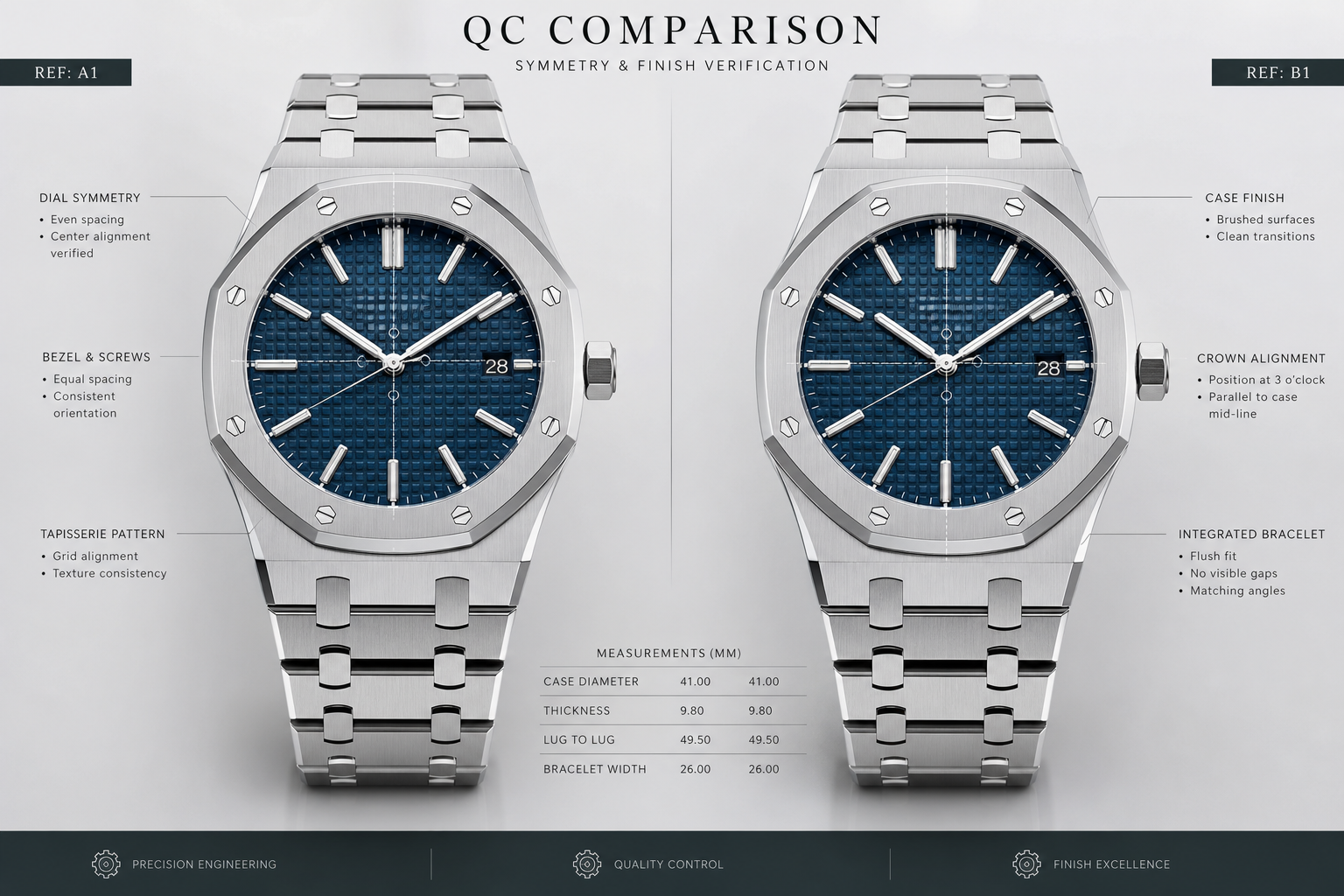
The Front Dial Photo: Bezel Screws, Markers, Logo, and Tapisserie Alignment
The AP Royal Oak QC front photo is usually the first image buyers study, and it should be. A straight-on dial shot can reveal more than just whether the watch looks attractive. It shows bezel screw alignment, marker placement, logo position, date window balance, hand centering, and whether the tapisserie dial appears properly framed within the case.
The mistake is judging the photo emotionally instead of structurally. A blue dial may look rich, a black dial may look clean, and a brushed bezel may catch the light nicely, but those are not enough for approval. Start with the fixed geometry. If the bezel, screws, markers, and dial grid do not agree with each other, the watch may keep looking slightly wrong even if the color and finishing are appealing.
Use the straightest front photo available. A slightly tilted camera can make a correct marker look crooked or make the date window appear off-center. The useful test is not whether every detail looks perfect in isolation. It is whether the whole front layout holds together when compared against the watch’s own lines.
Bezel Screw Position and Seating
Begin with the bezel screws because they frame the entire face of the watch. On AP-style designs, the visible screw heads are one of the first things the eye reads. In QC photos, look for consistency rather than fantasy-level perfection. The screws should appear evenly spaced around the octagonal bezel, seated at a similar depth, and visually balanced relative to the bezel edge.
A crooked bezel screw is not always a reason to panic if the photo angle is poor, but one screw that looks clearly rotated differently, raised, sunken, or poorly centered compared with the rest deserves attention. The most distracting examples are usually not subtle finishing differences. They are pattern breaks. If seven screws look uniform and one looks visibly out of place, your eye will likely find it again on the wrist.
Also check whether the screw heads look flush with the bezel surface. A screw that appears to sit too high can create an uneven reflection. A screw that looks deeply recessed can make the bezel feel cheaply assembled. You are not trying to verify genuine construction from a photo; you are checking whether the front of this specific replica looks clean enough to live with.
Hour Markers, Hands, and Dial Printing
After the bezel, move inward to the markers. Royal Oak hour markers should look straight, evenly placed, and aligned with the dial layout. Pay special attention to 12, 3, 6, and 9 because these positions anchor the dial visually. A small shift on a less prominent marker may be tolerable. A visibly tilted 12 o’clock marker is harder to forgive because it affects the whole face.
The hands should be centered cleanly and should not appear bent, scratched, or misaligned in a way that disturbs the dial. If the photo shows the hands blocking a key marker or date area, avoid making a final judgment from that photo alone. Hands can hide problems, but they can also create false concerns when their shadows cross the tapisserie pattern.
For dial printing, look for obvious heaviness, fuzziness, or tilt. The goal is not to use QC photos as a forensic authentication exercise. It is to decide whether the text looks neat enough at normal viewing distance. Thick or slightly imperfect printing may be a known limitation on some AP replicas, but visibly slanted text or poorly placed minute track printing can make the entire dial feel careless.
AP Logo and Tapisserie Pattern Centering
The AP logo sits in a dangerous area visually because it is judged against both the dial centerline and the tapisserie grid. If the logo is applied or printed slightly off, the square pattern behind it can make the shift more noticeable. Look at whether the logo appears centered relative to the upper dial, the 12 o’clock marker, and the vertical axis running through the hands.
For the tapisserie dial, avoid obsessing over every small square. QC photos are rarely consistent enough to judge micro-texture precisely, and replica tapisserie will still have limits under close inspection. What matters more before approval is centering. The grid should not look like it is drifting left, right, up, or down in relation to the markers and date window.
A useful trick is to stop looking at the dial as a “pretty pattern” and look at it as a background ruler. Does the pattern support the layout, or does it fight it? If the logo, hour markers, and date window all seem to sit naturally within the grid, the front photo is doing its job. If the pattern makes one area look crowded and another area look empty, the watch may feel visually unbalanced.
Front Photo Checks Before Approval
- Bezel screws: Check for consistent spacing, seating depth, and no single screw that looks obviously out of line with the rest.
- Hour markers: Focus on the main anchor points first, especially 12, 3, 6, and 9.
- Hands: Look for clean centering and no obvious bending, scraping, or visual distortion.
- AP logo: Confirm that it appears centered and not tilted against the dial grid.
- Tapisserie centering: Judge overall balance around the logo, markers, and date area rather than microscopic square detail.
- Date position: Note whether the date appears visually centered, but save the final judgment for a closer date-window review.
- Photo angle: Do not reject or approve based on a front photo that is clearly tilted or distorted.
Date Window and Dial Text: Small Details That Can Change the Whole Impression
The AP replica date window and Royal Oak dial printing deserve a separate inspection pass because small details in these areas can change the entire impression of the watch. Buyers often notice the bezel shape, dial color, and bracelet first, then only later realize the date sits too high, the text looks too bold, or the logo spacing feels awkward. Once noticed, those details are hard to unsee.
This is especially true on Royal Oak models because the dial is clean enough for small text and date errors to stand out. Offshore models can be more visually forgiving because subdials, larger cases, rubber details, and sportier layouts create more visual noise. But that does not make the date and text unimportant. It only changes the tolerance level. A slightly imperfect print edge may disappear in a busy Offshore layout, while the same flaw on a simpler Royal Oak dial may look more obvious.
The correct standard is not exact genuine font matching unless you are comparing a specific reference with verified data. For QC approval, the better question is whether the date and text look clean, centered, and stable enough for normal wear. A tiny font difference is usually less important than a date that sits visibly too high or a logo that looks shifted off the dial’s centerline.
How to Judge Date Centering Without Overreacting
Date alignment should be judged both vertically and horizontally. A date that sits slightly high or low may still be acceptable if it remains comfortably inside the window and does not touch the edge visually. A date that is clearly pressed toward the top, bottom, left, or right of the aperture is more distracting because the window becomes a frame around the error.
Be careful with shadows. AP date windows can show dark edges, crystal reflection, or side shadow depending on the light angle. A shadow along the top or bottom of the aperture can make a centered date look uneven. If the date looks questionable, compare it with the rest of the dial geometry instead of judging the number alone. Is the window itself straight? Is the date actually off-center, or is the camera slightly above or below the dial?
Single-digit and double-digit dates may also appear different. A “1” or “7” can look optically off-center even when the datewheel is reasonably aligned because the printed numeral is narrow. A two-digit date gives a clearer read. From QC photos, the red flag is not a date that looks mildly imperfect in one image. It is a date that appears consistently too high, too low, clipped, tilted, or crowded against the window edge.
Dial Text Weight and Spacing
Dial text should look sharp, controlled, and placed with intention. On many AP replicas, the difference between acceptable and distracting is not whether the text is microscopically identical to genuine. It is whether the printing looks too heavy, fuzzy, uneven, or tilted in a way that breaks the dial’s clean architecture.
Check the brand text, lower dial text, minute track, and any model-specific wording as separate elements. A slightly bold “AUTOMATIC” or lower text line may not be a dealbreaker if the dial remains balanced. Text that looks smeared, visibly misaligned, or too close to a marker is more serious. It suggests poor dial execution rather than normal replica tolerance.
Logo spacing also matters. An AP logo that is technically neat but positioned awkwardly can look worse than one with a minor finishing imperfection. The logo needs to sit naturally inside the tapisserie field, with enough breathing room around the marker above and the hands below. If the logo feels squeezed or off-center, the dial can look wrong even before the viewer knows why.
When a Small Dial Issue Becomes a Red Flag
A small dial issue becomes a red flag when it is visible without zooming, repeats across more than one photo, or sits in a high-attention area. The 12 o’clock area, logo area, center hand stack, and date window are the most sensitive zones. Buyers can usually tolerate minor print texture or tiny edge softness better than a tilted logo or badly centered date.
The best practical test is wrist-distance imagination. If the issue only appears after extreme zooming and disappears in the full front photo, it may be an acceptable flaw. If you can see it immediately in the normal QC image, it is more likely to bother you after delivery. AP dials are structured and symmetrical, so visible dial imbalance tends to age badly in ownership.
Do not reject every imperfect date or text detail automatically. Replica QC is about selecting an acceptable example, not finding a flawless one. But do not talk yourself into approving a watch when the date window or logo placement already annoys you in the photos. If a small detail is the first thing your eye finds before approval, it probably will not become less noticeable on the wrist.
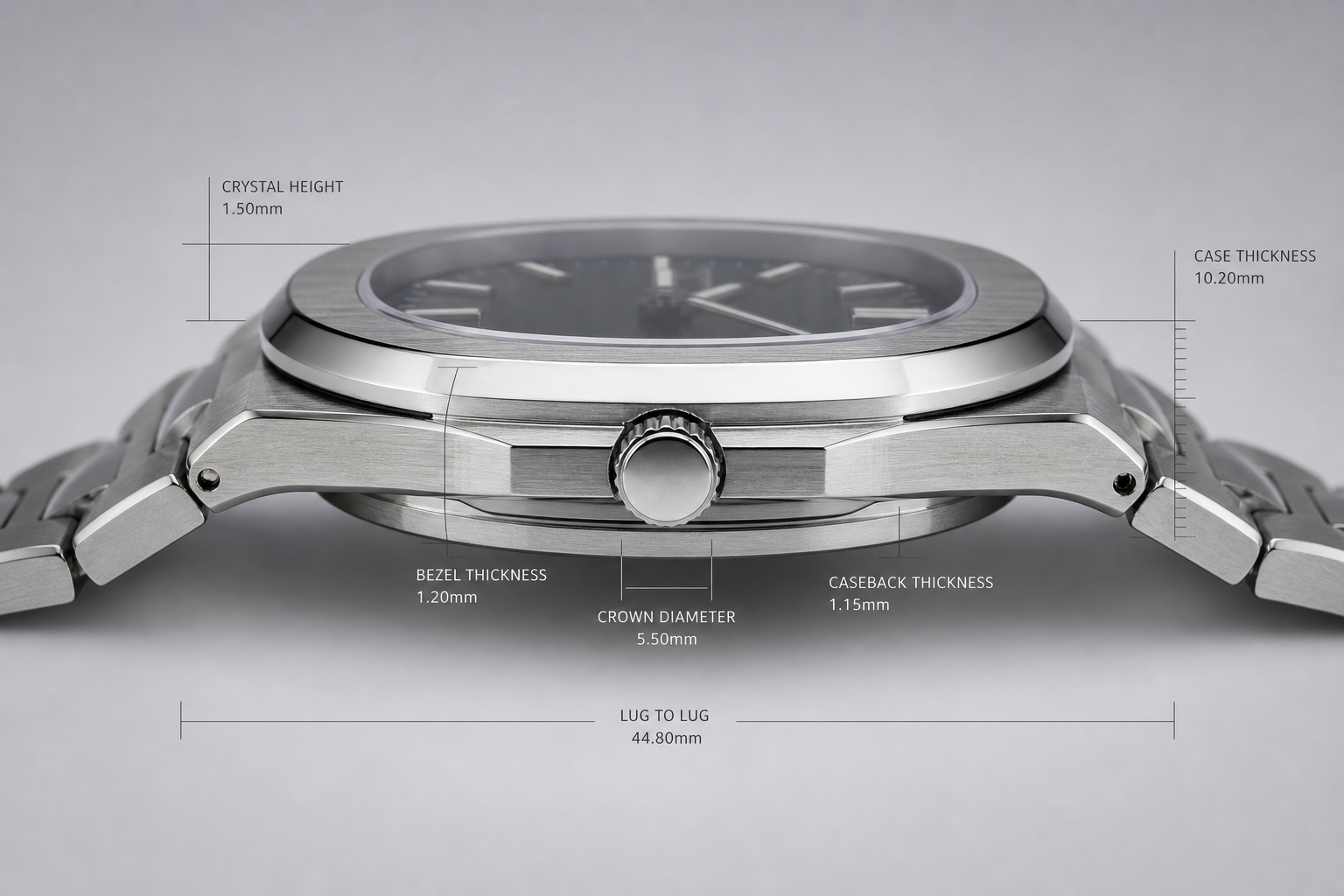
The Side Profile Shot: Case Thickness, Bezel Seating, Crystal Height, and Crown Position
The side profile is where many AP super clone QC photos become more honest. A Royal Oak or Offshore can look sharp from the front because the dial, bezel, and hands dominate the image. Turn the watch sideways, and the harder questions appear: does the case look balanced, does the bezel sit cleanly, is the crystal too proud, and does the crown line up naturally with the case?
This matters more on AP than on many round-case replica watches. The Royal Oak side profile is flat, architectural, and easy to read from the wrist. If the mid-case looks too slab-sided or the caseback stack looks bulky, the watch may feel visually heavy even if the front photo looks attractive. For this reason, AP super clone case thickness should not be treated as a minor technical detail. It often changes the whole wearing impression.
Water resistance should not be assumed from the model name, Offshore styling, visible gasket area, crown appearance, or caseback photo. Buyers should confirm whether the specific watch has been tested and understand that replica watches should be treated more cautiously around water than genuine watches designed, tested, and serviced through official channels.
Case Thickness and Mid-Case Proportion
Start by looking at the mid-case, not the total height alone. A thick watch is not always the problem; a poorly distributed thickness is. On a Royal Oak, the case should look like a controlled stack of bezel, mid-case, and caseback. If the middle section appears like a tall vertical wall, the watch can look too thick on the wrist even before you know the exact measurement.
The common mistake is approving a watch because the front image shows a clean tapisserie dial and aligned bezel screws, while the side image quietly shows a bulky case. That is a poor tradeoff. A small dial-print imperfection may disappear in normal use, but an overweight Royal Oak side profile is visible every time the wrist turns. In practice, side thickness usually matters more than a tiny text flaw unless the text issue is severe.
For Royal Oak references, the side view should show a fairly disciplined case shape, with the bezel and caseback not looking like separate blocks added to a base case. For Offshore models, more height is expected because the design is larger and sportier, especially on chronographs. The tolerance is wider, but not unlimited. If an Offshore case looks top-heavy, with pushers floating too high or a caseback that appears unusually deep, it is still worth questioning before approval.
If a seller provides a thickness number, treat it as model-specific information, not a universal promise, because a super clone Audemars Piguet guide should separate each reference by case architecture rather than flattening every profile into one standard. A 15400, 15500, Jumbo-style model, Diver, and Offshore chronograph do not share the same correct profile. The useful QC habit is to compare the watch against the expected shape of that specific reference, then use the photo to confirm whether the case looks balanced.
Crystal Height and Bezel Seating
The next check is the bezel and crystal stack. On AP QC photos, the bezel should appear evenly seated around the case, without one side showing a strange gap or lift. A slight shadow line is normal in side lighting, but an uneven bezel gap is different. If one edge looks raised while the opposite side looks compressed, the watch may have an assembly issue or the camera angle may be misleading. Either way, it deserves a second look from another side angle.
Crystal height is another detail buyers often miss. A crystal that sits too high can make the watch look cheaper from the side, even if the dial is well executed. This is especially noticeable on the Royal Oak because the bezel is flat and geometric. The crystal should not look like a tall dome sitting above the bezel. A small raised edge may be normal depending on the model, but an obviously proud crystal changes the clean, low-profile character of the design.
Be careful with reflections. A bright line along the crystal edge can make it look taller than it is, while a dark photo can hide a raised crystal. The best side profile QC image shows the bezel, crystal, mid-case, and caseback in the same plane without dramatic lighting. If the only side photo is shot at a flattering angle with heavy glare, it is not strong evidence.
From a practical QC standpoint, the question is not whether the crystal and bezel match genuine finishing under macro inspection. The better question is simpler: does the watch still look like a clean, integrated Royal Oak profile when viewed from the side? If the answer is no, the front dial photo cannot fully rescue it.
Crown and Pusher Placement on Royal Oak and Offshore Models
The crown should look like it belongs to the case architecture. On a Royal Oak, check whether the crown sits centered relative to the case height and whether it appears straight rather than tilted upward or downward. A crown that sits too low can make the case look awkward; a crown that sits too high can make the side profile feel unbalanced. Also look for a crown that appears loosely fitted, unusually thick, or visually detached from the case flank.
On Offshore models, pushers add another layer of risk. Larger cases and chronograph architecture naturally create more visual mass, so the side should not be judged by Royal Oak thin-watch standards. Still, the pushers should look symmetrical, parallel, and proportionate to the case. If one pusher appears angled, sunken, proud, or oddly spaced compared with the other, that is more important than a small cosmetic mark on the dial.
Crown guards, where present, should frame the crown cleanly. They should not look overly rounded, uneven, or poorly blended into the case. The Offshore is more forgiving because it is a bold design, but it is also easier for poor geometry to hide behind that boldness. A large case does not excuse a crown or pusher layout that looks mechanically careless.
At Clean VS Factory, we usually treat side geometry as a risk filter rather than a beauty detail. If the crown, pushers, and case stack do not make sense together, the watch may photograph well from the front but feel less convincing in daily wear.
Side Profile Angles to Review
The most useful side-profile set includes three views. First, a direct side view should show the full case thickness, crown position, and caseback profile without strong camera tilt. Second, a slight upper angle should show whether the bezel is seated evenly and whether the crystal height looks controlled. Third, a lower side angle, if available, can reveal how much the caseback contributes to the total height.
If only one side photo is provided, judge it cautiously. A single angle can hide a raised crystal, exaggerate thickness, or make a normal crown position look wrong. The safest read comes from comparing the side profile against the front photo: the watch should not transform from a sharp, flat Royal Oak into a bulky block once the angle changes.
A side shot does not need to be perfect studio photography. It only needs to be honest enough to answer the main QC question: does the case architecture look balanced for this AP model, or is there a visible geometry issue that will bother you on the wrist?
Bracelet and Clasp Photos: Where AP Super Clones Often Reveal Real-World Quality
AP replica bracelet QC deserves more attention than many buyers give it. On a Royal Oak, the bracelet is not an accessory attached to the case; it is part of the design. The case, first link, bracelet taper, brushing, polished bevels, and clasp all contribute to the watch’s identity. A good dial with a poor bracelet can still feel wrong in real use.
The key is to separate visual cleanliness from actual construction clues. A bracelet can look nicely brushed in one bright photo but still show endlink gaps, rough link finishing, stiff drape, uneven screw heads, or a clasp that does not sit cleanly. QC photos cannot prove long-term comfort, but they can reveal enough to prevent some bad approvals.
Endlink Fit and Case-to-Bracelet Transition
The first link is the most important bracelet area to inspect. On an integrated bracelet, the transition from case to bracelet should look natural, not like two unrelated parts meeting at a hinge. Look for uneven gaps on the left and right sides, a first link that sits higher on one side, or a visible step where the bracelet should flow out of the case.
A small shadow line at the case junction is normal, especially with bright lighting. A large bracelet gap is different. If the first link looks loose, twisted, or misaligned, the watch may feel less solid on the wrist and the issue will be easier to notice than many dial details. The Royal Oak’s flat case and bracelet surfaces give the eye too many straight lines for a bad transition to hide.
Bracelet drape is harder to judge from still photos, but not impossible. If the bracelet is shown hanging or laid naturally, the links should curve in a controlled way rather than forming stiff, unnatural angles. A bracelet that looks overly rigid may still be wearable, but it will not give the same fluid impression buyers expect from an AP-style integrated bracelet.
Bracelet Screws, Brushing, and Link Consistency
Next, inspect the bracelet screws and link surfaces. The screws should appear cleanly seated, with no obvious chewing, uneven depth, or one screw head that looks very different from the others. Do not overreact to tiny macro marks; QC photos can exaggerate small scratches. But if several screws look rough or poorly finished, that suggests weaker assembly care.
Brushing direction matters because AP bracelets depend on flat satin surfaces and polished bevels. In QC photos, look for links that appear mismatched, patches of brushing that run in the wrong direction, or polished bevels that disappear unevenly from one link to the next. The best AP replica bracelet QC is not about excessive shine. It is about consistency.
Polished bevels are especially important because they define the bracelet’s geometry. If the bevels look rounded, wavy, or inconsistent, the bracelet may lose the crisp architectural feel that makes the Royal Oak convincing. This is a detail that often matters more in hand than in a single photo, but obvious inconsistency can still be caught before approval.
Also watch for rough links. Photos cannot tell you exactly whether the bracelet will feel sharp, but they may show poorly finished edges, uneven gaps, or links that do not sit flush. These are the clues that connect visual QC to daily comfort. A bracelet that looks poorly assembled in photos is unlikely to become more refined after it arrives.
Clasp Engraving and Closure Appearance
Clasp photos should be judged with a different standard from bracelet photos. Clasp engraving is mostly a cosmetic check; clasp alignment and closure appearance are closer to functional clues. Royal Oak clasp engraving should look neat, centered, and reasonably sharp, but it does not need to be treated like a forensic authentication point. A slightly soft engraving is less important than a clasp that appears crooked or loosely assembled.
Look at the clasp both open and closed if possible. When closed, it should sit flat and symmetrical, without one side lifting or a visible twist. When open, check whether the inner engraving looks clean and whether the metal surfaces appear properly finished. Heavy, crude lettering or messy finishing inside the clasp can cheapen the impression even if the outside of the bracelet looks acceptable.
A loose clasp is difficult to confirm from photos alone. Still, some signs are visible: uneven closure, a clasp blade sitting off-center, or a gap that looks much larger on one side. These do not automatically mean the clasp will fail, but they reduce QC confidence. Bracelet and clasp photos should not be treated as decoration; they are part of the real-world quality check.
Bracelet Photos Worth Reviewing
The most useful AP bracelet QC set includes a clear case-to-bracelet transition photo, a bracelet laid flat, a bracelet shown with some natural curve, a clasp-open photo, and a clasp-closed photo. If there is a visible concern, a close-up of the affected screw, link, or endlink area is more useful than another attractive dial shot.
For approval decisions, prioritize structural-looking issues over cosmetic noise. A tiny surface mark may be acceptable on a replica watch, especially if it is only visible under harsh light. A crooked first link, uneven bracelet gap, badly mismatched brushing, or clasp that does not sit properly is more likely to affect the ownership experience. That is the difference between a flaw you forget and a flaw you see every time you wear the watch.
The Caseback and Movement Photo: Useful Clues, But Not a Full Reliability Test
The AP replica movement photo is useful, but it is one of the easiest QC images to overvalue. A decorated movement can look impressive through a display caseback, especially if the rotor has engraving and the bridges have visual finishing. That does not prove the movement is reliable, well-regulated, properly lubricated, or built to genuine-level standards.
Caseback photos should be used for confirmation, not comfort. They can help you see whether the rear side matches the claimed general movement route, whether the rotor style looks appropriate for the model, whether the caseback screws are cleanly installed, and whether there are obvious assembly problems. They cannot predict how the movement will behave after weeks or months of use.
Movement trust in the replica market depends on understanding what the movement claim actually describes: architecture, decoration, layout, reliability expectation, or simply a market name used by sellers. A movement photo may show a decorated bridge or rotor, but buyers should not treat that as proof of an official AP caliber, full service compatibility, or guaranteed long-term stability. The practical QC question is whether the visible movement side is clean, coherent, and consistent with the specific version being offered.
What the Caseback Photo Can Confirm
A good AP caseback QC image can show rotor shape, rotor engraving, bridge decoration, screw layout, caseback text, gasket area cleanliness if visible, and whether the movement appears properly seated. These are not small details on many AP models because the display back is part of the ownership experience. If the rear view looks sloppy, the watch may feel less satisfying even if the front is strong.
Start with the rotor. It should look centered, cleanly installed, and consistent with the claimed style of the model. A rotor that looks visibly off-center, scratched, poorly engraved, or unusually cheap is worth questioning. Some decoration differences are expected between replica movements and genuine AP calibers, but obvious sloppiness is not the same as an acceptable limitation.
Then check the caseback screws and alignment. Screws should not look stripped, missing, unevenly seated, or randomly damaged. The caseback should sit evenly against the case, without one side looking lifted. On a display caseback, also look for dust, fingerprints, loose particles, or marks inside the crystal area. These do not always affect function, but they suggest weaker assembly control.
The movement appearance should also match the claimed route in a general sense. If a watch is described as having an integrated-style clone movement but the photo shows an obvious plate-decorated layout that does not visually correspond, the issue is not just cosmetic. It may mean the buyer is evaluating a different version than expected. Factory names and movement descriptions can shift by batch, so the caseback photo is one way to catch a mismatch before approval.
What the Caseback Photo Cannot Prove
A caseback photo cannot prove long-term reliability. It cannot show amplitude, beat error, lubrication condition, calendar stability, automatic winding efficiency, or whether the movement was assembled cleanly under the dial side. It also cannot prove water resistance. A watch can have a clean rear photo and still have poor regulation, rotor noise, weak power reserve, or a date issue later.
This is where many buyers make a bad approval decision. They see an attractive decorated movement and assume the watch is mechanically safe. Decoration is not the same as engineering quality. Geneva-style stripes, engraved rotors, and colored screws can improve visual impression, but they do not guarantee correct servicing, clean assembly, or durable performance.
Chronograph and complication-style AP replicas deserve extra caution. A rear photo may show a movement that looks more complex or more convincing, but complexity also increases ownership risk. Pushers, calendar modules, chronograph functions, and decorated plates can create more points of failure. Unless the model-specific movement route is well understood, the caseback photo should be treated as one piece of evidence, not a reliability certificate.
Display Caseback Models Need Extra Visual Consistency
For AP models with display casebacks, the movement side matters more than it would on a closed-back sports watch. You may not look at the caseback every day, but if the rear view is visibly crude, it weakens the overall impression of the watch. Movement decoration is part of what the owner sees, so obvious engraving errors, rough rotor finishing, or dirty assembly should not be ignored.
That does not mean the movement must match genuine AP finishing under magnification. That is not a realistic QC standard for a replica watch. The practical standard is whether the rear view is clean, coherent, and consistent with the version being offered. If the movement looks attractive only because the photo is dark, angled, or heavily compressed, confidence should be lower.
The best use of AP caseback QC is to confirm visible consistency while staying realistic about what photos cannot show. Approve or question the watch based on the full evidence: rear-side appearance, caseback fit, rotor and engraving quality, screw condition, and whether the movement route appears to match the watch. Do not approve only because the movement photo looks decorated.
Wrist and Angle Photos: Checking How the Watch Actually Presents
An AP replica wrist shot is not the most technical QC image, but it often answers the question that straight photos cannot: does the watch look balanced once it is on a wrist? This matters more with Royal Oak and Offshore models than with many round-case watches because the case does not visually “shrink” on the wrist. The flat bezel, broad shoulders, integrated bracelet, and angular case edges all create a larger footprint than the diameter alone suggests.
The mistake is treating wrist and angle photos as either useless or decisive. They are neither. A flattering wrist photo can hide a thick case, uneven dial alignment, or bracelet stiffness. But ignoring angle photos completely can cause a buyer to approve a watch that looked clean in macro shots but wears like a slab. The right approach is to use AP QC angle photos as a proportion check after the front, side, bracelet, and caseback photos have already done their technical work.
Why Wrist Presence Matters on Royal Oak and Offshore Models
Royal Oak and Offshore watches have strong wrist presence because the case and bracelet are one visual structure. The first bracelet links do not fall away from the case like a soft leather strap. They extend the shape of the watch outward, so the effective width can feel larger than the listed case size. This is why a 41mm Royal Oak can appear more assertive than many 41mm round watches, and why an Offshore can look especially bulky even when the dial itself seems well proportioned.
In a wrist shot, look for whether the watch sits flat or appears perched above the wrist. A little height is normal, especially on Offshore models, but a case that looks top-heavy from casual angles will usually feel even more noticeable in daily wear. The most useful clue is not whether the watch looks “big” in one photo. It is whether the case height, bracelet drape, and wrist contact look natural together.
Bracelet drape is the detail many buyers miss. On a Royal Oak-style integrated bracelet, the first few links should look like they are following the wrist rather than fighting it. If the bracelet flares outward sharply or looks stiff at the case transition, the watch may wear less comfortably and appear less convincing in real use. A strong dial cannot fully compensate for a bracelet that sits awkwardly.
How Lighting Can Distort Dial Color and Finishing
Dial color is one of the easiest areas to overjudge from AP QC photos. Blue, gray, black, green, and smoked dials can shift dramatically under different lighting angles. A blue Royal Oak dial may look bright in direct light, dark navy in shadow, and slightly washed out under strong phone-camera exposure. That does not automatically mean the dial is wrong.
The better question is whether the dial remains visually coherent across several photos. If one image shows a strange color cast but the others look consistent, the issue may be lighting. If every photo shows the dial as flat, cloudy, or uneven in a way that does not match the model’s expected character, then it deserves more caution. For AP super clone QC photos, dial shade should influence the decision, but it should not outrank obvious proportion problems.
Bezel reflection can also mislead the eye. The Royal Oak bezel has multiple polished bevels and brushed flat surfaces, so it catches light in hard lines. Under harsh lighting, the bezel may look sharper, wider, or more reflective than it does in person. Under soft lighting, finishing flaws may become less visible. This is why a single beautiful angle photo should never be treated as proof that the watch is clean.
Angle Photos Should Confirm, Not Replace, Straight QC Shots
Angle photos are useful because they show how the watch presents in a more natural viewing position. They are weak evidence for alignment. A slightly tilted camera can make a straight marker look crooked, make the bracelet taper look uneven, or exaggerate the case size. Wide-angle phone lenses can also stretch the watch if the camera is too close, making the bezel and first links look larger than they are.
Use angle photos to confirm broad impressions: whether the watch looks too bulky, whether the bracelet sits naturally, whether the dial color changes reasonably, and whether the bezel reflections look consistent. Do not use them as the main judge of screw alignment, marker centering, date position, or dial symmetry. Those decisions need the straightest available photos.
A practical rule is simple: if an angle photo reveals a problem that is also visible in a straight photo, take it seriously. If the issue appears only in one dramatic angle and disappears in the direct photo, it may be distortion rather than a real defect. This distinction prevents both bad approvals and unnecessary rejections.
At Clean VS Factory, we usually treat wrist photos as the final reality check, not the starting point. They help answer whether the watch has the right presence for daily wear, but they should not override stronger evidence from cleaner front and side images.
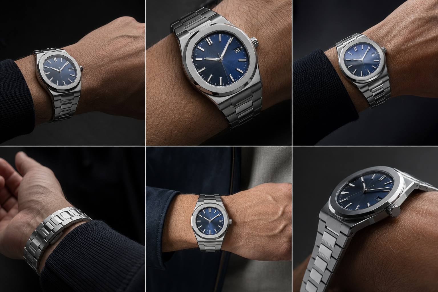
Common AP QC Mistakes That Lead to Bad Approvals
Most bad AP QC decisions do not happen because the buyer missed an obscure technical flaw. They happen because the buyer gives too much weight to one attractive photo and too little weight to the full set. AP QC mistakes are usually interpretation mistakes: loving the dial color, ignoring the side profile, trusting edited QC photos, or rejecting a good watch because a macro image made a minor tolerance look catastrophic.
The Royal Oak and Offshore are especially unforgiving because visual issues connect to each other. A slightly bulky case may make the bracelet transition look worse. A stiff bracelet may make the whole watch sit higher. A strong dial may distract from a side profile that will bother the wearer every time the watch is seen from an angle. Replica watch QC approval should be based on the full object, not the best-looking frame.
Claims such as “perfect,” “same as genuine,” or “guaranteed to pass inspection” should be treated with caution. A more reliable AP QC comparison looks at the actual model version, movement configuration, finishing details, and available QC evidence. The safest use of factory and movement information is to avoid misunderstanding quality or overpaying for a claim, not to represent a replica watch as genuine.
Judging Only by Dial Color
Dial color matters, especially on AP models where blue, gray, green, and smoked finishes carry much of the watch’s identity. But it is one of the least stable things in QC photos. Lighting temperature, camera exposure, compression, and reflection from the bezel can all shift the color. A buyer who approves only because the dial looks rich in one photo may miss a thick case, uneven bracelet fit, or awkward wrist presence.
The opposite mistake is also common: rejecting a watch because the dial shade in one image does not match an online reference photo. Unless the QC set shows consistent color problems across multiple lighting conditions, dial shade should be judged with restraint. A slightly different tone is often less important in daily wear than an obvious alignment error or a case that looks too tall.
Ignoring Case Thickness and Bracelet Fit
This is the approval mistake most likely to create regret. A Royal Oak can look impressive from the front and still feel wrong because the side profile is too bulky or the bracelet does not flow from the case. On AP designs, the case-to-bracelet relationship is not a secondary detail. It is part of the entire design language.
If the side profile looks slab-sided, or if the first bracelet links appear to sit awkwardly away from the wrist, the watch may never feel as clean as the dial photo suggested. Offshore models allow more visual mass, but they still need balance. Bigger does not mean any thickness or stiffness should be ignored.
A useful judgment: case thickness and bracelet integration usually matter more for real-world satisfaction than a tiny printing imperfection visible only under heavy zoom. Buyers who skip these areas often approve a watch that photographs well but wears poorly.
Expecting Genuine-Level Macro Perfection
Macro inspection is helpful, but it can also distort priorities. A close-up image can make a small brushing inconsistency, tiny dust reflection, or slight text edge look worse than it will ever appear on the wrist. AP super clone QC photos should reduce avoidable risk, not promise genuine-level hand finishing or flawless microscopic execution.
The key is to separate normal replica tolerances from visible defects. A tiny imperfection that disappears in normal viewing distance may be acceptable. A crooked marker, obviously uneven date, badly seated screw, strange case height, or bracelet gap that remains visible across multiple photos is different. Those are practical QC red flags because they affect how the watch presents, not just how it looks under magnification.
Do not approve every flaw just because “it is a replica,” but do not reject every watch because it fails a macro standard that even strong replicas are not built to meet. The sensible middle ground is to focus on defects that will keep drawing your eye during normal wear.
Trusting Over-Edited or Incomplete Photo Sets
Edited QC photos can make finishing look cleaner than it is. High contrast can hide brushing inconsistency. Heavy compression can blur screw seating and clasp details. Strong reflections can disguise small gaps. Overly polished images may look reassuring, but they often reduce the buyer’s ability to judge the watch.
Incomplete photo sets create a different problem. If every image is a flattering front angle and there is no useful side, wrist, bracelet, or caseback view, the buyer is being asked to approve without seeing the areas where AP replicas often reveal real-world quality. That does not automatically mean the watch is bad, but it does lower confidence.
The safest QC interpretation comes from consistency across photo groups. If the watch looks balanced from the front, reasonable from the side, clean through the bracelet, and natural in wrist angles, the approval decision is stronger. If the photos avoid one important angle, the missing evidence matters.
A Practical Approval Framework for AP Super Clone QC Photos
An AP super clone approval checklist should not treat every detail equally. The most important AP QC issues are usually geometry and proportion first, visible dial and date execution second, bracelet and clasp consistency third, and caseback or wrist-angle confirmation last. This order prevents the buyer from becoming distracted by attractive finishing while missing the flaws that change the whole wearing impression.
The goal is not to find a perfect replica watch. The goal is to decide whether the visible watch in the QC set is acceptable for the buyer’s expectations. A good Royal Oak QC checklist should answer three questions: does the geometry look straight, does the watch wear visually balanced, and are the remaining imperfections small enough that they will not dominate daily use?
Start With Geometry, Then Move to Finishing
Begin with the structure of the watch. On AP models, geometry controls the impression: bezel shape, screw placement, marker alignment, date placement, case height, and bracelet integration. If these are visibly wrong, better brushing or a pleasing dial shade will not save the watch.
Finishing still matters, but it should come after the watch passes the basic shape test. Slight differences in brushing texture, bevel sharpness, or engraving depth may be acceptable depending on the model and price tier. A crooked visual layout is harder to live with because the Royal Oak design gives the eye so many straight lines for comparison.
This is why the best final QC review starts with the big visual architecture. If the watch looks straight, balanced, and complete across multiple angles, then smaller finishing concerns can be judged with more patience.
Separate Acceptable Imperfections From Distracting Defects
An acceptable QC flaw is usually small, isolated, and not obvious at normal viewing distance. A slightly imperfect date print, minor reflection inconsistency, or small brushing difference may fall into this category if the overall watch looks balanced. These are the kinds of tolerances buyers should expect in replica watch QC approval.
A distracting defect is different. It remains visible without zoom, appears in more than one photo, or affects a main AP design feature. Examples include a visibly tilted marker, a date sitting clearly too high or low, a bezel screw that looks obviously sunken or raised compared with the others, a case that appears too thick from the side, or a bracelet that does not transition naturally from the case.
The practical test is simple: will this flaw bother you every time you check the time? If yes, it deserves more caution. If it only appears when enlarged on a screen and disappears in normal viewing, it may not justify rejecting an otherwise strong watch.
Use All Five Photo Groups Before Making the Final Call
A proper AP QC decision should come from the full photo set, not from one hero image. The front dial check shows symmetry and visible alignment. The side profile check reveals case height and proportion. The bracelet check shows integration and real-world fit clues. The caseback check confirms rear-side consistency without proving reliability. The wrist angle review shows how the watch presents outside flat technical photos.
Each photo group has a different job. A front photo can make the dial look excellent while hiding case bulk. A wrist photo can make the watch look exciting while hiding alignment issues. A caseback photo can look decorated but still say little about long-term movement behavior. The strength of the final decision comes from comparing all of them together.
If one photo group looks strong and another raises a serious concern, do not average them blindly. Give more weight to the flaw that will affect daily wear. On a Royal Oak or Offshore, that usually means visible geometry, case proportion, bracelet fit, and photo completeness carry more decision value than a tiny macro finishing issue.
Final Review Order Before Approval
- Front symmetry: Check whether the bezel, screws, markers, hands, and dial layout look balanced in the straightest front image.
- Date and text: Confirm that the date is not obviously high, low, or off-center, and that dial text is not visibly tilted, fuzzy, or misplaced.
- Side profile: Look at case height, bezel stack, crystal presence, and whether the watch appears overly bulky for the model.
- Bracelet fit: Review the case-to-bracelet transition, first-link behavior, visible gaps, and whether the bracelet appears to drape naturally.
- Clasp appearance: Check that the clasp looks cleanly assembled and that engraving or closure alignment does not show obvious assembly issues.
- Caseback consistency: Use the rear photo to spot obvious mismatches, sloppy decoration, or poor assembly, while remembering it cannot prove reliability or waterproofing.
- Wrist presence: Use wrist and angle photos to judge whether the watch looks balanced in a realistic wearing position.
- Photo quality: Be more cautious if the set relies on extreme angles, heavy reflections, missing views, or overly compressed images.
The strongest approval decisions are not based on finding a flawless watch. They come from knowing which flaws matter, which ones are tolerable, and whether the QC photos give enough visual evidence to judge the watch fairly. For AP Royal Oak and Offshore models, that means prioritizing geometry, proportion, bracelet integration, and consistent photo evidence before getting lost in isolated macro details.
A replica watch should be evaluated with realistic ownership expectations. Even a strong AP super clone can have limits in water resistance, long-term movement stability, servicing convenience, bracelet comfort, and close inspection compared with a genuine reference. A careful QC review improves the decision, but it should not be treated as a guarantee of mechanical performance or as a substitute for authorized retail.
Final Boundary Checklist Before You Approve Any AP Replica QC Set
Before approval, run one final boundary check that separates what you know from what you only assume. You may know that the visible bezel screws look even, the date is acceptable, the bracelet transition is clean, and the caseback appears consistent with the claimed movement route. You should not assume from those photos that the watch is waterproof, officially serviced, brand-authorized, mechanically guaranteed, or suitable to describe as a genuine Audemars Piguet watch.
If a listing or seller message relies on absolute language such as “perfect,” “official,” “same as genuine,” “guaranteed waterproof,” or “passes authentication,” treat that as a reason to slow down rather than a reason to feel safer. The more reliable QC mindset is narrower: judge the individual replica-market watch by the visible evidence, confirm unclear policies directly with the seller, and keep the replica-versus-genuine distinction clear in any future discussion of the watch.
CleanVSFactory’s buyer-facing approach is to make replica watch comparison clearer by connecting factory names, movement claims, visible QC details, version differences, and realistic ownership limits. That educational role should not be confused with official brand authorization, authentication certification, or a guarantee that any specific watch will perform, inspect, ship, or wear in a particular way.
Disclosure: This article is for general educational and comparison purposes only. Replica watches are not genuine products from the original luxury brands, and brand names are used only to identify reference designs or comparison topics. Factory names, movement descriptions, prices, availability, QC details, seller policies, and version information can change, so readers should verify important details with the seller before making a purchase decision. Replica watches should not be represented, resold, or used as genuine watches.