
AP replicas with display casebacks create a different buying problem from closed-back models: the movement is part of the visual judgment. A caseback can look impressive in seller photos because lighting, reflections, camera distance, and compression make rotors, jewels, stripes, and gold tones appear richer than they may look under closer inspection, which is why clone movement service reality should be weighed alongside layout accuracy, rotor noise, and finishing consistency. The real question is not whether the movement looks dramatic in one photo, but whether the layout, engraving, finishing, and color balance still hold together when viewed clearly.
This article explains how to judge that visible movement layer by layer. It focuses on practical checks such as rotor proportion, bridge architecture, text spacing, engraving depth, screw and jewel finishing, perlage, Geneva stripes, and batch-photo reliability. The goal is to help buyers separate acceptable visual compromises from warning signs, while remembering that a convincing caseback does not prove movement reliability, water resistance, or long-term serviceability.
| Inspection Area | What to Check First | Why It Matters |
|---|---|---|
| Full movement layout | Rotor size, bridge shape, open-space balance, centering | Architecture looks wrong before small finishing flaws matter |
| Rotor and bridge text | Engraving depth, spacing, alignment, crowding | Soft or shifted lettering becomes obvious under magnification |
| Decorative finishing | Geneva stripes, perlage, bridge edges, surface texture | Strong shine can hide rough or uneven execution |
| Small hardware | Screws, jewels, settings, color consistency | Several careless details together suggest weaker visible QC |
| Seller photos | Clear straight-on caseback view plus close-ups | Angled glare shots can conceal shallow engraving and rough finishing |
| Model expectation | 15400, 15500, 26240, and 15202-style layouts | Each version has different pressure points in movement appearance |
Quick Questions Before You Read
Q: Is one attractive caseback photo enough to approve an AP replica?
No. A clear straight-on image and close-ups are needed to judge layout, engraving, finishing, screws, jewels, and color consistency.
Q: Should movement decoration or movement reliability be judged together?
They should be separated. A caseback may look convincing visually, but that does not confirm power reserve, winding feel, water resistance, or serviceability.
Q: What should be checked before tiny macro details?
Start with broad architecture: rotor proportion, bridge layout, text placement, open spaces, and whether the movement looks integrated.
Q: Are small flaws always a reason to reject the watch?
Not always. One minor issue may be acceptable, but multiple weak details in engraving, finishing, hardware, and color usually indicate a poorer visual result.
Editorial Perspective: For AP display-caseback replicas, cleanvsfactory.com treats movement photos as useful evidence, not final proof. A factory label, a high price, or a dramatic rotor shot can help narrow the comparison, but the better buyer question is more specific: does this exact watch, in these exact QC photos, show a coherent bridge layout, controlled engraving, believable finishing texture, and a movement route that fits the buyer’s ownership expectations? Visual accuracy through the sapphire back and daily reliability are related concerns, but they should not be judged as the same thing.
Evidence Boundaries for Display-Caseback Comparisons
When buyers compare an AP-style replica movement with an authentic Audemars Piguet display caseback, the comparison should be kept narrow. Official brand information can help identify what the genuine watch is meant to represent, such as model family, design language, caseback presentation, or caliber naming. It does not prove that a replica movement has the same architecture, finishing, parts quality, adjustment, service standard, or water resistance. For that reason, this guide treats authentic-watch references as visual context only, not as evidence that any imitation watch is equivalent to an authorized product.
The same caution applies to movement labels used in replica listings. Terms such as “clone 3120,” “clone 4302,” “clone 4401,” “decorated movement,” or “super clone movement” may describe the seller’s positioning, but they should not be accepted as precise technical documentation unless the specific watch is supported by clear photos, consistent version information, and credible inspection. A decorated bridge plate can improve the caseback view without proving the underlying movement is mechanically identical to the genuine caliber it imitates.
Factory-market names should be read with the same restraint. A name such as APSF, ZF, XF, or any other commonly used replica-market label can help buyers organize comparisons, but it is not an official Audemars Piguet affiliation and it does not prove that every example from that source has identical movement decoration, assembly quality, or mechanical behavior. For display-caseback watches, the traceable evidence is the specific version, the exact movement route, and the current caseback photos being reviewed.
Brand Reference and Replica Status Boundary
Brand names are used in this article for identification and comparison only. An AP-style or Audemars Piguet-style replica watch is a replica-market product, not a genuine watch from Audemars Piguet and not an item produced, approved, serviced, or certified by the original luxury brand. A genuine reference watch can be useful as a visual benchmark for caseback layout, rotor shape, engraving placement, and finishing language, but that comparison does not make a replica movement authentic or officially equivalent.
The purpose of movement and factory discussion is buyer education: understanding visible compromises, version differences, QC-photo limits, and ownership risk. It should not be used to represent, resell, or present a replica watch as a genuine Audemars Piguet watch. A strong display-caseback replica may look convincing in normal wear, but close inspection can still reveal differences in movement construction, finishing texture, engraving execution, service compatibility, case assembly, or other details.
Movement Transparency Note: Movement references in this article describe replica-market movement types, decoration routes, or visual configurations, not official Audemars Piguet calibers unless supported by verifiable evidence. Buyers should judge movement claims through clear photos, version context, service expectations, and visible QC details rather than by caliber-style wording alone.
Why AP Display Casebacks Expose More Than Most Buyers Expect
An AP display caseback replica has a different problem from a closed-caseback Rolex-style replica: the movement is part of the watch’s visible design. With many closed-back watches, the buyer can focus mainly on the dial, bezel, case shape, bracelet fit, and clasp feel. On a Royal Oak caseback with sapphire, the buyer is also looking at the rotor, bridges, engravings, decorative finishing, jewel positions, and the general architecture of the replica AP movement.
This is where many buyers become too confident too early. A visible movement can look impressive in a seller photo because there is a lot happening at once. Gold-tone rotor, striped bridges, red jewels, engraved text, polished screws, and a shaped caseback all create the impression of complexity. That first impression matters, but it is not the same as close inspection. The caseback can look “busy” and premium while still showing shortcuts once the photo is sharp enough.
The strongest judgment here is simple: if the AP replica has an open caseback, the movement cannot be treated as a hidden technical detail. It has to be judged like a dial or bracelet. A rough movement finish is not only a mechanical compromise; it becomes a visual compromise every time the watch is turned over. This does not mean every small flaw should be rejected. It means buyers need to separate acceptable display-caseback decoration from obvious shortcuts that weaken the whole watch.
Display Casebacks Turn Decoration Into a Buyer Decision
On a closed-back watch, a decorative movement plate or simplified bridge layout may not affect daily visual confidence because the owner rarely sees it. On an AP Royal Oak replica with a sapphire caseback, that logic changes. The movement is exposed, so the buyer is effectively evaluating another dial. The rotor has to sit visually right. The bridges need to look balanced. The engravings should not feel crude. The finishing should look intentional rather than sprayed-on or printed-like.
This is especially important with Audemars Piguet designs because AP uses the caseback as part of the watch’s luxury language. The Royal Oak is already a sharp, architectural watch on the front: octagonal bezel, visible screw heads, integrated bracelet, hard brushed surfaces, polished bevels. A weak movement view breaks that same architectural impression from the back. Even if the front looks convincing on wrist, a careless caseback can make the watch feel lower-tier once handled.
At Clean VS Factory, we usually treat display-caseback evaluation as a version question, not a factory-name shortcut. A factory reputation may point you in the right direction, but the specific movement decoration, batch, photo quality, and buyer expectation decide whether the caseback is acceptable. The more open the caseback, the less room there is for lazy finishing.
Why Seller Photos Often Make the Movement Look Better Than It Is
Seller photos are useful, but they are often flattering by nature. A movement photographed from a slight angle under bright light can hide uneven texture and make the rotor look richer than it does in neutral lighting. Distance smooths out engraving edges. Compression removes small roughness. Low resolution makes thick lettering look sharper than it really is. Reflections on the sapphire caseback can blur weak areas while giving the movement a glossy, expensive-looking surface.
This is why buyers should not judge an AP display caseback replica from one dramatic full-caseback shot. That photo usually tells you the broad composition: rotor size, general bridge layout, color balance, and whether the movement looks complete rather than empty. It does not tell you whether the engraving is crisp, whether the decorative stripes have real texture, or whether the screws and jewels are neatly finished. The photo-level impression is only the first layer.
The common mistake is assuming that a movement that looks good in a normal photo must also be good under magnification. With AP replicas, the opposite is often true: the movement is designed to impress quickly, but the shortcuts appear slowly. A buyer who understands that difference will ask better questions and avoid overpaying for caseback decoration that only works from a distance.
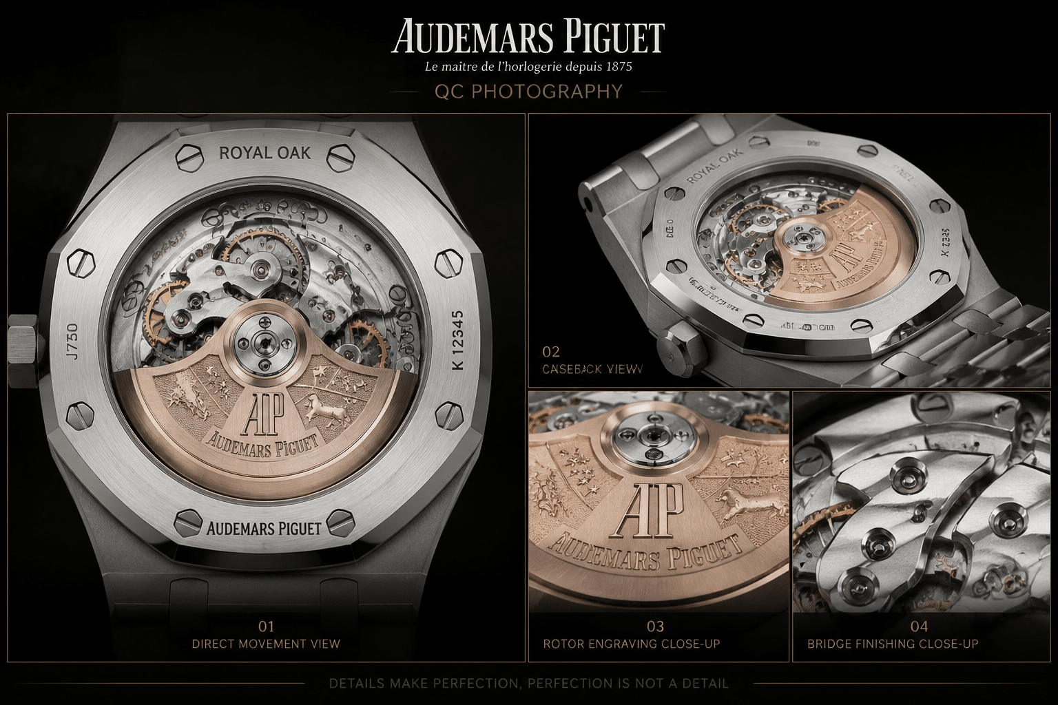
Before making a decision, buyers should review real QC photos where available, including a straight caseback view, rotor close-up, bridge text, screw and jewel areas, caseback profile, and any movement photos relevant to the specific version. Factory labels and polished stock photos are not enough for a reliable display-caseback judgment.
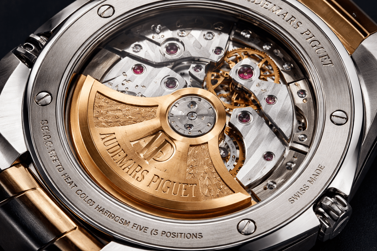
Photo-Level Appeal Versus Macro-Level Accuracy
The most useful way to inspect a replica AP movement is to separate photo-level appeal from macro-level accuracy. These are not the same standard. Photo-level appeal is what you see in ordinary seller photos: color contrast, rotor shape, bridge coverage, jewel dots, and decorative striping. Macro-level accuracy is what appears when the image is sharp enough to reveal engraving depth, text spacing, screw finishing, bridge edges, and texture consistency.
This distinction prevents two opposite mistakes. Some buyers reject a watch because they see one tiny macro flaw that will almost never matter in normal ownership. Others approve a watch too quickly because the full movement shot looks dramatic. The more balanced approach is to use both views. The normal photo tells you whether the caseback has the right overall presence. The macro photo tells you whether the details support that presence or fall apart under closer viewing.
A decorated replica movement can be visually successful without being flawless. The decision is not whether it matches a genuine AP caliber in every microscopic detail. A more realistic question is whether the movement still looks coherent after the first impression fades. If the rotor looks good but the text is heavy, the bridge edges are soft, and the decorative finishing has no texture, then the watch is relying on photo-level appeal rather than real execution.
What Normal Photos Usually Show Well
Normal seller photos are good for judging the broad movement picture. They show whether the rotor dominates the caseback correctly, whether the bridges fill the space in a believable way, whether the color tone looks too yellow or too flat, and whether the visible jewels create the expected sense of mechanical complexity. A full caseback shot also helps reveal whether the movement looks centered and whether the rotor visually belongs with the bridge layout beneath it.
This level of inspection is not useless. In fact, it should come first. If the broad layout already looks awkward, there is no point obsessing over microscopic finishing. A movement that appears poorly proportioned from normal viewing distance will not become convincing because one engraved line looks acceptable. For AP display-caseback replicas, broad architecture matters because the eye reads the movement as a designed object, not a random mechanical assembly.
Normal photos are also where decorative color does most of its work. A gold-tone rotor, rhodium-colored bridges, red jewels, and striped surfaces can create a strong first impression. That is why many buyers feel reassured when the caseback looks full and bright. The caution is that color and complexity can distract from whether the finishing is actually controlled.
What Macro Photos Reveal More Honestly
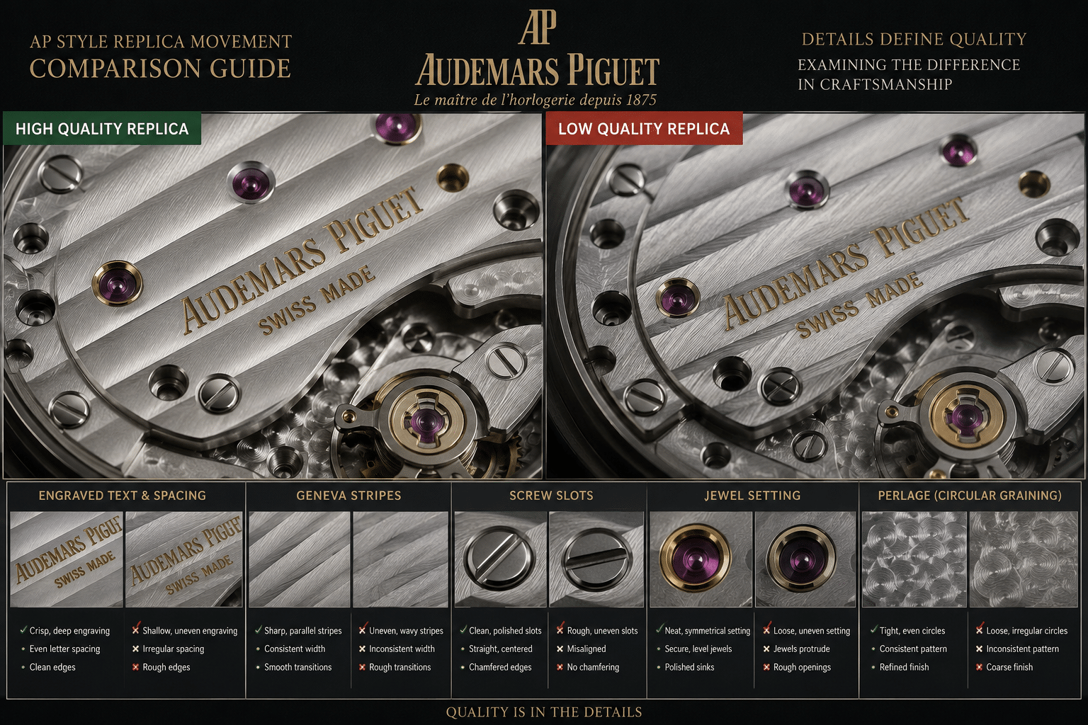
Macro movement inspection is less forgiving because it removes the softness that makes seller photos attractive. Under magnification, engraved text either has crisp edges or it does not. Letter spacing either looks controlled or crowded. Screw slots either look clean or chewed. Jewel settings either look neat or slightly rough. Geneva stripes and perlage either have consistent texture or appear flat, uneven, or machine-stamped without refinement.
This is where a movement that “looks good in photos” can become weak under magnification. The eye stops seeing general luxury cues and starts seeing execution. A striped bridge may look fine from a distance, but up close the stripes may have shallow contrast or inconsistent spacing. A rotor engraving may look impressive in a full shot, but the letters may be too thick or too soft when enlarged. These details do not always ruin the watch, but they do reveal what tier of finishing the buyer is actually accepting.
The non-obvious point is that macro inspection is not about hunting for perfection. It is about finding stacked weakness. One slightly soft engraving is a normal compromise in many replica watch movements. But if the text, screws, jewel setting, stripe pattern, and bridge color all look careless in the same photo, the caseback will not age well in the buyer’s mind. The watch may still function, but the visual confidence is already damaged.
Best Practical Viewing Rule
Judge the movement twice. First, look at the full caseback at normal viewing size and ask whether the layout, rotor, bridges, and color balance look coherent. Then inspect close-up photos and ask whether the details still support that first impression. If the movement only works in the full photo but collapses in close-ups, the seller image is doing too much of the work. If it looks balanced from a distance and reasonably controlled under magnification, that is usually a stronger sign than one dramatic caseback photo with no detail view.
The Easy-to-Impress Areas: Rotor, Bridges, Jewels, and Decorative Color
Replica movement makers know which areas sell the caseback fastest. The AP replica rotor, bridge decoration, visible jewels, and strong color contrast are the parts most buyers notice immediately. These details can make a decorated replica movement look premium before the buyer has checked whether the finishing is actually precise. That does not make them meaningless. It means they are the easiest parts to overvalue.
The rotor is usually the visual anchor. The bridges provide structure. The jewels add red points of complexity. Geneva stripes and perlage create a sense of traditional watch finishing. Together, these elements can make an AP-style movement look much more serious than a plain movement hidden behind a steel back. But on display-caseback replicas, the first impression is often engineered more carefully than the small execution details.
The key buying judgment is this: the attractive areas should earn attention, not end the inspection. A strong rotor and decorative bridge layout are positive signs only if they are supported by controlled engraving, consistent texture, and clean small parts. If the most photogenic areas are doing all the work, the movement may impress in a listing but feel less convincing once the buyer studies it closely.
Gold-Tone Rotors Create the Fastest Visual Impact
A gold-tone rotor can dominate the caseback in the best and worst ways. In normal photos, it gives the movement warmth, weight, and instant visual drama. Because the rotor is large and mobile, buyers naturally focus on it before they notice bridge edges or text quality. If the rotor shape and engraving look broadly correct, the whole movement can appear more convincing at first glance.
This is also why the rotor can become a distraction. A bright rotor can pull attention away from weaker bridge decoration, shallow engraving, or flat finishing texture. Seller lighting often makes the rotor look deeper and richer than it appears in neutral conditions. The buyer should enjoy a good-looking rotor, but not let it decide the whole caseback. On AP replicas, rotor presence is important, but rotor presence alone is not movement quality.
The more useful question is whether the rotor works with the movement beneath it. Does it look proportionate to the bridge layout? Does the engraving feel clean enough for the size of the part? Does the color match the rest of the movement, or does it look like a separate decorative plate added for effect? A rotor that photographs well but feels visually disconnected can make the caseback look assembled rather than designed.
Engraved Bridges Can Look Convincing From a Distance
Engraved bridges are another area where normal photos can be generous. From a distance, the buyer sees text blocks, bridge shapes, and decorative striping. The movement looks technical and complete. In a compressed photo, even soft or heavy engravings may appear acceptable because the image does not show the edges clearly enough.
Bridge engraving matters because AP-style movements rely on spacing and restraint. If the text is too bold, too crowded, or placed awkwardly, the movement loses refinement. The problem may not jump out in a full caseback shot, but once enlarged, the bridge can look more like a decorated cover than a carefully finished caliber. That difference matters most on a watch where the caseback is meant to be part of the experience.
A buyer should not expect hand-finished genuine-level bridge work from a replica AP movement. That would be the wrong standard. The sensible standard is whether the engraving remains clean, aligned, and controlled enough that it does not distract. If the lettering looks acceptable only when the photo is small, the movement is weaker than the seller image suggests.
Jewels and Decorative Patterns Add Complexity
Visible jewels, Geneva stripes, and perlage are powerful visual signals because they make a movement look layered. Red jewels break up the metal surfaces. Stripes create direction and rhythm. Perlage fills open areas with texture. In a normal photo, these details make the movement feel busy in a good way, especially to buyers who are comparing several AP display-caseback replica options quickly.
The risk is that complexity can be mistaken for quality. Jewels are not impressive only because they are visible; they should appear neatly seated and consistently placed. Geneva stripes are not convincing only because lines are present; they should have controlled spacing and a surface that looks finished rather than merely marked. Perlage should add texture without looking rough, random, or overly mechanical.
For this reason, decorative patterns should be treated as supporting evidence, not proof. They help the movement look refined at normal viewing distance, but they become meaningful only when the close-up view shows consistency. A caseback filled with jewels and patterns can still be a weak execution if every detail looks slightly careless under magnification. The better replica AP movements are not simply the busiest ones; they are the ones where the visual complexity stays controlled when the buyer looks closer.
Common Weaknesses That Appear Under Magnification
Most AP replica movement flaws are not obvious in the first seller photo. The movement may have the right basic ingredients: a large rotor, visible jewels, striped bridges, engraved text, and enough gold-tone contrast to look expensive at a glance. The problem starts when the image is enlarged. Under magnification, the movement stops being a decorative composition and becomes a collection of small manufacturing decisions.
The important point is not that every visible shortcut should kill the watch. Many display caseback movement defects are cosmetic rather than mechanical. Thick lettering does not automatically mean the movement will run poorly. Rough perlage does not prove bad timekeeping. But these details do tell you how much care went into the visible side of the movement, and on an AP-style open caseback, that visible side is part of the watch’s appeal.
The buyer’s mistake is treating all flaws equally. One slightly soft screw slot is usually less important than heavy, crowded bridge text across the whole movement. A small color variation may be acceptable, but rough stripes, shallow engraving, messy jewel setting, and shifted text all appearing together is a stronger warning. With AP display caseback movement defects, the stack of compromises matters more than one isolated imperfection.
Lettering That Looks Too Thick or Poorly Spaced
AP-style movement text should look controlled, thin, and evenly spaced. On many replica AP movement photos, the lettering looks acceptable in normal resolution because the viewer sees only a dark or gold inscription against a striped bridge. Under magnification, the same text may become too heavy, too square, or uneven from letter to letter.
The easiest issue to spot is thick lettering. Instead of crisp, narrow strokes, the words can look filled-in or printed with too much ink. This matters because AP movement engraving relies heavily on restraint. When the lettering becomes bold, the caseback loses refinement even if the rotor shape and bridge color are attractive.
Text spacing is just as important. Look for words that appear crowded near screws, jewels, bridge edges, or logo areas. If “AUDEMARS PIGUET,” jewel counts, or caliber-style text appears squeezed into the available space, the movement starts to feel like decoration applied after the fact rather than text designed into the bridge. That is one of the more obvious close-up caseback issues because the eye reads spacing quickly, even before it understands the movement.
A mild compromise is slightly heavier text that still sits straight and evenly. A more obvious shortcut is text that changes thickness, drifts off line, crowds nearby components, or looks stamped rather than engraved, much like AP rotor noise can reveal movement shortcuts before finer details are inspected. Buyers should be stricter here than they are with tiny polishing marks, because lettering is one of the first macro details people notice once the caseback is enlarged.
Shallow Engraving and Soft Bridge Edges
Shallow engraving often hides well in seller lighting. A bright reflection across the movement can make engraved text look deeper than it really is. Once the photo is magnified, weak engraving tends to look flat, with soft borders and little shadow inside the cuts.
Good-looking movement decoration does not need to be dramatic, but it should have definition. If the engraved areas look like surface printing, the bridge loses depth. This is especially noticeable on AP-style movements because the caseback view is built around layers: rotor over bridge, engraving over striping, screws and jewels sitting within the architecture. When the engraving has no depth, that layered impression becomes flatter.
Bridge edges are another giveaway. In a broad photo, a bridge may look clean because the striping catches light. Under magnification, the edge can appear rounded, soft, or slightly ragged. The issue is not only finishing beauty; it affects how precise the movement looks. AP design language is architectural, so soft bridge transitions weaken the whole caseback impression.
This does not mean every replica needs sharp hand-finished bevels to be acceptable. That is not a realistic expectation. The practical judgment is simpler: if the bridge edges look clean enough at macro level and the engraving has visible borders, the compromise may be reasonable. If the engraving looks shallow, the edges look melted, and the text appears heavy at the same time, the movement is no longer just imperfect; it is visually underdeveloped.
Rough Perlage and Uneven Geneva Stripes
Decorative patterns are among the most photo-friendly parts of a decorated replica movement. Geneva stripes can look rich from a distance because they create long bands of light. Perlage can look complex because the repeated circular texture adds visual density. Under magnification, these same patterns often reveal whether the decoration has real texture or only a quick machine-applied effect.
Uneven Geneva stripes usually show up as inconsistent width, wavy edges, or stripes that do not flow cleanly across bridge surfaces. In normal photos, this may read as “striped finishing.” In macro photos, it can look mechanical and unfinished, especially if the stripe direction does not align cleanly with the bridge shape.
Rough perlage is different. Instead of soft overlapping circles, the texture may look harsh, shallow, or randomly placed. Some perlage appears too uniform, like a printed pattern. Some appears too aggressive, with rough circular marks that distract from the rest of the movement. Neither is ideal, but the second type is usually more visible because it creates a gritty look behind the bridges or around open areas.
The flaw that matters most is inconsistency. A movement can survive simplified decoration if the finish looks controlled across the visible areas. It becomes weaker when one bridge has clean striping, another has uneven stripes, and the base plate has rough perlage that clashes with both. That kind of mixed execution tells the buyer the movement was designed to impress at photo level, not to hold together under macro inspection.
Screw Finishing, Jewel Setting, and Color Mismatch
Small parts often reveal the real quality level because they are harder to hide with dramatic rotor color or wide bridge striping. Screw finishing is a good example. In a normal caseback photo, screws appear as bright dots. Under magnification, the slot may look rough, the edges may be chewed, or the polishing may be inconsistent from screw to screw.
A few imperfect screw slots are usually a mild cosmetic issue. The larger problem is when the screws make the movement look careless. If several slots have burrs, uneven shine, or different surface tone, the eye starts to question the whole finishing package. On a display caseback watch, screws are not background hardware; they are visible punctuation points across the movement.
Jewel setting deserves the same attention. Jewels add color and complexity, but they should sit neatly and consistently. If a jewel looks sunken, unevenly framed, poorly centered, or surrounded by rough metal, it weakens the visual impression. The buyer does not need to judge the technical function of the jewel from a photo. The useful question is whether the setting looks clean enough to belong in the same movement as the rotor and bridge decoration.
Color mismatch is another subtle but important AP replica movement flaw. Bridge metal, rotor tone, screw color, and jewel surrounds should feel visually coherent. Some replicas show bridges that are too yellow, rotors that look too orange, or mixed metal tones that make different parts look sourced from unrelated decoration sets. This is not always a rejection point, but it becomes distracting when combined with heavy text and weak finishing.
The best practical rule is to look for harmony. If screws, jewels, striping, engraving, and bridge color all look moderately controlled, the movement may be acceptable even with some macro compromises. If every small detail tells a different story, the caseback will look less convincing each time you inspect it closely.
Bridge Layout and Text Placement: The Details That Decide the Illusion
A decorated movement can still feel wrong if the architecture underneath the decoration is not convincing. This is where AP movement bridge layout becomes more important than many buyers expect. Striping, gold-tone parts, and jewels create the first impression, but the eye eventually reads the bigger structure: where the bridges sit, how the rotor passes over them, where the text is placed, and whether the open spaces look intentional.
This is why layout should be judged separately from finishing. A movement can have acceptable Geneva stripes and still look off if the bridge shape is too bulky, the engraving is pushed into the wrong area, or the rotor seems visually disconnected from the movement below it. On an AP-style display caseback, the movement is not just a machine hidden behind glass. It is part of the watch’s design language.
At Clean VS Factory, we usually treat this as a visual architecture check rather than a hunt for microscopic perfection. The buyer does not need to become a watchmaker. The more useful question is whether the movement looks balanced through the sapphire caseback, or whether the text, bridges, screws, and rotor appear arranged around manufacturing convenience.
Why Broad Layout Matters Before Tiny Decoration
Broad layout should come before tiny decoration because proportions are harder to forgive once you notice them. If the bridge layout looks crowded, if open areas are shaped awkwardly, or if the rotor covers the movement in a way that feels wrong, no amount of attractive striping will fully rescue the caseback.
This is especially true for AP-style clone movements because the genuine design language is very architectural. Buyers expect symmetry, controlled spacing, and a sense that the rotor belongs to the caliber below it. A replica movement with the right decorative colors but the wrong bridge proportions may still look impressive in a seller photo, yet feel less coherent in a direct caseback view.
The most useful inspection habit is to blur your attention slightly before zooming in. Look at the whole movement first. Do the bridges feel balanced? Is the rotor visually centered in the composition? Are the engraved areas placed where the eye expects them, or do they look shifted to avoid screws and jewels? This broad impression often tells you more than one isolated screw or stripe flaw.
A small finishing imperfection is usually acceptable if the movement architecture looks composed. A layout mismatch is harder to ignore because it changes the entire caseback impression. For buyers asking “does the layout look right,” this is the first serious checkpoint.
Text Spacing Around Screws, Jewels, and Bridge Edges
Replica movement text placement is one of the clearest signs of whether the decoration was planned well. Text should not look like it is fighting the bridge shape. It should not sit too close to screw heads, crowd jewel settings, or run awkwardly into the edge of a bridge.
Spacing errors often appear small in normal photos but become obvious when the caseback is enlarged. A logo that is too large can dominate the bridge. A caliber marking placed too close to a screw can look squeezed. A long inscription that bends awkwardly around open space can make the movement feel less refined even if the engraving itself is reasonably clean.
The issue is not only whether the words are readable. Readability is the low bar. The better question is whether the text placement looks designed. On stronger AP-style movement decoration, text feels integrated with the bridge layout. On weaker examples, text feels pasted into whatever flat area was available.
Buyers should pay particular attention to three zones: text near screw heads, text close to jewel settings, and text along bridge edges. These areas expose spacing discipline. If inscriptions are centered, evenly distanced, and not crowded by nearby parts, the caseback will usually feel more convincing. If several inscriptions appear shifted or cramped, the movement can look lower-grade even before the finishing texture is judged.
Version Details to Confirm
Movement decoration can vary by factory version, batch, and even by the specific movement route used inside a similar-looking Royal Oak replica caseback. A photo from one example should not be treated as proof that every delivered watch will have the same engraving depth, bridge color, rotor finish, or text placement.
The practical move is to confirm which movement decoration route is actually being shown in the photos you are reviewing. Some listings reuse attractive caseback images from earlier samples, promotional pieces, or different batches. That does not automatically mean the watch is bad, but it does mean the buyer should avoid judging from borrowed photos alone.
For display caseback QC, direct current photos matter more than a factory label. A factory name can be useful context, but it does not replace checking the actual caseback image for bridge spacing, engraving position, rotor clearance, and overall movement architecture. If the photos avoid a clear centered caseback view, that absence itself becomes part of the evaluation.
Model-Specific Caseback Expectations: 15400, 15500, 26240, and 15202-Style Builds
AP movement evaluation changes by model family. A 15400 clone 3120 movement, a 15500 clone 4302 movement, a 26240 clone 4401, and a 15202-style movement route do not create the same visual expectations through the caseback. The buyer should not use one generic AP movement checklist and apply it equally to every Royal Oak replica.
The reason is simple: each reference carries a different caseback story. Some are judged mainly by rotor presence and bridge decoration. Some are judged by whether the movement fills the case correctly. Chronograph-style casebacks create more visual density, while thin Royal Oak-style builds make thickness and movement architecture harder to ignore.
This section is not a universal factory ranking. Exact bridge shape, engraving quality, rotor treatment, and caseback execution can vary by factory, version, and batch. The useful approach is to know what pressure point belongs to each model family before reviewing photos.
A factory comparison is most useful when it is tied to the exact AP reference, version, movement configuration, and visible execution details rather than treated as a universal ranking. The same factory name may perform strongly on a 15400-style build but show different compromises on a 26240 chronograph or a thin 15202-style case, because case thickness, movement display, rotor design, and decorative bridge layout are not equally difficult across every model.
15400 Clone 3120: Rotor Presence and Bridge Decoration
The 15400-style caseback tends to attract attention through the rotor and the balanced appearance of the decorated bridges. For many buyers, the 15400 clone 3120 movement is appealing because the display caseback has a strong traditional layout: visible rotor, clear bridge surfaces, engraved areas, and enough open structure to look like a serious movement rather than a simple decorated plate.
The main inspection point is whether the rotor and bridge decoration work together. If the rotor looks bold but the bridge engraving is flat, crowded, or poorly aligned, the caseback becomes top-heavy visually. The rotor sells the first impression, but the bridge finishing has to support it.
Buyers should also look at the movement’s overall balance inside the caseback. A good 15400-style photo should not feel like the rotor is hiding an otherwise weak movement. If the bridges look coherent, the engraved text is controlled, and the striping is consistent, small macro shortcuts are easier to accept. If the movement relies only on a dramatic rotor, the caseback may disappoint under closer inspection.
15500 Clone 4302: Larger Movement Impression and Layout Expectations
The 15500 clone 4302 movement creates a different expectation because buyers tend to look for a more modern, larger movement impression. Compared with older Royal Oak movement layouts, the caseback should feel more spacious and deliberate, not like a smaller architecture stretched to fill a larger watch.
This makes bridge proportions and text placement especially important. If the engraved areas sit awkwardly, if open spaces look unbalanced, or if the rotor does not visually belong to the movement below it, the 15500-style caseback can look less convincing even when the finishing patterns are attractive.
For this model family, the buyer should inspect spacing before obsessing over one small screw or jewel. Does the movement fill the caseback in a way that looks natural? Are the bridges shaped with enough visual weight? Is the text positioned with breathing room? A 15500-style build with good broad architecture but minor macro finishing compromises is usually more satisfying than one with shiny decoration and weak layout logic.
26240 Clone 4401: Chronograph Complexity Raises the Inspection Standard
The 26240-style chronograph caseback raises the standard because visual complexity increases. A 26240 clone 4401 movement has more going on than a simple time-and-date Royal Oak-style movement, so the buyer has more surfaces, levers, text areas, screws, jewels, and layered components to inspect.
Complexity can help a replica in seller photos. More parts create more visual drama. The caseback looks technical, busy, and premium at first glance. Under magnification, the same complexity gives shortcuts more places to appear. Uneven finishing, awkward spacing, simplified component shapes, and rough screw work become easier to notice because the eye has more reference points.
The key judgment is not whether the chronograph caseback looks impressive. It probably will in a normal photo. The better question is whether the details remain orderly. If the movement looks busy but controlled, the caseback impression can be strong. If it looks busy because many decorative parts are competing without clean spacing or finishing consistency, the complexity works against it.
Buyers should be more cautious with chronograph-style display casebacks than with simpler Royal Oak layouts. More visible mechanics do not automatically mean a better replica watch. They mean more areas where the photo needs to hold up under close inspection.
15202-Style Builds: Thin-Watch Expectations Make Shortcuts More Noticeable
15202-style builds carry a separate problem: thin-watch expectations. The Royal Oak “Jumbo” design is associated with slimness, elegance, and a very specific caseback feel. Even before the buyer studies the movement decoration, the watch has to look thin and composed enough to support the design idea.
This is where movement appearance and case thickness interact. A decorated 15202-style movement may look attractive in isolation, but if the caseback sits too thick or the movement architecture looks like a workaround, the overall impression suffers. Slim Royal Oak-style watches leave less room for visual excuses because the original design language is restrained, flat, and elegant.
For 15202-style replicas, buyers should not judge only the rotor or engraved text. They should look at the whole rear profile: how the movement appears through the sapphire, how the caseback thickness feels relative to the case, and whether the decoration supports the thin-watch illusion. A flashy movement is not always the right answer here. Sometimes excessive decoration makes the caseback feel less refined rather than more convincing.
The practical standard should be stricter but realistic. No current 15202-style replica should be evaluated as if it solves every thin-movement challenge. The better question is whether the caseback compromise is visually acceptable for the buyer’s tolerance. If the watch looks slim enough in profile and the movement decoration is clean enough under magnification, it may be a sensible compromise. If the caseback looks thick, crowded, and cosmetically overdone, the model’s strongest design trait has been weakened.
How Lighting, Angle, and Resolution Can Hide Movement Shortcuts
AP movement QC photos need to be read with more caution than ordinary dial or bracelet shots because the caseback is reflective, layered, and easy to flatter. A Royal Oak caseback can look rich in a seller photo simply because the sapphire catches light across the rotor and bridges. That does not mean the movement is poor, but it does mean the photo may be showing the most forgiving version of the decoration.
The practical mistake is treating one attractive caseback image as a final answer. Replica movement photo quality varies heavily depending on lighting, angle, compression, and focus distance. Bright glare can make shallow engraving look deeper. A tilted photo can make bridge spacing harder to judge. Low resolution can make thick lettering, soft screw slots, and uneven jewel setting look cleaner than they are. The buyer does not need studio-grade photography, but a display caseback QC angle should give enough information to judge the movement directly, not just admire the shine.
Glare Can Make Rough Finishing Look Smooth
Sapphire casebacks reflect light before the camera reaches the movement. On AP-style replicas, that reflection often falls across the rotor, bridge stripes, and engraved text. The result is a more dramatic image, but not always a more honest one. Caseback glare can wash over rough perlage, soften the edges of Geneva-style striping, and make uneven finishing look more continuous than it appears in a sharper close-up.
This is why very bright movement photos should not automatically create confidence. Strong reflection can make a gold-tone rotor look warmer and more expensive, while hiding whether the engraving is crisp or slightly muddy. It can also blur the border between a bridge edge and the main plate, which matters because AP display backs depend heavily on clean visual separation between components.
A useful photo should have enough light to show the movement, but not so much reflection that the decoration disappears into glare. If the only available image makes the rotor look dramatic but the bridge text cannot be read clearly, the photo is selling mood more than information. That is a warning to slow down, not necessarily a reason to reject the watch immediately.
Angled Shots Can Hide Bridge Proportion Problems
Angled caseback photos are common because they reduce reflection and make the rotor look more three-dimensional. They can be useful for showing depth, but they are weaker for judging layout. Once the movement is tilted, bridge proportions compress, text position shifts visually, and open spaces between bridges become harder to compare. A movement that looks balanced at an angle may look less controlled when viewed straight on.
For AP replica movement evaluation, a direct caseback view matters because the eye needs to see whether the rotor sits naturally over the bridge architecture, whether inscriptions are centered, and whether the layout feels coherent. The issue is not only tiny finishing. If the broad movement architecture looks shifted, cramped, or visually disconnected, no amount of decorative striping will fully rescue the impression.
A centered photo also helps separate real layout concerns from photography distortion. If an engraving appears too close to a screw or jewel in an angled shot, it may simply be perspective. If the same problem appears in a straight-on view, it carries more weight. Buyers should prefer a small set of useful angles over a large number of flattering but unclear photos.
Low Resolution Makes Thick Lettering Less Obvious
Photo compression is one of the easiest ways for movement shortcuts to disappear. In a low-resolution image, heavy lettering can look thinner, shallow engraving can look smoother, and screw slots can lose the rough edges that would be visible in a close-up. This is especially relevant for AP-style movement text because the genuine design language is fine, controlled, and evenly spaced. Thick or crowded replica lettering may not stand out until the image is sharp enough to read at the bridge level.
Low resolution also hides texture problems. Perlage can look like a soft decorative field instead of individual circular finishing, which is why Audemars Piguet replica movements need to be judged with enough magnification to separate real machining quality from camera blur. Geneva stripes can appear even because the camera has blurred away the variation. Jewel setting may look acceptable because the edges around the jewel are no longer visible. The buyer sees “complex movement decoration,” but not the quality of that decoration.
The best judgment is not to demand unrealistic macro photos of every screw. It is to avoid approving a watch based only on compressed images where the important areas are unreadable. If the rotor engraving, bridge text, and a few screw and jewel areas cannot be inspected at all, the caseback photo is incomplete for decision-making.
What Buyers Should Prioritize in AP Movement Photos
An AP replica movement checklist is only useful if the items are not treated as equal. Buyers often zoom straight into screws or jewels because those details feel technical, but the larger caseback impression usually decides whether the movement looks coherent. For display caseback QC, the smarter order is simple: layout first, engraving second, finishing texture third, small hardware last.
This priority order prevents two common mistakes. The first is rejecting a watch over one tiny macro flaw that will not affect the caseback impression in normal viewing. The second is approving a watch because the rotor looks impressive while the bridge layout, text placement, or decoration consistency is obviously weak. In practice, the second mistake is more expensive because it leaves the buyer with a visible caseback that never looks quite right once the flaw is noticed.
Start With Layout Before Decoration
Begin with the full caseback, not the most zoomed-in photo. Look at the bridge layout, rotor position, and overall spacing. Does the rotor visually belong to the movement underneath it, or does it look like a decorative cover placed over a less convincing architecture? Do the bridges feel balanced, or are some areas crowded while others look empty? This broad read is the first serious quality signal.
Layout problems matter because they are visible even when the watch is not being examined under a loupe. A slightly imperfect screw slot is a normal replica compromise. A movement architecture that looks cramped, shifted, or poorly proportioned is harder to ignore because it affects the whole caseback impression. For AP replicas, where the open back is part of the appeal, visual architecture should carry more weight than one isolated finishing mark.
At Clean VS Factory, we usually treat this as a caseback composition question before a macro-detail question. If the full movement view already looks unbalanced, better close-ups rarely change the decision. If the layout is coherent, then the smaller details decide whether the execution feels acceptable or merely photo-friendly.
Then Check Engraving and Printed-Looking Details
After the layout passes the first test, move to rotor engraving and bridge inscriptions. The key is not whether text exists; most higher-tier AP replica movements have plenty of text and decoration. The question is whether the lettering has controlled weight, clean spacing, and enough depth to avoid looking printed or stamped flat onto the surface.
Thick lettering is more distracting than many buyers expect. It makes the movement look less refined because AP-style casebacks rely on thin, precise inscriptions. Crowded text near screws, jewels, or bridge edges also lowers the impression quickly. Even if the words are technically readable, poor spacing makes the decoration feel rushed.
Engraving should be judged as part of the visible design, not as proof of mechanical quality. A sharper inscription does not guarantee a better-running AP clone movement. It does, however, make the caseback more convincing as a finished object. For a display back, that visual difference matters.
Finish With Screws, Jewels, and Texture Consistency
Small details should confirm the movement’s quality level, not dominate the entire decision. Screw slots should look reasonably clean, not chewed or randomly polished. Jewel alignment should look tidy enough that the jewels appear intentionally set, not dropped into the plate. Perlage quality and Geneva stripe consistency should support the bridge layout rather than fight it with uneven texture.
These details become more important when several of them are weak at the same time. One imperfect screw is usually not a major issue. Messy screw slots, uneven jewel setting, rough perlage, and inconsistent bridge color in the same movement photo point to a lower execution level. The buyer should look for patterns, not single defects.
Color consistency belongs near the end of the inspection, but it should not be ignored. A rotor that looks overly yellow, bridges that shift tone from one part to another, or decorative plates that look mismatched can make the movement feel cheaper even when the layout is acceptable. In photos, color can be distorted by lighting, so confirm it across more than one angle before treating it as a serious flaw.
Red Flags Before You Decide
The strongest red flags are not tiny marks that require extreme magnification. They are visible problems that survive across normal and close-up photos: badly shifted text, bridge inscriptions crowded against screws, obviously rough finishing, mismatched bridge color, messy screw slots, and jewel setting that looks uneven even in standard QC images.
Another red flag is the photo set itself. If every caseback image is angled, reflective, distant, or too compressed to read the movement, the buyer is being asked to judge decoration without enough evidence. One imperfect photo is not enough to reject a watch, but a photo set that avoids a clear direct caseback view should reduce confidence. For an AP display caseback replica, the movement is not a hidden component. It is part of what the buyer will see every time the watch is turned over.
Verification Note: When possible, buyers should review current photos of the exact watch rather than relying only on stock images, factory labels, or older sample pictures. Clear caseback views, readable movement text, rotor detail, bridge finishing, screw and jewel areas, and profile shots can help reduce uncertainty before a decision.
Movement Appearance Still Does Not Prove Movement Quality
A good-looking caseback is visual evidence, not mechanical proof. This distinction matters because AP display-caseback replicas can create a strong impression with engraved bridges, striped decoration, jewel dots, and a gold-tone rotor. Those details help the watch look more complete, but they do not prove replica movement reliability, actual power reserve, serviceability, or long-term stability.
The buyer should separate two questions. The first is visual: does the movement look acceptable through the sapphire caseback? The second is mechanical: does the AP clone movement have a sensible movement route, stable winding behavior, acceptable timekeeping, and realistic service prospects? Photos can help with the first question. They can only hint at the second.
Decoration Is Visual Evidence, Not Mechanical Proof
Engraving, Geneva-style stripes, perlage, jewel count, and rotor color tell you how the movement has been presented. They do not tell you whether the movement is clean, properly lubricated, well regulated, or built with consistent parts tolerance. A movement can look attractive in photos and still have rotor noise, rough winding feel, or calendar behavior that is less refined than expected.
This is especially important with decorated movements and decorative plate constructions. A plate can improve the caseback appearance without changing the base movement’s operating character. Even with more integrated clone-style routes, appearance still does not guarantee performance. The visible bridge layout may be closer, but reliability depends on construction quality, assembly, servicing access, and current version maturity.
The balanced judgment is simple: attractive movement decoration is valuable for a display caseback watch, but it should not be treated as a warranty on mechanical health. Buyers who confuse visual refinement with durability often set themselves up for disappointment.
Movement Specifications Should Not Be Assumed From Decoration
Movement decoration can suggest what a replica is trying to imitate, but it should not be used to infer exact specifications. A bridge shape, rotor engraving, jewel display, or caliber-style inscription does not by itself verify beat rate, power reserve, jewel count, winding efficiency, chronograph construction, calendar architecture, or parts compatibility. If those details matter to the buyer, they should be treated as separate questions that require clearer movement information than a flattering caseback photo.
This matters because some replica listings use technical language loosely. A watch may be described with a famous caliber number, but the visible movement may still be a decorated route, a modified base movement, or a clone-style construction with different tolerances and service realities. Buyers should avoid treating the printed or engraved text on the movement as a specification sheet. It is part of the visual presentation unless the seller can provide a credible basis for the mechanical claim.
Movement trust in the replica market depends on understanding what the movement claim actually describes: architecture, decoration, layout, reliability expectation, or simply a market name used in listings. For AP-style display backs, a clone-style bridge arrangement may improve the visual match, while a decorated base movement may focus more on appearance than architecture. Those differences affect both the caseback view and the ownership expectation, so they should be identified before the watch is judged by photos alone.
Why Movement Route Can Matter More Than Caseback Drama
For a first-time AP replica buyer, the movement route can affect ownership more than the caseback photo suggests. A more visually ambitious movement may offer a better bridge layout or a more convincing rotor view, but it can also introduce more parts-specific risk, harder servicing, or less predictable long-term behavior. A simpler or more established movement route may not look as impressive through the sapphire back, yet it may be the more comfortable daily-wear choice if the buyer values stability over macro-level visual accuracy.
This is where “best factory” or “best version” claims become too broad. A factory may have a strong reputation for one Royal Oak reference, but that does not automatically mean every AP display-caseback model from the same source has the same balance of appearance and reliability. The useful comparison is narrower: for this specific reference and batch, does the movement decoration justify any added ownership risk, or would a less dramatic but more stable movement make more sense for how the buyer plans to wear the watch?
Price does not settle this question by itself. A higher price may reflect a more complex movement, better visible decoration, limited availability, seller margin, or after-sale risk that has been priced in. It does not automatically prove better regulation, easier servicing, or cleaner assembly. Before paying more for a display-caseback AP replica, the buyer should know whether the premium is mainly buying visual architecture, movement complexity, improved finishing, or simply market demand around a popular version.
What Photos Cannot Tell You
Photos cannot tell you how loud the rotor is on the wrist. They cannot show whether winding through the crown feels smooth, gritty, or loose. They cannot confirm actual power reserve after a full wind, whether the date changes cleanly every time, or whether timekeeping remains stable after weeks of use. These are ownership questions, not image questions.
Photos also cannot prove serviceability. Some replica movement routes may be easier for a local watch repairer to understand than others, while some decorated or clone-style constructions may require more specific parts or more careful handling. A movement that looks more impressive through the caseback may not always be the simpler or less risky ownership choice.
Water resistance should be treated separately as well. A clean caseback photo does not prove gasket condition, pressure testing, crown sealing, or case assembly quality. For any replica watch, especially one with a display back, buyers should avoid assuming practical durability from visual decoration alone.
The right conclusion is not to ignore movement photos. They are essential for judging the visible caseback. But once the appearance is acceptable, the buyer still needs realistic expectations about movement route, version history, user feedback, and servicing options. A beautiful caseback can make the watch more enjoyable; it does not remove the normal risks of replica movement ownership.
Seller Claims, Factory Labels, and QC Photos Need Different Weight
A seller description may say “latest version,” “best AP movement,” or “super clone caseback,” but those phrases are not specific enough to approve the watch. They can be useful starting points only if they connect to visible details in the actual QC set. For a display-caseback AP replica, the buyer should be able to match the claim to what the photos show: bridge architecture, rotor engraving, text placement, finishing texture, caseback thickness, and whether the movement route is the one being advertised.
Factory labels should be treated the same way. A known factory name can reduce the search area, but it does not remove the need to inspect the watch in front of you. Factories can perform differently by model, version, and batch, and AP display-caseback models expose those differences more clearly than many closed-back watches. A strong factory reputation on one Royal Oak does not automatically transfer to a chronograph caseback, a thin 15202-style build, or a newer movement route with less ownership history.
QC photos are the buyer’s best practical evidence, but they also have limits. They show visible alignment, finishing, and caseback presentation; they do not prove lubrication, shock resistance, gasket performance, or long-term part stability. The most useful approach is to use QC images to answer visual questions, then keep movement reliability as a separate risk category. If a seller’s photos are clear enough to judge the movement and the buyer’s expectations are realistic, the decision becomes more grounded than simply chasing the most famous factory name or the brightest caseback shot.
How to Read Factory Language Without Overtrusting It
Factory names in the replica watch market are often used as shorthand for buyer expectations, but they are not the same as official manufacturing disclosure. A label can help buyers organize comparisons, yet it should not be treated as proof of a specific movement supplier, steel grade, waterproof construction, or finishing method. Display-caseback AP replicas make this especially important because a familiar label cannot hide a weak rotor engraving, crowded bridge text, rough screw finishing, or a caseback photo set that avoids direct inspection.
A more defensible way to use factory language is to connect it back to visible evidence. Instead of asking whether one factory is universally “best,” ask whether this particular watch shows the caseback qualities that matter for the reference: correct-looking broad architecture, controlled decoration, current QC photos, consistent finishing, and a movement route that matches the buyer’s tolerance for risk. That narrower question is more useful than broad rankings because AP display-back execution can change by model, batch, and version.
Claims such as “perfect,” “same as genuine,” or “guaranteed to pass inspection” should be treated with caution because they replace inspection logic with marketing language. The safer purpose of movement and factory information is to avoid misunderstanding quality, overpaying for unclear decoration, or assuming that a replica watch has official brand-level construction. A transparent comparison should make the replica status clearer, not encourage anyone to represent the watch as genuine.
Seller Policy Questions That Photos Cannot Replace
Even strong QC photos do not answer every practical buying question. Before ordering, buyers should confirm the seller’s actual terms for returns, exchanges, repair support, shipping expectations, payment handling, and what happens if the delivered watch differs from the approved photos. Those terms should be verified directly with the seller rather than assumed from a factory label, a model name, or a polished product description.
Water resistance is a separate policy and testing question, not a movement-photo conclusion. A display caseback can look clean and tightly assembled while still lacking verified pressure testing or consistent sealing. Buyers should not assume swimming, showering, or diving suitability from the Royal Oak design, sapphire back, screw-down appearance, or seller photography. If water exposure matters, the specific watch should be tested and the seller’s position should be clear before the buyer relies on it.
Price comparisons also need restraint. Replica watch prices can change by factory label, version, movement route, seller channel, availability, finishing quality, and support terms. A higher price may correspond to better caseback decoration, but it may also reflect scarcity, margin, or a claim that has not been proven by photos. Buyers should compare like-for-like movement configuration and visible QC evidence before treating one option as better value.
Water Resistance, Daily Wear, and Legal Disclosure Should Stay Separate
Display-caseback replicas can create a stronger impression of construction quality because the buyer can see screws, gaskets, sapphire, and movement decoration through the rear of the watch. That impression should not be confused with tested durability. A visible caseback may look well assembled in photos, but water resistance, dust sealing, crown sealing, and gasket condition are practical questions that cannot be verified from movement decoration alone. Unless the individual watch has been pressure-tested after purchase, buyers should avoid assuming it is safe for swimming, showering, or water exposure.
Daily-wear confidence should also be separated from appearance. A movement that looks strong through the caseback may still require careful handling, especially if the owner does not know the movement route, service options, or long-term parts availability. The safest expectation is that display-caseback replicas are visual and mechanical compromises, not authorized substitutes for genuine watches with official warranty, brand service, or documented testing.
Finally, replica watches should be described and handled as imitation products, not as authentic or authorized goods. They may raise trademark, customs, import, resale, and disclosure issues depending on jurisdiction and circumstances. This article is a buyer-inspection guide, not legal advice, and it does not claim that any replica watch is risk-free to import, sell, or present as genuine. Clear disclosure matters because the visual goal of a display-caseback replica can be convincing, but its legal and commercial status is still different from an authentic Audemars Piguet watch.
The Practical Takeaway: Judge the Caseback in Layers, Not at a Glance
The safest way to handle AP display caseback movement evaluation is to slow the inspection down. A caseback photo that looks impressive in the first two seconds may still be weak after you separate the movement into layers: full layout, rotor relationship, engraving control, finishing texture, small hardware, and then mechanical expectations. Treating all of that as one “looks good” reaction is where buyers get trapped.
For replica watch movement photos, the first pass should be simple: does the movement look balanced through the full caseback? The rotor should not feel visually pasted over the bridges, the open spaces should not look awkward, and the text should sit naturally within the movement architecture. If the broad composition already feels wrong, better Geneva stripes or a brighter gold-tone rotor will not rescue the impression.
The second pass is where macro accuracy matters. Look at whether the rotor engraving is clean, whether bridge text has controlled spacing, whether the bridge finishing looks like textured metal rather than a flat printed effect, and whether the screws and jewels support the overall quality level. One small imperfection is normal in this category. Several shortcuts stacked together are different: thick lettering, rough stripes, messy screw slots, uneven jewel setting, and odd color tone all in the same photo usually point to a weaker movement presentation.
A practical movement photo checklist should not make every detail equally important. Layout comes first because it shapes the whole caseback impression. Engraving comes next because AP-style movements depend heavily on thin, controlled text. Finishing texture follows because perlage and stripes can look decorative in seller lighting but crude under sharper inspection. Screws, jewels, and color consistency are final confirmation details. They may be small, but they often tell you whether the movement decoration was executed with care or only designed to pass a quick photo review.
A Good First Impression Is Not Enough
The rotor is usually the emotional center of an AP replica caseback. A large gold-tone rotor, visible jewels, striped bridges, and engraved branding can make the movement feel expensive before the buyer has actually inspected anything. That first impression is useful, but it is not a decision by itself. It only confirms that the movement has photo-level appeal.
The mistake is assuming that photo-level appeal equals strong execution. Seller photos often reward contrast, shine, and symmetry more than precision. A rotor can look dramatic while its engraving is shallow. Bridges can look decorated while the stripe texture is uneven. Jewels can add color while their settings look careless up close. The movement may still be acceptable for a buyer who only cares about normal viewing distance, but it should not be mistaken for a macro-strong build.
The better judgment is this: if the caseback looks good at normal distance and only shows minor compromises under magnification, that is a reasonable result for many high-end AP replicas. If the movement only looks good because the photo is soft, angled, or flooded with reflection, confidence should drop. A convincing caseback should not need bad visibility to look convincing.
The Stronger Question Is Whether the Details Stay Consistent Up Close
The final question is not “does the movement look impressive?” Many decorated replica AP movements do. The stronger question is whether the details stay consistent when the image gets closer and clearer. Good AP display caseback inspection is about consistency across the visible areas: bridge layout, rotor engraving, text spacing, screw finishing, jewel placement, Geneva stripes, perlage, and metal color.
This is where buyers should be realistic. A replica movement does not need to survive professional-level scrutiny to be a satisfying daily-wear watch. But the visible caseback should not collapse under basic close-up review. If the full layout is coherent, the text is reasonably controlled, the finishing is not aggressively rough, and the small parts do not draw attention for the wrong reasons, the movement has a stronger visual foundation.
At Clean VS Factory, we usually encourage buyers to separate three questions: does it look convincing from normal viewing distance, does it remain acceptable under macro inspection, and what can the photos not prove about reliability? Keeping those questions separate prevents two common mistakes: rejecting a watch over one tiny macro flaw, or approving a weak movement because the first caseback photo looked dramatic.
The most useful takeaway is layered judgment. Start wide, then move closer. Check architecture before decoration. Check engraving before shine. Check texture before color drama. Treat reliability as a separate issue from appearance. That method will not make every AP display-caseback replica easy to judge, but it will help buyers avoid the most common photo traps and make a decision based on what the movement actually shows, not only what the first image suggests.
Disclosure: This article is for general educational and comparison purposes only. Replica watches are not genuine products from the original luxury brands, and brand names are used only to identify reference designs or comparison topics. Factory names, movement descriptions, prices, availability, QC details, seller policies, and version information can change, so readers should verify important details with the seller before making a purchase decision. Replica watches should not be represented, resold, or used as genuine watches.