
Blue dial AP Royal Oak super clones create a different buying problem from black or silver versions because the dial is judged against a very specific mental image, and any practical AP clone vs genuine experience often starts with whether that blue tone feels credible in hand. A small shift toward purple, gray, navy, or overly bright blue can make the watch feel wrong, even when the case and bracelet are acceptable. Photos can make this harder, since phone cameras, seller lighting, and heavy reflections may exaggerate or hide the real tone.
This article focuses on how to judge blue dials more realistically: not by chasing the brightest photo, but by checking color stability, tapisserie depth, dial printing, bezel and case balance, and normal-wear appearance. It also explains why black and silver dials are often safer choices for buyers who want less QC stress, while blue can still make sense for buyers willing to review current-unit photos carefully.
Brand names are used here to identify the genuine reference design being discussed. Replica watches and super clone watches are replica-market products, not genuine Audemars Piguet watches, and they should not be represented, resold, or used as authentic luxury watches. A genuine reference may be useful as a visual comparison point, but it does not prove official authorization, original-brand production, or equivalence in materials, movement, finishing, water resistance, or service support.
| Buying Check | What Looks Acceptable | Warning Sign |
|---|---|---|
| Blue tone | Restrained blue that holds up in natural, indoor, and LED light | Strong purple, neon, gray, or one-photo-only “perfect” color |
| Tapisserie texture | Visible depth without looking harsh or painted | Flat pattern or excessive contrast that looks artificial |
| QC photo review | Multiple angles plus normal-distance wrist or hand shots | Judging only by a dramatic seller image or one macro shot |
| Whole-watch balance | Dial works with bezel brushing, case profile, bracelet, and date window | Good dial color hiding bulky case, poor screws, or bracelet gaps |
| Color choice | Blue for buyers who accept lighting sensitivity and careful QC | Choosing blue when black or silver would better suit daily wear expectations |
Editorial Perspective: For a blue Royal Oak super clone, the factory name is only a starting signal. The more useful buyer question is whether the current unit’s blue tone, tapisserie depth, case thickness, bracelet feel, movement choice, and QC evidence fit the way the watch will be used. A version that looks strong in one seller photo may not be the best daily-wear choice if the dial only works under controlled light, the bracelet feels rough, or the movement route creates a thicker case profile. At cleanvsfactory.com, this type of AP comparison is treated as a model-specific judgment rather than a simple “best factory” ranking.
Evidence Boundary: This guide discusses imitation watches and buyer evaluation methods, not authorized Audemars Piguet products. Factory names, batch labels, movement descriptions, and seller claims should be treated as practical buying signals rather than official proof. Without inspection of the exact unit, it is not responsible to claim that a specific replica dial, movement, steel grade, crystal, or water-resistance level is the same as an authentic watch.
Quick Questions Before You Read
Q: Is a brighter blue dial usually better?
No. A convincing blue AP dial is usually balanced and layered, not simply vivid or glossy.
Q: Can one QC photo prove the dial color is correct?
No. Blue shifts heavily with lighting and cameras, so several lighting conditions matter more.
Q: Are black or silver dials safer choices?
Often yes, because small tone variations are usually less obvious than on blue dials.
Q: Should factory reputation decide the blue dial choice?
Not by itself. Current batch photos, dial texture, case fit, and finishing still need checking.
Why Blue Royal Oak Dials Get Judged More Harshly Than Other Colors
A blue AP super clone is judged harder than the same watch in black or silver because blue carries more emotional weight. For many buyers, the blue Royal Oak replica is not just another dial option; it is the Royal Oak look they have already memorized from auction photos, celebrity wrist shots, dealer videos, and carefully lit genuine reference photos. That makes the buying standard much less forgiving before the watch even appears in QC.
This is the first mistake many buyers make: they think they are choosing a color, when they are really choosing a comparison problem. The iconic blue dial has become the mental default for the Audemars Piguet Royal Oak. A small shift toward purple, gray, navy, or electric blue may not ruin the watch mechanically, but it can make the buyer feel the watch is “off” faster than a similar issue on a black or silver dial.
That does not mean every blue AP replica is weak. Some current blue Royal Oak super clone versions are visually strong in normal wear. The problem is that blue gives the factory less hiding space. It invites more direct comparison, more photo-to-photo anxiety, and more disappointment when the buyer’s mental image does not match the actual watch under ordinary lighting.
A useful way to make this comparison more traceable is to separate three different standards: the genuine reference design used as a visual comparison point, the replica-market factory version being discussed, and the exact individual watch shown in QC photos. These are not the same thing. A factory name can help identify the general production route, but the actual judgment still depends on visible execution such as dial tone, tapisserie depth, marker placement, bezel finishing, bracelet fit, and case profile on the specific unit.
The Blue Royal Oak Has a Stronger Visual Memory
Most buyers do not approach a blue Royal Oak with a blank mind. They have already seen the dial in its most flattering conditions: bright outdoor light, high-end camera exposure, controlled boutique photography, or edited social media posts. Those images create a strong visual memory of what the blue should look like, even though the real watch can change dramatically depending on light and angle.
This is why blue dial accuracy feels more personal than black or silver dial accuracy. A buyer may not know the exact case thickness or bracelet bevel profile, but they usually have a strong opinion about whether the blue “feels right.” If the QC photo arrives darker, flatter, or slightly purple compared with the seller’s dramatic product image, the reaction is often immediate doubt.
The difficult part is that the buyer may be comparing three different things without realizing it: a genuine reference photo, a seller’s best-looking image, and a plain QC photo taken under harsh light. Those are not equal references. A convincing replica watch comparison has to separate real dial weakness from photo conditions, but blue makes that separation harder because the buyer’s expectation is already emotionally fixed.
At Clean VS Factory, we usually see blue AP questions become more emotional than technical. Buyers may accept a small bracelet flaw or a modest rotor sound, but if the blue dial does not match the image they had in mind, the whole watch can feel disappointing even when the case and bracelet are reasonably well executed.
Black and Silver Give the Factory More Room for Error
Black and silver Royal Oak dials are not automatically better, but they are usually more forgiving. A black AP replica dial hides small tone shifts because the buyer expects depth, shadow, and contrast. Minor differences in texture depth or surface reflection often disappear into the darker color, especially at wrist distance.
Silver has its own risks because it depends on brushing, brightness, and clean reflection. Still, silver does not carry the same “famous blue Royal Oak” pressure. If a silver dial looks slightly warmer or cooler in photos, many buyers read it as lighting variation. If a blue dial shifts the same amount, buyers are more likely to read it as a flaw.
This is why blue is often the hardest AP dial color from a buyer-expectation standpoint. Not because black and silver are easy to manufacture perfectly, but because they allow more visual tolerance. Blue is the emotional choice. Black and silver are often the safer dial choices for buyers who want fewer doubts during QC and fewer moments of second-guessing in daily wear.
The Real Problem: Blue Changes Under Different Light
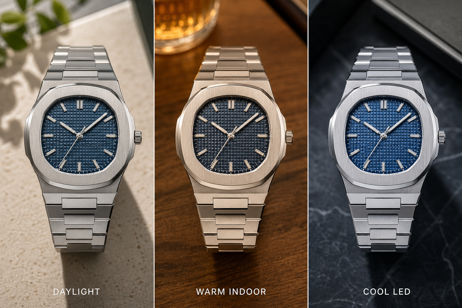
The most important thing to understand about a blue AP replica dial color is that blue is unstable in appearance. It can look navy in one photo, brighter royal blue in another, gray-blue in indoor light, and slightly purple under certain LEDs. This does not always mean the watch changed, the batch changed, or the seller switched pieces. Sometimes it means the light changed.
That is why a blue dial color shift should not be judged from one image. A single photo may tell you the watch is attractive, but it cannot prove whether the blue is truly balanced in real use. Seller photos often make the dial look richer and more saturated because the lighting is controlled. QC photos may do the opposite, flattening the dial under direct lamps or overexposing the surface until the color looks colder than it does on the wrist.
The practical judgment is simple: if you are buying a blue Royal Oak super clone, one photo is not enough. Blue is too sensitive to light temperature, camera exposure, and angle. Even genuine blue Royal Oak dials do not show one fixed shade in every condition, so expecting a replica dial to match a single perfect reference image at all times is not realistic.
Natural Light Versus Indoor Light
Natural daylight usually gives a blue Royal Oak dial its best chance to show depth. It can reveal the richer parts of the blue, separate the dial texture from the surface reflection, and make the watch look more dimensional. This is why many seller photos and wrist shots look most convincing outdoors or near a window.
Indoor light is less predictable. Warm indoor lighting can make blue appear muted or slightly dull. Cool LED lighting can push the dial toward a sharper, colder blue and sometimes exaggerate purple or gray undertones. Harsh direct lighting can also reduce the sense of depth, making a decent dial look flatter than it really is.
This matters because many buyers judge QC photos as if they are neutral evidence. They are not. A blue dial that looks too dark in QC may look more balanced in daylight, while a dial that looks exciting in a bright seller photo may be too loud in normal indoor wear. The more saturated the blue appears in a single image, the more carefully it should be interpreted.
Why Phone Cameras Make Blue Harder to Trust
Phone cameras are especially unreliable with blue. Auto white balance tries to correct the whole scene, not just the watch. If the background is warm, the camera may cool the dial. If the lighting is cold, the phone may adjust exposure in a way that changes the blue again. The result can make the same AP replica dial color look different across two photos taken minutes apart.
Exposure correction is another issue. A phone may brighten the dial to show detail, making the blue look washed out. Or it may reduce exposure to control reflections, making the dial look darker and more navy. Sharpening can also make the tapisserie pattern appear harsher, while saturation processing can push a normal blue into a more electric tone.
This is why “looks too bright in photos” and “looks too dark in QC” are not always opposite problems. They may be camera problems. A buyer should be cautious before rejecting or approving a blue dial based only on the strongest or weakest image in the set.
QC photos reduce uncertainty, but they do not remove every risk. For blue AP super clones, buyers should review more than one angle and lighting condition, then check dial printing, marker alignment, datewheel centering, bezel screw presentation, case thickness, bracelet fit, clasp engraving, and normal-distance wrist appearance before making a decision.
What One Photo Cannot Tell You
One edited photo cannot tell you the true dial tone, the real wrist appearance, or whether the color has balanced depth in normal light. It can show a possible version of the watch, not the whole behavior of the dial.
The non-obvious risk is that the best-looking photo may be the least useful one. A dramatic image with perfect reflections can make the blue look richer than it will feel in daily wear. A harsh QC image can make the same dial look flatter than it will appear on the wrist. For blue AP super clones, the more useful question is not “which photo looks most beautiful,” but “does the dial stay acceptable across several ordinary lighting conditions?”
If the answer is yes, mild blue dial color shift is usually acceptable. If the dial only looks right in one carefully controlled image and looks wrong everywhere else, that is a stronger warning sign.
How Tapisserie Depth Changes the Way Blue Looks
The AP tapisserie dial is the reason blue Royal Oak dials are not just a color-matching exercise. The dial is a structured surface made of raised squares, recessed grooves, and tiny reflective planes. Blue reacts to all of those surfaces at once. That means the perceived color is created by tone, texture, shadow, and reflection together.
A flat blue surface can be painted close to the right shade and still look wrong. A Royal Oak dial needs the pattern to break the light into layers. The raised parts should catch light differently from the grooves, and the dial grid should create controlled shadow contrast rather than looking like a simple printed waffle pattern. When that structure is weak, the blue loses richness even if the base color is attractive.
This is where many buyers misjudge blue dial accuracy. They chase one “correct” shade from a photo, but the real issue may be Royal Oak dial texture. A slightly imperfect blue with good surface depth can look more convincing on the wrist than a better color applied to a shallow, lifeless dial.
Why Shallow Texture Makes Blue Look Flat
When tapisserie depth is too shallow, the dial stops behaving like a layered surface. The raised squares and recessed channels do not create enough contrast, so the blue begins to look like a printed pattern under a glossy crystal. This is the source of the common complaint that a blue AP dial looks flat or cheap-looking, even when the color itself is not obviously wrong.
Shallow texture hurts blue more than black because blue needs controlled variation to feel alive. A black dial can hide weaker depth inside shadow. A blue dial exposes it. If the grooves do not create enough separation, the whole dial can turn into one broad blue field, and the Royal Oak character becomes weaker at normal viewing distance.
For buyers, this means a macro photo should not be used only to check color. It should also show whether the tapisserie blocks have real definition. If the dial lacks depth, no amount of attractive blue saturation will fully solve the problem.
Why Overly Strong Contrast Can Also Look Wrong
The opposite problem is also possible. Some dials try to create depth by making the grooves too dark, the raised squares too glossy, or the grid too aggressive. At first glance this can look dramatic, especially in close-up photos. On the wrist, it may look harsh and artificial.
A convincing Royal Oak-style blue should not look like a high-contrast graphic pattern. The texture should support the color, not dominate it. If the waffle dial appears overly sharp, metallic, or busy, the watch can feel less refined even if the blue tone is close in one lighting condition.
This is a common trap in replica watch comparison photos. A dial with stronger contrast may look better in a side-by-side image because it appears more detailed. But more visible texture is not always more accurate. The better question is whether the texture creates believable depth without turning the dial into a loud pattern.
Texture Can Matter More Than the Exact Shade
For blue AP super clones, texture and color should be judged together. Buyers often ask whether the blue is too dark or too bright, but the more useful question is whether the dial has the right balance of color, shadow, and surface reflection. A dial can be slightly darker than expected and still look convincing if the tapisserie has depth. A dial can be a beautiful blue and still look wrong if the pattern is shallow or overly glossy.
This is why chasing one isolated blue color is a weak buying strategy. The Royal Oak blue dial is not supposed to behave like a flat paint sample. It should change subtly across the grid and still feel coherent as a whole. The safest judgment is not based on one perfect shade, but on whether the dial keeps its structure and richness under normal viewing.
If the texture looks flat, the blue will usually disappoint over time. If the texture is too aggressive, the dial may look impressive in photos but less natural in daily wear. The better blue AP replica dial is not the one that screams blue the loudest; it is the one where the color and tapisserie work together without calling attention to the compromise.
Sunburst, Saturation, and the Risk of “Too Blue”
The easiest trap with an AP Royal Oak blue dial is assuming that the most vivid blue is the best blue. It usually is not. A convincing AP Royal Oak blue dial needs restraint. It should have depth, controlled reflection, and enough darkness in the tapisserie structure to avoid looking like a bright painted surface. If the blue dial saturation is too strong, the watch may look exciting in a seller photo but artificial on the wrist.
This is where many blue AP super clones become visually risky. A dial can look expensive at first glance because it is bright, glossy, and metallic, yet still feel wrong once it is worn in normal indoor light. Authentic Royal Oak blue dials and their photographed appearances are not one fixed electric-blue tone across every reference, year, and photo condition. They can appear to move between navy blue, gray-blue, and brighter blue depending on finish and light. But the important point is balance. If the dial constantly screams “blue” instead of letting the texture and case finishing share attention, the color is doing too much.
Rich Blue Is Not the Same as Accurate Blue
A rich blue dial should look layered, not simply saturated. The better versions create a darker base tone with controlled highlights on the raised tapisserie squares, which is why a 15400 15500 15510 comparison is useful when judging dial manufacturing and model-specific execution. That gives the dial a sense of depth. A weaker version often uses saturation as a shortcut: the dial looks bright, clean, and attractive in a frontal photo, but the surface lacks the darker contrast that makes the Royal Oak dial feel architectural.
This distinction matters because buyers often judge the AP Royal Oak blue dial from dramatic photos. A heavily lit photo can make a replica watch look more desirable by pushing the blue brighter and increasing the metallic reflection. That does not automatically mean the dial is closer to the genuine reference. Sometimes it means the photo is flattering a dial that will look too glossy or too loud in daily wear.
The practical judgment is simple: if the dial looks beautiful only because it is intensely blue, be cautious. A better blue Royal Oak super clone should still look interesting when the color is less dramatic. The tapisserie texture, hour markers, hands, date window, and case brushing should continue to carry the watch. If the entire appeal depends on a high-saturation blue punch, the dial may disappoint once the lighting becomes ordinary.
When Purple or Electric Blue Becomes a Red Flag
A mild color shift is normal for blue dials, but a strong purple tint or electric blue cast is harder to excuse. Purple-blue can appear when the coating, lacquer, or camera processing pushes the dial away from the restrained blue many buyers expect from the Royal Oak. Electric blue has a different problem: it can look modern and eye-catching, but it often fights against the industrial, brushed-steel character of the watch.
This is one reason blue dial mistakes can bother buyers more than small case or bracelet flaws. A slightly imperfect bevel may not be obvious at arm’s length. A dial that reads too purple, too bright, or too metallic is visible immediately because it sits at the center of the watch. On an AP Royal Oak, the dial is not a background element. It defines the personality of the entire watch.
The red flag is not that the dial looks different from one photo to another. The red flag is when every view points in the same wrong direction: consistently purple, consistently neon, or consistently flat and glossy. Those are not just lighting issues. They suggest the color balance itself may not suit the watch.
Color Should Be Judged With the Whole Watch
Blue should not be judged as an isolated square of color. The dial has to work with the bezel, case finishing, bracelet tone, and overall wrist presence. A blue that looks impressive in a macro close-up may look oversized visually once surrounded by the Royal Oak’s sharp bezel, exposed screws, and integrated bracelet. The stronger the dial color, the more it competes with the case architecture.
This is why a slightly quieter blue can be more convincing than a louder one. A restrained navy or gray-blue tone may look less exciting in a single photo, but it often fits the brushed steel case better. For daily wear, that balance is more important than winning a color contest on a screen.
At Clean VS Factory, we usually treat blue dial evaluation as a whole-watch judgment, not a color-swatch judgment. A blue dial that is only “better” in saturation may still be the wrong choice if the bezel brushing, bracelet finishing, and case profile do not support it. The Royal Oak is a design of surfaces and angles; the dial color has to belong to that structure.
Why Black and Silver AP Dials Are Usually More Forgiving
Black and silver Royal Oak dials are not automatically better than blue, but they are usually more forgiving. That matters for buyers who want a lower-risk replica watch and do not enjoy studying every color shift in QC photos. Blue has the strongest emotional pull, but it also creates the highest chance of disappointment because the buyer usually has a very specific mental image of what the watch should look like.
A black AP replica dial or silver Royal Oak replica dial gives the factory more room to be slightly imperfect. Neutral dial colors rely less on delicate color behavior and more on contrast, texture, brightness, and finishing. Those things still matter, but small errors tend to blend into the overall watch more easily than a blue tone that looks too purple, too bright, or too flat.
Black Hides More Than Buyers Realize
Black is the safest color for hiding small dial issues. It naturally reduces the visibility of minor texture inconsistency, slight printing weakness, and camera exposure problems. A black tapisserie dial can still show depth through shadow and contrast, but it does not need to reproduce a famous blue tone that buyers have seen in hundreds of online photos.
This is why black often feels easier to QC. If the dial printing is clean, the markers are aligned, the date window is acceptable, and the tapisserie pattern has reasonable depth, most buyers will not obsess over whether the black is the “correct” black. There is simply less emotional pressure attached to the exact shade.
The tradeoff is that black may not deliver the same iconic Royal Oak feeling as blue. It is more discreet, more practical, and less risky, but also less emotionally charged. For buyers who want the classic blue Royal Oak look, black can feel like a compromise. For buyers who want fewer visual surprises, it can be the smarter dial choice.
Silver Is Sensitive, But in a Different Way
Silver is not risk-free. A silver Royal Oak dial depends heavily on brushing, surface brightness, and how the tapisserie pattern catches light. If the finish is too flat, it can look plain. If it is too reflective, it can wash out the markers and hands. Silver also needs strong contrast between the dial, hands, and applied markers, otherwise legibility suffers.
Still, silver does not usually trigger the same comparison pressure as blue. Buyers may notice if a silver dial is too bright or too dull, but they are less likely to compare it against one famous internet image of the “perfect” Royal Oak blue. That makes silver more forgiving psychologically, even though it remains technically demanding.
Silver also works well with the Royal Oak case because it extends the steel-on-steel language of the watch. The dial becomes part of the bracelet and case architecture rather than a separate color statement. That can make minor tone differences less disturbing in daily wear.
Blue Is the Emotional Choice, Not Always the Safest Choice
The real comparison is not blue versus black AP or blue versus silver AP as a matter of taste. It is a question of visual tolerance. Blue gives the strongest identity, but it also asks the buyer to accept more variation in tone, reflection, and photo behavior. Black and silver reduce that stress because they do not depend on hitting such a narrow emotional target.
If a buyer wants the most iconic look and accepts that the dial may appear different across lighting conditions, blue still makes sense. If the buyer wants a safer AP dial color that is easier to QC and less likely to create color anxiety, black or silver is usually more rational. The less a buyer enjoys uncertainty, the more a neutral dial color starts to look like the better daily-wear choice.
That does not make blue wrong. It means blue is a higher-sensitivity choice. The buyer is not only choosing a color; they are choosing a more demanding evaluation standard.
Factory Differences: Dial Texture, Case Finishing, and Batch Variation
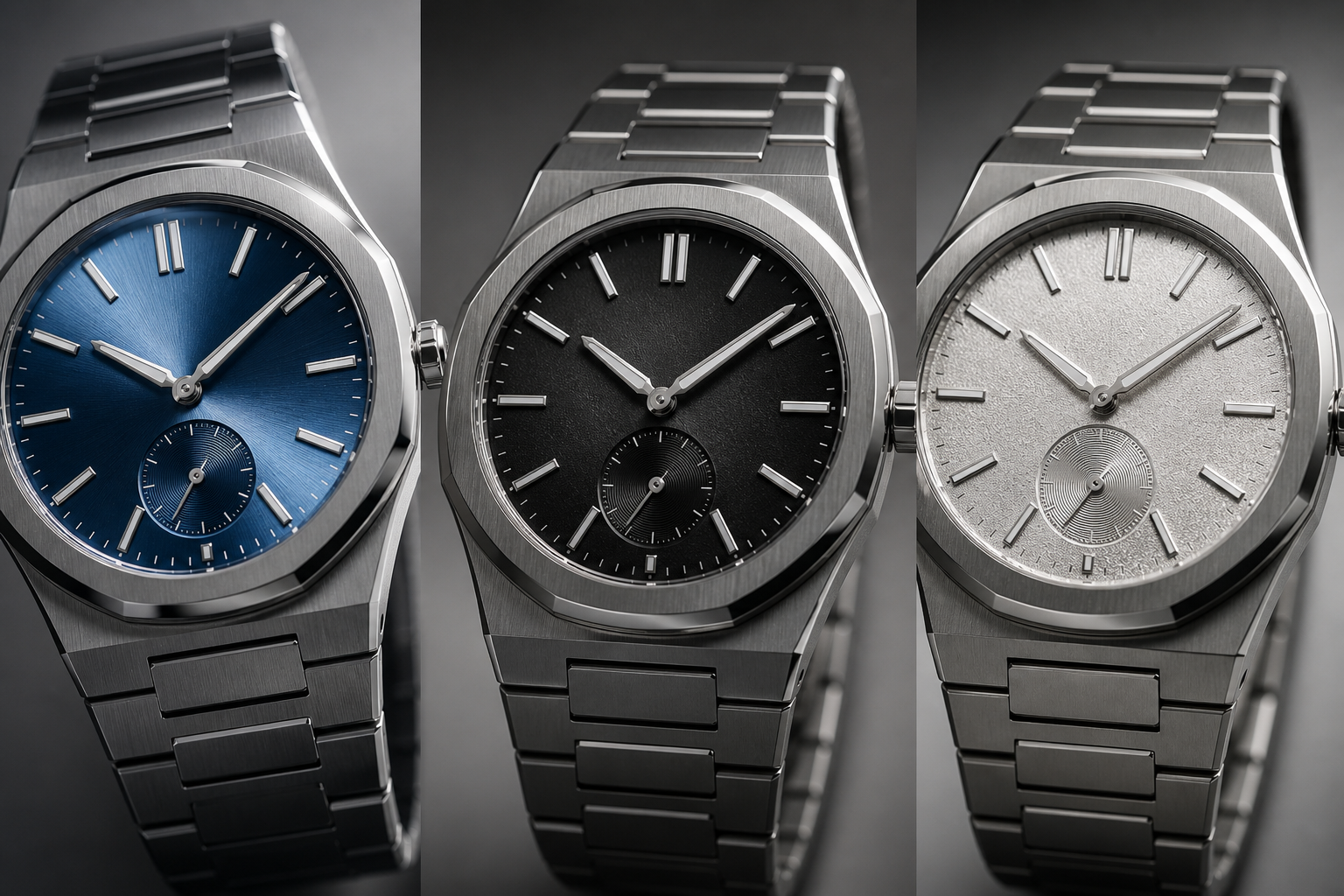
Factory reputation helps, but it does not settle the blue Royal Oak question by itself. An AP super clone factory comparison becomes more complicated with blue dials because the factory may be strong in one area and weaker in another. One version may have a more convincing tapisserie pattern, while another may have better bezel brushing, bracelet articulation, or overall case finishing. For blue, the decision is rarely just “which factory is best.” It is “which factory version balances the dial and the rest of the watch better in this batch.”
APSF and ZF are often discussed for Royal Oak super clones, but buyers should avoid treating either name as a permanent answer across every reference and version. Blue dial execution can change with updates, supply batches, dial coating adjustments, and even the way sellers photograph the watch. A blue Royal Oak factory version that looked strong in one comparison set may not look identical months later.
Factory Name Clarification: Factory names in the replica watch market are buyer-facing reference labels, not official Audemars Piguet affiliations or guarantees of identical quality across every Royal Oak model. For blue AP super clones, the useful standard is current-unit evidence: dial tone, tapisserie depth, case finishing, bracelet fit, movement route, and batch-specific photos should be checked model by model.
A factory comparison is most useful when it is tied to the exact reference, version, movement configuration, and visible execution details rather than treated as a universal ranking. For example, one factory-market version may look stronger on a 41mm blue Royal Oak because the dial texture and bracelet finishing work together, while another may be more convincing on a different case size or dial color. The safer question is not which factory name sounds strongest, but which current version has the most consistent evidence for the watch being considered.
Why “Best Factory” Is Too Simple for Blue AP Dials
The Royal Oak is unforgiving because the dial, bezel, case, and bracelet all sit in the same visual plane. If a factory improves the dial but leaves the bracelet feeling sharp or the bezel brushing too coarse, the watch may still feel less convincing on the wrist. If another factory has cleaner case finishing but a flatter blue dial, the buyer faces a different tradeoff.
This is why a simple factory ranking can mislead buyers. For a black dial, stronger case and bracelet finishing may carry more of the ownership experience because the dial is less visually demanding. For a blue dial, the dial itself has more power to make or break the watch. A factory with excellent case work but a blue tone that looks too electric may not be the better choice for a buyer who is highly sensitive to color.
The strongest choice is usually the version where nothing feels out of balance. The dial should have enough depth, the case should have crisp brushing, the bezel screws should not dominate the face, and the bracelet should integrate cleanly with the case. A blue dial cannot be evaluated as a separate part because it changes the perceived quality of the entire watch.
Movement Choice Still Matters, Even in a Dial-Focused Purchase
Because blue dial AP discussions are so visual, buyers sometimes forget that movement choice affects ownership more than a color photo does. On Royal Oak replicas, the movement route can influence case thickness, rotor noise, crown feel, hand-setting smoothness, power reserve, and future service options. A watch with a strong blue dial but a less suitable movement may look good in photos and still be less pleasant as a daily-wear piece.
This is especially important for beginners. A decorated movement or visually similar movement is not automatically the most reliable choice for daily use. Some buyers care most about the caseback appearance and movement architecture; others care more about stable timekeeping, lower maintenance risk, and a case profile that does not feel bulky. Those are different priorities. The better buying decision is to decide which tradeoff matters before being pulled in by the dial color.
For blue AP super clones, movement and dial should be judged together rather than separately. If one version offers a more convincing blue but creates a thicker case or a less comfortable ownership experience, it may be better for photos than for regular wear. If another version has a slightly less dramatic dial but a more stable movement setup and better bracelet feel, it may be the more sensible daily choice.
Movement Transparency Note: Movement descriptions in this article refer to replica-market movement types, decoration routes, or practical ownership differences, not official Audemars Piguet calibers unless supported by verifiable evidence for the exact watch. Buyers should treat movement claims as points to confirm through clear photos, case thickness checks, and realistic service expectations rather than as proof of official-brand equivalence.
Movement trust in the replica market depends on understanding what the movement claim actually describes. Sometimes the phrase points to a clone-style architecture, sometimes to a decorated movement, sometimes to a modified Asian base, and sometimes only to a seller’s market shorthand. These differences can affect thickness, rotor sound, winding feel, date operation, reliability expectations, and serviceability. A movement that looks attractive through a display back is not automatically the best choice if the buyer prioritizes daily stability and easier maintenance.
Batch Changes Can Affect Blue More Than Neutral Colors
Blue reacts more visibly to small production changes than black or silver. A slight change in dial coating, printing pressure, tapisserie depth, lacquer thickness, or surface finish can push the color toward navy, gray-blue, purple-blue, or a brighter metallic blue. On a neutral dial, the same production variance may be less obvious. On blue, it can change the buyer’s entire reaction to the watch.
Batch variation is also one reason older forum comments can become unreliable. A review from one version or batch may still be useful for understanding general factory tendencies, but it should not be treated as proof that every current watch will look the same. Factories update parts, suppliers change components, and sellers may use older beauty photos that do not match the current sample.
The practical move is to verify the actual current version before forming a strong opinion. A factory claim about an improved blue dial is not enough. Buyers should look for real photos of the watch being considered, ideally under more than one condition, and compare the dial with the case and bracelet rather than relying on a single promotional image.
How to Treat Factory Claims as Evidence
For blue AP replicas, factory claims should be ranked by how directly they can be checked. A factory name alone is weak evidence. A current-unit QC set is stronger. Multiple photos under different lighting are stronger still. A clear movement photo or side-profile shot can help explain why one version wears differently from another, but those photos still need to match the actual watch being offered.
Buyers should be especially careful with broad phrases such as “latest version,” “best blue,” “same color,” or “waterproof.” These claims may be used casually in listings and chats, but they do not prove dial accuracy, movement origin, material grade, or water resistance. A cautious buyer should translate those phrases into verifiable questions: What does the current dial look like? Does the case profile match expectations? Are there recent photos? Has this individual watch been pressure-tested if water exposure matters?
This evidence-first approach does not remove all risk, but it prevents the most common mistake: treating reputation as inspection. Factory reputation may help choose which watches deserve attention, but approval should come from the actual unit’s visible execution, not from a label that cannot be independently verified.
Whole-Watch Balance Matters More Than One Dial Photo
A beautiful dial photo can hide a weak Royal Oak. The case may be slightly too soft, the bezel brushing may lack definition, the bracelet may not drape naturally, or the clasp finishing may feel rough. Blue can distract from these issues because the color draws attention first. That is exactly why buyers need to step back and judge the complete watch.
On a Royal Oak, case finishing and bracelet quality are not secondary details. The design depends on flat brushed surfaces, polished bevels, tight transitions, and an integrated bracelet that flows from the case. If those elements look cheap, a strong blue dial will not save the watch. In some cases, it makes the weakness more obvious because the eye is already drawn to the front of the watch.
A more balanced factory version may not have the most dramatic blue in photos, but it may wear better as a complete object. For daily use, that is often the smarter choice. Buyers who chase the best dial image alone may end up with a watch that looks good in one angle and less convincing everywhere else.
Version Details to Confirm
Before judging a blue Royal Oak super clone, confirm the factory version and whether the photos show the actual watch being reviewed. If a batch date or version update is available, it is worth asking about, because blue dials can change more noticeably than neutral dials between production runs.
Buyers should also confirm the movement route, especially on references where different versions may use different movement architectures. The movement is not the focus of dial color, but it can affect case thickness and overall proportions. A watch with a better dial but less convincing case profile may not be the better buy.
The main details to verify are straightforward: factory name, current version, movement type, recent blue dial photos, case and bracelet views, and whether the shown photos match the actual unit rather than an older factory sample. This does not guarantee perfection, but it reduces the chance of choosing based on reputation, outdated images, or an over-polished seller photo.
QC Photos for Blue AP Super Clones: What to Ask For and What to Ignore
Blue AP QC photos need more discipline than most replica watch QC sets. A black dial can often be judged from a clear front photo and a few alignment checks. A blue Royal Oak replica cannot. The same dial may look deep navy in one image, gray-blue in another, and slightly purple under a harsh LED lamp. That does not automatically mean the watch is wrong, but it does mean one photo is not enough to approve or reject it.
The biggest mistake is treating a seller beauty shot and a QC photo as if they were taken under the same conditions. Seller photos are often brighter, cleaner, and more flattering. Royal Oak replica QC photos are usually more functional: direct lighting, quick angles, phone camera processing, and less editing. For blue dials, that difference can change the entire personality of the watch. A serious review should separate color shift caused by lighting from actual defects such as poor tapisserie definition, crooked markers, a misaligned date window, or uneven bezel screw placement.
Ask for More Than One Lighting Condition
For blue AP QC photos, the minimum useful set should include more than a straight-on dial shot under one lamp. Daylight, indoor light, and neutral lighting each reveal something different. Daylight usually gives the best sense of whether the blue has depth or whether it turns flat and dull. Indoor warm light can make the dial look darker or slightly muted. Cool LED lighting can make some blue dials look sharper, colder, or more purple than they appear in normal wear.
A mild color shift across lighting is acceptable. In fact, a blue Royal Oak-style dial that looks exactly the same in every photo may be more suspicious than reassuring, because real textured blue dials change as the angle changes. The red flag is not “the blue looks different.” The red flag is when every lighting condition shows the same problem: a heavy purple cast, an artificial electric-blue tone, a dead flat surface, or a tapisserie pattern that disappears unless the photo is heavily sharpened.
When we look at QC sets for blue AP super clones, we tend to treat color as a pattern, not as a single frame. If the dial looks rich in one angle, slightly darker in another, and still shows texture at normal distance, that is usually more convincing than a dial that looks spectacular only in one highly staged photo.
Use Macro Shots Carefully
Macro shots are useful, but they are also dangerous if the buyer does not know what they exaggerate. A close-up photo can help check dial printing, applied marker alignment, the AP logo position, date window centering, hand finishing, and the tapisserie pattern, especially when cross-referenced with a super clone Audemars Piguet guide for dial manufacturing and date wheel alignment. It can also make the dial color look harsher than it will ever look on the wrist. Phone cameras often boost sharpening and contrast, which can make the waffle pattern look more aggressive or the blue look more metallic than it is in person.
Use macro images for structure, not for emotional judgment. They are good for answering practical questions: Is the date sitting too high or too low? Are the hour markers cleanly applied? Is the minute track reasonably aligned? Does the tapisserie pattern have visible depth, or does it look like a printed grid? Are the bezel screws seated evenly? These are fair QC questions.
What macro shots cannot reliably answer is whether the dial will feel “too blue” in daily wear. A blue dial that looks loud at 5x zoom may settle down at wrist distance. The opposite can also happen: a dial that looks acceptable in a compressed seller photo may look flat once you see a neutral, unedited close-up. The better approach is to combine macro shots with normal-distance photos before deciding whether a flaw is real or only camera-driven.
Seller Descriptions and Factory Labels Are Signals, Not Final Proof
A seller listing may describe the dial as “updated blue,” “latest batch,” or “best version,” but those phrases are only useful if they can be checked against photos of the actual watch. For blue Royal Oak replicas, wording is easy to overvalue because the buyer wants reassurance before seeing the dial under ordinary light. The practical evidence is still the current-unit QC set: dial tone across more than one angle, tapisserie definition, marker alignment, date position, case profile, bracelet fit, and movement information.
Factory labels should be treated the same way. A known AP factory can narrow the shortlist, but it does not prove that every blue dial from that factory is equally strong. A current batch can differ from an older review, and a seller may use attractive stock photos that do not fully represent the watch being shipped. The buyer should avoid approving a blue AP simply because the listing uses a familiar factory name or because the first photo looks impressive.
The most useful seller information is specific: which factory, which version, which movement, whether the photos are of the actual unit, whether the dial photos are recent, and whether additional neutral-light photos can be provided. Vague claims are not useless, but they should never replace buyer-verifiable details.
Do Not Judge the Dial Without the Case and Bracelet
A Royal Oak is not a dial-only watch. The blue dial may be the emotional center, but the watch succeeds or fails as a full object: octagonal bezel, exposed screws, sharp brushed planes, polished bevels, integrated bracelet, clasp, case profile, and how the first links drop from the case. A convincing dial cannot fully rescue weak case finishing or a bracelet that looks stiff, gappy, or poorly integrated.
This matters even more with blue because the dial attracts attention first. Buyers often spend all their energy arguing over whether the blue is navy enough, then miss more obvious ownership issues: rough bracelet edges, uneven brushing, a thick-looking case side, a weak clasp feel, or bezel screws that are visibly inconsistent. Those are not just macro-photo concerns. They affect the way the watch wears and how convincing it feels in normal use.
A practical Royal Oak replica QC review should therefore include both dial-specific checks and whole-watch checks. If the dial color is acceptable but the bezel brushing looks soft, the screw alignment is messy, and the bracelet does not sit naturally, the watch may still disappoint. If the dial is slightly darker than the buyer imagined but the texture, case profile, bezel finishing, and bracelet integration are strong, it may be the more sensible approval.
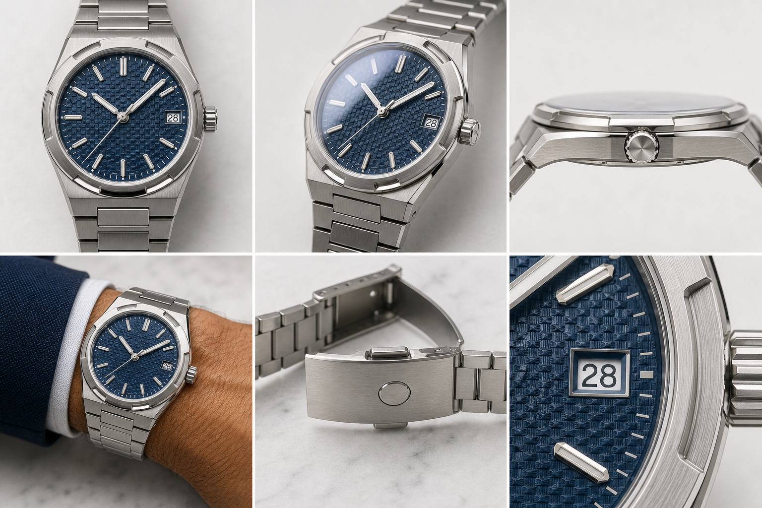
QC Photos to Request
A good QC set for a blue AP super clone should not be a collection of dramatic dial macros. It should show how the watch behaves under realistic viewing conditions and whether the whole package is coherent.
- Straight dial shot: Useful for checking dial alignment, marker placement, logo position, hand alignment, and overall tapisserie pattern symmetry.
- Angled dial shot: Important for seeing whether the blue has depth and whether the texture reacts naturally to light.
- Neutral-light image: Prefer at least one less-edited photo under plain lighting, even if it looks less beautiful. This is often more honest than a saturated beauty shot.
- Date window close-up: Check whether the date is centered, whether the font looks consistent, and whether the window edges are clean.
- Bezel screw alignment shot: Look for screws that are obviously uneven, poorly seated, or visually distracting at normal viewing size.
- Side profile: Helps judge case thickness, crystal height, bezel stack, and whether the watch carries too much visual bulk.
- Bracelet and clasp views: Check bracelet fit, link articulation, brushing consistency, clasp engraving, and whether the bracelet looks comfortable rather than rigid.
- Normal-distance wrist-style or hand-held shot: This is the most underrated photo. It shows whether the blue dial still works when the watch is viewed like a watch, not like a microscope sample.
Acceptable variation includes mild blue shift across lighting, slight differences between seller photos and QC photos, and macro-level texture harshness that disappears at normal distance. Red flags include a severe purple cast in multiple lighting conditions, a visibly flat dial with weak tapisserie definition, a date that sits obviously off-center, badly uneven bezel screws, poor bracelet integration, or a case profile that looks too bulky for the reference being copied.
The most useful rule is simple: do not approve a blue AP based only on the best photo, and do not reject it based only on the worst photo. Blue is too sensitive for that. Judge the repeated evidence across the full QC set.
Evidence Hierarchy for Blue AP QC Decisions
Not every piece of information deserves the same weight. A polished stock photo is useful for understanding the seller’s intended presentation, but it is weak evidence for the exact unit. A current QC photo is better, but one photo still cannot show color stability. A set that includes straight-on, angled, neutral-light, side-profile, bracelet, and normal-distance shots gives a much stronger basis for judgment.
Movement descriptions should also be treated carefully. A listing may name a movement style or describe a decorated movement, but that does not automatically confirm origin, serviceability, or long-term reliability. If the movement matters to the buyer, the evidence should be specific: clear photos, consistent seller explanation, and an understanding that decorative similarity is not the same as mechanical equivalence.
Water resistance deserves the most conservative treatment. Unless the individual watch has been pressure-tested after purchase or before delivery with results that apply to that exact unit, buyers should not assume it is suitable for swimming, showering, or sports use. Authentic-watch specifications should not be used to infer the water resistance of a replica, because the case construction, gaskets, assembly quality, and testing standard may differ.
Common Buyer Mistakes When Choosing a Blue AP Replica
Most blue AP replica mistakes start before the buyer even sees the watch. The buyer already has a mental image: a famous Royal Oak photo with a perfect deep blue dial, sharp tapisserie texture, bright steel case, and dramatic wrist presence. Then the real QC photos arrive under ordinary lighting, and the watch looks darker, flatter, or less cinematic. Sometimes the watch has a real flaw. Often, the expectation was built from the wrong comparison.
The goal is not to lower standards. A blue Royal Oak super clone should still be checked carefully. The better point is that buyers should know which flaws matter and which reactions are caused by chasing an unrealistic photo memory. The following mistakes are the ones that most often turn a reasonable watch into an emotional disappointment.
Mistake One: Treating the Brightest Blue as the Best Blue
The brightest blue is often the easiest blue to sell in photos, but it is not automatically the most convincing blue for daily wear. A dial that looks electric, glossy, or heavily saturated on screen can become too loud on the wrist, especially under office lighting or direct sun. The Royal Oak’s blue appeal is supposed to come from controlled depth, texture, and shifting reflection, not from looking like a flat metallic paint sample.
This is where many blue AP replica mistakes happen. Buyers reject a more restrained dial because it does not “pop” in one photo, then choose a brighter version that looks exciting in seller images but artificial in real life. A slightly darker, more layered blue can be the better watch if the tapisserie pattern has depth and the dial changes naturally with angle.
The smarter habit is to judge richness, not brightness. Ask whether the dial has texture, whether the color remains believable in different lighting, and whether it works with the steel case and bracelet. If the only attractive thing about the watch is that the blue screams in one photo, be careful.
Mistake Two: Comparing Against One Perfect Internet Photo
One perfect genuine reference photo is a poor standard for judging a blue AP replica. Genuine Royal Oak photos vary dramatically depending on lighting, camera exposure, editing, dial reference, production year, and even the angle of the tapisserie surface. Some official-looking photos make the blue appear almost navy. Some wrist shots make it bright and saturated. Some indoor images turn it gray-blue.
If a buyer chooses one image and treats it as the only correct blue, nearly every QC photo will look wrong. This is especially unfair because QC photos are usually not shot to flatter the watch. They are practical approval photos, often taken quickly under strong lighting. Comparing those directly to a polished internet image creates unnecessary anxiety.
A better comparison is a range of references, not one hero shot. Look at several real-world images of the same Royal Oak style under different lighting, then compare the QC set for behavior rather than exact color. Does the dial move between darker and lighter tones in a believable way? Does the tapisserie remain visible? Does the blue avoid obvious purple or toy-like saturation? Those questions are more useful than asking whether the watch matches one perfect photo pixel for pixel.
Mistake Three: Ignoring Case and Bracelet Quality
Blue gets attention, but the Royal Oak is unforgiving because of its case and bracelet. Weak brushing, rounded bevels, uneven bezel screw presentation, poor first-link articulation, and a stiff bracelet can make the entire watch feel less convincing even if the dial color is attractive. The buyer who focuses only on avoiding the wrong blue may still end up with the wrong watch.
This is one reason factory name is not enough. A factory or batch may have a strong dial but less impressive bracelet feel, or a good case shape with a dial that is slightly less emotional. The buying decision should weigh the dial against the whole watch. On a Royal Oak, the integrated bracelet is not an accessory; it is part of the design architecture.
For daily wear, uncomfortable finishing is often more annoying than a mild blue-tone difference. A bracelet that pulls hair, a clasp that feels rough, or case edges that look soft under normal light will bother the owner more often than a dial that appears slightly darker than expected. A strong blue dial is valuable, but it should not blind the buyer to the physical watch.
Mistake Four: Assuming a Higher Price Automatically Solves the Blue Dial Problem
Price can be useful information, but it does not prove that a blue AP dial is more accurate. A higher price may reflect a better movement, a newer batch, limited availability, stronger bracelet finishing, seller margin, added after-sale risk, or simply higher demand for the blue dial. It may also reflect hype around a factory name. None of those factors automatically means the dial tone, tapisserie depth, or case profile is better on the actual unit.
For this model, the more useful price comparison is what the extra money is supposed to buy. If the difference is for a movement route that improves case thickness or ownership stability, that may matter. If it is for a current batch with visibly better dial texture and cleaner finishing, it may also matter. But if the only evidence is a more dramatic seller photo and a broad “best version” claim, the price difference should be treated cautiously.
A blue Royal Oak super clone can be expensive and still have a color issue, just as a less expensive version can be visually acceptable but weaker in movement or bracelet feel. Buyers should connect price to specific verifiable details rather than assuming the highest quote is the safest choice.
Who Should Choose Blue, and Who Should Consider Black or Silver Instead
The most suitable AP replica dial color is not the same for every buyer. Blue is the emotional choice. It carries the strongest Royal Oak identity and, when done well, gives the watch the presence most buyers imagine before they start comparing factories or QC photos. But blue is also the least relaxed choice because it invites constant judgment: Is it too dark? Too purple? Too bright? Too flat? Too different from the photo I had in mind?
Black and silver are not automatically better. They are simply lower-anxiety choices for many buyers. If the goal is daily wear with fewer color doubts, a neutral dial can be more rational. If the goal is the iconic blue Royal Oak look and the buyer accepts the extra sensitivity, blue can still be the most satisfying option.
Blue Makes Sense for Buyers Who Accept Visual Sensitivity
A blue Royal Oak super clone makes sense for the buyer who understands that the dial will not look identical in every environment. It may appear deeper indoors, brighter near a window, flatter in a harsh QC photo, and more textured at an angle. That behavior is not automatically a defect. It is part of why blue AP dials are difficult to judge.
Blue is worth considering if the buyer is willing to review multiple QC photos, accept reasonable color variation, and judge the dial together with tapisserie depth, case finishing, bezel alignment, and bracelet quality. It is also better suited to buyers who want the recognizable Royal Oak look and are not going to panic every time the dial appears different under a new light source.
The wrong buyer for blue is the person who needs one stable shade in every photo. If a small difference between daylight, indoor light, and seller images will ruin the experience, blue may create more stress than enjoyment.
Black or Silver Makes Sense for Lower-Risk Daily Wear
Black or silver is usually safer for buyers who want less visual anxiety. A black AP replica dial hides small tone variation better and puts more emphasis on contrast, case shape, and bracelet finishing. It is less likely to trigger constant comparison against the famous blue Royal Oak image. This does not make black flawless, but it gives the buyer more margin for error.
Silver is sensitive in a different way. It can look too bright, too flat, or too reflective if the brushing and dial finish are weak. Still, silver usually does not carry the same emotional expectation as blue. Buyers tend to judge it as a watch, not as a direct test of whether the factory captured the most iconic AP dial color.
For a first AP replica, black or silver can be the more sensible daily-wear route if the buyer wants fewer QC arguments and less dependence on lighting. The watch may be less dramatic, but it is often easier to live with.
The Best Choice Depends on Tolerance, Not Just Taste
The real decision is not simply “blue versus black versus silver.” It is whether the buyer wants the most emotionally rewarding dial or the lowest-risk dial. Blue offers the strongest Royal Oak identity, but it demands more careful QC review and more realistic expectations. Black and silver reduce the color problem, but they may not deliver the same visual excitement.
If you are asking, “Should I choose blue AP?” the practical answer is this: choose blue if you can accept lighting shifts, batch variation, and the need to judge several photos instead of one. Consider black or silver if you want a calmer ownership experience and are more sensitive to color differences than to having the most iconic look.
A blue Royal Oak replica is not just a style choice. It is a higher-sensitivity evaluation choice. Buyers who understand that before ordering are less likely to overreact to QC photos, chase the wrong shade, or ignore the rest of the watch. That is the difference between choosing blue because it looks famous and choosing blue because it actually fits your tolerance for daily wear.
A replica watch should also be evaluated with realistic ownership expectations. Even when the dial, case, and bracelet look strong, close inspection may still reveal differences from the genuine reference in finishing, movement architecture, water-resistance performance, long-term stability, or servicing convenience. The safest role of a factory comparison is to help buyers understand quality and tradeoffs, not to suggest that a replica watch should be represented as genuine or treated as a substitute for authorized retail.
Compliance-Aware Buying Boundaries for Blue AP Super Clones
Blue AP super clone research is most useful when it stays focused on visible comparison and ownership risk rather than authenticity claims. A strong replica-market watch may look convincing in casual wear, but it should not be described as an authentic Audemars Piguet watch, used for misrepresentation, or treated as something that will pass professional authentication. Close inspection can still reveal differences in dial finishing, movement architecture, case construction, bracelet feel, engraving quality, service compatibility, and water-resistance performance.
Factory names, including APSF, ZF, and other replica-market labels, should be read as buyer-facing references rather than official sources. A factory label can help organize research, but it is not a certificate, brand approval, or proof that every model from that label has the same quality. For blue Royal Oak replicas, the safer comparison is version-specific: current dial batch, tapisserie execution, case size, movement configuration, bracelet construction, and actual QC evidence.
Pricing and seller terms also need careful handling. Replica watch prices can vary by factory label, version, movement route, dial demand, seller channel, availability, and after-sales support. Exact price comparisons should be verified at the time of purchase, and buyers should confirm return terms, repair options, shipping expectations, water-resistance testing, and any after-sales support directly with the seller rather than assuming those details from a listing or factory name.
CleanVSFactory’s buyer-facing approach is to make replica watch comparison clearer by connecting factory names, movement claims, visible QC details, version differences, and realistic ownership limits. That does not make CleanVSFactory an authorized representative of Audemars Piguet or any luxury watch brand, and it does not turn replica-market terminology into proof of authenticity. The practical purpose is education: helping readers avoid overpaying, misunderstanding movement claims, ignoring QC evidence, or expecting a replica watch to behave like a genuine brand-manufactured watch.
Final Evidence-Based Buying Standard for Blue AP Super Clones
The safest way to judge a blue AP super clone is to separate what can be observed from what is being assumed. Observed evidence includes current-unit photos, dial texture, color behavior across lighting, marker alignment, date position, bezel screw presentation, bracelet fit, and side-profile proportions. Assumptions include claims that the watch uses a particular material, has a specific water-resistance rating, contains a certain movement, or matches an authentic watch in construction unless those points are directly verified for the exact unit.
When comparing factories, the most defensible conclusion is usually narrow: one current version may appear stronger for dial depth, another may look better for bracelet finishing, and another may be more comfortable for buyers who prioritize movement simplicity or case thickness. That is different from saying one factory is universally best. Blue Royal Oak replicas are too batch-sensitive and too photo-sensitive for permanent, all-reference rankings.
Buyers should also avoid using authentic-watch specifications as proof of replica performance. An authentic model’s design language may explain why buyers care about the blue dial, tapisserie texture, integrated bracelet, and case finishing, but it does not prove that an imitation watch has the same materials, construction, finishing tolerances, movement behavior, water resistance, warranty, or service path. The comparison should stay visual and practical unless there is specific evidence for the individual replica.
For most buyers, the best final test is simple: would the watch still look acceptable if the blue is slightly darker indoors, less dramatic than the seller photo, and viewed at normal wrist distance rather than under a macro lens? If the answer is yes and the case, bracelet, date, and finishing also hold up, blue can be a satisfying choice. If the answer depends on one perfect photo, the safer decision may be black, silver, or waiting for a better current batch.
Disclosure: This article is for general educational and comparison purposes only. Replica watches are not genuine products from the original luxury brands, and brand names are used only to identify reference designs or comparison topics. Factory names, movement descriptions, prices, availability, QC details, seller policies, and version information can change, so readers should verify important details with the seller before making a purchase decision. Replica watches should not be represented, resold, or used as genuine watches.