
Why Portofino Is One of the Hardest IWC Models to Replicate Well
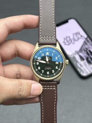
Minimal design leaves no place to hide
The Portofino does not succeed through spectacle. It succeeds through visual order. Unlike sport references with rotating bezels, layered subdials, or textured cases, the Portofino offers almost nothing to distract your eye. That absence of distraction is precisely why replication becomes unforgiving.
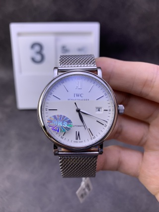
On this design, print thickness becomes obvious the moment light skims the dial. Index seating shows itself through the smallest tilt. Hand alignment stops being a minor tolerance issue and turns into a daily irritation when the minute hand fails to land cleanly at twelve. There is no ceramic bezel to absorb attention, no chronograph furniture to create visual noise. Every surface carries responsibility.
That is why Portofino should be treated as a discipline watch. Success depends on restraint rather than ambition. The factories that approach it like a feature project usually fail. The ones that treat it like a proportion exercise tend to last.
What the genuine watch prioritizes in daily use
The original design language from IWC Schaffhausen is centered on quiet wear rather than mechanical theater. The profile stays slim enough to disappear under a shirt cuff without catching. The dial preserves generous negative space so your eye rests instead of hunts. Crown interaction feels smooth and deliberate, not mechanical or gritty. On the wrist, presence remains low. This is not a tool watch, and it is not meant to announce itself.
Those priorities matter because Portofino lives most of its life in social and office environments. It needs to slide under tailoring, sit calmly during meetings, and avoid the micro-annoyances that accumulate when a watch constantly reminds you it is there. Anyone approaching this model expecting ruggedness, strong lume, or outdoor performance is already misaligned with what the design is trying to do.
MKS Factory’s Dress-Watch Philosophy
Why MKS gravitates toward Portofino instead of sports IWCs
MKS Factory has never positioned itself as an innovation-driven manufacturer; as noted in MKS vs peer IWC replica factory capability and specialty comparison, its historical comfort zone has been narrow and intentional, so you rarely see it chasing integrated steel bracelets, aggressive case geometries, or stacked complication projects, and instead it returns again and again to three-hand dress references, moonphase variants, and thin automatic layouts.
That pattern matters. It tells you what kind of problems MKS prefers to solve. The factory behaves like a surface-and-proportion shop rather than a technical experiment lab. Its strengths sit in case curvature, dial calmness, and wearable geometry. When it stays inside that lane, results tend to feel coherent. When factories built around sport watches try to enter this territory, they often bring the wrong instincts with them.
This is why MKS keeps circling back to Portofino. The model rewards restraint, and restraint is where MKS is most comfortable.
Movement strategy: stability over ambition
MKS typically builds around mature automatic architectures in the 2892 family or equivalent layouts. That choice is not about prestige. It is about behavior.
These thinner platforms allow the midcase to stay controlled instead of ballooning. They deliver smoother winding feel through simpler gear trains. They reduce module interfaces, which in turn lowers the number of friction points that show up months later as rough crown action or inconsistent setting.
On Portofino, this matters more than decorative finishing. A dress watch that winds harshly or sits thick at the case wall breaks the illusion immediately. MKS prioritizes movements that disappear during use. That invisibility is the point. Wear behavior matters more here than technical bragging rights.

Case Profile and Under-Cuff Behavior (The Silent Test)
Midcase thickness vs bezel proportion
The fastest way to judge a Portofino is from the side. Look at how much raw case wall you can see between bezel and caseback. Then notice whether the bezel visually compresses that thickness or simply sits on top of it.
MKS generally performs well in this specific relationship. Its Portofino cases avoid the stacked look that plagues many replicas, where a tall midcase announces itself regardless of wrist position. The bezel carries enough visual weight to shorten the apparent profile, keeping the watch from feeling top-heavy.
This matters in daily wear because thickness does not announce itself only in millimeters. It announces itself when cuffs snag, when jackets catch, and when the watch feels perched instead of seated. On a dress watch, those sensations accumulate quickly.
Lug geometry and wrist stability
Lug shape determines whether a watch behaves or wanders, and as emphasized in the IWC replica quality-control geometry and wear performance criteria, shorter, downward-curving lugs pull the case into the wrist instead of letting it float; when that geometry is right, the watch stays centered, and when it is wrong, rotation becomes constant.
MKS Portofino cases usually sit flatter than bulkier Portugieser-style replicas because the lugs do more of the holding. That difference shows up after a few hours of wear, not in spec sheets. Dress watches fail when they wobble. They fail when you keep nudging them back into place. Stability is quiet, but it is foundational.
When Portofino works, you forget it is there until you check the time. That is the benchmark.
Dial Discipline: Where MKS Usually Earns Its Reputation
Print behavior and negative space control
Portofino dials live on emptiness. Large, uninterrupted fields of color leave nowhere for sloppy execution to hide, which is why print behavior becomes the first real test.
Start with the logo edges. On a good MKS example, the perimeter of the lettering looks clean rather than fuzzy, and the ink sits flat instead of bleeding into the dial lacquer. Then let your eye follow the minute track. Spacing should feel evenly paced all the way around, without compression near the date window or drift at the quarter markers. Finally, look at stroke thickness. The numerals and indices need to share the same visual weight. When one element looks bolder than the rest, the dial loses its calm.
This is where MKS usually earns its reputation. Its approach is conservative. It avoids aggressive contrast and exaggerated printing, favoring softer execution that preserves negative space. That restraint translates into a dial that feels settled rather than busy, even under close inspection.
Applied markers and hand alignment
Applied indices tell you a lot about a factory’s discipline. They should sit flat, with no visible tilt when viewed from shallow angles. Even a slight lean becomes obvious on Portofino because there is nothing else competing for attention.
Hand alignment matters just as much. At twelve o’clock, the minute hand should land cleanly on the marker, not hover to one side or fall short. That single alignment check reveals more about assembly consistency than most macro photos ever will.
MKS benefits here from limited model diversity. Because it does not scatter its resources across dozens of unrelated designs, batch consistency tends to stay tighter. You see fewer random alignment errors compared to factories juggling multiple sport platforms at once.
Date window realism
If there is one detail that decides whether Portofino feels convincing, it is the date window.
A simple three-point inspection usually tells the whole story. First, look at the bevel. The edge of the window should feel crisp rather than rounded, creating a clean boundary between dial and aperture. Second, examine the font, especially the shapes of “2,” “4,” and “7.” These numerals reveal mismatches quickly because their geometry is unforgiving. Third, cycle through several dates and watch how the numbers sit. Centering needs to remain consistent, not wander from day to day.
On Portofino, this window is not a minor detail. It carries disproportionate visual weight. When it is right, the watch feels composed. When it is wrong, everything else becomes harder to forgive.
Wearing Reality: What MKS Portofino Feels Like After a Week
Crown interaction and daily setting
After a few days of ownership, crown feel starts to matter more than dial photography.
A good Portofino should pull smoothly into setting positions without gritty threads or vague detents. Winding ought to feel fluid rather than crunchy. MKS usually delivers a softer, less mechanical interaction here than factories built around sport references, where crown systems are often overbuilt and stiff.
That difference shows up during routine adjustments. When setting the time in the morning feels effortless instead of transactional, the watch integrates into daily life instead of interrupting it.
Strap behavior and dress comfort
MKS leather straps lean toward softness rather than longevity. Out of the box, they tend to break in quickly and conform to the wrist without resistance, which suits the Portofino’s role as a dress piece.
The trade-off appears over time. Edge paint and stitching deserve early inspection because dress straps age faster than steel bracelets. The leather itself usually remains comfortable, but cosmetic wear can arrive sooner than some expect. This is not a defect so much as a design choice. Portofino prioritizes immediate comfort over rugged durability, and the straps follow that philosophy.
Many owners eventually replace the factory strap. That is normal. What matters is that the watch head itself wears lightly and stays balanced once paired with higher-quality leather.
Lume and visibility (expectation reset)
Portofino lume is intentionally weak.
This is not a manufacturing failure. It is a design decision consistent with the model’s purpose. The hands and markers glow just enough to orient you in low light, but they will not light up a room or remain legible through the night.
If strong nocturnal visibility matters to you, this entire model family is the wrong choice. Portofino trades nighttime performance for daytime elegance. Understanding that boundary avoids disappointment later.
Moonphase Variants: Added Beauty, Added Responsibility
What changes when moonphase enters the system
The moment moonphase joins the layout, the watch becomes more than a simple three-hander.
You introduce additional gears. You increase setting sensitivity. You also raise the likelihood of user-induced damage through rushed adjustments or incorrect correction windows. None of this makes moonphase undesirable, but it does change ownership dynamics.
Moonphase Portofino wears beautifully. The complication adds visual depth without disturbing the dial’s balance. Mechanically, however, it demands gentler handling.
How to evaluate moonphase function
Evaluation here is less about visual accuracy and more about tactile behavior.
Advance the complication slowly. Pay attention to resistance changes. Half-clicks or sudden stiffness usually indicate alignment issues inside the module. Smooth advancement matters more than whether the moon disc matches astronomical reality to the day. What you are really testing is mechanical harmony.
A healthy system moves evenly and predictably. Anything else suggests future frustration.
Who moonphase Portofino actually suits
Moonphase Portofino makes sense for owners who already have at least one simpler daily watch and who are comfortable with gentler handling routines. It rewards patience and familiarity.
It is not a good first replica. New owners benefit from learning basic setting habits on straightforward three-hand models before introducing additional complications.
Beauty comes with responsibility here, and that trade-off should feel intentional rather than accidental.
Where MKS Stops Competing (By Design)
Water resistance
Portofino should be treated as splash-resistant, nothing more. That is not a conservative disclaimer. It reflects how these cases are actually built.
MKS does not engineer sealing systems the way sport-focused factories do. There is no emphasis on reinforced crown tubes, overbuilt caseback gaskets, or pressure-tested assemblies. The construction prioritizes slimness and comfort, which inevitably trades away environmental protection. Hand washing and light rain are fine if the crown is properly seated. Swimming, showers, or humid heat cycles are not what this watch is designed to tolerate.
If water confidence sits high on your priority list, Portofino is already the wrong model. Trying to turn it into something else usually ends with moisture marks under the crystal six months later.
Night readability
The restrained lume is intentional.
Portofino was never meant to behave like a pilot or dive watch after dark. The hands and markers glow just enough to give orientation in low light, then fade. This is not a defect and it is not a production shortcut. It is part of the aesthetic contract of the model. The dial stays clean in daylight precisely because it avoids heavy luminous application.
Expecting strong night legibility here misunderstands the design. This watch optimizes for daytime presence and under-cuff discretion, not midnight visibility.
High-complexity movement projects
MKS deliberately avoids perpetual calendars, stacked chronographs, and ambitious complication platforms.
Its catalog remains narrow on purpose. You see three-hand automatics, moonphase variants, and thin dress layouts. You do not see grand complication experiments. That is not a limitation. It is specialization.
Factories that attempt everything tend to spread tolerance too thin. MKS chooses not to play that game. It focuses on surfaces, proportions, and wearable geometry, then repeats those skills across a small set of references. In practice, this restraint produces more predictable results than chasing technical headlines.
MKS Portofino vs Other Factories (Reality-Based, Not Brand-Based)
Where MKS usually wins
MKS tends to outperform competitors in areas that actually matter on a dress watch.
Thinness is one of them. The case profile remains controlled, avoiding the stacked look that appears when thicker movement architectures get forced into elegant shells. Dial calmness is another. Printing stays conservative, negative space remains intact, and visual noise stays low. Over time, that restraint translates into predictable wear comfort. The watch sits flat, rotates less, and integrates into daily clothing instead of constantly announcing itself.
These advantages do not show up in spec comparisons. They reveal themselves after repeated wear cycles, when the watch stops demanding attention.
Where others may outperform
Sport-oriented factories often do better with durability-driven traits. Strong lume, heavier bracelet engineering, and cases designed to absorb impact are areas where Portofino, by definition, does not compete.
That imbalance is not a problem because Portofino buyers usually do not value those characteristics anyway. This model attracts people who care about proportion, quiet aesthetics, and how a watch behaves under a cuff. If bracelet articulation or night visibility ranks higher for you, there are better families to explore.
The key is alignment. MKS optimizes for dress behavior. Other factories optimize for sport resilience. Mixing those expectations leads to disappointment.
QC Acceptance Checklist (Portofino-Specific)
Dial checks
Start with print sharpness. Look for clean logo edges and consistent stroke thickness across numerals and markers. Let your eye travel around the minute track and notice whether spacing feels even or drifts near the date window. Then check index level from shallow angles. Applied markers should sit flat, without tilt, and the minute hand should land cleanly on its target at twelve.
On Portofino, these details are not cosmetic. They determine whether the dial feels composed or restless.
Case checks
Use reflected light to assess polishing. Straight lines should appear straight across the bezel and case flank, without ripples or distortion. Compare lug symmetry side to side, making sure curvature and length match. Then examine bezel evenness. The transition from bezel to midcase should feel continuous, not stepped or irregular.
Dress watches live and die by these quiet geometries.
Functional checks
Operate the crown slowly. Pulling into setting positions should feel smooth, without gritty threads or vague engagement. Cycle through several dates and confirm that centering remains consistent rather than wandering across the aperture. If you are evaluating a moonphase version, advance the complication gently and watch for resistance spikes or half-click behavior. Smooth progression matters more than perfect visual alignment of the moon disc.
These checks do not guarantee perfection, but as outlined in the beyond-the-big-three IWC replica factory comparison and defect filtration methodology, they filter out the problems that most often surface during ownership.
The MKS Portofino makes sense when you judge it as a wearable design instrument defined by proportion, calmness, and interaction feel rather than as a feature-driven object.
Related IWC Articles: If you found this helpful, you might also enjoy Guangzhou IWC Watch Market Explained: How IWC Replicas Actually Move From Factory to Buyer, and Seagull/Dandong vs Swiss ETA in IWC Replicas: What You Really Get (And What You Don’t). Another related article is IWC Portuguese Replica Guide: Classic Models & Best Versions.