
1. First Wear Impression: Clean, Stable, and Subtle
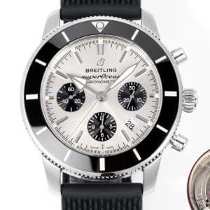
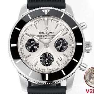
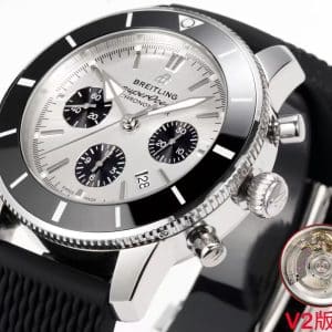
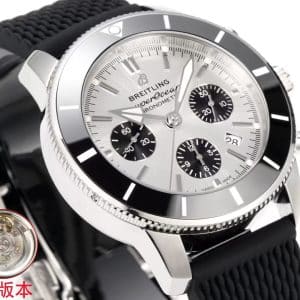
The brushed silver dial does not read like a high-polish silver surface. It diffuses light more softly, helping the black sub-dials, hands, and markers stay organized across the chronograph layout.
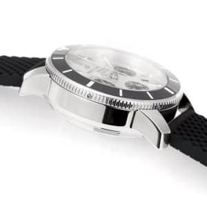
On the wrist, the 44 mm Superocean Heritage II Chronograph format gives the watch a clear presence, while the black rubber strap helps keep the case visually grounded. The black bezel frames the silver dial and adds contrast without making the colorway feel loud.
The overall impression is restrained: silver dial, black bezel, black sub-dials, and rubber strap working together as a daily-wear configuration.
2. Light Behavior: A Silver Dial With Restraint
Indoor lighting
The dial can lean slightly warmer indoors, which helps the text, markers, and sub-dials remain separated from the silver surface. The chronograph layout stays readable because the black registers create clear visual zones.
Sunlight
In brighter light, the brushed silver finish is the key detail to inspect. Instead of relying on a mirror-like effect, the vertical brushing is intended to spread reflections in a more controlled way. The black bezel acts as a stable border around the dial.
Evening / low light
In lower light, the silver tone may appear darker or more gray. That shift is a normal fit consideration for this colorway, especially compared with black, blue, or green Superocean variants.
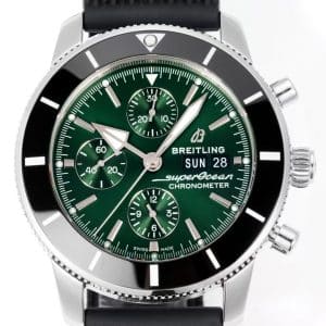
For buyers comparing dial colors, this silver version is best understood as the restrained option: brighter than black, less expressive than blue or green, and more contrast-driven than a plain monochrome layout.
3. Chronograph Control Checks: Practical and Photo-Aware
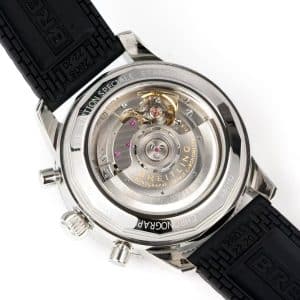
The movement caliber and architecture are not specified in the available product data, so this section should be treated as buyer guidance rather than a technical movement claim. For a BLS Factory V2 Superocean Heritage II Chronograph 44, the practical checks are the visible and functional details that can be confirmed before purchase.
-
Chronograph hands should reset cleanly to their intended zero positions in QC photos or video if provided
-
Sub-dials should appear symmetrical and evenly printed
-
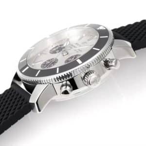
Pushers should sit evenly against the case profile
-
Crown alignment should look straight and properly seated
-
Dial printing should remain sharp around the chronograph registers and date window where visible
Because exact movement details are not confirmed, avoid judging this listing by unsupported caliber claims. The safer evaluation is visible alignment, clean reset behavior if shown, and overall case and dial consistency.
4. Strap Behavior: Everyday Stability
The black rubber strap changes the posture of the watch compared with a bracelet:
-
It keeps the 44 mm case visually centered
-
It gives the silver dial and black bezel a more casual profile
-
It reduces the formal look a steel bracelet would create
-
It supports the daily-wear character of this Superocean configuration
On a silver dial chronograph, a steel bracelet can make the watch feel more dress-oriented. Rubber keeps the design grounded, especially for office, commute, travel, and smart-casual use.
5. BLS Factory V2 Execution: Version Details to Inspect
BLS Factory V2 is the main version cue for this listing. Based on the provided product description, the areas to focus on are visual refinement and alignment rather than unsupported technical claims:
-
Dial brushing should look straight and even across the silver surface
-
Sub-dial spacing should appear balanced within the chronograph layout
-
Bezel alignment should line up cleanly with the dial markers
-
Marker finishing should avoid distracting reflections in close photos
-
Date window should appear centered and cleanly printed where visible
The factory/version note is useful for comparison, but it should not be treated as a guarantee of perfect matching. The best approach is to review the actual product images and any QC photos for the specific watch.
6. Real-Life Wearing Scenarios
Morning routine, soft indoor light
The silver dial should remain easy to read when the brushing is not catching strong direct light.
Afternoon sunlight in motion
The brushed finish becomes more noticeable, with the black bezel helping define the edge of the dial.
Evening wear, dim environments
The silver tone may deepen toward gray, giving the watch a more restrained look than brighter Superocean colorways.
Workday typing or commuting
The rubber strap supports a stable, less formal wearing profile for daily use.
This model is best suited to buyers who want a readable 44 mm chronograph that does not rely on a loud dial color.
7. Who This Watch Is Actually For
This configuration fits someone who:
-
Likes clarity more than strong color
-
Wants a chronograph layout with organized contrast
-
Prefers a silver dial that changes with light without becoming overly bright
-
Wants a modern Superocean Heritage II look with a larger 44 mm case presence
-
Prefers the casual stability of a black rubber strap over a bracelet look
It may not be ideal for buyers who want a smaller case, a dressier bracelet configuration, or a louder blue, green, or high-contrast colorway.
8. Neutral Difference Guidance
When comparing this BLS Factory V2 listing with other Superocean Heritage II Chronograph 44 options, focus on confirmed visible details: silver dial tone, black sub-dial balance, black bezel alignment, rubber strap finishing, and overall case proportion.
The useful decision axis is not an unsupported claim of perfect accuracy. It is whether this restrained silver-and-black configuration fits your wrist, style, and QC expectations better than darker or more expressive Superocean colorways.
Design Background
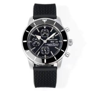
This Superocean Heritage II Chronograph 44 is built around a restrained silver-and-black colorway: a brushed silver dial, black sub-dials, a black bezel, and a black rubber strap. The result is a chronograph that keeps the Superocean identity visible without leaning into a loud or heavily contrasted look, which makes it easier to read in daily use and easier to pair with office or casual clothing.
The 44 mm case size gives it a clear wrist presence, so this version is aimed at buyers who want a larger chronograph rather than a compact dive watch. The chronograph layout adds visual structure across the dial, while the rubber strap keeps the profile more stable and less formal than a bracelet. That combination is the main reason this colorway stands apart from brighter or more decorative Superocean variants.
BLS Factory V2 is the version cue to pay attention to here. In the provided description, it is associated with cleaner dial brushing, better sub-dial balance, tighter bezel alignment, and a more centered date window where visible. The movement is not specified in the available product data, and thickness, crystal type, case material, lume specification, clasp type, and water-resistance details are also not specified, so those details should not be assumed.
For buyers comparing similar Superocean Heritage II chronographs, this one sits in the restrained category: silver dial for controlled light behavior, black bezel for definition, and rubber strap for everyday stability. It is a practical choice for someone who wants the chronograph format and larger case presence without moving into a brighter or more expressive colorway.
Watch Specifications
- Factory version
- BLS Factory V2
- Movement
- Not specified on this product page
- Case size
- 44 mm
- Thickness
- Not specified on this product page
- Bracelet / strap
- Black rubber strap
- Crystal
- Not specified on this product page
- Dial details
- Brushed silver dial with black sub-dials
- Bezel
- Black bezel
- Caseback
- Not specified on this product page
- Model / reference family
- Superocean Heritage II Chronograph 44
- Colorway
- Silver dial, black bezel, black rubber strap
- QC focus
- Dial brushing, sub-dial symmetry, bezel alignment, print sharpness, date window centering if visible, crown and pusher alignment, strap finishing, case proportion consistency
Watch Evaluation Highlights
BLS Factory V2
This listing is anchored by the BLS Factory V2 callout, so the most useful check is visual consistency rather than unsupported technical assumptions. Focus on dial brushing, sub-dial placement, bezel alignment, and whether the date window sits cleanly if it is visible in the photos.
Silver Dial Control
The brushed silver dial is the main character point here. It should read as restrained rather than flashy, with black sub-dials creating structure and helping the chronograph layout stay organized in changing light. In lower light, the silver tone may look darker, which is a normal fit consideration for this colorway.
44 mm Case Presence
The 44 mm size gives the watch clear wrist presence, so it suits buyers who want a larger chronograph format. That scale is part of the design logic, but it also means the watch may wear assertively compared with smaller Superocean variants. Case proportion consistency is worth confirming in QC photos.
Rubber Strap Profile
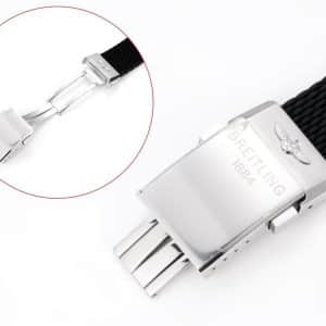
The black rubber strap keeps the watch visually grounded and more practical for daily wear than a bracelet look. It softens the overall tone of the silver dial and black bezel combination, and it makes the watch feel better suited to commute, office, and mixed casual use than a dress-oriented setup.
QC and Tradeoffs
Inspect the dial print, sub-dial symmetry, bezel alignment, crown and pusher alignment, strap finishing, and the date window position if shown. The main tradeoffs are straightforward: the 44 mm size is assertive, the rubber strap is less formal than a bracelet, the silver dial can shift darker in low light, and the chronograph layout is busier than a time-only watch.
Known Flaws
- Dial print and sub-dial symmetry: inspect the main text, sub-dial spacing, and register alignment closely in photos, because small print or spacing errors are the easiest way for a chronograph face to look off. This is a medium concern for most buyers who care about visual balance.
- Bezel alignment and pip placement: check that the black bezel lines up cleanly with the dial markers and that the bezel insert sits evenly all the way around. Misalignment changes the whole front view, so this is a medium-to-high concern.
- Date window centering and edge finish: confirm the date opening is cut and seated cleanly where visible, since a shifted window can make the dial feel less composed. This is a medium concern, especially for buyers focused on QC consistency.
- Crown and pusher alignment: look for straight seating and even spacing against the case profile, because uneven hardware fit can be visible even when the watch is otherwise well presented. This is a medium concern.
- 44 mm presence and strap formality: expect a larger wrist footprint and a more casual look from the black rubber strap, since both are part of this version’s design rather than faults. This is a low concern for buyers who want the stated wearing profile, but it matters if you prefer a smaller or dressier setup.
- Silver dial behavior in low light: verify how the brushed silver surface reads under dimmer conditions, because it can shift darker and less reflective than in bright light. This is a low concern, but it affects day-to-night appearance.
Superocean models often appeal to collectors who prefer a design shaped by clarity and functional purpose. Much of the line’s identity comes from how its bezel texture, dial contrast, and case profile work together to maintain strong legibility in a variety of lighting conditions, not just underwater. For many wearers, the charm lies in how these practical details translate into a watch that feels capable without being overly imposing.
Because factors such as bezel action, dial printing depth, and bracelet stability can noticeably influence how a Superocean behaves in day-to-day use, it is often helpful to compare versions by focusing on real-world ergonomics rather than specifications alone. This Breitling super clone buying guide offers broader context on design tendencies across the brand, helping you understand which elements tend to matter most as you refine your preferences over time.