


1. How the Green Dial Behaves in Real Light
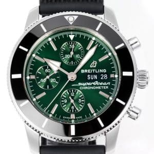
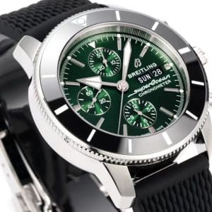
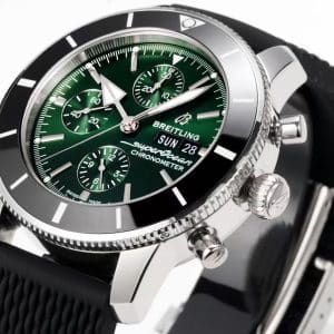
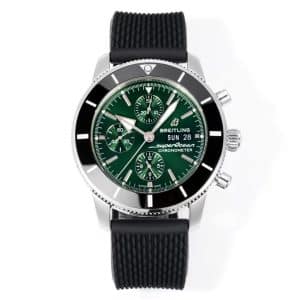
The green dial is the main decision point on this BLS Factory Superocean Heritage II Chronograph. On a busy chronograph layout, the color needs to add character without making the registers harder to read.
Indoor lighting
The green appears darker and more forest-like, with the radial brushing sitting in the background. The sub-dials remain visually close to the main dial rather than creating a high-contrast, scattered look.
Outdoor sunlight
The brushing becomes more active and the dial can lift by one or two tones. In the described examples, it does not shift into a bright lime or emerald effect, which keeps the color controlled for a sport chronograph.
Evening / dim environments
The bezel becomes more visually dominant and the dial reads as a darker surface. This gives the watch a calmer appearance than the register count might suggest.
For buyers comparing green chronographs, this version is best understood as a restrained green rather than a loud sport-green execution.
2. Chronograph Layout That Stays Readable
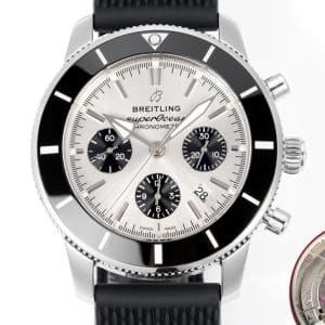
The dial includes three chronograph registers, a day-date window, and a central chronograph seconds hand. That creates more visual activity than a simple three-hand Superocean-style watch, so spacing and print clarity matter.
Key visible points to check:
-
Sub-dial printing should look sharp and evenly placed
-
The day and date should sit centered in the window without crowding the frame
-
The central chronograph seconds hand should align cleanly when reset
-
Hands should remain legible against the green background
The strongest appeal is the balance between a multi-register chronograph look and a dial color that does not overpower the layout.
3. Wrist Feel and Rubber Strap Behavior
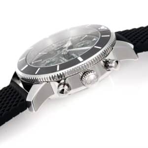
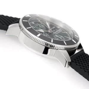
A chronograph case usually carries more presence than a simpler diver-style watch. The rubber strap helps keep the wearing profile sport-focused and can make the case feel more settled on the wrist than a heavier bracelet setup.
Buyer-facing points to confirm in photos or video:
-
The case should sit evenly between the lugs
-
The rubber strap texture should look clean and consistent
-
The strap should curve naturally rather than flaring sharply away from the case
-
The pushers should respond cleanly if a function video is provided
-
The crown should appear straight and secure when viewed from the side
This configuration is better suited to buyers who want a sportier wearing profile than a formal bracelet presentation.
4. Where the BLS Factory Execution Should Be Checked
BLS Factory is the named factory version for this China replica edition. The useful way to evaluate this example is through visible quality-control points rather than broad claims about perfection.
On this green chronograph, inspect:
-
The transition between the green main dial and the sub-dials
-
Printed text sharpness at straight and angled views
-
Bezel marker alignment at 12 o’clock
-
Even bezel action if a short video is available
-
Case reflections for distortion or uneven polishing
-
Rubber strap surface texture and fit at the lugs
The goal is a controlled, readable execution with no obvious visual distractions in the dial, bezel, or strap areas.
5. What This Chronograph Offers Over a Simpler Diver-Style Layout
A three-hand Superocean-style watch will usually feel quieter and easier to scan. This chronograph version adds more presence, more dial structure, and more interaction through the pushers and registers.
The chronograph layout adds:
-
A central chronograph seconds hand
-
Three sub-dials for a more technical dial appearance
-
A day-date window for daily-use reference
That also means the buyer should be comfortable with a busier dial. The green colorway helps by staying darker and more composed than brighter sport greens, but it is still more expressive than a minimal black or simple three-hand layout.
6. Verified Product Details and Not-Specified Fields
The available product information supports the following details:
-
Brand named in title: Breitling
-
Collection named in title: Superocean Heritage II
-
Model type: Chronograph
-
Dial color: Green
-
Factory version: BLS Factory
-
Edition positioning: China replica edition
-
Dial layout: Three-register chronograph with day-date window
-
Strap: Rubber strap mentioned in the product copy
-
Category: Superocean
The following specifications are not provided in the available product data: case size, thickness, movement, crystal type, exact case material, bezel material, clasp type, reference number, and water resistance.
7. Known Inspection Cautions
The main buyer checks are visual and functional. These are not stated defects, but practical points to verify before purchase.
-
Confirm the green dial tone in both indoor and brighter lighting
-
Check that the radial brushing looks even across the dial
-
Inspect sub-dial edges and printing for clean spacing
-
Verify day-date centering and spacing inside the window
-
Check chronograph hand reset alignment
-
Inspect bezel alignment against the dial markers
-
Review hand polish and legibility under angled light
-
Confirm pusher response and bezel action by video if available
These checks are especially important because the green dial and chronograph layout create more visible detail than a simpler diver-style watch.
8. Who Should Choose the Green Chronograph
This version fits buyers who want a Superocean Heritage II Chronograph look with more personality than black but less brightness than louder green colorways.
Best suited for buyers who:
-
Want a readable green chronograph dial
-
Prefer deeper, more grounded color tones
-
Like multi-register chronograph layouts
-
Want a rubber-strap sport profile
-
Care about QC-photo checks for color, printing, bezel alignment, and day-date spacing
Not ideal for buyers who:
-
Prefer a very quiet or minimal three-hand dial
-
Need confirmed movement specifications before considering the watch
-
Need confirmed water-resistance information
-
Want the visual simplicity of a darker, less expressive colorway
9. FAQ
Does the green dial look bright?
Based on the supplied description, the dial appears darker indoors and becomes more active in sunlight, but it is described as staying away from lime or emerald brightness.
Is the chronograph dial easy to read?
The layout is busier than a simple diver-style watch, but the supported copy describes readable sub-dial printing, clear hand legibility, and a day-date window that remains visible.
What should be checked in QC photos?
Check the green dial shade, radial brushing, sub-dial print sharpness, chronograph hand reset alignment, day-date centering, bezel marker alignment, hand legibility, crown position, pusher response if video is available, and rubber strap fit.
Are the movement and case specifications confirmed?
No. Movement, case size, thickness, crystal type, exact case material, clasp type, reference number, and water resistance are not specified in the available product data.
Who is this version best for?
It is best for buyers who want a sportier Superocean Heritage II Chronograph look with a controlled green dial, rubber strap wearability, and more visual activity than a minimal three-hand watch.
10. QC-Focused Request Before Purchase
Before confirming this BLS Factory Superocean Heritage II Chronograph Green Dial, request clear QC photos in indoor light and brighter light. Confirm the green dial tone, sub-dial printing, chronograph hand alignment, day-date spacing, bezel centering, pusher behavior if video is available, and rubber strap fit. Any unspecified technical details should be confirmed directly before ordering.
Known Flaws
- Inspect the green dial tone under indoor light and brighter light, because this version depends on a controlled darker green rather than a loud lime or emerald effect. For most buyers this is a moderate concern: a slight lighting shift is expected, but an overly bright or uneven dial can change the whole look of the watch.
- Check the sub-dial printing, register edges, and hand legibility, because the three-register chronograph layout has more visual detail than a simple diver-style dial. This is usually a medium-priority QC point, since small print softness may be acceptable to some buyers but poor spacing or weak contrast can make the dial feel cluttered.
- Verify the day-date window centering and spacing, because a crowded or off-center day-date display is easy to notice on a busy green chronograph dial. For most buyers this is a moderate to high concern, especially if the text touches the frame or sits visibly high, low, or uneven.
- Inspect the central chronograph seconds hand reset and general hand alignment, because the chronograph layout draws attention to whether the hands return cleanly to their markers. This is a practical medium-level issue for most buyers; minor tolerance may not affect casual wear, but obvious misalignment is visible in every dial photo.
- Check the bezel marker and bezel pip alignment against the 12 o’clock dial marker, because the broad bezel is a major visual part of the Superocean Heritage II chronograph shape. This is typically a high-visibility QC point: even a small offset can be distracting when the dial and bezel are viewed straight on.
- Review the rubber strap fit at the lugs, crown position, and pusher response if video is available, because the sport profile depends on the strap sitting cleanly and the side controls looking secure. For most buyers this is a medium concern; it may not dominate the appearance, but poor strap curvature or loose-feeling controls can reduce wearing confidence.
Superocean models often appeal to collectors who prefer a design shaped by clarity and functional purpose. Much of the line’s identity comes from how its bezel texture, dial contrast, and case profile work together to maintain strong legibility in a variety of lighting conditions, not just underwater. For many wearers, the charm lies in how these practical details translate into a watch that feels capable without being overly imposing.
Because factors such as bezel action, dial printing depth, and bracelet stability can noticeably influence how a Superocean behaves in day-to-day use, it is often helpful to compare versions by focusing on real-world ergonomics rather than specifications alone. This Breitling super clone buying guide offers broader context on design tendencies across the brand, helping you understand which elements tend to matter most as you refine your preferences over time.