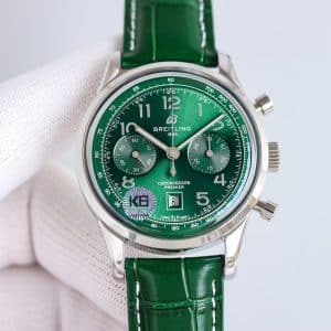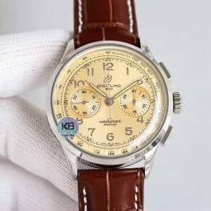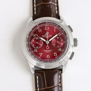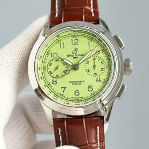


How the Dial Behaves in Real Light
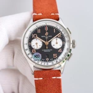
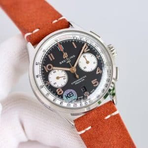
Black dials are straightforward in photos but complex in real use. This one shifts depending on how the hour hits it:
Morning light (around 9:30 AM):
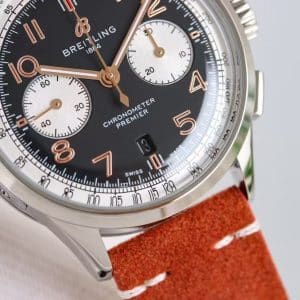
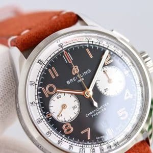
The black surface brightens slightly, showing fine radial texture. The white subdials pick up the sun first, giving the watch a clipped, precise appearance.
Afternoon light (2:00 PM):
The copper numerals become the main character. They glow just enough to break the dial into layers—digits, hands, and chronograph tracks all becoming separate visual zones.
Evening indoor light:
The black deepens again, and the copper tones warm up. Under warm LED lighting, the watch takes on a vintage mood that feels more “Premier heritage” than modern chronograph.
KB factory kept the printing clean and the numeral curvature consistent—something many lower-tier replica watch versions struggle with.
A Chronograph That Responds Predictably
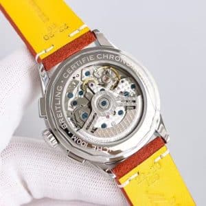
KB’s interpretation of the Premier chronograph leans on stability rather than imitation alone.
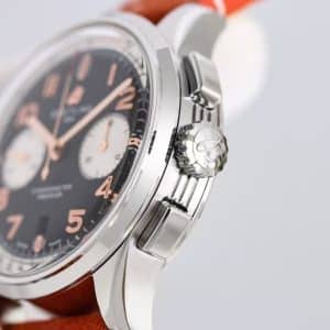
The pushers have a clear click, not mushy or overly stiff. The start/stop pusher is slightly firmer than reset, which mirrors the behavior of many Swiss chronograph movements.
Winding feels steady with a mild grain to it—not buttery smooth, but consistent and reassuring. The watch gives tactile feedback every time you engage with it, and that predictability matters more in daily use than theoretical accuracy.
The subdials, especially the 30-minute counter, are easy to read because of the color separation. Even in motion, the hand contrast stays strong.
How the Case Sits on the Wrist
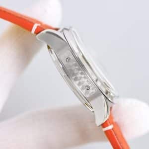
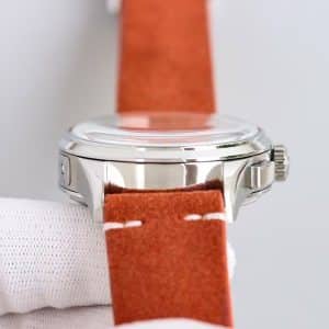
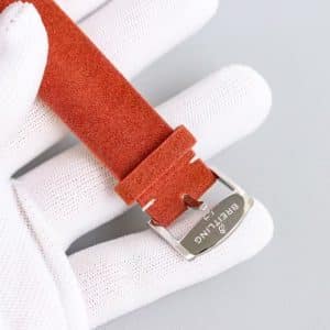
On the wrist, this configuration feels compact and proportionate. The lugs curve down cleanly, keeping the watch centered without floating. With the suede-texture strap in this orange-brown tone, the whole piece leans into a casual, vintage aesthetic.
The stainless-steel case from KB factory reflects light more softly than many Guangzhou productions. Edges are crisp but not sharp, and the polished surfaces don’t overwhelm the dial.
This combination—black dial, copper numerals, white subdials, warm strap—feels intentionally eclectic, and it works.
What Changes When You Actually Wear It
Watches with contrasting subdials often look fast, almost aggressive. But wearing this one slows it down. The copper numerals draw your eyes into the dial’s warmth instead of the chronograph’s timing function.
During a typical day:
-
At a desk: reflections stay low; numerals remain readable without shifting your wrist
-
Walking outdoors: the copper indices spark briefly in sunlight
-
Low-light environments: the subdials fade slightly, letting the numerals take over
It becomes a watch that adapts to your environment rather than announcing itself all the time.
Whether that fits your daily rhythm is something only you can determine.
Who This Configuration Makes Sense For
This Premier suits someone who wants contrast without harshness. Someone who likes a black dial but doesn’t want the clinical feel many black chronographs have. Someone who values how colors interact more than how specs read.
If you enjoy vintage-coded tones mixed with modern symmetry, this KB factory version delivers exactly that balance.
If you prefer stark, monochrome modern designs, this may feel too warm or decorative. But if you appreciate dials that read differently throughout the day, this combination earns that second look.
Genuine vs KB Factory: What to Expect
The genuine model has:
-
Slightly richer copper numerals
-
Smoother brushing on the hands
-
A more refined transition between subdial recess and main dial
KB factory tracks these well for a china super clone. The proportions, numeral placement, and chronograph alignment are faithful. The finishing is a touch brighter and more reflective, but this difference is subtle in real-world use.
The mechanical behavior—especially pusher feedback—is one of KB’s stronger achievements in this batch.
Comparison Table — Genuine vs KB Premier (Black / White / Copper)
Premier models tend to appeal to collectors who prefer a cleaner, more composed presentation rather than an overtly technical aesthetic. The character of the line often comes from how its case proportions, dial layout, and finishing details work together to create a calmer, more adaptable presence on the wrist.
Because small differences in dial balance, case curvature, and bracelet feel can meaningfully shape the wearing experience, it is often helpful to compare versions with a focus on how they behave in everyday settings rather than on specifications alone. This Breitling super clone buying guide provides a wider context for understanding how different Breitling families relate to one another, making it easier to refine your preferences over time.