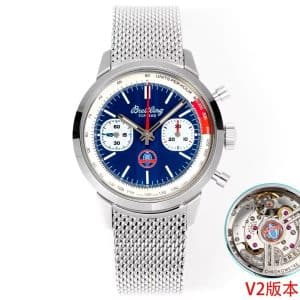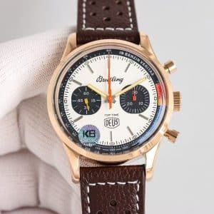
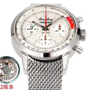
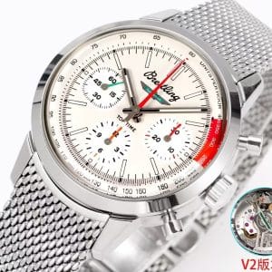
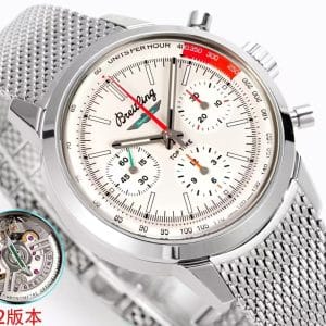

Dial Structure, Color Interaction & Visual Calmness
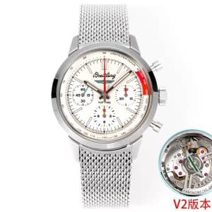
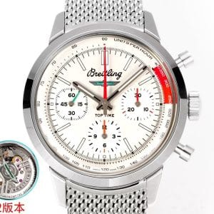
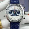
The cream dial is the main reason to consider this BLS Factory Breitling Top Time 41 configuration. Indoors, it reads as a warm cream-white tone that gives the indices, minute track, and three-register chronograph layout a softer frame. Under stronger light, the dial brightens toward ivory rather than stark white, which helps the colored details remain readable without making the watch look overly graphic.
The turquoise arrow logo, green-blue markings inside the left subdial, red tachymeter segment, and orange-tipped chronograph seconds hand give the dial its visual identity. These accents are best judged in QC photos by checking color separation, print sharpness, and whether the tachymeter markings sit evenly around the dial. The V2 execution is described around cleaner subdial color separation and steadier chronograph reset behavior, so those areas are worth inspecting before ordering.
Case Shape, Steel Presence & Wrist Comfort
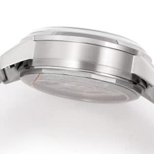
The 41mm stainless steel case gives this Top Time a clear chronograph presence without pushing into an oversized look. The source description lists an approximate 14.3mm thickness, so buyers who prefer very thin watches should factor that into the fit. The polished case surfaces and downward lug shape help the watch appear more compact on the wrist, especially when paired with the mesh bracelet.
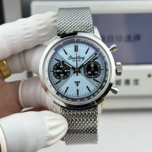
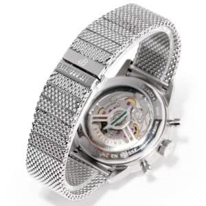
The stainless steel mesh bracelet changes the wearing profile compared with leather-strap Top Time variants. It gives the cream dial a brighter, more open look and can feel firm during the first wears before it gains more flexibility. In QC photos, buyers should check the bracelet end fit at the lugs, the consistency of the mesh brushing, and the clasp seating if the clasp is shown.
Movement Behavior & Chronograph Interaction
The V2 description focuses on more consistent winding feel and improved hand alignment during chronograph reset compared with earlier execution notes. For buyer inspection, the practical point is simple: request QC photos or a short check showing the chronograph seconds hand and subdial hands returning cleanly to zero.
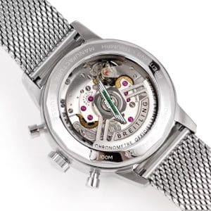
The pushers are described as having a measured, slightly firm action. That can suit buyers who prefer a more deliberate chronograph feel, but it should not be confused with a verified movement specification. The movement caliber, power reserve, and water resistance are not provided in the structured product data, so they should be confirmed directly if they matter to the order.
BLS Factory V2 Execution Notes
This BLS Factory V2 version is positioned around the classic cream dial, polished stainless steel case, stainless steel mesh bracelet, and three-register chronograph layout. The key buyer-visible areas are dial cleanliness, index alignment, subdial print, colored accent separation, and chronograph reset position.
Expected inspection cautions include a cream tone that may shift under different lighting, subdial texture that can appear smoother than the original reference, mesh brushing that may look glossier, and a firmer pusher feel. These points are best treated as QC-photo checks rather than defects by default.
Quick Specification Guide
| Brand Context | Breitling Top Time style replica product page |
| Factory | BLS Factory |
| Version Context | V2 execution described in the product copy |
| Case Size | 41mm |
| Approximate Thickness | About 14.3mm, based on the source description |
| Dial | Classic cream dial with three-register chronograph layout |
| Dial Accents | Turquoise logo detail, green-blue subdial markings, red tachymeter segment, orange chronograph seconds tip |
| Case | Stainless steel wording appears in the product title |
| Bracelet | Stainless steel mesh bracelet |
| Not Specified | Movement caliber, crystal material, water resistance, clasp type, lug width, power reserve, official reference number |
QC Photo Checklist
- Check dial print sharpness around the minute track, inner scales, and subdial markings.
- Confirm the turquoise logo is centered and cleanly placed above the dial text.
- Inspect the green-blue markings in the left subdial for clean color separation.
- Review the red tachymeter segment for even alignment with the surrounding scale.
- Confirm the chronograph seconds hand returns to zero after reset.
- Check the subdial chronograph hands for centered reset positions.
- Look at the cream dial under angled light for dust, marks, or uneven tone.
- Inspect polished case edges for consistent finishing and visible symmetry.
- Check that the crown and pushers sit evenly against the case.
- Review mesh bracelet end fit at the lugs and overall bracelet brushing.
- Confirm clasp seating if clasp photos are included.
Who This Top Time Is For
This cream-dial Top Time suits buyers who want a calmer chronograph look rather than a darker, louder, or more racing-graphic configuration. The light dial, colored accents, polished steel case, and mesh bracelet make it a practical choice for daily wear, smart-casual outfits, and buyers who want the Top Time shape with a more restrained wrist presence.
It may not be the best fit for buyers who prefer a leather strap, a darker dial, a thinner case profile, a more technical specification sheet, or a bolder racing-style colorway. Buyers who need confirmed movement caliber, crystal material, clasp specification, or water-resistance information should request those details before ordering.
FAQ
What makes this cream dial version different from bolder Top Time variants?
The cream dial and stainless steel mesh bracelet give this version a quieter, brighter wearing profile. The colored chronograph accents remain visible, but the overall effect is more restrained than blue, reverse-panda, or more graphic Top Time layouts.
What should be checked most carefully in QC photos?
Focus on dial print sharpness, turquoise logo placement, subdial color separation, red tachymeter alignment, chronograph hand reset to zero, case finishing, and mesh bracelet fit at the lugs.
Does the mesh bracelet change the wearing feel?
Yes. The mesh bracelet gives the watch a brighter steel look and can feel firm at first. It is also part of why this cream-dial version appears lighter and more open on the wrist than a leather-strap configuration.
Which specifications are not confirmed here?
Movement caliber, crystal material, water resistance, clasp type, lug width, power reserve, and official reference number are not provided in the structured product facts. These should be confirmed before ordering if they are important to the buyer.
Before Ordering
Use the inquiry process to request QC photos and confirm any details that matter to your order. For this BLS Factory Top Time 41 cream dial mesh bracelet version, the most useful checks are dial cleanliness, colored accent placement, chronograph reset alignment, polished case finish, and bracelet fit.
Watch Specifications
- Factory version
- BLS Factory V2 execution
- Movement
- Not specified on this product page
- Case size
- 41mm
- Thickness
- Approximately 14.3mm
- Bracelet / strap
- Stainless steel mesh bracelet
- Crystal
- Not specified on this product page
- Dial details
- Classic cream dial with three-register chronograph layout, turquoise logo detail, green-blue subdial markings, red tachymeter segment, and orange-tipped chronograph seconds hand
- Bezel
- Not specified on this product page
- Caseback
- Not specified on this product page
- Model / reference family
- Breitling Top Time 41
- Colorway
- Classic cream with colored chronograph accents
- QC focus
- Dial print sharpness, turquoise logo placement, subdial color separation, red tachymeter alignment, chronograph hand reset to zero, crown and pusher seating, polished case edges, mesh bracelet end fit, and clasp behavior if visible
Known Flaws
- Cream dial tone can vary under light: inspect the dial in both neutral and angled lighting to confirm the cream finish reads the way you want. This matters because the color can shift from warm cream to a lighter ivory look, which changes the watch’s overall character. For most buyers, this is a minor visual variation rather than a functional issue.
- Subdial print and color separation need a close QC check: look for crisp printing, clean edges around the colored subdial details, and even separation between the turquoise, green-blue, red, and orange accents. This matters because the dial’s visual balance depends on those small details staying clear. For most buyers, this is a moderate inspection point because it affects appearance at a glance.
- Chronograph reset position should be verified: confirm that the chronograph seconds hand and subdial hands return cleanly to zero in QC photos. This matters because hand alignment is one of the easiest ways to judge execution quality on this layout. For most buyers, this is a higher-priority check, though still an inspection point rather than a confirmed defect here.
- Mesh bracelet finish and fit may feel different from leather versions: check the bracelet end fit at the lugs, clasp seating if visible, and whether the mesh brushing looks even. This matters because the bracelet is part of the watch’s visual identity and can look glossier or feel firmer during early wear. For most buyers, this is a moderate comfort-and-finish point.
- Case edges, pusher feel, and seating should be examined together: inspect polished case surfaces, crown alignment, and how the pushers sit against the case. This matters because the Top Time’s profile depends on clean case finishing and balanced controls. For most buyers, this is usually minor unless the alignment looks noticeably off in photos.
Best For / Not Ideal For
Best For
- Buyers who want a calmer Top Time 41 look built around a classic cream dial, readable chronograph layout, and restrained colored accents.
- Wearers comfortable with a 41mm chronograph case and the source-described approximate 14.3mm thickness, rather than a very thin watch profile.
- Buyers who prefer the brighter steel presence of a stainless steel mesh bracelet over a leather strap, including a firmer initial bracelet feel.
- Those comparing Top Time variants and wanting a quieter alternative to darker, louder, or more graphic racing-style colorways.
- Buyers willing to review QC photos for dial print sharpness, subdial color separation, red tachymeter alignment, chronograph reset position, and mesh bracelet fit.
Not Ideal For
- Buyers who prefer a darker dial, stronger racing graphics, or a more aggressive colorway than this cream-dial configuration.
- Those who want a leather-strap Top Time or a softer strap feel instead of the brighter, firmer character of stainless steel mesh.
- Buyers who need a slimmer case profile and may find an approximately 14.3mm chronograph thickness too present.
- Those who require confirmed movement caliber, crystal material, water-resistance details, clasp type, or other technical specifications before considering the watch.
- Buyers who do not want to evaluate QC-photo details such as chronograph hand reset, cream dial tone under light, logo placement, bracelet end fit, and polished case finishing.
Top Time models often draw interest from buyers who prefer a sportier Breitling look with lighter proportions. Compared with other lines in the catalog, the Top Time usually emphasizes dial personality—sub-dial layout, color balance, and case curvature play a large part in how the watch wears. For replica and super clone collectors, these visual cues matter because they quickly reveal how well a piece captures the character of the originals without relying on bold dimensions.
When comparing different Top Time references, practical details—pushers feel, dial surface texture, and strap fit—tend to influence daily comfort more than numbers on a spec sheet. If you are evaluating options, focusing on these small ergonomic differences often leads to a more informed purchase. This Breitling super clone buying guide offers a broader overview of the brand’s design patterns and can help you understand which traits matter most when choosing the right version for long-term wear.