1. Why This Blue Dial Presentation Works
Many blue-dial replica chronographs can shift quickly between bright and dark, which may make the dial feel less settled in changing light.
This K Factory edition is positioned around a calmer blue presentation.
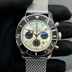
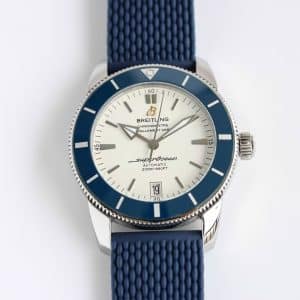
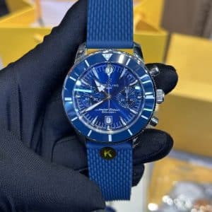
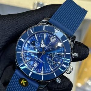
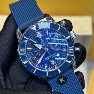
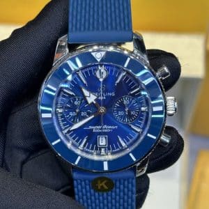
The dial tone stays deep in shade, then opens outdoors with a controlled gradient. The bezel adds a smooth, ceramic-like gloss effect without turning the front of the watch overly reflective. Together, the blue dial, glossy bezel, applied markers, and chronograph sub-dials create a balanced sports-watch look.
The overall effect is rhythm, not noise.
2. Wrist Presence and Chronograph Layout
On the wrist, the rubber strap gives this Superocean Heritage Chronograph configuration a lighter, more casual wear profile than a bracelet-focused version. The chronograph layout remains the main visual feature, but the sub-dials are kept close enough to the dial tone that the face does not become overly busy.
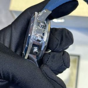
Pushers are described with deliberate resistance.
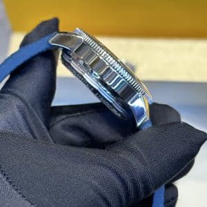
The crown has visible grip detail.
The chronograph registers should be reviewed for clean spacing and even alignment in QC photos.
For buyers comparing K Factory versions, the appeal here is not unsupported mechanical specification. It is the combination of blue-dial control, readable sub-dial separation, and rubber-strap sports wearability.
3. Light Interaction: Subtle, Predictable, and Comfortable
Indoor lighting
The dial deepens toward a darker blue. The sub-dials settle into the surface rather than standing out sharply, giving the watch a calmer, more even appearance.
Direct sunlight
The brushing becomes more visible without creating a harsh glare effect. The hands and applied markers remain important QC points because they carry much of the dial readability under stronger light.
Evening / low light
The watch shifts into a darker profile. The bezel outline can appear more defined as the dial becomes lower contrast, helping the case and dial shape stay visually clear.
This light behavior is a key reason to consider this blue-dial configuration if you want a sports chronograph that feels controlled rather than loud.
4. K Factory Character and QC-Focused Details
K Factory positioning on this replica edition is best understood through visible finishing and layout details rather than unsupported claims of perfect replication. The main buyer-facing points to review are:
-
Dial printing should look crisp, centered, and stable around the chronograph scales
-
Sub-dials should show clean spacing and consistent depth separation
-
Applied markers should appear evenly placed and similarly polished
-
The blue tone should remain controlled across indoor, outdoor, and angled-light photos
-
Crystal clarity should be checked under bright light for distortion, haze, or distracting reflection
This is a China replica sports chronograph where the practical evaluation should focus on visual coherence: dial tone, bezel reflection, marker alignment, hand placement, and how calmly the chronograph layout reads.
5. Strap Behavior: Why the Rubber Strap Matters
The rubber strap changes the character of the watch. It moves the Superocean Heritage Chronograph away from a dress-first profile and toward daily sports wear.
Useful buyer-fit points include:
-
Lighter wrist feel than many bracelet-style configurations
-
More secure-feeling strap contact during casual daily movement
-
Cleaner visual continuity with the blue dial and bezel tone
-
A more relaxed profile for warm-weather, commuting, and smart-casual use
A mesh or steel bracelet can give this model family a more formal presence, but this rubber-strap version is better suited to buyers who want the blue chronograph look to stay sporty and easy to wear.
6. Daily-use Scenarios
Workday / indoors
The dial stays controlled and readable.
Chronograph sub-dials remain present without turning the face into a high-contrast cluster.
Driving or commuting
Bezel reflection is intended to soften rather than flash strongly.
Hands and markers should still be checked in angled-light photos for quick legibility.
Outdoor weekend
The blue tone opens gently.
The rubber strap keeps the watch in a casual sports-watch lane.
Evening dinner
The strap keeps the profile relaxed.
The polished case and glossy bezel provide enough presence for smart-casual use without making the watch feel dress-first.
This configuration is best for buyers who want a blue sports chronograph with a calmer dial rhythm and a lighter wrist feel.
7. Neutral Buyer-Fit Notes
This K Factory China replica edition suits buyers who are comparing Superocean Heritage Chronograph versions and want a blue dial, rubber strap, and readable chronograph layout. The main strengths are visual balance, controlled light response, and practical sports-watch wearability.
It may be less suitable if you prefer a dress-focused bracelet feel, a simpler three-hand dial, or fully verified mechanical specifications before purchase. The blue tone can shift with lighting and camera angle, so QC photos should be used to confirm dial color, bezel alignment, hand placement, marker finishing, sub-dial spacing, pusher finish, crown grip, and crystal clarity.
Design Background
This K Factory China replica edition takes the Superocean Heritage Chronograph formula and shifts it toward a steadier blue-dial presentation. The dial is described as deep in shade and more open in brighter light, with the glossy bezel adding contrast without turning the face overly reflective. That makes the model read as a sports chronograph with controlled visual rhythm rather than a high-noise dial.
The chronograph layout is the main structure on the watch face, so balance matters more here than on a simple three-hand model. Applied markers, crisp dial printing, and the spacing around the sub-dials are the points that give this blue version its order. In photos, the goal is a calm separation between the blue field, the registers, and the bezel line, not a crowded or flattened look.
The rubber strap changes the wear profile in a practical way. It keeps the watch in a more casual, everyday sports category and is better aligned with buyers who want lighter wrist feel and easier daily use than a bracelet-heavy configuration. The case shape, movement, case size, thickness, and crystal material are not specified in the provided source, so those details should be confirmed from the listing data or QC photos if they matter to your comparison.
This version is most relevant for buyers comparing Superocean Heritage chronograph variants who want a blue dial with controlled light behavior, readable sub-dial separation, and a strap setup that stays comfortable for office wear, commuting, and warm-weather use. The main QC checks are straightforward: hand placement, marker alignment, dial print, bezel alignment, pusher finish, crown grip, reflection consistency, and crystal clarity under angled light.
Watch Specifications
- Factory version
- K Factory China replica edition
- Movement
- Not specified on this product page
- Case size
- Not specified on this product page
- Thickness
- Not specified on this product page
- Bracelet / strap
- Rubber strap
- Crystal
- Not specified on this product page
- Dial details
- Blue dial with chronograph sub-dials, applied markers, and controlled light response
- Bezel
- Glossy bezel with a ceramic-like visual effect; exact material not specified
- Caseback
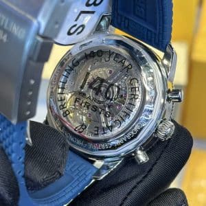
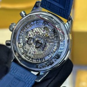
- Not specified on this product page
- Model / reference family
- Breitling Superocean Heritage Chronograph family
- Colorway
- Blue dial
- QC focus
- Dial print, hand placement, marker alignment, sub-dial spacing, pusher finish, crown grip, bezel alignment, reflection consistency, and crystal clarity
Watch Evaluation Highlights
K Factory Version
This K Factory China replica edition is best evaluated through visible layout control rather than unsupported specification claims. The key factory-version check is whether the blue dial, chronograph registers, bezel reflection, and applied markers stay visually balanced across the supplied photos.
Blue Dial Behavior
The main distinction is the calmer blue presentation. The dial is described as deeper in shade and more open in brighter light, so buyers should confirm that the color shift looks controlled instead of patchy, overly bright, or inconsistent between angles.
Chronograph Readability
The sub-dials are central to the Superocean Heritage Chronograph look, but they should not crowd the face. In QC photos, review sub-dial spacing, hand placement, dial printing, and marker alignment to confirm the layout remains readable and even.
Rubber Strap Profile
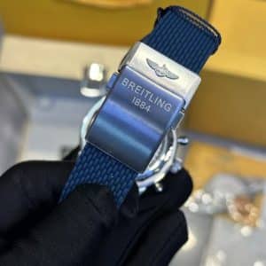
The rubber strap moves this version toward casual sports wear rather than a dress-first bracelet profile. It is a better fit for buyers who want a lighter daily-wear feel with the blue chronograph design, while bracelet feel and clasp details should be treated as separate comparison points.
Bezel and Crystal Checks
The bezel is described as having a glossy, ceramic-like visual effect, but the exact material is not specified. Check angled-light photos for bezel alignment, reflection consistency, crystal clarity, haze, distortion, or glare that could affect the calm dial presentation.
Unverified Specs
Movement, case size, thickness, crystal material, water-resistance rating, and exact reference details are not provided in the source data. Buyers who need those points confirmed should treat them as inspection or listing-confirmation items rather than assumed product facts.
Known Flaws
- Blue dial tone under different light: Inspect the dial in indoor, outdoor, and angled-light photos because the blue is meant to stay controlled, but it will still shift with lighting and camera angle. This matters if you are choosing between factory versions by color balance rather than by overall style. Seriousness: moderate for color-sensitive buyers, low for buyers focused mainly on wearability.
- Chronograph sub-dial spacing and hand alignment: Check that the sub-dials sit evenly and that the hands are centered cleanly at rest and during reset, since the chronograph layout is denser than a simple three-hand watch. This matters because small alignment errors are the first thing that can make the dial feel off. Seriousness: moderate.
- Dial print and applied markers: Confirm that the printing is crisp and that the markers are aligned consistently around the dial. This affects how calm and readable the watch looks, especially on a blue dial where small printing issues can stand out more clearly. Seriousness: moderate to high for QC-focused buyers.
- Bezel reflection and alignment: Review the bezel edge and its glossy finish for even reflection and clean alignment in photos. This matters because the bezel contributes a lot of the front-facing visual balance, and uneven reflection can make the watch look less composed. Seriousness: moderate.
- Pusher feel and crown grip cues: Look for visual signs that the pushers have clean, even action and that the crown grip is finished neatly. These details do not confirm movement behavior, but they do help judge overall assembly quality and factory consistency. Seriousness: moderate.
- Crystal clarity and distortion: Inspect for haze, glare, or lens distortion in bright-light photos. This matters because the design depends on controlled light behavior, and poor crystal presentation can break that effect quickly. Seriousness: moderate.
Superocean models often appeal to collectors who prefer a design shaped by clarity and functional purpose. Much of the line’s identity comes from how its bezel texture, dial contrast, and case profile work together to maintain strong legibility in a variety of lighting conditions, not just underwater. For many wearers, the charm lies in how these practical details translate into a watch that feels capable without being overly imposing.
Because factors such as bezel action, dial printing depth, and bracelet stability can noticeably influence how a Superocean behaves in day-to-day use, it is often helpful to compare versions by focusing on real-world ergonomics rather than specifications alone. This Breitling super clone buying guide offers broader context on design tendencies across the brand, helping you understand which elements tend to matter most as you refine your preferences over time.