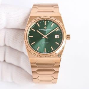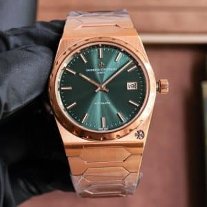
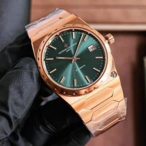
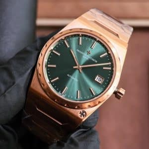
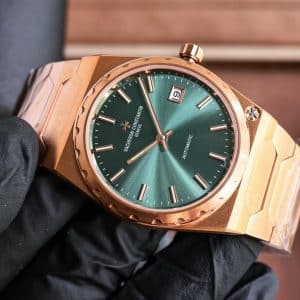

The first hours reveal how restrained this watch feels in motion. Time reading is not instant. The green dial shifts constantly, from deep forest to muted olive depending on angle and light. While walking, quick glances often catch the applied markers before the hands, requiring a second look to confirm the time. The integrated bracelet keeps the watch centered, but because it behaves as a single structure, wrist rotation feels intentional rather than fluid. Under a shirt cuff, the case slides in cleanly, though the bracelet edges occasionally remind you of their angular geometry when the wrist bends.
The design intent feels rooted in refusal rather than adaptation. Nothing here compensates for modern expectations of contrast or ergonomic softness. The dial spacing leaves generous negative space, which calms the eye but slows interpretation. The date window is small, framed, and slightly recessed, never demanding attention. This watch does not rush to be read. It accepts being checked twice, sometimes three times, without apology.
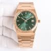
In morning daylight, the dial appears subdued and textured. The brushed surface softens reflections, allowing the rose gold indices to cast shallow, shifting shadows. The minute track remains peripheral, present without asserting itself. Under office LED lighting, the green cools and flattens slightly, and the hands can briefly blend when aligned with markers near the top half of the dial. In evening ambient light, the dial recedes further, and the rose gold case and bracelet define the watch’s presence more than the time itself.
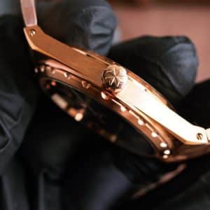
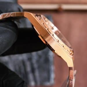
The case architecture determines how the watch negotiates the wrist. The notched bezel breaks reflections into short flashes, while the mid-case remains brushed and quiet. There is little curvature designed to accommodate the wrist automatically. Instead, the watch expects adaptation. Traditional lug articulation does not exist, so movement causes the entire watch to shift as one unit. Compared with modern Vacheron Constantin lines, this case does not disappear. It holds position. Subtle traces of guangzhou watchmaking appear in the edge finishing, where transitions are slightly softened to avoid sharpness without losing definition.
Interaction with the movement becomes minimal after the first setup. The crown is small and close to the case, requiring intention rather than convenience. Winding resistance feels light but controlled, encouraging brief interaction instead of extended handling. Once set, days pass without touching the crown again. The watch becomes something you observe rather than manage.
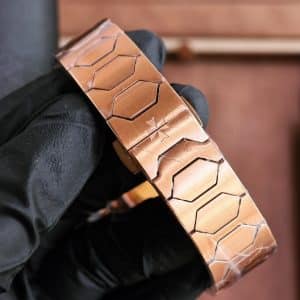
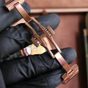
The integrated bracelet defines long-term wear more than the case itself. Its width remains consistent from case to clasp, reinforcing the watch’s architectural stance. Initially rigid, it loosens slightly with time but never drapes. Seasonal comfort shifts noticeably. In warmer conditions, the rose gold feels warm and grounding against the skin. In cooler air, it sharpens awareness of contact. This behavior mirrors the watch’s overall restraint, never softening itself fully for comfort.
From a factory execution perspective, VC+ factory Historiques 4200H/000R-9359 executions tend to prioritize case and bracelet silhouette accuracy. The brushing on the bracelet is even, though transitions between brushed and polished surfaces are marginally softer under close inspection. Dial color can vary under cooler artificial light, appearing darker and less saturated than expected, while marker alignment remains consistent. The overall impression is controlled rather than expressive, closer to discipline than display.
One ordinary moment occurred around 8:10 AM on a subway platform under diffuse fluorescent lighting. Holding a phone in one hand, I glanced down and had to stop walking to confirm the time, as the hands briefly disappeared into the dial. Another moment came at 12:30 PM in a café with indirect daylight. While reaching for a cup, a narrow band of light crossed the dial, briefly revealing a brighter green before it returned to restraint as my wrist relaxed.
Later that evening, around 6:45 PM, seated at a desk under warm indoor light, the watch felt quieter. The bracelet reflected the room softly, while the dial remained reserved, almost withdrawn. The time was present, but it did not insist on being read. That quiet persistence defines daily wear more than any single feature.
A second everyday scene unfolded at 3:20 PM in an office corridor with mixed natural and artificial light. Walking quickly between rooms, I glanced down and misread the minute hand by several minutes before stopping to look again. That hesitation repeated itself throughout the day. It never became frustrating. It simply became part of wearing the watch.
This watch suits someone comfortable with integrated designs and restrained legibility. It favors wearers who accept slower reading and prefer proportion over optimization. It is not forgiving of haste, and it does not attempt to be adaptable in every context. That intentional inconvenience becomes part of its character.
Compared neutrally to an original, this Historiques replica maintains similar tension in case proportions and bracelet rigidity. Dial depth feels slightly less nuanced, case edges marginally softer, and crown resistance lighter. The rhythm of wear, however, remains closely aligned, with the same requirement for attention and patience that defines the model. As a china super clone Historiques, it mirrors the original’s refusal to prioritize speed.
Near the end of the day, it becomes clear that this is not a watch designed to be glanced at and forgotten. It remains present, quietly insisting on engagement rather than urgency. That quality does not suit everyone, but for those comfortable with restraint, it becomes quietly persuasive.
I see this model as a watch that rewards attention rather than speed, but that is only my view — the choice is yours.
| Category | Original Historiques | Factory Version |
|---|---|---|
| Model Code | 4200H/000R-9359 | VC+ factory Historiques 4200H/000R-9359 china super clone |
| Case Size | 37mm | 37mm |
| Dial Orientation | Symmetrical, minimal | Same layout with slight visual shift |
| Case Profile | Flat planes, sharp edges | Slightly softened transitions |
| Crown Feel | Firm, compact | Lighter resistance |
| Strap Proportion | Integrated gold bracelet | Similar width with firm articulation |
| Light Behavior | Warm, nuanced green | Slightly darker under LED |
| Daily Interaction | Slow, intentional | Comparable rhythm |
Watch Specifications
- Factory version
- VC+ Factory
- Movement
- Not specified on this product page
- Case size
- 37mm
- Thickness
- Close to 8mm thick, based on the short description
- Bracelet / strap
- Integrated bracelet with continuous case-to-bracelet geometry
- Crystal
- Not specified on this product page
- Dial details
- Radially brushed green dial, darker at the edges, with applied markers and a small framed date window
- Bezel
- Notched bezel styling
- Caseback
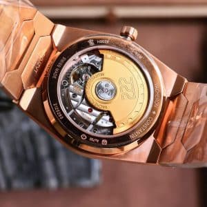
- Not specified on this product page
- Model / reference family
- Vacheron Constantin Historiques 4200H/000R-9359 style
- Colorway
- Green dial with rose gold case presentation
- QC focus
- Check dial color consistency, marker alignment, hand visibility, date centering, bezel symmetry, case edge definition, bracelet link alignment, and clasp finishing if visible
Design Background
This VC+ Factory Vacheron Constantin Historiques 4200H/000R-9359 style replica is centered on the compact 222-style integrated-bracelet format. The 37mm case and close-to-8mm thickness give it a lower, more restrained profile than larger modern integrated designs, so the appeal comes from proportion, case geometry, and bracelet continuity rather than oversized wrist presence.
The green dial is a key part of this version’s character. Its radially brushed surface is described as darker at the edges, with applied markers and a small framed date window keeping the layout minimal. Buyers should expect a more subdued read than a high-contrast tool watch, especially because the rose gold case presentation and dial tone can make hand visibility dependent on angle and lighting.
The case shape uses a notched bezel and flat architectural lines that continue into the integrated bracelet. VC+ Factory is positioned here around case and bracelet silhouette execution, so the most useful comparison points are bezel symmetry, edge definition, brushed-to-polished transitions, bracelet link alignment, and how smoothly the bracelet continues from the case.
Movement and crystal details are not specified on this product page, so this version is best judged through visible QC photos rather than undocumented technical claims. It is most relevant for buyers who want a compact green-dial, rose-gold-tone Historiques 222 style watch with integrated-bracelet geometry, and less suitable for buyers who need full movement, crystal, or water-resistance specifications before deciding.
Watch Evaluation Highlights
VC+ Factory Focus
VC+ Factory is best evaluated here through the case and integrated bracelet silhouette. Check QC photos for bezel symmetry, case edge definition, brushed-to-polished transitions, and how cleanly the bracelet continues from the case.
Compact 37mm Profile
The 37mm case gives this Historiques 4200H/000R-9359 style watch a compact, vintage-proportioned stance. It suits buyers who prefer controlled wrist presence over a larger modern integrated-bracelet fit.
Close-to-8mm Thickness
The short description places the watch close to 8mm thick, supporting a low case profile. Treat this as an approximate page-stated figure and confirm the visual slimness through side-angle QC images.
Green Dial Legibility
The radially brushed green dial is described as darker at the edges, with applied markers and a small framed date window. Buyers should inspect hand contrast, marker alignment, dial color consistency, and date centering under available QC lighting.
Integrated Bracelet Geometry
The bracelet continues the case architecture rather than reading as a separate strap. This creates a deliberate integrated look, but buyers should expect a firmer wearing feel than a highly flexible bracelet and should review link alignment and clasp finishing if shown.
Unspecified Technical Areas
Movement, crystal, exact material construction, clasp type, and water resistance are not specified on this product page. Those points should be treated as confirmation items rather than assumed specifications.
Known Flaws
- Inspect the green dial under the available QC lighting for color consistency, radial brushing, and hand contrast. This matters because the darker edge tone and rose-gold-tone hands can reduce instant legibility in cooler or low light. For most buyers, this is a moderate usability concern rather than a deal-breaker if the dial finish is even.
- Check applied marker alignment and dial print spacing around the minute track. Small shifts are easier to notice on a restrained, open dial layout, especially when the markers catch more light than the hands. Minor variance is usually low to moderate in seriousness, but uneven markers should be questioned before approval.
- Review the small framed date window for centering, level placement, and clean edge finishing. The date is a subtle part of this design, so a tilted or crowded date display can stand out more than expected. This is a moderate QC point because it affects the dial balance even if time reading remains usable.
- Look closely at the notched bezel, case edges, and brushed-to-polished transitions. The product copy notes that transitions may appear slightly softened under close inspection, so QC photos should confirm that the geometry still looks controlled and symmetrical. For most buyers, this is a low to moderate finishing concern unless the softening is visibly uneven.
- Inspect the integrated bracelet fit where it meets the case, including link alignment and clasp finishing if shown. This matters because the bracelet is central to the Historiques 222-style silhouette and a rigid integrated bracelet can make gaps or uneven links more noticeable. Seriousness is moderate for buyers sensitive to case-to-bracelet continuity.
- Confirm crown seating and basic hand alignment in QC photos or setup checks. The crown is described as small and close to the case, and movement details are not specified, so visible setting behavior should be treated as a confirmation area. For most buyers this is a practical low to moderate concern unless the hands fail to align cleanly or the crown does not sit flush.
Vacheron Constantin’s Historiques Collection celebrates iconic designs from the brand’s past while adapting them to modern wearability. In the replica world, capturing the nuanced case contours, dial proportions, and vintage-style markers of these historic references is often what distinguishes a satisfying piece. For discerning buyers, these visual and tactile traits matter more in real use than abstract numbers on a product sheet.
When evaluating super clones within the Historiques lineup, pay close attention to the fidelity of the dial details, the feel of the crown and pushers (if present), and how the strap or bracelet complements the case lines. These elements often reveal how closely a replica echoes the spirit of the original. For broader context on what qualities to prioritize across Vacheron Constantin models, this Vacheron Constantin replica watches buying guide offers helpful insights to support informed comparisons and long-term satisfaction.