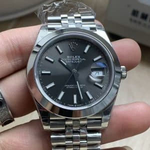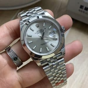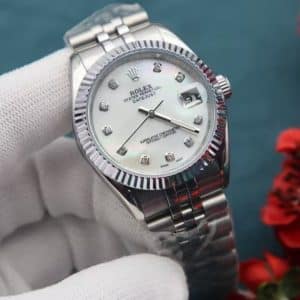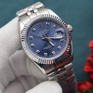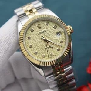
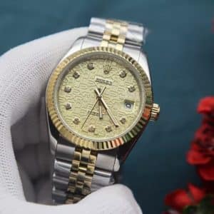


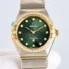

Working on two-tone pieces has its own challenges. Gold brings out every flaw, especially around the bezel. If the ridges aren’t cut evenly, the reflections instantly look wrong. So we machine these bezels in slower passes. It takes longer, but the result is cleaner — crisp lines that catch light in a way that feels sharp but not harsh. When you see it in natural light, the bezel almost looks animated, like it’s breathing with every small movement of your wrist.
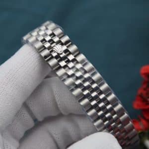
The bracelet is one of those parts that look simple until you try assembling one. Getting the center gold links to sit perfectly between the steel segments requires a certain rhythm. Too much pressure on the pins and the link loses its smooth drape; too little and you get a tiny rattle you can feel when you move your wrist. People don’t talk about these things when they review watches, but they matter. A watch can look expensive but feel cheap the moment the bracelet misbehaves. This one feels right — flexible, quiet, and balanced.
The dial is where the watch earns its personality. Gold can easily cross the line into loudness, but the patterned texture keeps it grounded. The diamonds aren’t oversized, and we deliberately avoid overly shiny settings. When you pair them with the patterned dial, the sparkle becomes more of an accent rather than the center of attention. In my experience, this dial works best for people who like gold but don’t want their watch to shout from across the room.
The movement inside is our usual daily-wear setup — not built for display through an open caseback, but built to stay dependable. Smooth winding, solid click feedback, and a rotor that doesn’t sound like it’s fighting the case. It’s the sort of movement you forget about in the best possible way. It just works. You can leave it on your dresser for a weekend and it’ll still feel alive when you pick it back up.
What I appreciate most about this piece is that it has character without requiring confidence. Some watches demand attention; this one keeps it. It looks elegant on a good shirt, but it doesn’t look out of place with a T-shirt. The two-tone finish adds presence, but the patterned dial softens the whole design, so it never feels like you’re trying too hard.
As someone who has assembled more watches than I can count, I enjoy when a piece reminds me why people love this style in the first place. It’s the little things — how the bezel catches morning sunlight, how the gold center links warm up against your skin, how the dial changes tone when you tilt your wrist. These aren’t dramatic features; they’re quiet moments. But they’re the moments that make you reach for the same watch again the next day.
If you’re looking for something that feels classic but not predictable, polished but not loud, this one tends to leave a lasting impression. Not because it demands it — but because it earns it slowly, wear after wear.
Design Background
This two-tone Datejust-style watch sits in the classic dress-watch space: a rounded case profile, ridged fluted-style bezel reflections, a gold-and-steel bracelet presentation, and a gold patterned dial that gives the watch more depth than a plain champagne-style dial. The design is best read as Datejust-style rather than official-brand affiliated, with the appeal centered on wrist presence, light play, and formal-casual versatility.
The dial layout is the main reason this version stands apart. The gold patterned surface changes character under light, while the diamond-style hour markers add controlled sparkle without turning the watch into a fully gem-set look. For buyers comparing similar replica Datejust-style pieces, this is the warmer and more decorative choice than a plain stick-marker dial, but still more restrained than an oversized or heavily iced dial.
The bracelet style matters almost as much as the dial. Gold-tone center links against steel-tone outer sections create the familiar two-tone formula, so QC photos should be used to judge color consistency, center-link alignment, end-link fit, and whether the bracelet appears tight and balanced. The fluted-style bezel should also be checked for even ridge spacing and clean reflections, because uneven finishing is more visible on this kind of bright two-tone design.
Factory version, exact movement caliber, case size, thickness, crystal type, case material, bracelet material, clasp type, and water-resistance rating are not verified in the provided product data. The source copy mentions smooth winding, click feedback, and rotor sound, but it does not identify a movement specification. This version attracts buyers who want a classic two-tone Datejust-style look with a warmer patterned dial and diamond-marker detail, while still reviewing the unconfirmed technical specifications before inquiry.
Watch Evaluation Highlights
Factory Version
The page language references a VSF-style bench perspective, but the provided product data does not verify an exact factory version. Treat factory identity as a confirmation point before ordering rather than a guaranteed specification.
Dial Details
The gold patterned dial is the strongest visual decision here. It should be checked in photos for centered pattern alignment, clean dial printing, even marker spacing, and diamond-style markers that look neatly set rather than oversized or uneven.
Movement Check
The description mentions smooth winding, click feedback, and rotor sound, but it does not identify the movement caliber. Ask for movement confirmation and, where possible, a short handling video if rotor noise or winding feel matters to you.
Bracelet Profile
The two-tone bracelet presentation uses gold-tone center links with steel-tone sections, so buyer review should focus on color consistency, center-link alignment, end-link fit, clasp closure, and whether the bracelet sits evenly without visible gaps.
Crystal and Bezel
The fluted-style bezel is a key part of the wrist presence, but bezel material and crystal type are not specified. QC photos should show even ridge spacing, clean light reflection, clear crystal visibility, and no obvious distortion around the dial edge.
Wearing Profile
This version suits buyers who want classic two-tone Datejust-style presence with a warmer dial and restrained marker sparkle. It is less suitable for buyers who prefer a low-key all-steel look or require fully verified technical specifications before inquiry.
Known Flaws
- Inspect the gold patterned dial for clean printing, centered texture, and even spacing around the chapter area. Patterned gold dials can make small print or alignment errors easier to notice under angled light, but this is usually a moderate concern unless the text or pattern visibly drifts.
- Check the diamond-style hour markers for straight placement, consistent height, and neat settings. Marker sparkle is part of this watch’s dress look, so uneven markers can distract from the dial; for most buyers this is a medium-priority QC point rather than a deal breaker if the layout looks balanced.
- Review the date window and cyclops area if visible in QC photos. A Datejust-style design draws attention to the date position, so date centering, magnification alignment, and edge clarity matter; slight variation is common in replica QC, while a badly tilted or off-center date is more serious.
- Look closely at the fluted-style bezel ridges and reflections. Two-tone watches make uneven ridge spacing or rough light play more visible, especially around the gold-tone bezel area; most buyers should treat obvious asymmetry as a high-priority issue because it affects the watch at first glance.
- Check bracelet fit, SEL fit, and the transition between gold-tone center links and steel-tone outer sections. This matters because bracelet rattle, uneven end-link gaps, or inconsistent gold tone can make an otherwise polished watch feel less refined; minor play is usually acceptable, but visible gaps or misaligned links should be questioned.
- Ask for a short handling video if movement feel or rotor sound matters to you. The source copy mentions smooth winding and rotor behavior, but no movement caliber is verified, so noisy winding, harsh rotor sound, or inconsistent hand/date setting would be a practical concern rather than a confirmed flaw.
Want a no-drama breakdown of super clone Rolex Datejust builds — from dial printing and fluted bezels to Jubilee bracelet comfort and daily accuracy? Our full Rolex replica guide walks through what actually matters before you pay.