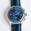
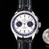
Dial Behavior and Light Reaction
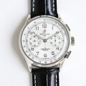
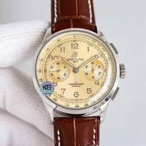
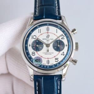
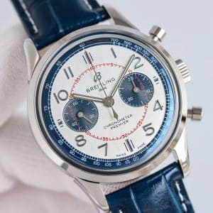
Silver dials are unforgiving: if the brushing is inconsistent, you see it immediately. KB factory handles this surprisingly well. The brushing runs clean from top to bottom, and each pass of the wrist reveals slight changes in tone — cooler near indoor lighting, warmer under natural sun.
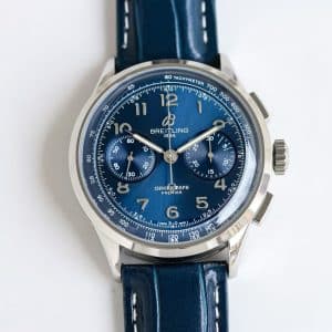
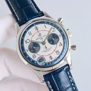
The blue tachymeter ring catches the eye next. Unlike polished steel, this blue doesn’t shine; it absorbs light in a controlled way, giving the dial a boundary that prevents the silver center from feeling too open. The blue subdials then anchor the composition, offering a darker contrast that enhances readability without feeling harsh.
When the wrist turns, the dial transitions in clean gradients — bright at the center, shadowed at the edges, with the blues maintaining depth at every angle.
Subdial Identity and Chronograph Readability
The navy subdials behave differently from the silver surface. They stay stable in tone, barely shifting under changing reflection. That steadiness keeps the chronograph function clear even when the silver dial becomes bright. Red accents in the seconds track introduce a subtle layer of energy — a small detail, but one that keeps the watch from feeling static.
KB’s printing on the subdials is crisp and even. No bleeding. No softness around the numerals. On a bi-color layout, poor printing becomes obvious, and here it holds its ground.
Case, Wrist Presence, and Daily Ease
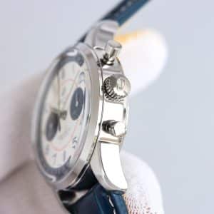
The Premier’s 42mm steel case has always been a comfortable shape, and this replica watch version from KB maintains the same proportions. The lugs drop sharply enough to follow the wrist, and the polished surfaces bring a clean contrast to the blue strap and dial accents.
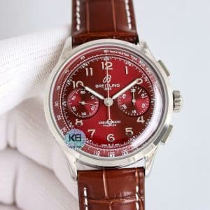
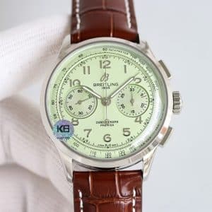
On the wrist, the watch wears brighter than the burgundy or green versions. It feels more present — not because it’s larger, but because the dial responds strongly to light. In a meeting room, it stays refined; outside, the brushed silver becomes noticeably more expressive.
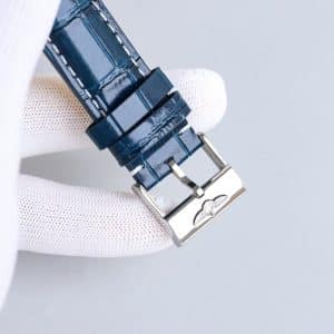
The blue leather strap is glossy but not slippery, and once it warms up, it sits securely without micro-shifting. That stability matters because bi-color dials look best when the watch stays centered.
Mechanical Feel and KB Factory Movement Behavior
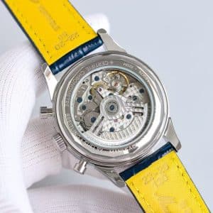
The KB movement behaves consistently with the rest of the Premier line:
-
Winding has a light mechanical grain
-
The rotor moves quietly, noticeable only when the wrist is still
-
Pusher resistance is firm and decisive rather than soft
Chronograph start-stop feels stable, with a clean click that avoids the mushiness some Guangzhou factories struggle with. Reset snaps precisely back to zero without drift.
This is a replica movement tuned for reliability rather than silent luxury. In daily use, that equation works — the watch feels predictable and mechanically honest.
How the Bi-Color Layout Changes the Wearing Experience
Every Premier color carries a different temperament. Burgundy feels warm. Green feels grounded. Silver-blue feels alert.
This version suits someone who likes visual precision: clean lines, defined contrasts, clear readability. If you enjoy seeing a dial change dramatically under light — silver brightening, blue deepening — this colorway lives for that moment.
It is expressive, but not loud. Technical in tone, but not cold. Whether that energy fits your day-to-day rhythm is something only you can decide.
Neutral Differences vs Genuine Premier
Under a loupe, the Swiss model shows finer brushing density on the silver center, with a slightly smoother transition into the chapter ring. The blue on the genuine tachymeter is marginally softer and more matte. Pusher action on the original is gentler and more cushioned.
KB’s interpretation is brighter, slightly more contrast-driven, and visually sharper — which some buyers may actually prefer.
Final View
My honest take: this KB silver-blue Premier behaves like a confident, clear-cut chronograph. The light play is immediate, the contrast is strong without being aggressive, and the watch wears with a crisp presence that stays interesting throughout the day. Whether this bright, structured personality matches your style is a decision only you can make.
Comparison Table — Genuine vs KB Factory Blue-Silver Premier
| Feature | Genuine Breitling Premier | KB Factory Super Clone |
|---|---|---|
| Case Diameter | 42mm | 42mm |
| Case Thickness | ~13.0mm | Slightly above 13mm |
| Dial Finish | Fine vertical brushing | Clean brushing, slightly bolder |
| Dial Tone | Softer silver transitions | Brighter, higher contrast |
| Tachymeter Ring | Matte, soft blue | Slightly deeper, glossier blue |
| Subdials | Smooth navy | Dark navy, stable tone |
| Pusher Feel | Softer, cushioned | Firm, decisive |
| Winding | Smooth | Light mechanical grain |
| Printing Quality | Extremely fine | Crisp and consistent |
| Rotor Noise | Very low | Quiet with mild presence |
| Strap | Swiss calf | Glossy Guangzhou leather |
Premier models tend to appeal to collectors who prefer a cleaner, more composed presentation rather than an overtly technical aesthetic. The character of the line often comes from how its case proportions, dial layout, and finishing details work together to create a calmer, more adaptable presence on the wrist.
Because small differences in dial balance, case curvature, and bracelet feel can meaningfully shape the wearing experience, it is often helpful to compare versions with a focus on how they behave in everyday settings rather than on specifications alone. This Breitling super clone buying guide provides a wider context for understanding how different Breitling families relate to one another, making it easier to refine your preferences over time.