How the Champagne Dial Behaves in Real Light
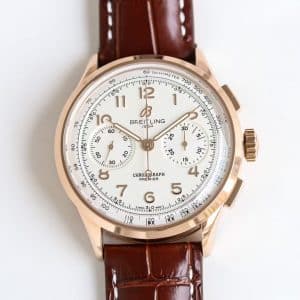
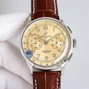
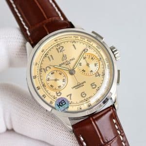
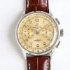
Champagne is one of the hardest tones for Guangzhou workshops to reproduce because it requires restraint. Too much yellow and it feels artificial; too much white and it loses its identity. The KB factory version walks the same careful line the genuine model uses — soft, low-saturation warmth.
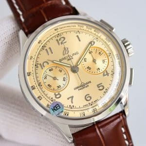
Under indoor light around 8:40 AM, the dial shows a pale golden layer that feels almost matte, though it reacts to small wrist movements with subtle highlights. In outdoor brightness, it becomes more reflective, creating a gentle halo effect rather than a hard shine. The effect is surprisingly sophisticated for a replica, especially compared to the common yellow-heavy attempts from lower-tier factories.
The champagne tone also makes the numerals stand out without harsh contrast. Their raised edges catch small glints of white as the wrist moves, helping the watch retain legibility even as the dial warms in color.
Subdial Texture and the Quiet Structure of the Layout
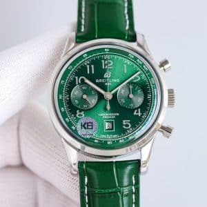
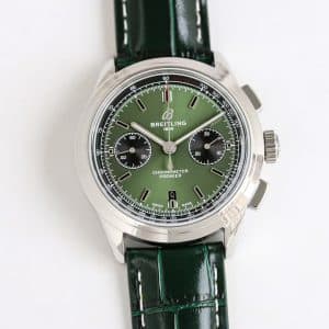
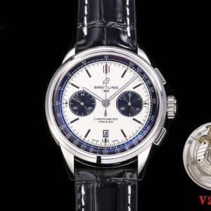
Unlike the ruby-red or blue Premier versions, the subdials here blend rather than contrast. They sit only half a shade deeper than the main dial, giving the face a continuous appearance. This design choice makes the watch feel calmer, more uniform, almost as if it were carved from a single surface.
The concentric texture on the subdials still does its job: giving the chronograph functions clarity when viewed up close. But from a normal viewing distance, the champagne color absorbs the texture into the background, letting the hands and numerals do the visual work.
That unified tone is what gives this version its relaxed character.
Case, Wrist Comfort, and Strap Interaction
The 42mm stainless-steel case behaves exactly as it does across the KB Premier series — softly curved lugs, balanced weight, consistent polishing. On the wrist, the champagne dial amps up the sense of refinement. Where the red and green feel expressive, this one settles into an almost quiet confidence.
The brown leather strap introduces warmth that supports the dial rather than competing with it. Together, the strap and dial build a palette that feels grounded and familiar, the kind of watch that looks natural whether paired with a shirt cuff or a simple T-shirt.
As the watch warms through the day, the dial tone deepens slightly, shifting toward a creamier gold in the afternoon light. That change is subtle but noticeable, and it adds a layer of “living texture” that feels surprisingly thoughtful for a KB factory replica.
Mechanical Feel and Chronograph Behavior
The tactile behavior is consistent with KB’s other Premier 42 pieces:
-
Winding has a light, even grain
-
Pusher feedback comes with a clear, mechanical snap
-
Reset returns reliably to zero without hesitation
On the champagne dial version, the movement’s steadiness contributes to the overall personality of the watch. Because the color scheme is quieter and smoother than other variants, the mechanical clicks stand out more — not loudly, but distinctly. It creates a balance between soft visual presence and firm mechanical response.
Rotor sound stays minimal, and most wearers won’t notice it unless the wrist is completely still.
Daily Scenes and How the Dial Lives With Them
At 7:20 AM, the champagne dial appears almost cream-colored, absorbing cool indoor light. The watch looks unassuming — something you can wear without thinking.
At 1:10 PM, outdoor sunlight brightens the dial from the center outward. The soft gold tone becomes more noticeable, but remains gentle rather than flashy.
At 9:00 PM, warm indoor lighting turns the dial into a deeper champagne, almost like the warmth of a candle-lit surface. It becomes more intimate, more vintage in personality.
This is a watch that follows the light quietly rather than dominating it.
Who the Champagne Premier Suits
The champagne Premier is for someone who wants warmth without excess, personality without attention-seeking. If you enjoy watches that feel smooth, calm, and subtly expressive, this colorway fits naturally into that space.
It won’t appeal to someone who prefers strong contrast or vivid tones — but that’s exactly what makes this version valuable. It’s understated in a way many modern watches are not.
Whether that softer temperament resonates with your own style is something only you can decide.
Genuine vs KB: Nuanced Differences
On the real Breitling Premier, the champagne tone carries a slightly finer metallic grain, and the gradient is smoother when transitioning into shadow. The KB factory version is extremely close, but leans a touch brighter in direct light.
Printing precision is consistent with KB’s recent improvements — clean, centered, no feathering. The genuine model’s pusher action, as expected, feels more cushioned, while the KB version is firmer and more mechanical.
Both tell the same story, only with slightly different accents.
Final Thought
My honest view: the KB factory champagne Premier is one of the most wearable and quietly refined members of the Premier lineup. Its charm comes from restraint — a dial that changes with the light but never demands attention, a color that feels warm without glitter, and a mechanical behavior that stays steady throughout the day. If you want a chronograph that blends into your rhythm while still offering depth when you look closely, this version delivers that experience. Whether its calm presence suits your daily style remains entirely your choice.
Comparison Table — Genuine vs KB Factory Champagne Premier
| Feature | Genuine Breitling Premier | KB Factory Super Clone |
|---|---|---|
| Case Diameter | 42mm | 42mm |
| Case Thickness | ~13.0mm | Slightly above 13mm |
| Dial Tone | Softer champagne with ultra-fine grain | Slightly brighter champagne, clean grain |
| Subdial Contrast | Minimal, blended | Slightly deeper tone, still unified |
| Printing Quality | Very fine line weight | Crisp, slightly thicker |
| Pusher Feel | Smooth, cushioned | Firmer mechanical click |
| Winding Texture | Smooth | Light, even grain |
| Rotor Noise | Minimal | Quiet with mild presence |
| Strap | Swiss calf | Guangzhou leather (brown) |
Premier models tend to appeal to collectors who prefer a cleaner, more composed presentation rather than an overtly technical aesthetic. The character of the line often comes from how its case proportions, dial layout, and finishing details work together to create a calmer, more adaptable presence on the wrist.
Because small differences in dial balance, case curvature, and bracelet feel can meaningfully shape the wearing experience, it is often helpful to compare versions with a focus on how they behave in everyday settings rather than on specifications alone. This Breitling super clone buying guide provides a wider context for understanding how different Breitling families relate to one another, making it easier to refine your preferences over time.