Presence and First-Wear Behavior
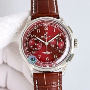
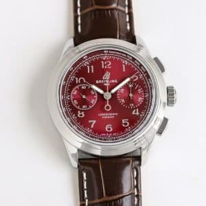
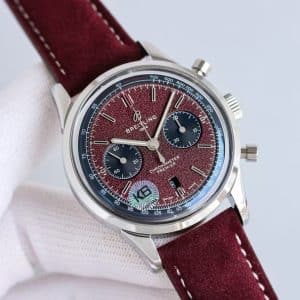
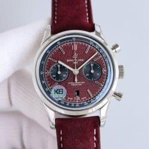
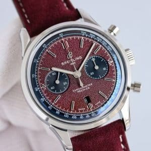
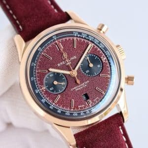
The grain texture is the first thing you notice once the watch turns under light. It does not shimmer the way a sunburst dial does. Instead, it breaks the reflection into small, controlled highlights, making the watch feel quieter yet more detailed. The burgundy tone itself has range — deep and muted indoors, brighter and more pronounced near a window or under natural light.
When the watch sits on the wrist for the first few minutes, the suede strap remains firm and structured. As it warms, the material softens and molds slightly around the wrist bone. That transition, from cool suede to warm pliability, reinforces the calm, grounded character of this Premier.
Dial Texture, Color Reaction, and Subdial Contrast
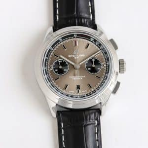
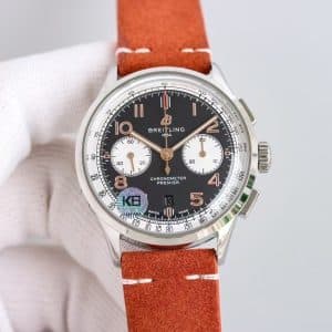
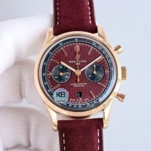
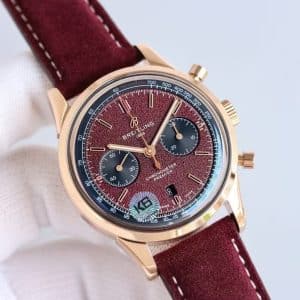
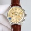
This is the only Premier colorway from KB with a sand-grain texture, and the effect shows immediately. Under soft light, the dial looks matte. Under stronger light, it reveals tiny reflective grains that catch light moment by moment. The texture deepens the burgundy tone, preventing it from ever appearing too bright or too flat.
The navy-toned subdials contrast just enough to separate function from color. They behave with a different light response — smoother, more even — which keeps the chronograph layout readable in motion. As you raise and rotate the wrist, the dial transitions from dark wine to a lighter crimson edge, while the subdials remain stable anchors.
KB factory’s printing remains crisp at all points, even with the textured surface beneath it. Nothing bleeds or sinks into the grains.
Case Feel and Daily Wrist Experience
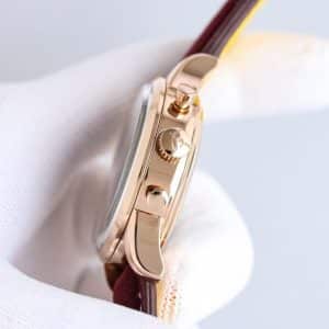
The Premier case in 42mm has always been one of Breitling’s easiest chronographs to wear, and KB holds that shape accurately. The lugs drop just enough to help the watch sit flat. The polishing is bright in typical KB fashion, which works well with the burgundy tone — the dial absorbs light while the case returns it.
During day-to-day movements — lifting a sleeve, placing a hand on a steering wheel, typing — the watch stays controlled and steady. The suede strap reduces micro-slippage, making the watch feel more planted than the leather versions.
The pushers offer firm, deliberate resistance. The chronograph does not start softly; it starts decisively. The crown has a clean, shallow grip, and winding produces a light, mechanical grain that feels consistent across the KB Premier series.
Movement Behavior and Mechanical Response
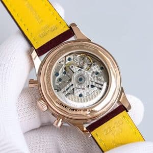
KB’s movement setup behaves predictably:
-
Winding has a tactile, lightly textured feel
-
The rotor shifts softly, noticeable only when the wrist is still
-
Chronograph engagement snaps in with confidence, not mush
The replica movement inside is tuned for reliability rather than silent luxury, and in practice that serves a burgundy-dialed dress-chronograph well. There is no harshness, no looseness — just steady resistance and smooth reset alignment.
Strap Comfort and Long-Term Aging
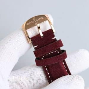
The burgundy suede strap reinforces the watch’s softer visual texture while giving it a firm wrist presence. Early wear keeps the strap structured, almost rigid; after several days, the suede develops subtle creases that make the watch feel more personal and less new.
This strap-darkening effect — where the leather picks up natural oils and deepens in color — works beautifully with the burgundy dial. Over time, the whole watch gains a slight patina without becoming aged.
Factory Interpretation and Execution Logic
KB factory’s strengths show clearly on this dial:
-
Steel polishing is bright, clean, and sharp at the lug transitions
-
The grain dial texture is even, with consistent particle density
-
Subdial color separation is strong without feeling aggressive
-
Printing clarity remains sharp despite the textured surface
-
Pushers behave with KB’s typical firm engagement
Compared with BLS, KB’s burgundy tone is deeper and less glossy. Compared with GF, the texture is more refined and the subdials better aligned. Compared with GR, the overall finishing and dial uniformity feel more disciplined.
Wearing Impressions in Real Light
Morning light gives the dial a cooler wine tone.
Midday light reveals the full texture, bringing out finer reflections.
Evening indoor light turns the watch into a deep, velvety red with almost no glare.
The watch never looks flat and never looks overly shiny — it lives in a space between refinement and subtle aggression, which suits the Premier identity well.
Who This Burgundy Premier Suits
This version fits someone who likes character but avoids flash. Someone who values color but prefers depth over brightness. Someone who wants a chronograph that reads vintage without leaning into nostalgic clichés.
It is a calm watch with strong personality — expressive in color, disciplined in structure. Whether that balance speaks to your taste is something only you can answer.
Neutral Differences vs Genuine Premier
The real Premier has a subtler grain texture with more micro-gradients in the burgundy shade. The Swiss pushers feel slightly softer. Case finishing is more balanced — less bright, more refined. Subdial printing on the genuine model has marginally sharper edges.
KB’s version captures the presence and behavior well but offers a stronger, more vivid tone.
Final View
My take: the KB burgundy Premier behaves like a textured, emotionally warm chronograph with unusual depth for its price tier. It reacts to light with restraint, carries color confidently, and feels structurally sound on the wrist. Whether this textured burgundy character fits your daily rhythm is a choice only you can make.
Comparison Table — Genuine vs KB Factory Burgundy Premier
| Feature | Genuine Breitling Premier | KB Factory Super Clone Premier |
|---|---|---|
| Case Diameter | 42mm | 42mm |
| Case Thickness | ~13.0mm | Slightly above 13mm |
| Dial Surface | Micro-grain, layered | Even grain, slightly bolder |
| Dial Color | Deep burgundy with soft gradient | Rich wine tone, more vivid |
| Subdials | High relief, tight edges | Clean, slightly flatter |
| Steel Finish | Polished with subtle transitions | Brighter KB polishing |
| Pusher Feel | Softer, refined | Firm, mechanical |
| Winding Texture | Smooth | Light grain |
| Rotor Noise | Very low | Soft but audible in quiet rooms |
| Printing | Ultra crisp | Sharp with minor texture interaction |
| Strap | Swiss calf or suede | Structured Guangzhou suede |
| Wearing Personality | Deep, quiet elegance | Warm, textured presence |
Premier models tend to appeal to collectors who prefer a cleaner, more composed presentation rather than an overtly technical aesthetic. The character of the line often comes from how its case proportions, dial layout, and finishing details work together to create a calmer, more adaptable presence on the wrist.
Because small differences in dial balance, case curvature, and bracelet feel can meaningfully shape the wearing experience, it is often helpful to compare versions with a focus on how they behave in everyday settings rather than on specifications alone. This Breitling super clone buying guide provides a wider context for understanding how different Breitling families relate to one another, making it easier to refine your preferences over time.