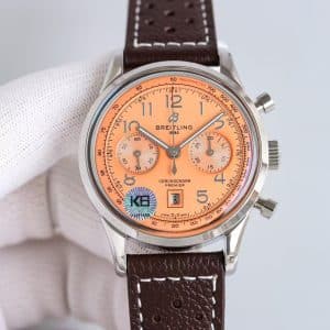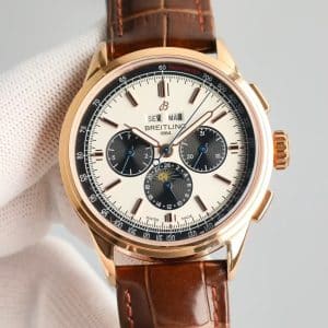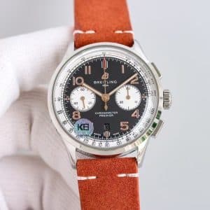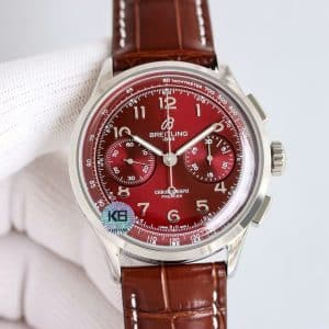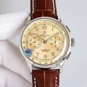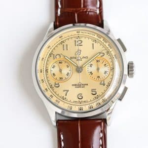
How the Green Dial Behaves in Light
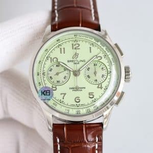
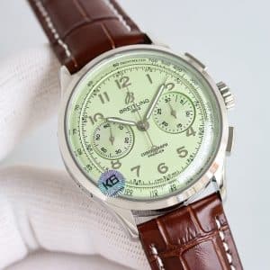
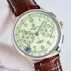
This pastel tone reacts quietly. Under natural sun, the dial brightens into a clean mint green, while indoor lighting pushes it toward a softer, cream-green wash. It’s not metallic, so you don’t see harsh flashes — instead, the dial breathes, opening and closing in tone depending on the light source.
KB factory keeps the texture fine and matte enough that reflections don’t overwhelm the numerals. The Arabic markers stay visible because they sit slightly raised, catching small peaks of light even when the dial itself turns matte. This balance makes the watch readable without ruining the softness that defines the color.
The chronograph subdials blend into the main dial rather than contrasting strongly. That subtle integration is intentional; it keeps the watch cohesive and avoids the “three tones fighting each other” issue common in lower-tier Guangzhou replica watches.
Subdials, Hands, and the Rhythm of the Layout
Because the dial color is gentle, the subdials feel almost recessed. They darken slightly when the wrist tilts, giving the chronograph a quiet separation without breaking the dial’s serenity.
The hands behave differently. Their polished finish catches small highlights that travel along their edges. When the second hand crosses the green surface, it draws a clear, thin line — not dramatic, but precise. It suits someone who wants detail without theatrics.
The red accent at the 12 o’clock position is the single point of visual tension, and it works. Without that small mark, the dial might feel too uniform. Here, it acts like a pulse.
Case Feel, Wearing Comfort, and Daily Behavior
The 42mm steel case remains unchanged across the Premier line, but this color makes the watch wear differently. It feels lighter — not by weight, but by attitude. The pastel dial softens the polished case edges, making the watch feel friendly rather than formal.
On the wrist, the brown leather strap brings warmth back into the composition. Green and brown is a classic pairing, and the texture of the strap stops the dial from becoming too airy.
This replica watch settles well against the wrist. No shifting. No slipping. The case curvature handles the fit naturally, which makes the entire presentation feel easy rather than demanding.
Mechanical Behavior and KB Factory Interpretation
Inside, the KB factory movement keeps the same characteristics:
-
A light grain in the winding feel
-
A rotor that stays quiet unless the wrist is completely still
-
Pushers that click firmly, with a consistent resistance
Because the dial color is gentle, the crisp pusher feel becomes more noticeable. It reminds you that this soft-looking watch is still a chronograph, still mechanical, still meant to be used rather than admired from afar.
It’s not trying to imitate Swiss smoothness perfectly. Instead, it gives you a predictable, stable rhythm that makes daily wear straightforward.
Who This Color Actually Suits
Green watches usually lean into deep forest tones or bright emeralds, but this pastel tone sits in a different category. It suits someone who prefers pieces that feel relaxed — someone who likes a chronograph but doesn’t want the watch to announce itself.
It’s neither loud nor shy; it’s simply calm. And if your style leans toward earthy tones, soft neutrals, or anything that lives in natural light, this colorway folds into your wardrobe quietly.
Whether you want your watch to feel peaceful rather than attention-seeking is something only you can decide.
Genuine vs KB: Real Differences Worth Knowing
The Swiss version carries slightly finer grain in the matte texture and marginally warmer green under warm light. The KB tone is a touch cooler and more even across angles. Pusher feel on the genuine is smoother, with less mechanical grain, while the KB version delivers a sharper click.
Both present the color beautifully, but they tell the story with different accents: the original with a touch more refinement, the KB with a bit more clarity.
Final Thought
My honest take: this pastel-green Premier doesn’t need to prove anything. It’s soft, balanced, and surprisingly mature for such an unconventional color. The KB execution respects that personality, letting the green breathe instead of overwhelming it with shine or contrast. If you want a chronograph that feels calm and confident at the same time, this colorway belongs on your shortlist — whether it becomes your daily companion is your decision to make.
Comparison Table — Genuine vs KB Factory Pastel Green Premier
| Feature | Genuine Breitling Premier | KB Factory Super Clone |
|---|---|---|
| Case Diameter | 42mm | 42mm |
| Case Thickness | ~13.0mm | Slightly above 13mm |
| Dial Texture | Very fine matte grain | Smooth matte, slightly more even |
| Dial Tone | Warmer pastel green | Cooler mint-leaning green |
| Subdials | Soft contrast | Light recess, subtle tone shift |
| Pusher Feel | Softer, cushioned | Sharper and more mechanical |
| Printing Quality | Ultra-precise | Clean and consistent |
| Rotor Noise | Very low | Quiet with mild presence |
| Hand Finish | Slightly smoother polish | Bright polish, stronger highlights |
| Strap | Swiss calf | Guangzhou leather (brown) |
Premier models tend to appeal to collectors who prefer a cleaner, more composed presentation rather than an overtly technical aesthetic. The character of the line often comes from how its case proportions, dial layout, and finishing details work together to create a calmer, more adaptable presence on the wrist.
Because small differences in dial balance, case curvature, and bracelet feel can meaningfully shape the wearing experience, it is often helpful to compare versions with a focus on how they behave in everyday settings rather than on specifications alone. This Breitling super clone buying guide provides a wider context for understanding how different Breitling families relate to one another, making it easier to refine your preferences over time.