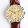
How the Red Dial Responds to Light and Movement
Red is a difficult color for replica watches. Too flat, and it looks synthetic. Too glossy, and it loses depth. KB factory finds a narrow path between the two.
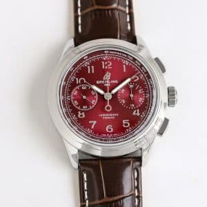
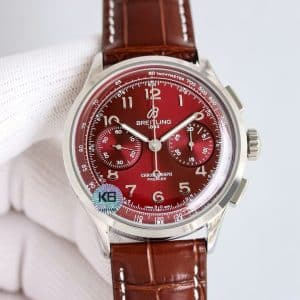
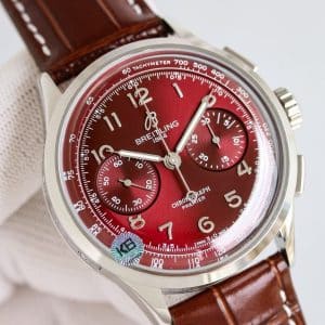
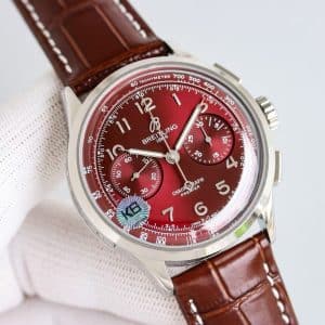
Under soft indoor lighting, the dial turns wine-deep, almost burgundy at the edges, while the center keeps a brighter ruby tone. The curvature of the dial helps create that gradient naturally. When you tilt your wrist, the color rolls instead of flipping abruptly.
In sunlight, the surface becomes livelier. The grain inside the red finish pushes micro-highlights outward in a radial pattern, giving the dial a sense of motion even when the watch is still. But the key is restraint — it never becomes overpowering.
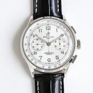
The raised Arabic numerals keep their clarity even when the dial deepens. They catch slim flashes of white light, helping the layout breathe.
Subdials, Hands, and the Character of the Layout
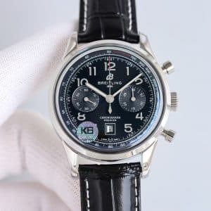
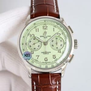
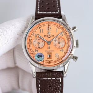
On this red version, the subdials take on a shadowed tone that separates them from the main field without breaking the composition. They appear slightly darker, which grounds the dial and gives the chronograph layout structure.
The hands behave sharply here. Their polished finish reflects bright streaks that stand out against the red background. This makes legibility stronger than expected for a saturated dial.
The long seconds hand, with its warm metallic tone, cuts across the dial cleanly. And because red shifts so easily with angle, the hands act as fixed anchors — something your eyes return to as the color moves.
Case, Wrist Feel, and the Role of the Leather Strap
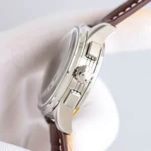
The polished 42mm stainless-steel case contrasts well with the red dial. The dial handles color; the case handles clarity. Together, they create a watch that feels more serious than playful.
On the wrist, the watch settles with the same comfort the Premier line is known for. The case curve hugs without pressure points, and the KB factory finishing feels consistent — no sharp transitions, no uneven brushing.
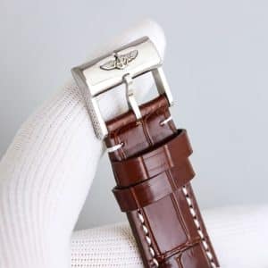
The brown leather strap changes the temperature of the entire composition. Red and brown bring warmth, and the stitching breaks the intensity. This keeps the watch from becoming a “special-occasion red” and pushes it firmly toward daily usability.
Mechanical Behavior and KB Factory Interpretation
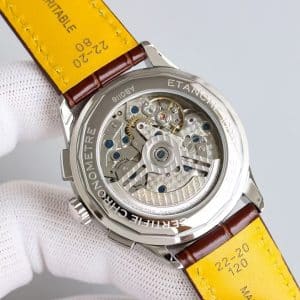
The KB factory movement behaves much like the others in the Premier series:
-
A clean but lightly grained winding feel
-
A rotor that remains quiet in normal use
-
Pushers with a clear, mechanical click
On the red dial version, the pusher feel becomes part of the overall impression. The bold color primes you for drama, but the movement behaves calmly — steady amplitude, predictable reset, no exaggerated feedback.
It’s a reminder that this super clone is built for routine, not spectacle.
Light, Routine, and Real Scenarios
At 7:15 AM, indoor morning light softens the red into a muted wine tone. The watch looks understated, almost formal. When you step outside, the ruby tone brightens but keeps its depth.
At 2:30 PM, under strong overhead light, the center of the dial glows, and the numerals shine sharply. The subdials darken slightly, giving the face more dimension. Small wrist motions cause the red to flare briefly before returning to calm.
At 8:20 PM, the color compresses again, turning deeper and more intimate. The watch feels more tailored at night than during the day.
Who This Red Premier Suits
Some people prefer neutral colors on their chronographs — blues, blacks, silvers. Others enjoy tone as personality. This red Premier fits the latter group. It’s confident without being aggressive, expressive without shouting.
If you want a chronograph that reads differently depending on where you stand and how the light falls, this red dial offers that experience. Whether that variation excites you or feels too expressive is something only you can decide.
Genuine vs KB: Subtle Differences to Expect
The real Premier’s red has a softer gradient and slightly warmer center. The KB version leans a touch cooler and cleaner, creating a more defined color transition. The pusher feel is sharper on the KB, while the Swiss version delivers a smoother, cushioned action. Printing precision is close, though the genuine retains marginally finer line weight.
Both tell the same color story, but each with its own accent.
Final Thought
My honest view: the red dial Premier from KB factory is one of the most character-driven pieces in their china super clone lineup. It turns color into texture, uses depth instead of shine, and carries an identity you feel immediately but understand slowly. If you want a chronograph that feels alive in changing light, this version earns a place in your rotation — whether it becomes part of your style is entirely your choice.
Comparison Table — Genuine vs KB Factory Red Premier
| Feature | Genuine Breitling Premier | KB Factory Super Clone |
|---|---|---|
| Case Diameter | 42mm | 42mm |
| Case Thickness | ~13.0mm | Slightly above 13mm |
| Dial Tone | Warmer ruby with smoother gradient | Cooler ruby with stronger edge shading |
| Subdial Contrast | Subtle, natural dimming | Slightly darker, more defined contrast |
| Printing Quality | Ultra-fine line weight | Clean, slightly thicker print |
| Pusher Feel | Soft, damped pressure | Sharper, more mechanical |
| Winding Texture | Smooth with light resistance | Slightly grained mechanical feel |
| Rotor Noise | Minimal | Quiet with mild vibration |
| Strap | Swiss leather | Guangzhou leather (brown) |
Premier models tend to appeal to collectors who prefer a cleaner, more composed presentation rather than an overtly technical aesthetic. The character of the line often comes from how its case proportions, dial layout, and finishing details work together to create a calmer, more adaptable presence on the wrist.
Because small differences in dial balance, case curvature, and bracelet feel can meaningfully shape the wearing experience, it is often helpful to compare versions with a focus on how they behave in everyday settings rather than on specifications alone. This Breitling super clone buying guide provides a wider context for understanding how different Breitling families relate to one another, making it easier to refine your preferences over time.