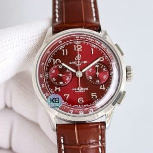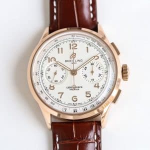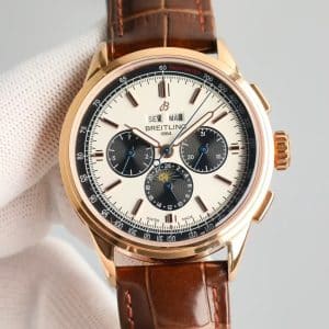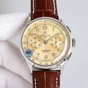
Identity and First-Wear Experience
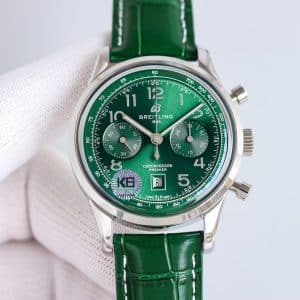
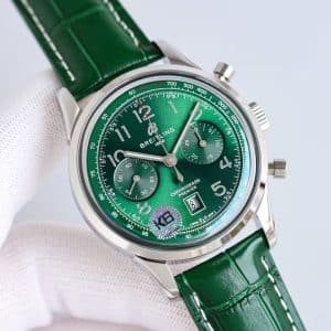
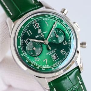
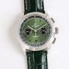
The Premier case has an understated grace, and the 42mm size carries its weight evenly. The green dial adds emotional presence without breaking the watch’s composure. It catches attention, but doesn’t demand it. On first wear, the contrast between the polished steel and the saturated green feels refined rather than flashy.
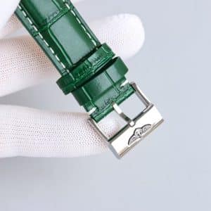
The green leather strap immediately reinforces the dial’s personality. It begins with structure, holding its shape firmly, yet the curved lugs still allow the watch to settle comfortably against the wrist. As the wrist warms the strap, the stiffness eases and the watch feels like it was designed to sit in that exact spot.
The chronograph layout — numerals, two subdials, and the central hand — remains legible even against the strong color. The dial pulls the eye inward, but the markers keep the watch grounded.
Background and the Premier’s Purpose
The Premier series has always existed as the more civilized face of Breitling — a chronograph meant to live in daily environments rather than technical or aviation-heavy settings. It must feel elegant without being fragile, functional without being severe.
A green dial might seem bold for that mission, but it surprisingly fits. It adds personality while staying faithful to the Premier’s underlying idea: a chronograph that performs cleanly during real movement, yet presents itself with refinement.
This KB factory replica continues that mission. The color feels intentional, not decorative, and the watch behaves consistently across contexts.
Dial Behavior, Light Interaction, and Bezel Presence
The dial is the story here. KB’s radial brushing is even and pronounced, creating smooth transitions between bright and shadowed areas. When viewed under soft indoor light, the green stays restrained, almost moss-like. In brighter light, the dial opens dramatically, reflecting sharp streaks of metallic green.
Despite these changes, readability stays strong. The numerals and hands maintain contrast, and the subdials — a slightly darker shade of green — maintain visual depth without breaking the unity of the dial.
The bezel, polished more brightly than BLS versions, frames the dial with a clean border of steel. It doesn’t overpower the green; instead, it creates a structured boundary that keeps the color from feeling overwhelming.
Case Construction and Wrist Behavior
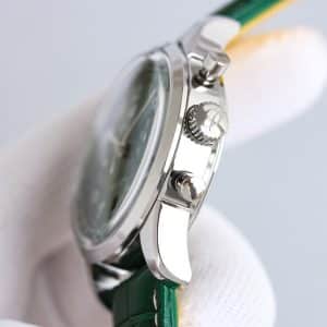
KB machining gives the case a crisp, articulate quality. The combination of brighter polishing and clean surface transitions results in a case that feels lively in light, but still substantial in hand. As the wrist moves, the reflections shift in narrow controlled bands rather than broad flashes.
The pushers behave with firm, consistent feedback. They offer more resistance than a Swiss Premier, but the sensation is predictable and secure. The crown’s shallow knurling provides steady grip without discomfort.
During walking, typing, steering, or pulling a sleeve past the case, the watch holds its position well. The dial’s green hue occasionally catches light and changes tone, creating small moments of color shift throughout the day.
Movement Feel and Mechanical Behavior
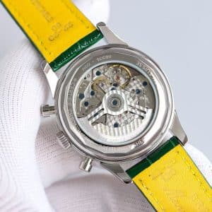
The KB factory setup aims for stability over silent elegance. Winding the watch provides a tactile, lightly gritty feedback that signals movement engagement without sounding coarse. The rotor remains soft and muted, avoiding the loose wobble common in lower-tier Guangzhou watchmaking.
Chronograph activation feels decisive. The stop action is crisp, and the reset motion snaps the central hand back cleanly. Functional behavior remains consistent, which suits a watch designed for daily use rather than collector-only display.
Strap Comfort and Long-Term Experience
The green leather strap amplifies the dial’s personality and ties the entire watch together visually. Out of the box, it is structured and glossy, holding its form with moderate stiffness. After regular use, the strap begins to shape around the wrist, relaxing especially near the first bend point. Heat softens it further, making it feel more integrated with the case.
Once broken in, the strap supports the watch with a comfortable, tailored fit.
Factory Execution Logic
KB factory’s strengths translate well onto this vibrant colorway:
• Brighter steel polish that pairs well with a vivid dial
• Crisp dial printing and evenly applied sunburst texture
• Consistent chronograph pusher resistance
• Strong color uniformity across main dial and subdials
Compared with BLS, KB’s green appears more saturated and more reactive to light. Compared with GR, the brushing feels cleaner with fewer dull spots. Compared with GF, the numerals appear sharper and more defined.
This is a dial that benefits from precision, and KB delivers that precision.
Real-Life Wearing Impressions
The watch behaves differently depending on its surroundings. In cooler, lower light, the green takes on a darker gravity, making the watch feel more formal. In brighter or outdoor environments, the sunburst texture activates and the color becomes energetic.
Across these shifts, the Premier maintains its identity: readable, balanced, and comfortably restrained.
Who This Green Premier Suits
This version fits someone who enjoys color but still wants a chronograph that feels composed. Someone who likes the Premier’s elegant structure but wants a dial with more personality. Someone who appreciates how a watch behaves in motion — not just how it appears in a photo.
It is expressive, but not loud; refined, but not plain.
Neutral Differences vs Genuine Premier
The genuine green Premier uses deeper metallic layering, giving the dial more gradient complexity. KB’s version is smoother and more uniform. The Swiss pushers feel softer and require less force. The winding is quieter and less textured. The strap breaks in more quickly on the original. Tachymeter printing is slightly sharper on the Swiss version.
These differences are expected and do not compromise daily usability.
Final Perspective
My view: the green-dial KB Premier behaves like a chronograph with character — lively when light hits it, calm when it doesn’t, and consistently stable on the wrist. It brings personality without compromising the Premier’s underlying elegance. That is how it lives day to day — and whether that fits your style is a choice only you can make.
Comparison Table — Genuine vs KB Factory Premier (Green Dial)
| Feature | Genuine Breitling Premier | KB Factory Super Clone Premier |
|---|---|---|
| Case Diameter | 42mm | 42mm |
| Case Thickness | ~13.0mm | Slightly above 13mm |
| Dial Finish | Multi-layer deep metallic green | Smooth sunburst, more uniform |
| Subdial Treatment | High depth, strong dimensionality | Slightly flatter but well-colored |
| Steel Polishing | Balanced Swiss polish | Brighter KB polish |
| Pusher Feel | Soft, fluid engagement | Firmer, more mechanical |
| Winding Feedback | Smooth and quiet | Light grit, controlled |
| Rotor Presence | Barely audible | Soft, muted shift |
| Tachymeter Printing | Micro-precise | Clean but less dimensional |
| Leather Strap | Premium Swiss calf | Glossy Guangzhou leather, slower break-in |
| Wearing Personality | Elegant, rich color transitions | Vivid, articulate, stable |
Premier models tend to appeal to collectors who prefer a cleaner, more composed presentation rather than an overtly technical aesthetic. The character of the line often comes from how its case proportions, dial layout, and finishing details work together to create a calmer, more adaptable presence on the wrist.
Because small differences in dial balance, case curvature, and bracelet feel can meaningfully shape the wearing experience, it is often helpful to compare versions with a focus on how they behave in everyday settings rather than on specifications alone. This Breitling super clone buying guide provides a wider context for understanding how different Breitling families relate to one another, making it easier to refine your preferences over time.